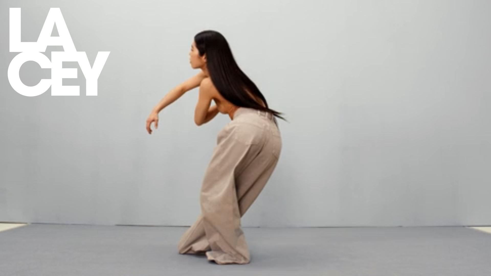
Lacey Studio Creative Portfolio Portfolio
A minimalist director's portfolio featuring a full-screen video hero, masonry-style grid with auto-playing video previews, and a sophisticated overlay navigation system.
Overview
This website is a high-end minimalist portfolio for Lacey Studio, characterized by its cinematic use of full-screen video and a dynamic masonry grid. It serves as an excellent clone reference for creatives who want to prioritize visual storytelling through auto-playing media and a clean, oversized typographic identity.
Design System
- Color Palette & Visual Hierarchy: The site uses a monochrome aesthetic with a neutral base (whites, grays, and blacks) to ensure the colorful video content remains the focus. Large-scale high-contrast white typography creates a bold brand presence against dark video backgrounds.
- Typography System: A heavy, sans-serif display font (appearing as a custom "LACEY" logo/header) dominates the hero section. Subtitles like "Director & photographer" use a smaller, clean sans-serif for secondary hierarchy.
- Page Structure & Flow: The site follows a vertical progression: it begins with a full-height video hero featuring a split-text logo, followed by a dense masonry grid (
role="grid") of work samples. The grid uses absolute positioning to create a balanced yet irregular layout of varying aspect ratios. - Reusable Components:
- Video Hero: A full-bleed background video container (
css-x62egm-fillArea-FillContainer) with centered overlay text. - Masonry Grid Cells: Individual project cards that toggle between a static image (
gatsby-image-wrapper) and a high-quality video preview (css-1uel0un-fillArea-Video) using Mux streaming. - Overlay Logo: A fixed or top-aligned large logo that stays prominent during the initial scroll.
- Video Hero: A full-bleed background video container (
- Interaction & Motion: The site leverages hardware acceleration for smooth transitions. Video previews in the grid appear to be set to loop and autoplay, providing a living "mood board" feel. There is a blur-to-clear transition visible in the code (
filter: blur(0px)) that likely triggers during asset loading. - Implementation Clues: Built with Gatsby, the site utilizes
gatsby-imagefor optimized loading and Mux for streaming video delivery. The layout relies on sophisticated CSS-in-JS (indicated bycss-prefixed classes) to handle positioning and aspect ratios.
Use Cases
- Creative Professionals: Ideal for film directors, cinematographers, and high-fashion photographers who need a "reel-first" portfolio.
- Production Agencies: Agencies can remix the masonry grid to showcase a wide variety of campaigns without the layout feeling repetitive.
- Practical Remix Directions:
- Brand Swap: Replace the aggressive display font with a sophisticated serif to pivot from modern/edgy to luxury/editorial.
- Grid Adaptation: Scale the masonry logic down for use as a blog index or a product gallery for a boutique e-commerce brand.
- Suggested Clone Scope: A full-page clone is recommended to capture the seamless transition from the high-impact hero to the information-dense grid. However, cloning just the
gridcellvideo component is useful for builders needing performance-optimized video previews.
Related Inspirations
Waka Waka Furniture Portfolio
A minimalist design showcase featuring a custom cursor, parallax scroll effects, and a vertical image grid layout for high-end product displays.
Unknown Untitled Design Portfolio Screensaver
A minimalist, experimental design agency website featuring an automated image-layout screensaver and oversized typography overlays.
Linus Rogge Portfolio Work Gallery
A minimal, full-bleed case study grid featuring sticky typography, mix-blend-mode text effects, and integrated Mux video layers for high-impact project showcases.

Clase Agency Branding Portfolio
A minimalist design agency portfolio featuring a typographic hero section, full-width image articles, sticky title bars, and integrated scrolling text marquees for a clean editorial layout.

Ayaka B. Ito Creative Portfolio
A minimalist design portfolio featuring an immersive full-screen hero image, clean typographic navigation, and a structured layout for showcasing branding and editorial projects.
David Fiz Visual Design Portfolio
A minimalist portfolio featuring a fixed sidebar navigation paired with an immersive, full-screen media showcase and interactive project-specific image carousels.
