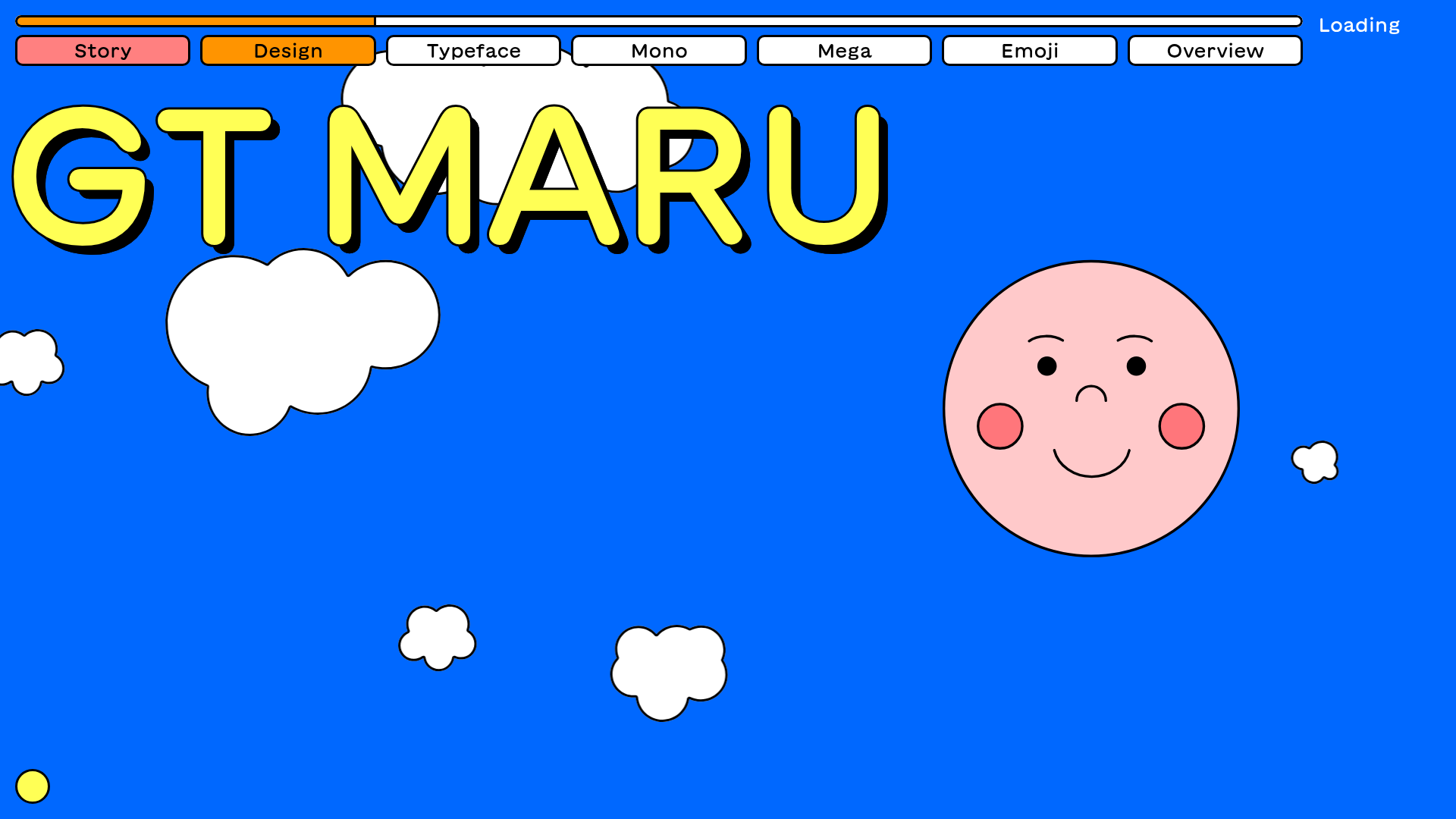
GT Maru Typeface Promotional Landing Page
A playful, multi-section landing page featuring interactive typography testers, Lottie animations, scroll-triggered sticky text blocks, and a wave-divider layout with dynamic navigation colors.
Overview
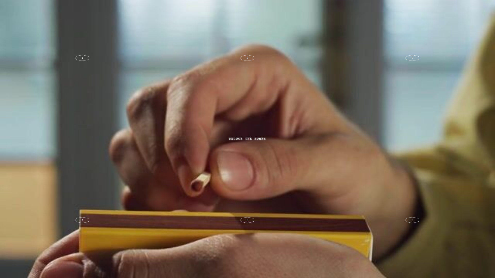
This site is a high-energy, interactive promotional landing page for the GT Maru typeface, blending Swiss minimalism with Japanese-inspired playfulness. It serves as an excellent reference for builders looking to implement complex scroll-driven storytelling, interactive typography testers, and seamless Lottie animation integration.
Design System
- Color Palette & Visual Hierarchy: The site uses a high-contrast, vibrant palette featuring Electric Blue (#0047FF), Bright Yellow, and Coral Red. A dynamic navigation system changes the UI theme (via
data-nav-color) as the user scrolls through different chapters. Sections are separated by unique SVG wave dividers that create organic transitions between solid background blocks. - Typography: Centered around the GT Maru family, the system showcases variable font axes (Weight, Slant, Optical Size). Visual hierarchy is driven by massive, outlined display headers and compact, readable body text contained within "sticky" text boxes that remain fixed while background animations play.
- Page Structure: The flow follows a narrative arc: Hero (Intro) → Story (Inspiration) → Design (Process) → Typeface (Technical Specs) → Mono/Mega (Subfamilies) → Emoji. It uses a "Side-Padding" container strategy for body content while headers often span full-width.
- Reusable Components:
- Inline Type Testers:
contenteditabledivs with custom range sliders for real-time font manipulation. - Sticky Text Boxes:
.textbox.scroll-stickyelements that prevent information overload by anchoring context to moving visuals. - Interactive Alphabet Grid: A hover-triggered grid that updates a primary large-scale SVG character (
#alphabet-large). - Lottie Player Containers: Standardized wrappers for JSON-based vector animations.
- Inline Type Testers:
- Interaction & Motion: The site is heavily reliant on scroll-triggered events. It features a custom loading indicator, parallax floating clouds, and "x-ray" image states (toggled on hover) to show typographic metrics.
- Implementation Clues: The HTML reveals a custom-built structure using
lottie-playerfor animations anddata-outline-duplicate-textattributes, likely used for the heavy outline CSS effects. It utilizes a section-based navigation where each<section>informs the global UI state.
Use Cases
- Font Foundries & Creative Tools: The most direct application is for showcasing digital assets where users need to manipulate variables (weight, size) before purchasing.
- Brand Storytelling Pages: Companies with a strong "origin story" can use the sticky-text and Lottie-animation pattern to guide users through their history without losing them in long paragraphs.
- Educational Microsites: The "x-ray" hover effect and interactive grids are perfect for technical explainers or online modules that require visual evidence to support text.
- Remix Strategy: For a quick win, clone the SVG wave dividers and the sticky text-box logic. For a full-page remix, swap the playful Japanese aesthetic for a dark-mode tech aesthetic while keeping the robust variable-font testing modules.
Related Inspirations
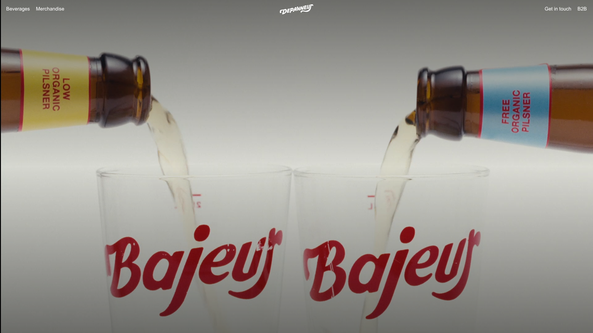
Depanneur Beverage E-commerce Hero
A minimalist Shopify storefront featuring a full-screen background video hero, sticky translucent navigation, and integrated mobile menu components.
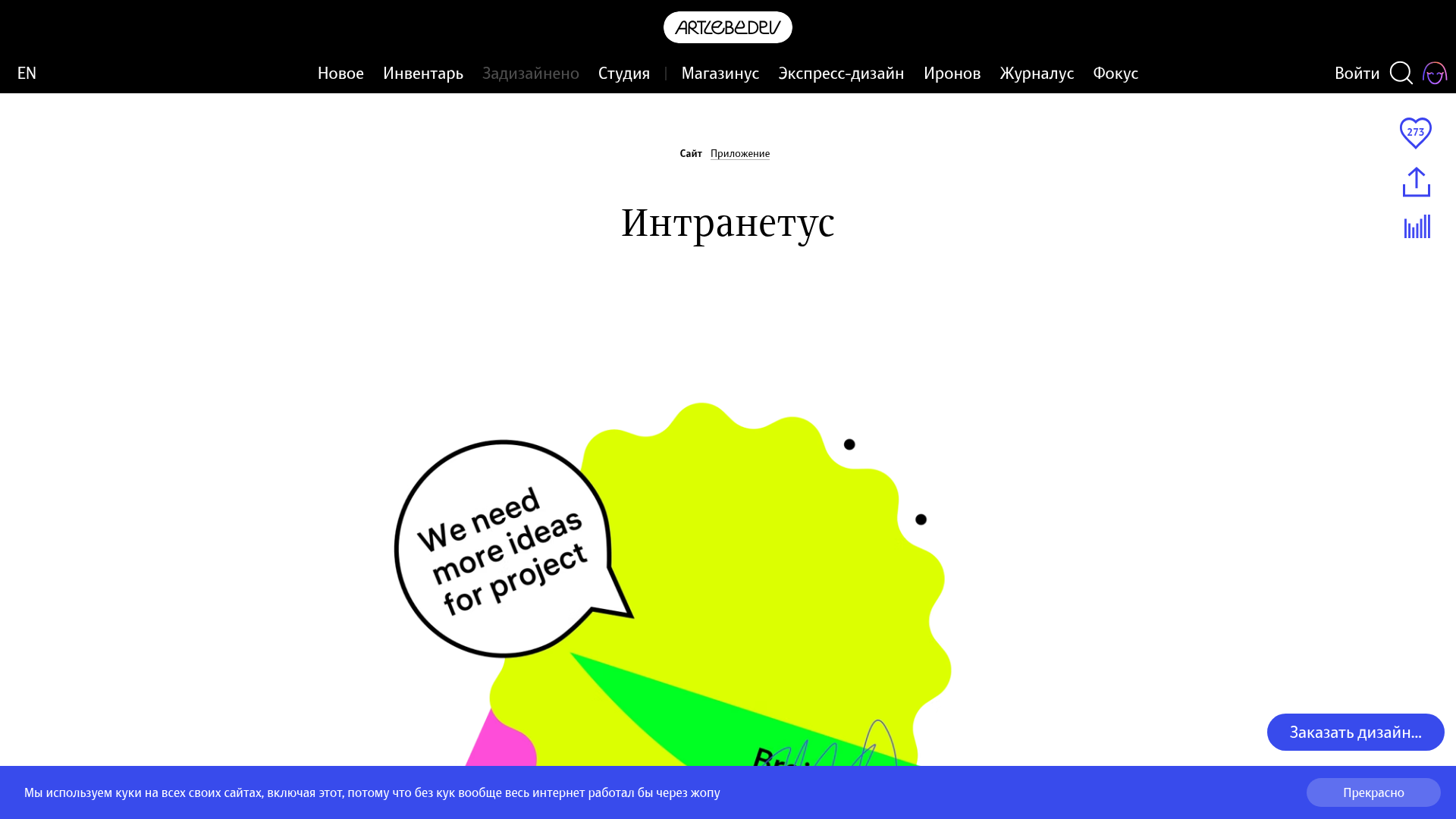
Intranetus Project Showcase Landing Page
A high-concept portfolio page featuring a large-scale video hero, Lottie animations, layered parallax transition effects, and a vertical grid of browser-mockup feature cards.
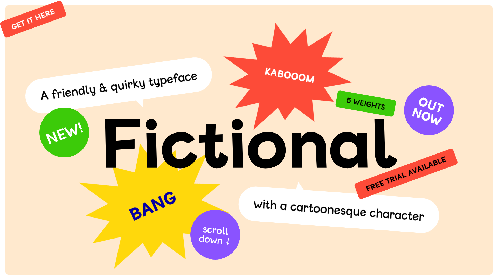
Fictional Typeface Interactive Showcase Page
A playful landing page featuring a gamified hero section with shootable elements, an editable text playground for variable fonts, and a comprehensive character set grid.
Fornasetti Profumi ASMR Interactive Gallery
A high-concept landing page featuring full-screen atmospheric video backgrounds, numbered interactive hotspots, and a minimal overlay UI for an immersive storytelling experience.

The Other Side of Truth Narrative Scroll
A dark-themed storytelling layout featuring GSAP-powered scroll animations, sticky pinned sections, and scattered social media card components.
How Many Plants Illustrated Hero
A unique houseplant resource featuring layered SVG shelf layouts with hover-triggered animations, interactive image masks, and alternating content sections for educational guides.
