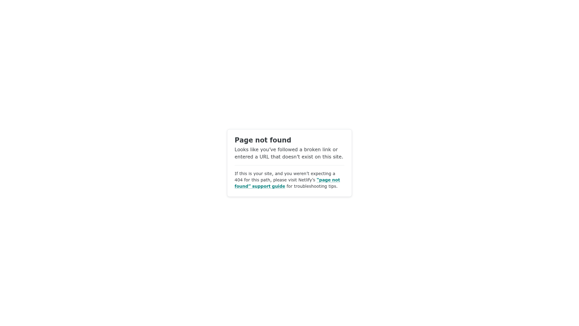
Netlify Default 404 Error Page
A minimal, centered 404 error card featuring a clean layout, typography, and a horizontal divider for troubleshooting links.
Overview
This is a clean, minimal 404 error page pattern used by Netlify to handle broken links. It is a strong reference for developers who need a professional, un-opinionated error state that prioritizes clear communication and troubleshooting resources over decorative graphics.
Design System
- Color Palette & Visual Hierarchy: The design uses a high-contrast monochromatic base with a white card centered on a light gray background. A thin horizontal rule (
<hr>) provides a clear visual break between the user-facing error message and technical support instructions. Links are highlighted in a distinct teal color to draw attention to the call-to-action. - Typography: The hierarchy is established through weight and scale. The
<h1>uses a bold sans-serif typeface for the main status, followed by smaller body text for explanation, and a noticeably smaller font size for the secondary "your-site" troubleshooting information. - Page Structure: The layout follows a classic card-based centered alignment. It consists of a top-level container (
.main) wrapping a single.cardcomponent. The flow moves from primary notification ("Page not found") to general explanation, then to a footer-like section for technical guidance. - Reusable Components: The primary cloneable component is the centered utility card. This container includes defined padding, rounded corners (border-radius), and a subtle box shadow to lift it from the background.
- Implementation Clues: The HTML structure is lean and semantic, using standard block elements and a simple class naming convention (
.main,.card,.your-site). This indicates a utility-first or custom CSS approach designed for fast loading even when site assets might be failing.
Use Cases
- Who should clone this: Developers looking for a "fail-safe" error page that works across any brand identity without clashing with the main site's design.
- Effective Remixes: This pattern is ideal for SaaS platforms, developer documentation sites, or admin dashboards where utility and information density are more important than visual flair.
- Remix Directions: Replace the generic teal link color with brand-specific primary colors, or swap the text content for more playful brand voice. For a more modern feel, add a simple SVG illustration or a "Go Home" button component directly above the
<hr>. - Suggested Clone Scope: A full-page clone is recommended as this is a complete standalone utility page. The
.cardcomponent alone can also be reused for simple modal popups or login/signup screens.
Related Inspirations
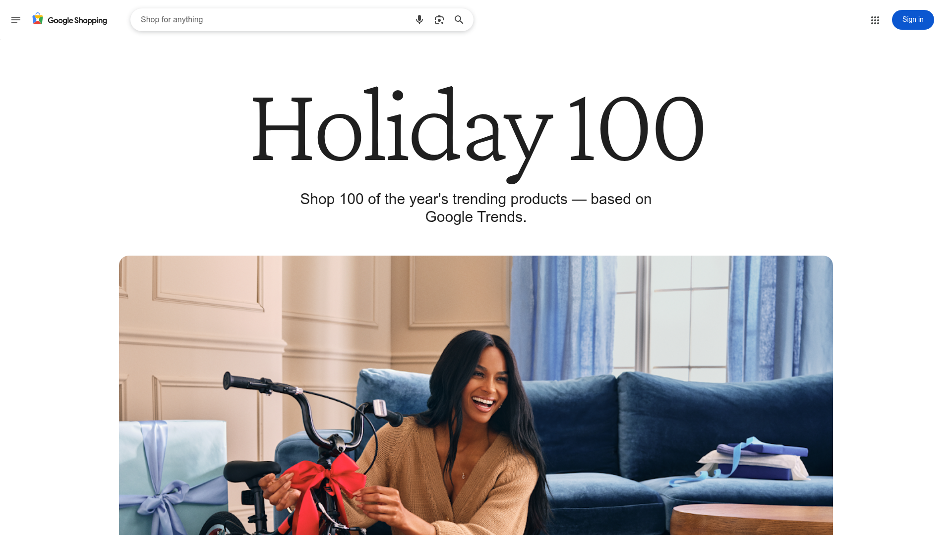
Google Holiday 100 Curator Landing Page
A minimalist e-commerce showcase featuring a wide hero section, clean search integration, and a bold typography-driven header designed for trending product collections.

Finn Pet Supplements Landing Page
An e-commerce landing page featuring high-contrast typography, a sticky brand logo banner, parallax scroll effects on product headers, and a clean product grid.
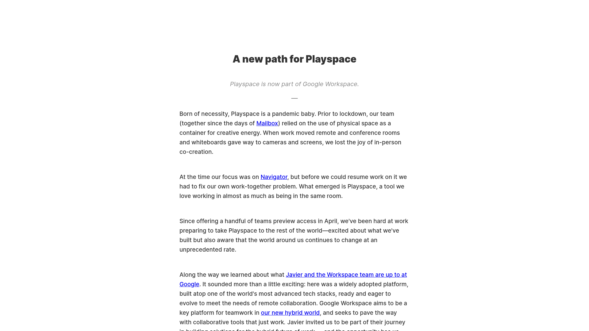
Playspace Acquisition Announcement Minimalist Layout
A clean, center-aligned announcement template featuring a vertical stack of rich text content and linked text elements on a neutral background.
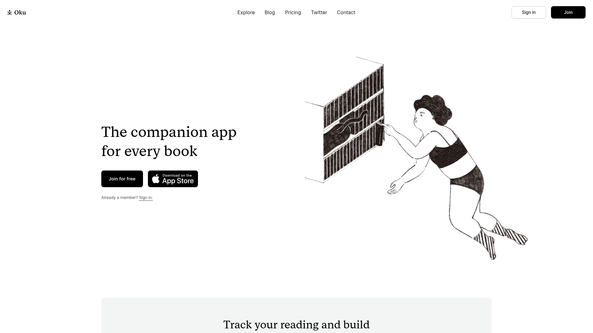
Oku Minimalist Book Tracking Landing Page
A clean, typography-focused landing page featuring a minimalist header, illustrated hero section, and clear call-to-action buttons for app downloads.
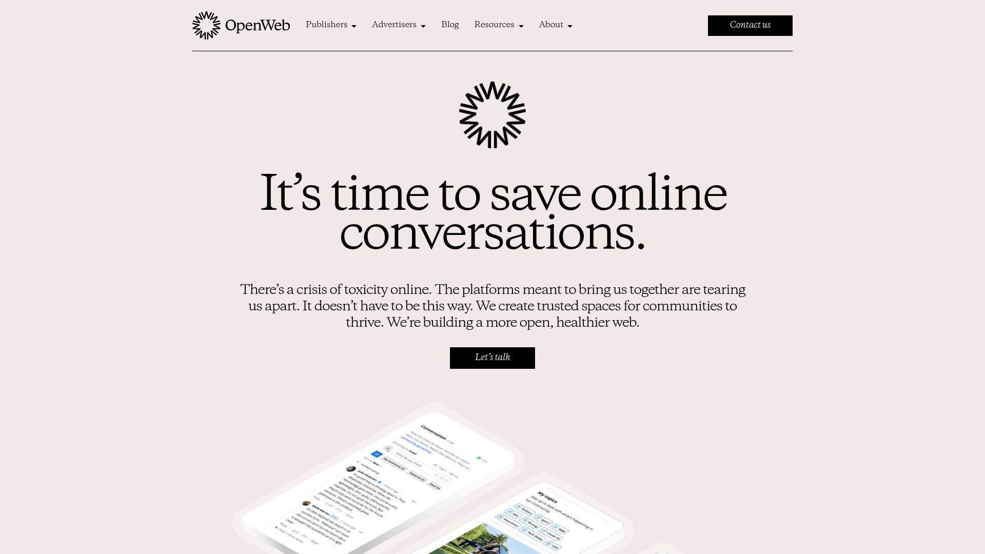
OpenWeb B2B Service Landing Page
A professional landing page layout featuring a central animated hero area, data visualization counters, a client logo grid, testimonial slider, and tabbed lead generation forms.

Slite SaaS Knowledge Base Landing Page
A clean SaaS hero section with a conversational headline, secondary call-to-action buttons, and a structured software interface preview featuring user testimonials.
