Norgram Minimalist Design Portfolio
A high-end, monochrome studio portfolio featuring a brutalist typography-led hero section, a clean asymmetrical masonry grid, and minimalist project navigation.
Overview
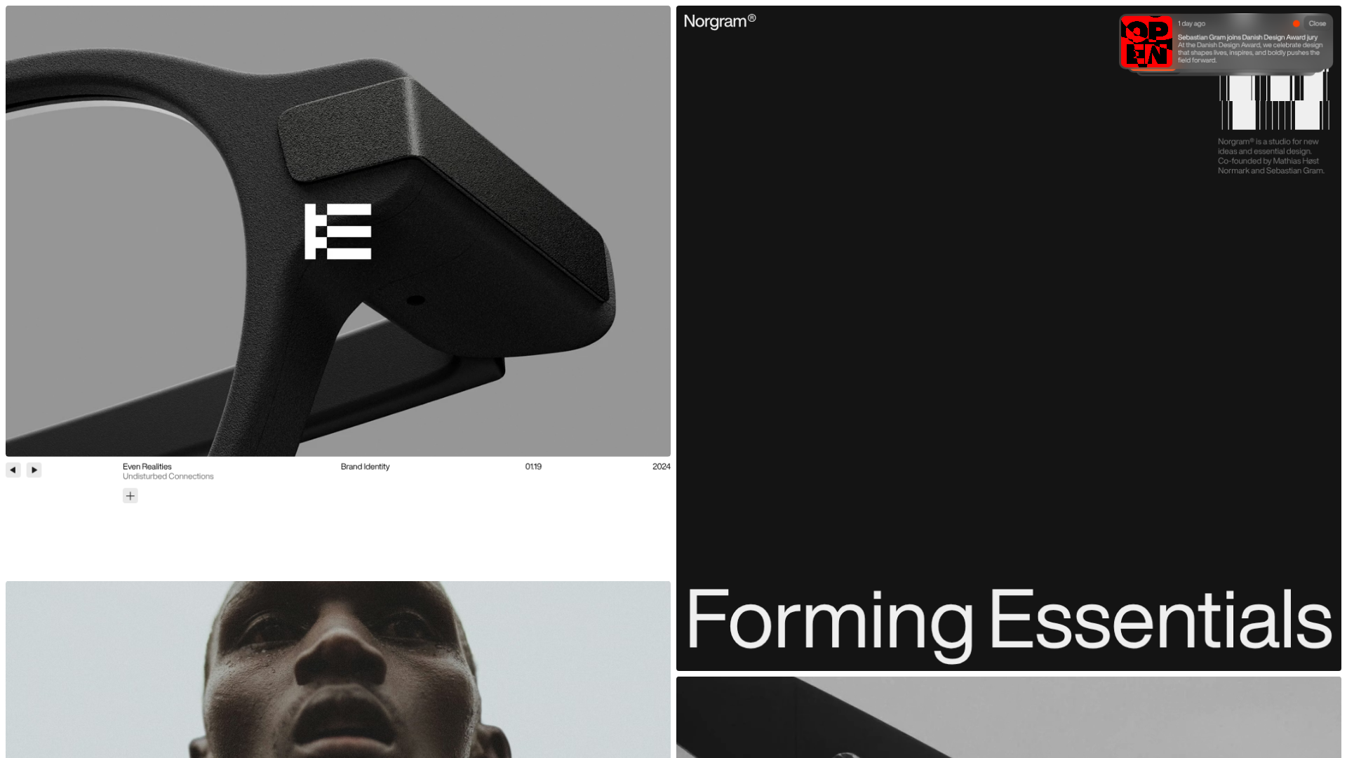
This website is the portfolio for Norgram, a Danish design studio. It serves as a premier reference for high-end minimalist design, utilizing a sophisticated split-screen layout and brutalist typography to showcase brand identity and digital product work. Builders should clone this to master asymmetrical layouts and tight typographic systems that communicate premium authority.
Design System
- Color Palette & Visual Hierarchy: A strict monochrome theme dominated by deep blacks (#141414, #232323) and stark whites (#FFFFFF). Contrast is used to separate the project showcase (white background) from the studio information and hero messaging (black background).
- Typography: Heavily features a clean, high-contrast Neo-Grotesk sans-serif. Large-scale fluid headings (e.g., "Forming Essentials") provide visual impact, while small-caps or standard casing across meta-data (year, category, pagination) creates a technical, archival feel.
- Page Structure: The site utilizes a horizontal split-screen structure. The left side functions as a vertically scrolling masonry gallery of project cases, while the right side contains fixed hero content that transitions into studio narrative sections as you scroll.
- Reusable Components:
- Project Accordions: Minimalist expansion panels for project descriptions and credits with a thin-line "plus" icon.
- Project Metadata Bars: Grid-based horizontal bars that align title, client, category, and date in a single row above project images.
- Image/Video Carousels: Wide-aspect ratio containers supporting mix-and-match landscape and portrait media using
mux-videofor high-performance video embedding.
- Interaction Patterns: The design features smooth parallax-style scaling (seen in the
translate3dandscaleCSS in the HTML) where content blocks shift and resize slightly during scroll. Navigation is minimal, relying on intuitive scroll-based discovery. - Implementation Clues: Built using Svelte, as evidenced by the
svelte-scoped classes. It uses a component-based structure where sections are wrapped in containers with fixed widths (960px) and dynamic gap scaling.
Use Cases
- Who should clone this: Design studios, independent creative directors, and architects who need a portfolio that feels both archival and cutting-edge.
- Effective Remixes: High-end fashion lookbooks or premium furniture e-commerce landing pages. The split-screen logic is excellent for balancing detailed product shots with a brand manifesto.
- Practical Remix Directions: Swap the monochrome palette for a tonal earthy set (beiges and browns) for a lifestyle brand, or replace the project gallery with a documentation feed for a high-end SaaS product.
- Clone Scope: A full-page clone is recommended to capture the complex interplay between the left and right scroll containers, though the "Project Metadata Bar" is a perfect individual component for any minimalist site.
Related Inspirations

Niklas Rosén Designer Portfolio Index
A minimalist, responsive grid-based portfolio index featuring a clean 16-column layout, typographic list components, and a custom dark mode transition.
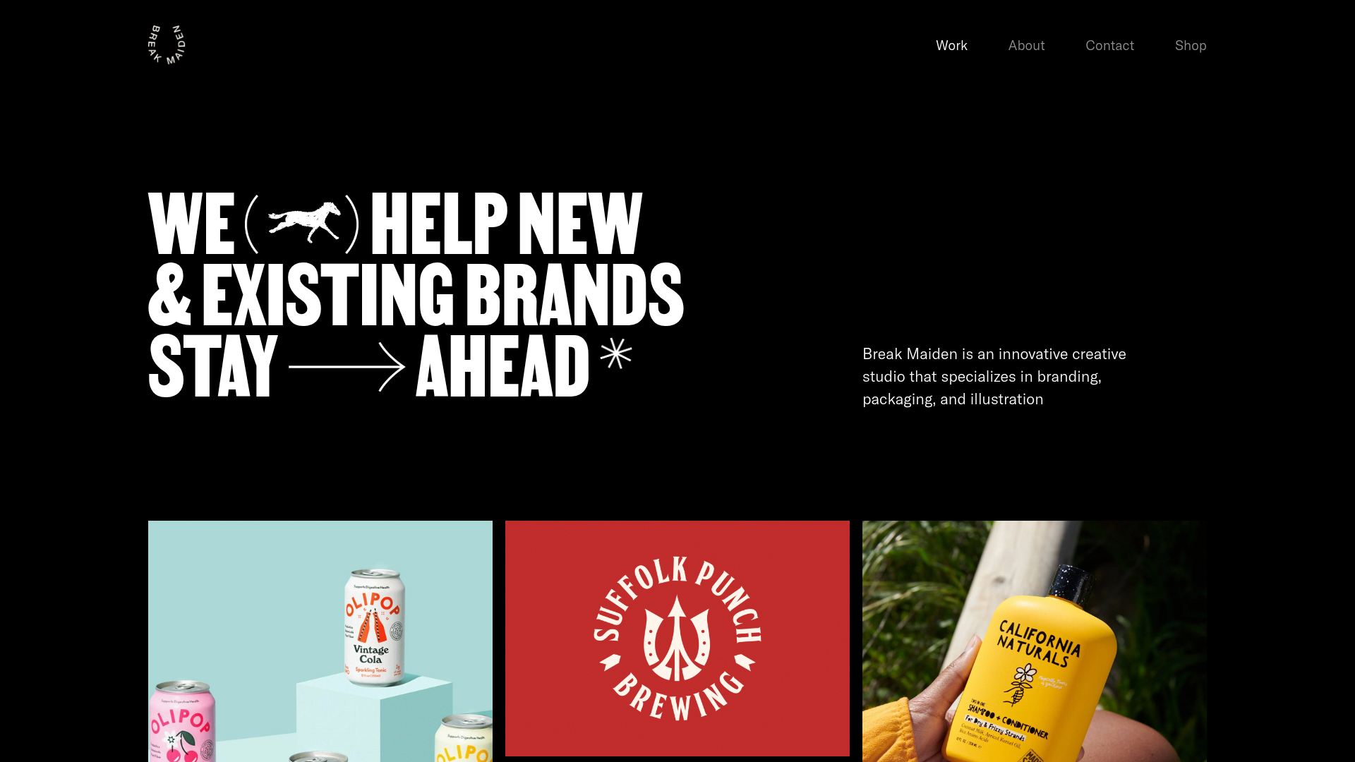
Break Maiden Agency Portfolio Hero
A high-impact dark mode hero section featuring oversized typography with inline GIF icons and a responsive grid for display-heavy case studies.
Marx Design Minimal Portfolio Grid
A high-end design portfolio featuring a synchronized image-hover grid layout, GSAP-powered transitions, and a hidden fullscreen menu with portrait image links.
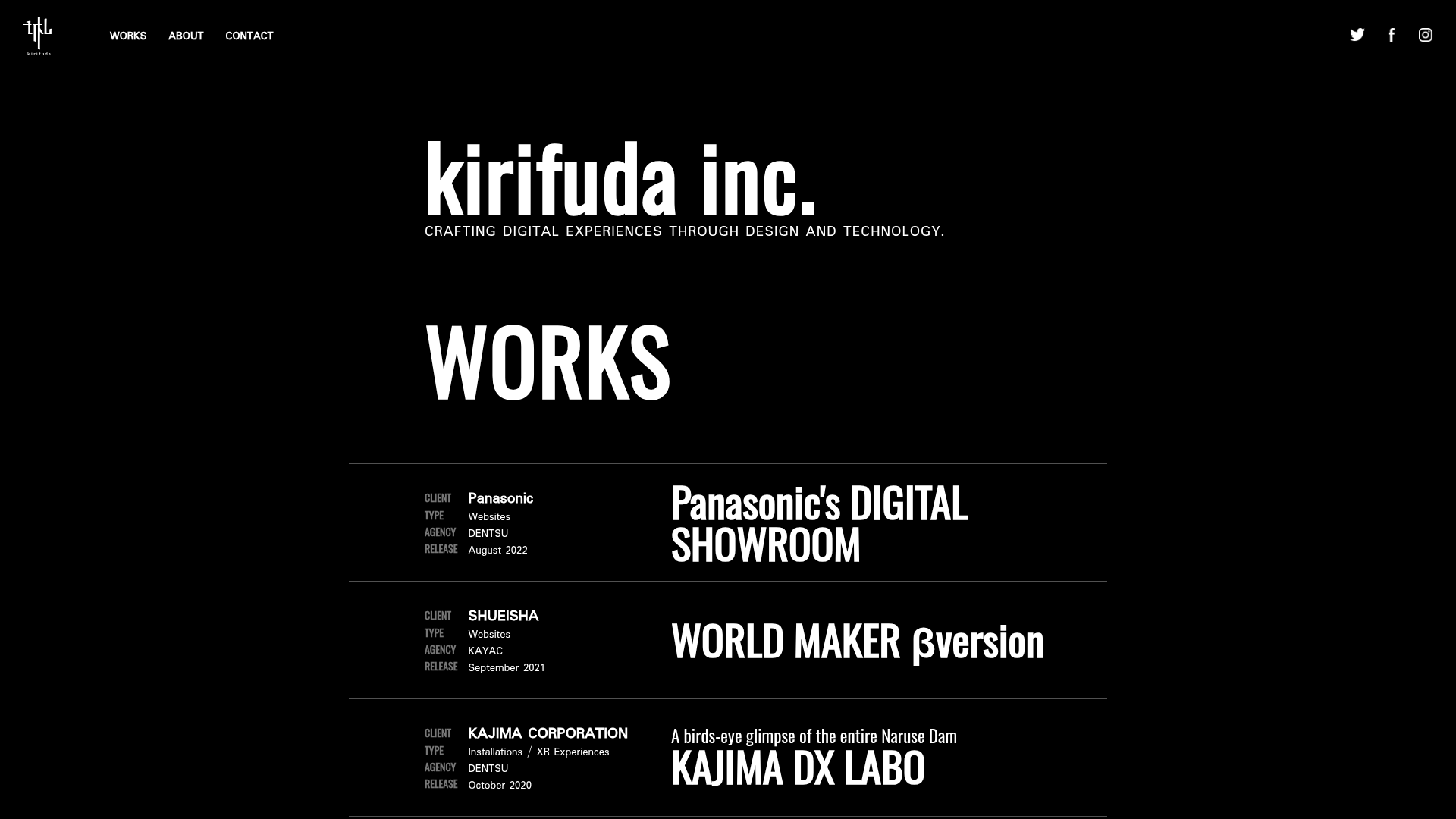
Kirifuda Inc. Minimal Portfolio Showcase
A clean, dark-mode agency portfolio featuring a typographic hero section, a high-contrast list-based works gallery with metadata, and a segmented multi-column footer for company details.
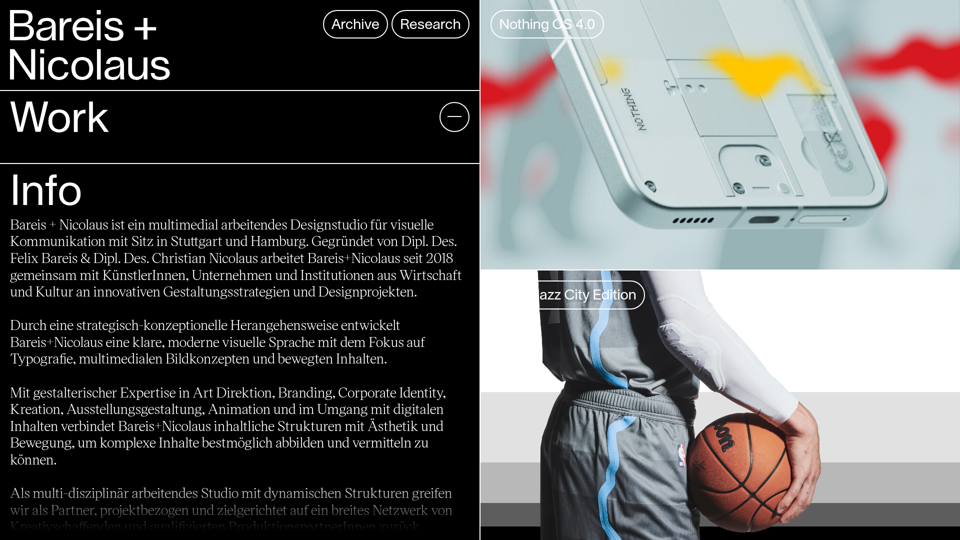
Bareis + Nicolaus Design Portfolio
A split-screen portfolio featuring a fixed text-based sidebar alongside an edge-to-edge scrollable gallery of video and image project components.
Two Create Studio Minimalist Portfolio
A high-contrast, text-centric agency landing page featuring a bold typographic header and a dark-mode minimalist layout suitable for creative portfolios.
