Marx Design Minimal Portfolio Grid
A high-end design portfolio featuring a synchronized image-hover grid layout, GSAP-powered transitions, and a hidden fullscreen menu with portrait image links.

Overview
This website for Marx Design is a masterclass in high-end, minimal portfolio layout, utilizing a sophisticated grid system that prioritizes visual storytelling. It is an excellent reference for builders because of its seamless integration of GSAP-powered motion and a unique 'synchronous hover' effect where landscape and portrait assets swap positions. The architecture demonstrates how to present a large volume of creative work without overwhelming the user through clean typography and strategic whitespace.
Design System
- Color Palette & Visual Hierarchy: The site employs a stark, high-contrast monochrome palette. The interface relies on a
#000000background for the entrance/preloader and transitions to a#ffffffcanvas for the main gallery. This shift creates a dramatic 'reveal' effect. Minimal 'Best Award' pins (Gold, Silver, Bronze) are the only consistent sources of color, serving as subtle status indicators. - Typography System: A clean, modern sans-serif is used throughout. The hierarchy is extremely flat; navigation items and project titles use a similar scale, relying on positioning and letter spacing rather than heavy font weights for emphasis. The preloader transforms sentences into discrete
worddivs for sequenced animation. - Page Structure & Flow: The flow begins with a centralized text-based intro (
.marx--intro), followed by a dense masonry-style grid (.work-grid). Projects are organized in rows of five cells (cell--number-0tocell--number-4), alternating between landscape and portrait orientations to create a rhythmic, non-linear reading experience. - Reusable Components:
- The Adaptive Card: A complex asset container (
.image-grid) that holds both a primary image and a hiddenimage-hoverelement programmed for state changes. - Fullscreen Menu: A triggered overlay (
.main-menu) featuring a vertical link list and synchronized portrait image previews of key studio members. - The Transition Block: A global route transition div used for seamless page-to-page hex-color shifts.
- The Adaptive Card: A complex asset container (
- Interaction & Motion: The primary interaction is the project hover: when a user interacts with a cell, the primary image scales or translates while a hidden landscape/portrait counterpart fades in via GSAP (
translate: none; scale: none;). The site also features a 'secret link' dot and a live 'studio time' clock in the footer/menu. - Implementation Clues: Built using Nuxt.js (
#__nuxt), the site leverages GSAP for layout transforms and Prismic as a headless CMS for asset delivery. The HTML structure shows heavy use of data attributes (e.g.,data-transition-color,data-is-landscape) to pass parameters to the animation engine.
Use Cases
- Who should clone this: Independent creative directors, high-end architecture firms, or boutique branding agencies who need to showcase a high-velocity output of visual work in a curated manner.
- Effective Remixes: This pattern is ideal for luxury e-commerce lookbooks or editorial digital magazines where visual assets (like photography) are the primary driver of value.
- Remix Directions:
- Information Architecture: Swap the dense 5-column grid for a more spacious 2-column layout to suit smaller project volumes.
- Branding: Adapt the
data-transition-colorattributes to cycle through a brand's specific seasonal colors instead of monochrome. - Functionality: Reuse the fullscreen menu logic but replace the internal portrait images with dynamic project thumbnails or categories.
- Clone Scope: Start with the Grid Cell Component for the hover-swap logic. For a more ambitious project, clone the Nuxt/GSAP transitions to manage the color-shifting page loads.
Related Inspirations

Niklas Rosén Designer Portfolio Index
A minimalist, responsive grid-based portfolio index featuring a clean 16-column layout, typographic list components, and a custom dark mode transition.
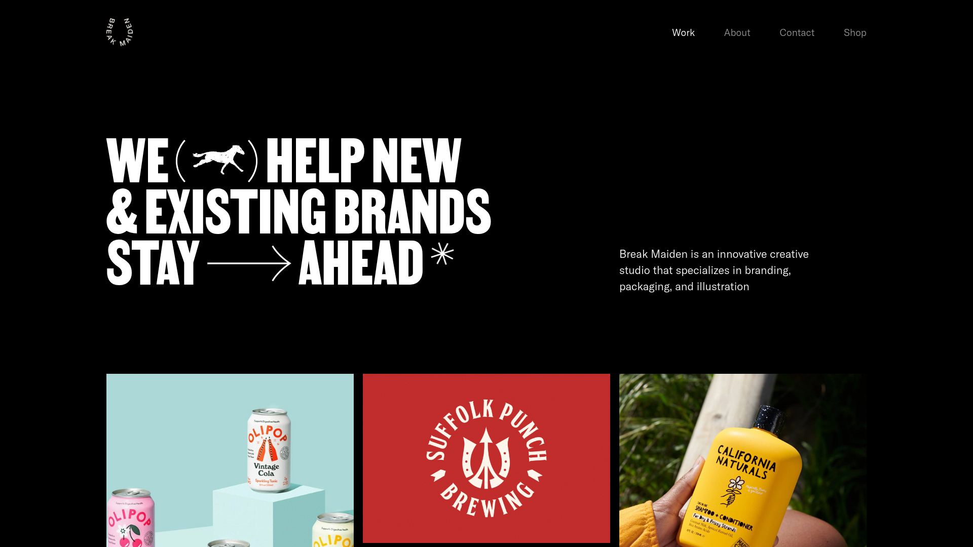
Break Maiden Agency Portfolio Hero
A high-impact dark mode hero section featuring oversized typography with inline GIF icons and a responsive grid for display-heavy case studies.
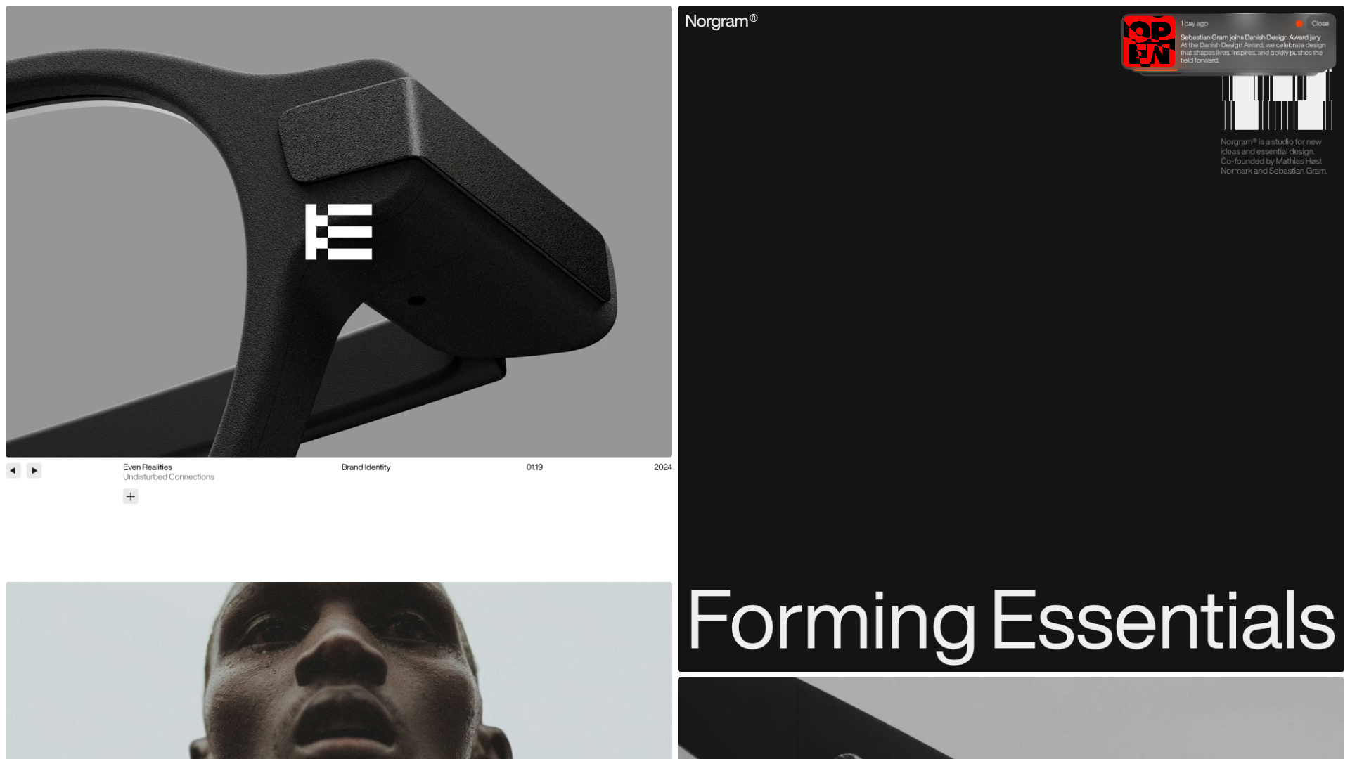
Norgram Minimalist Design Portfolio
A high-end, monochrome studio portfolio featuring a brutalist typography-led hero section, a clean asymmetrical masonry grid, and minimalist project navigation.
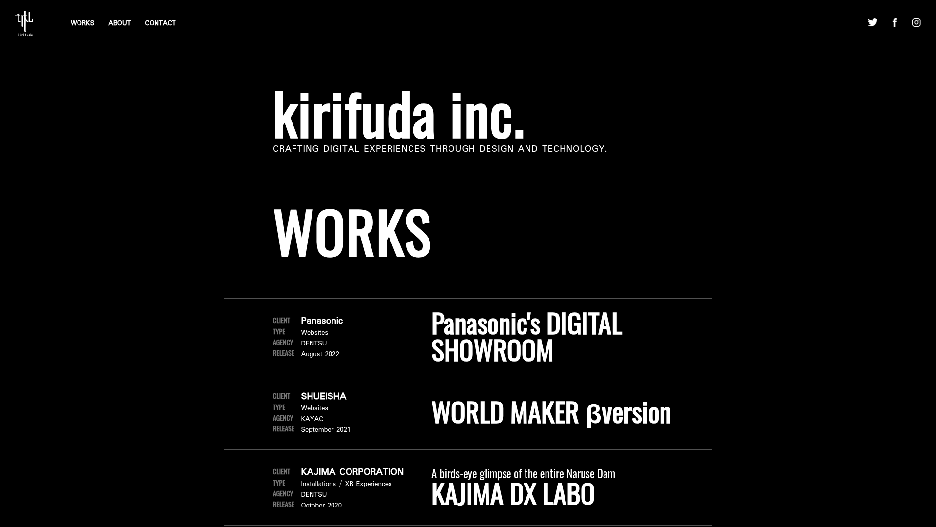
Kirifuda Inc. Minimal Portfolio Showcase
A clean, dark-mode agency portfolio featuring a typographic hero section, a high-contrast list-based works gallery with metadata, and a segmented multi-column footer for company details.
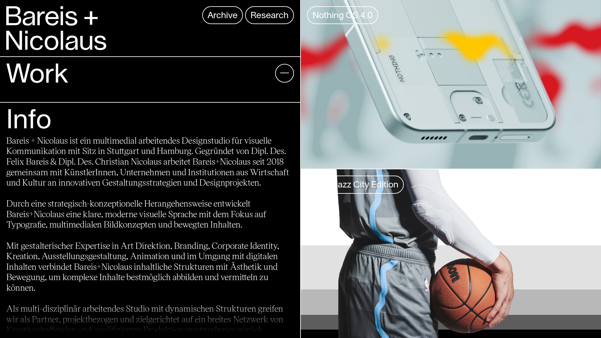
Bareis + Nicolaus Design Portfolio
A split-screen portfolio featuring a fixed text-based sidebar alongside an edge-to-edge scrollable gallery of video and image project components.
Two Create Studio Minimalist Portfolio
A high-contrast, text-centric agency landing page featuring a bold typographic header and a dark-mode minimalist layout suitable for creative portfolios.
