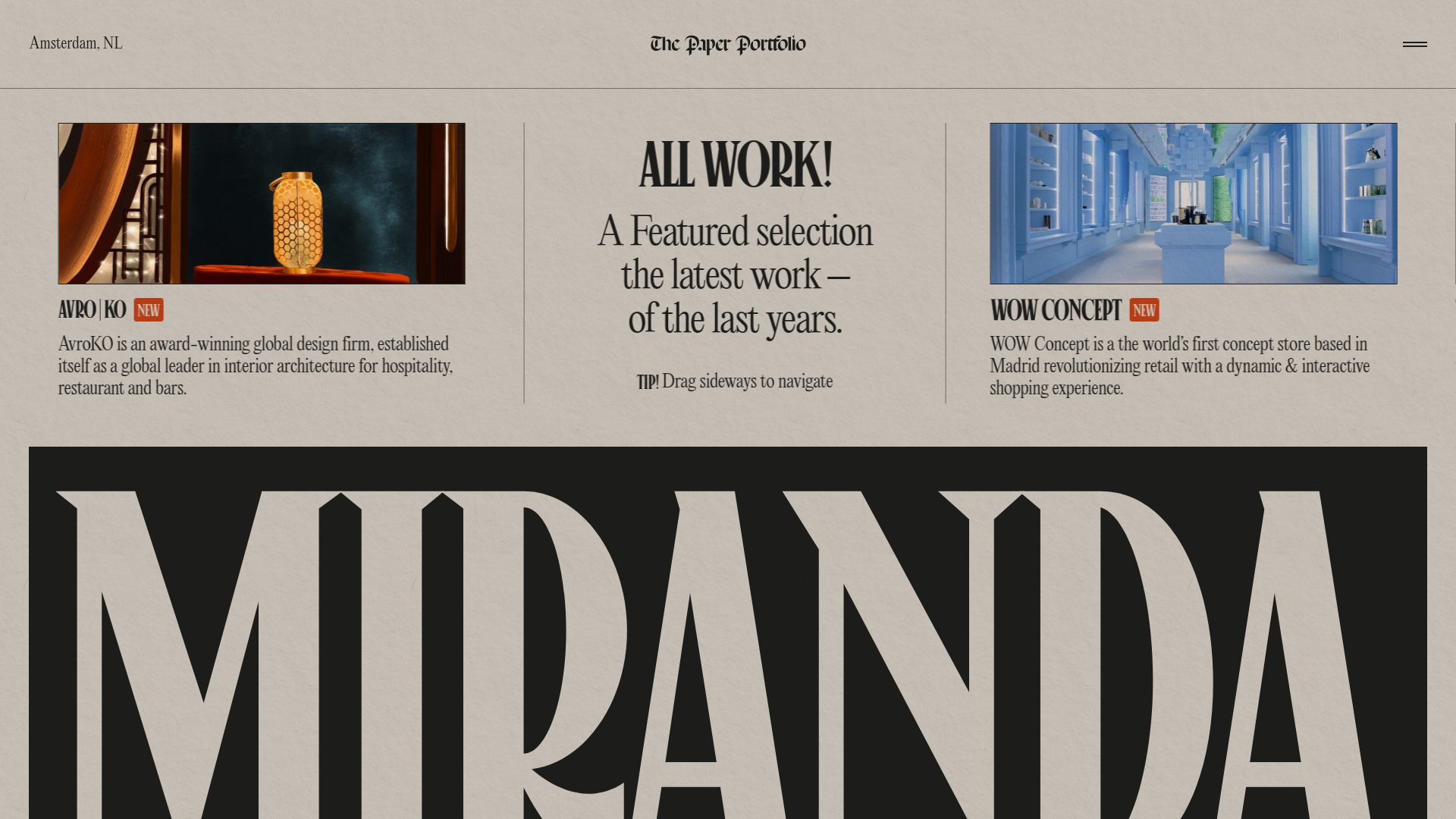
Niccolò Miranda Portfolio Grid Layout
A high-end editorial portfolio featuring a bespoke grid layout, vintage paper textures, experimental typography masks, and horizontal scroll interaction patterns.
Overview
This site is an award-winning portfolio belonging to Niccolò Miranda, showcasing a masterful blend of editorial design and high-end digital interactivity. It serves as a premier reference for builders wanting to execute sophisticated grid-based layouts, textured backgrounds, and 'old-world' print aesthetics in a modern web context.
Design System
- Color Palette & Texture: A monochromatic base of warm beiges and deep blacks, utilizing a grain/paper texture overlay to soften the digital feel. The primary contrast is achieved through black typography on a 'parchment' background, with occasional orange accents for status indicators like "NEW".
- Typography: The system relies on high-contrast Serif fonts (reminiscent of traditional broadsheets) paired with condensed display Sans-Serifs for a sophisticated hierarchy. Notable elements include extreme typographic scaling (e.g., the oversized "MIRANDA" footer/masthead) and drop caps embedded in body text.
- Page Structure: A complex, non-linear grid system. The layout uses a horizontal scroll paradigm (
data-scroll-container) where content blocks are organized in vertically and horizontally offset columns. - Reusable Components:
- Project Cards: Image-centric blocks featuring a custom SVG title and a short descriptive blurb.
- Award/Stat Ticker: Vertical list items showing counts (e.g., "Site of the Day") with clear internal borders.
- Testimonial Blocks: Horizontal sliding cards with avatar thumbnails and signature-style quote marks.
- Floating Stamps: An image component styled as a postage stamp that adds to the 'paper' theme.
- Interaction & Motion: The site uses horizontal scrolling patterns with
transform: translate3dfor smooth panning. Elements like images use a grayscale-to-color hover effect (filter: grayscale(0%)), and many headings utilize character-level span tags for staggered entrance animations. - Implementation Clues: Developed using Webflow (visible via
w-nodeandw-dynclasses). It incorporates a custom canvas (#below-canvas) for advanced background effects and utilizes the Locomotive Scroll library (implied byc-scrollbaranddata-scroll-section) for custom scrolling physics.
Use Cases
- Creative Professionals: Designers, art directors, and photographers wanting a high-impact portfolio that feels like a physical magazine.
- Premium Agencies: Firms looking to demonstrate technical prowess through non-standard navigation and bespoke typographic layouts.
- Experimental Ecommerce: High-end fashion or furniture brands can remix the 'Upcoming Next' section and the grid system for curated collection lookbooks.
- Practical Remix Directions:
- Style Swap: Keep the horizontal navigation framework but replace the paper texture with glassmorphism or minimalist white for a more tech-centric feel.
- Section Clone: Isolate the 'Awards' grid or the 'Testimonial cards' to use as a high-density information section in standard vertical sites.
- Scope: A full-page clone is best for those comfortable with custom scroll libraries; otherwise, cloning the responsive grid cards for a standard CSS grid layout is a high-value entry point.
Related Inspirations

Grand Matter Agency Portfolio Layout
A creative agency site featuring a full-screen image hero, asymmetrical masonry work grids, and bold typography sections across a clean responsive layout.
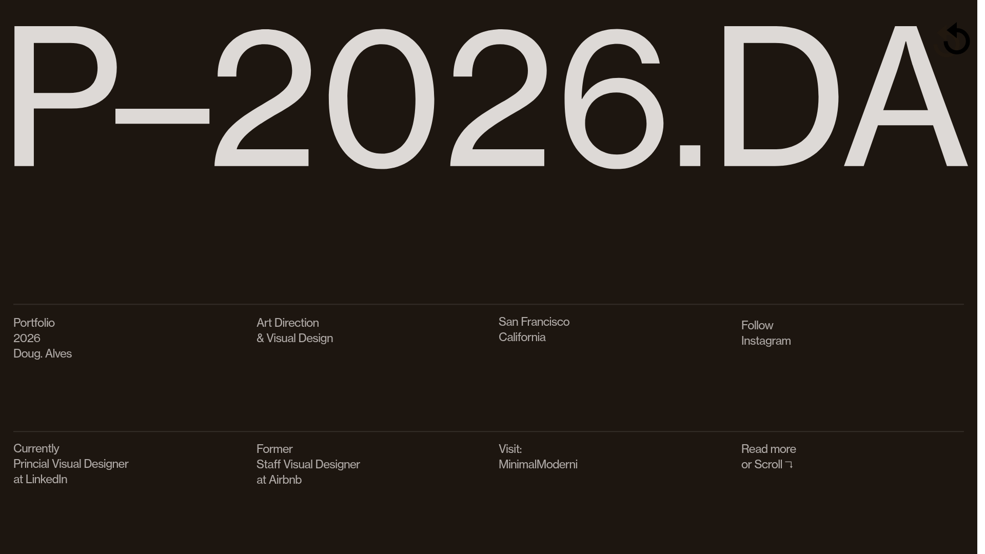
Doug Alves Visual Design Portfolio
A minimalist, high-contrast design portfolio featuring oversized typography, a sticky four-column grid footer, and a vertical scroll-triggered slide-show for project showcases.
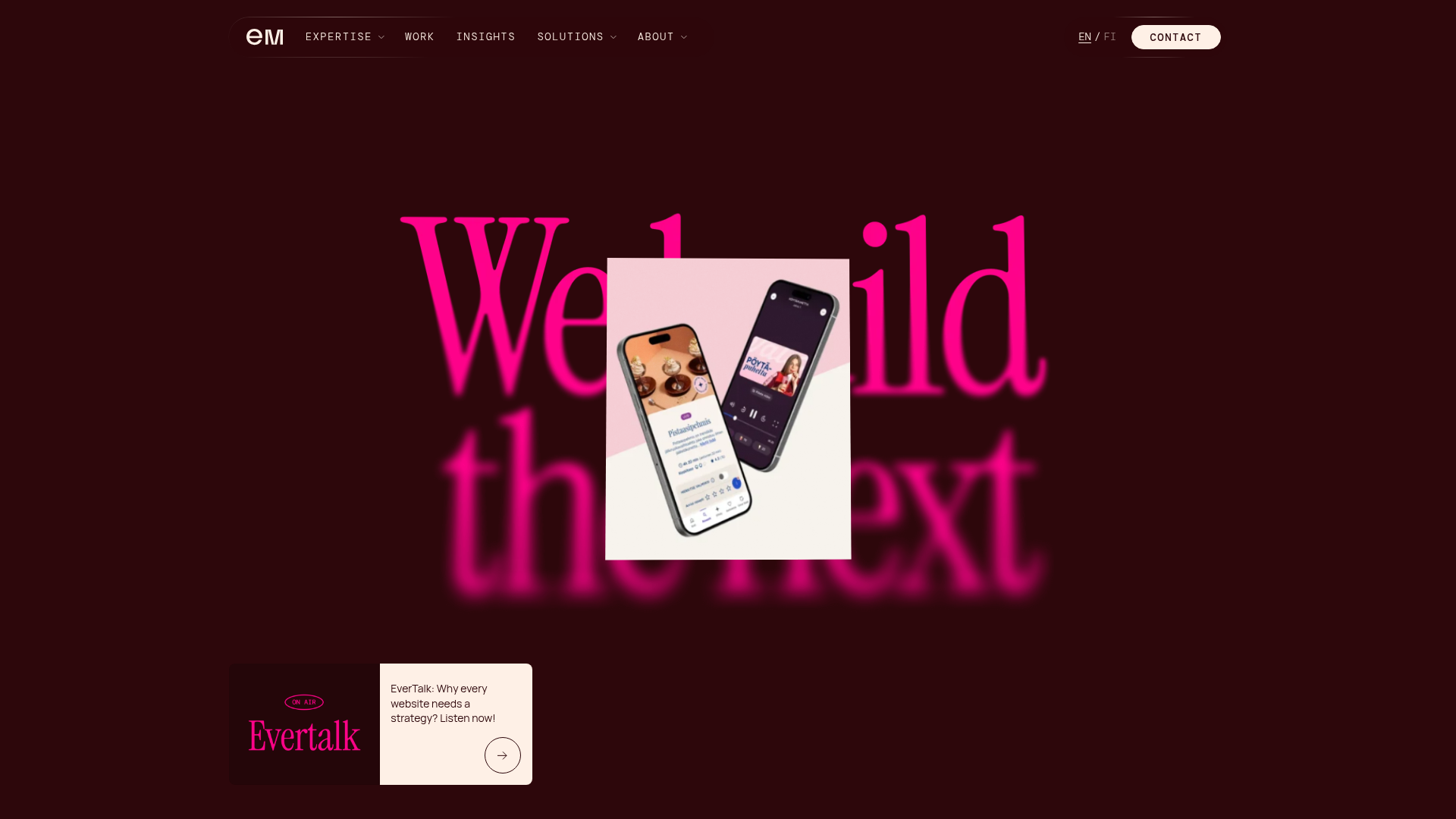
Evermade Agency Site Showcase
A high-performance agency site featuring a luxury dark aesthetic, interactive 3D hero tilt effects, custom slider components, and a unique 'text-reveal-on-hover' service section.
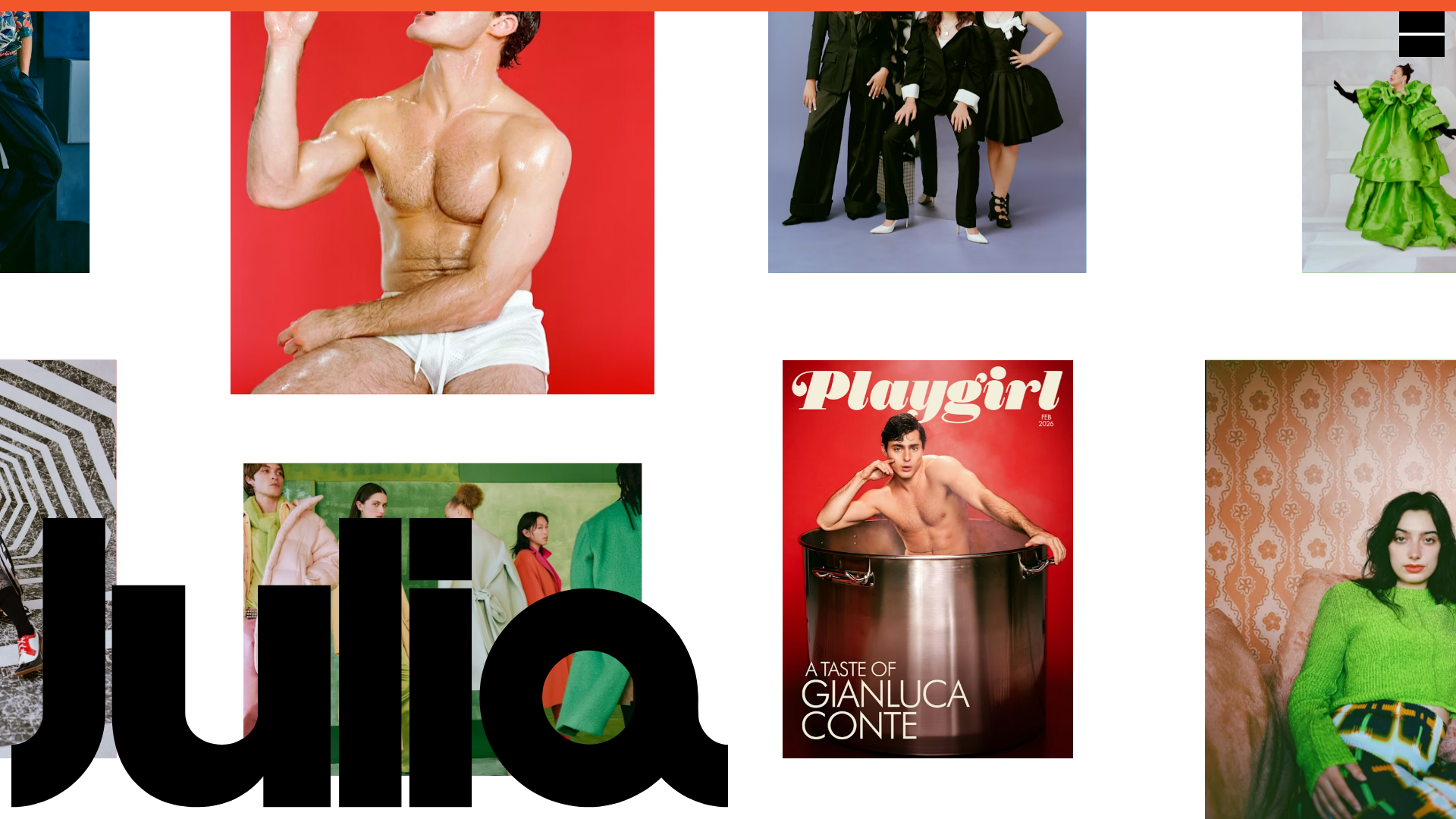
Julia Johnson Photography Portfolio Website
A creative portfolio featuring a masonry-style image grid, overlapping oversized typography, and a minimalist full-screen navigation overlay.
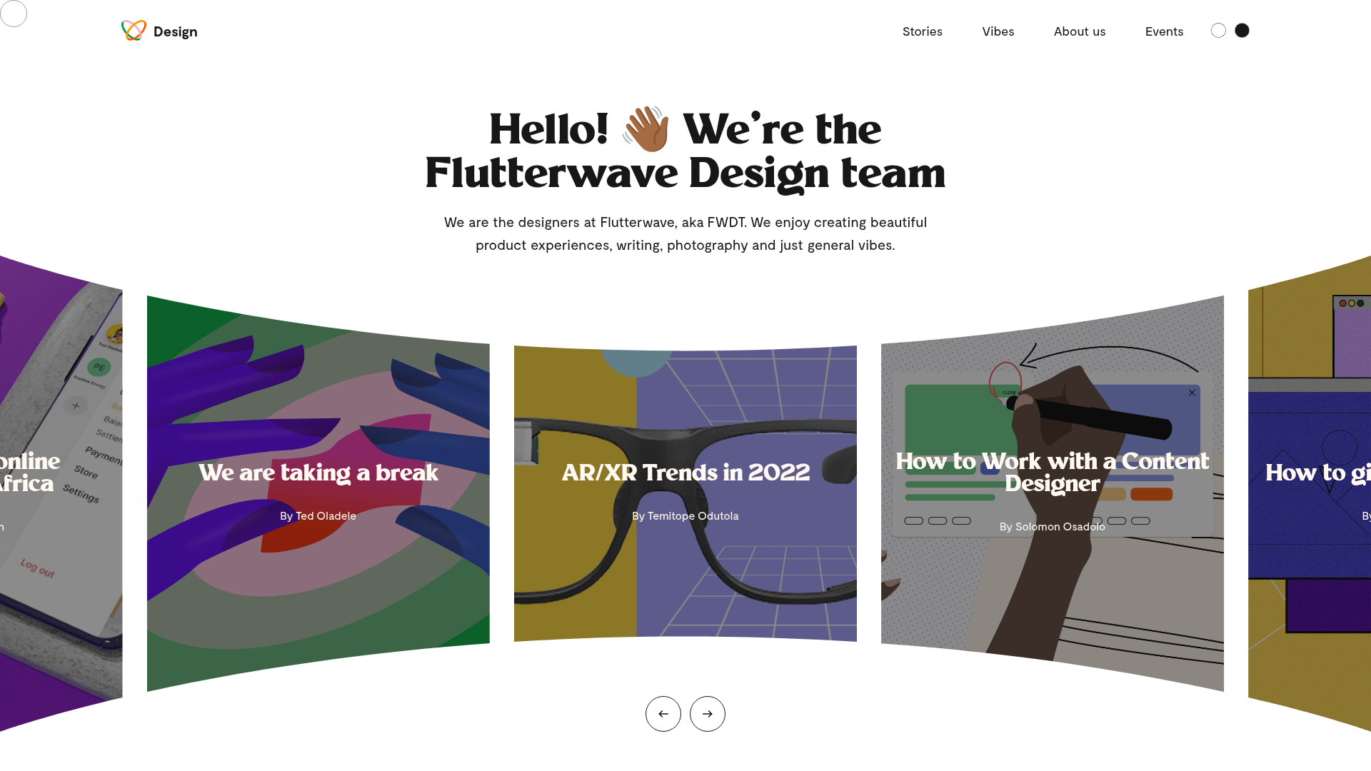
Flutterwave Design Team Portfolio Blog
A design team showcase featuring a curved fisheye-style hero carousel, custom cursor tracking, and a clean grid layout for articles and visual 'vibes'.
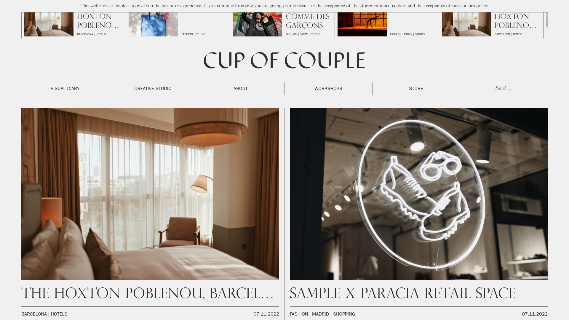
Cup of Couple Editorial Portfolio
A high-fashion editorial layout featuring a sticky compartmentalized header, a horizontal marquee carousel, and a mixed-width masonry grid with marquee typography effects.
