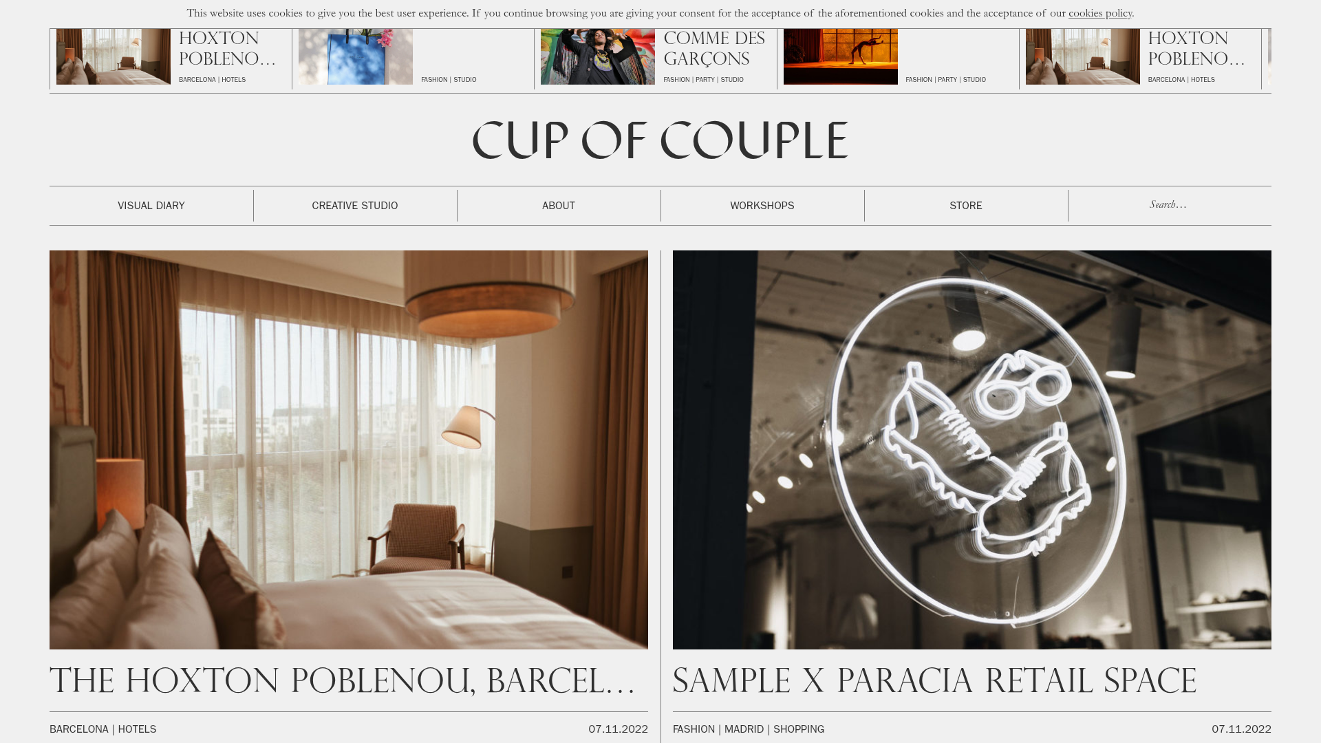
Cup of Couple Editorial Portfolio
A high-fashion editorial layout featuring a sticky compartmentalized header, a horizontal marquee carousel, and a mixed-width masonry grid with marquee typography effects.
Overview
This website is a sophisticated editorial portfolio for a creative studio, characterized by a minimalist, high-fashion aesthetic that mimics a printed broadsheet or magazine. It is a strong reference for builders because of its unique "compartmentalized" layout, where content is separated by thin, structural borders that create a rigid yet elegant grid.
Design System
- Color Palette & Visual Hierarchy: The site uses a high-contrast monochromatic base (off-white/light gray
#F2F2F2backgrounds and black text) with occasional black-and-white image filtering. Visual hierarchy is achieved through extreme scale shifts rather than color—large, thin-weight typography dominates the structure. - Typography: The system relies on a mix of a high-contrast serif (Perpetua/Libre Baskerville style) for large headlines and a clean, utilitarian sans-serif (Franklin Gothic style) for navigation and metadata. Headlines often feature a "marquee" animation where long text scrolls horizontally within its container.
- Page Structure:
- Sticky Header: A multi-row grid containing a cookie notice, branding, and a segmented navigation bar.
- Featured Carousel: A
swiper-containerhorizontal slider showing small preview cards with project titles and categories. - Masonry Grid: A mixed-width layout where articles occupy 50%, 33%, or 25% of the row width depending on their importance (
data-sizeattributes like 'large', 'medium', 'small'). - Segmented Footer: A dense, multi-column grid containing contact info, newsletter sign-up, and social links.
- Reusable Components:
- Compartmentalized Nav: A header built as a definition list (
dl) where each link is a separate bordered box. - Editorial Post Card: A card featuring a full-width image, followed by a headline (sometimes animated), and a meta-footer containing categories and dates.
- Border-Based Dividers: CSS borders (
b--black-80) are used consistently across all elements to create the "grid map" look.
- Compartmentalized Nav: A header built as a definition list (
- Interactions: The primary motion pattern is the
truncateandanimatetext effect on headlines, which move on hover or scroll. The header remains sticky to maintain the structural frame while content scrolls underneath.
Use Cases
- Who should clone this: Photographers, high-end fashion brands, architecture firms, and editorial agencies looking for a "print-to-web" aesthetic.
- Effective Remixes: This pattern works well for newsletters or curated blogs where the sheer volume of content needs to feel organized and academic rather than cluttered.
- Practical Directions:
- Swap the thin black borders for thicker, colorful ones for a "Neo-Brutalist" look.
- Adapt the horizontal swiper into a persistent "latest news" ticker at the top of a corporate site.
- Reuse the definition-list (
dl) structure for a highly organized, grid-based pricing table.
- Clone Scope: A full-page clone is best to maintain the grid's structural integrity, but the sticky header and the article card components are the most valuable pieces for a quick-section remix.
Related Inspirations
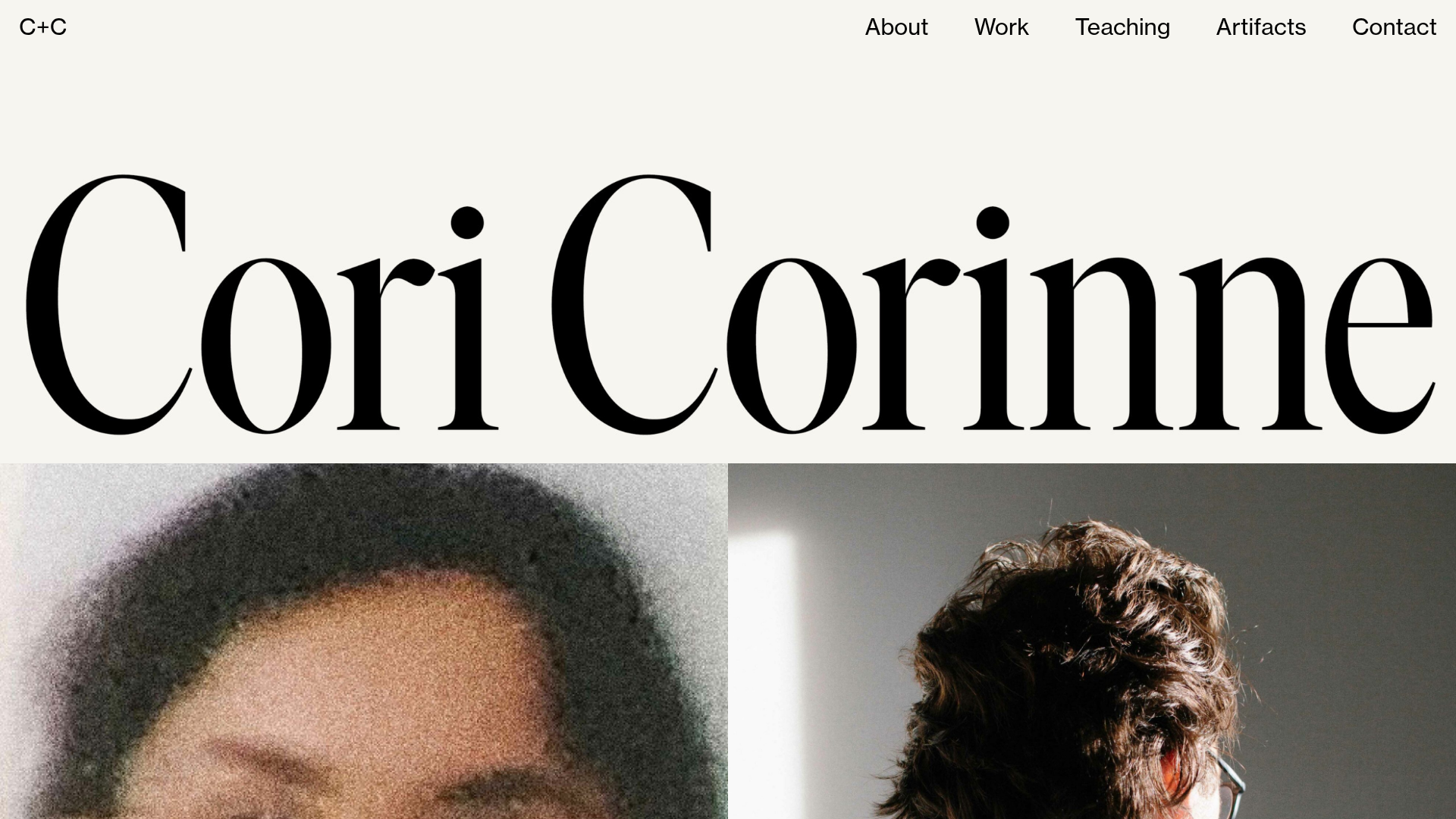
Cori Corinne Minimalist Portfolio Home
A clean, typography-focused layout featuring a massive serif hero header, two-column image grid, and text-based navigation for a high-end editorial feel.

Context Gallery High-End Furniture Landing Page
A minimal editorial layout featuring a multi-column product carousel, designer biographies with image-text pairings, and a magazine-style content grid for curated design stories.

Glein Minimalistic Bento Grid eCommerce
A clean, modular layout using a bento-style responsive grid of text teasers and large-scale product imagery for lookbooks and collection browsing.

Basic.Space E-commerce Gallery Clone
A minimalist product marketplace featuring a clean sticky navigation bar, nested flyout menus, and a horizontally scrollable product carousel with hover-state image switching.

Clase Agency Branding Portfolio
A minimalist design agency portfolio featuring a typographic hero section, full-width image articles, sticky title bars, and integrated scrolling text marquees for a clean editorial layout.
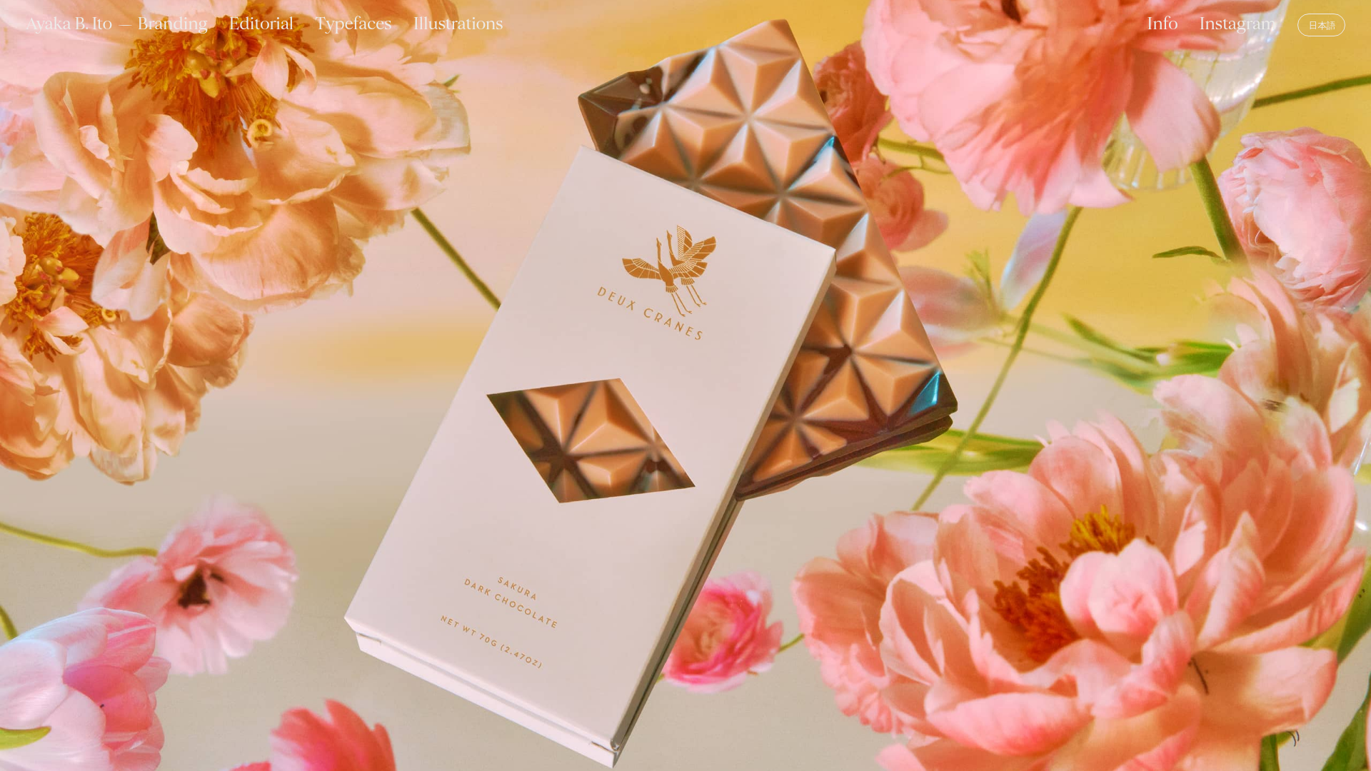
Ayaka B. Ito Creative Portfolio
A minimalist design portfolio featuring an immersive full-screen hero image, clean typographic navigation, and a structured layout for showcasing branding and editorial projects.
