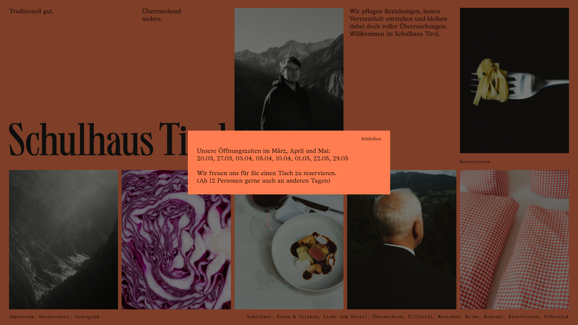
Schulhaus Tirol Restaurant Grid Layout
A terracotta-themed editorial design featuring a multi-column asymmetric grid, monochromatic photography, and a stylized reservation modal.
Overview
This website for Schulhaus Tirol is an avant-garde restaurant and hospitality landing page that uses a sophisticated terracotta-themed editorial layout. It serves as a premier reference for builders looking to master asymmetric grid systems, high-contrast typography, and a seamless blend of photography and whitespace.
Design System
- Color Palette & Visual Hierarchy: The primary brand color is a deep terracotta/burnt orange (
has-bg-red), which creates a warm, earthy atmosphere. High-contrast monochromatic and desaturated photography is used to ground the vibrant background, while text is primarily black or white depending on the specific block contrast. - Typography System: The design uses a mix of a bold, high-contrast serif for the large "Schulhaus" brand element and a clean, modernist sans-serif for body copy. Large font sizes (
has-xl-font-size) are used for introductory paragraphs to maintain an editorial, magazine-like feel. - Page Structure: The layout is driven by a series of flexible columns (
wp-block-columns) using an asymmetric distribution (e.g., 40/20/20/20 splits). It begins with a sparse hero section, transitions into a dense image grid for category navigation (Wine, Food, People), and ends with an integrated reservation form. - Reusable Components:
- The Asymmetric Image Grid: Captioned image cards with subtle borders that act as category navigation.
- The Reservation Modal/Overlay: A bright orange block that breaks the grid to highlight opening times and booking calls-to-action.
- Minimalist Form: An integrated booking form using clean input lines and a
flatpickrdate picker, maintaining the minimalist aesthetic.
- Interactions & Implementation: The project uses WordPress block structures with utility-first CSS patterns similar to Tachyons or Tailwind (e.g.,
flex,flex-row,justify-between). Mobile behavior involves stacking these flexible columns into a single-column scroll while maintaining the large typography for legibility.
Use Cases
- Who should clone this: Designers building sites for boutique hotels, high-end farm-to-table restaurants, or lifestyle brands that want an "editorial" rather than a "commercial" feel.
- Effective Remixes: This pattern works exceptionally well for portfolio sites; the asymmetric grid can be used to showcase projects of varying sizes while keeping the viewer engaged through rhythm changes.
- Remix Directions:
- Brand Swap: Replace the terracotta with a deep forest green or slate blue for a more corporate-modern look.
- Information Architecture: Use the 20% width column blocks for secondary navigation or sidebar-style metadata instead of images.
- Clone Scope: A full-page clone is recommended to understand the grid's rhythm, but the image-grid section alone is a valuable component for any gallery-based project.
Related Inspirations
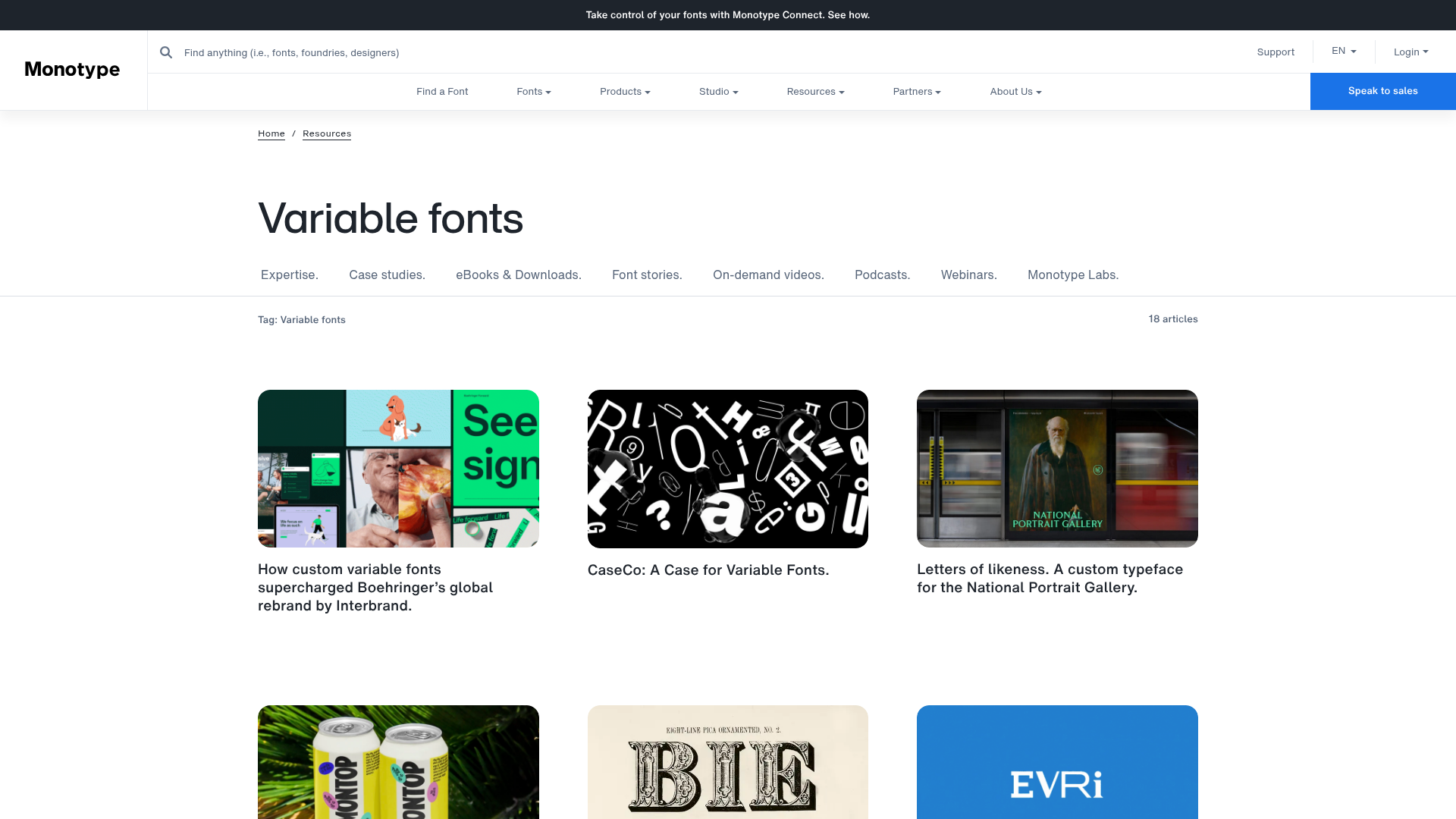
Monotype Variable Fonts Resource Gallery
A clean masonry grid layout featuring content cards with hover-state overlays, category filtering, and responsive image scaling for a media-rich resource center.
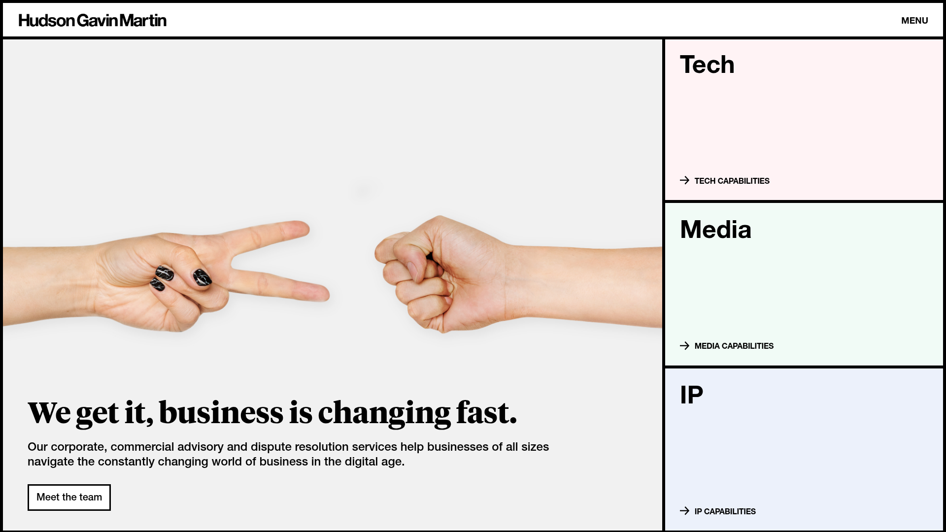
Hudson Gavin Martin Corporate Law Landing
A professional service homepage featuring a minimalist grid-based hero, color-themed navigation blocks, and a bento-style insights feed with subtle hover interactions.
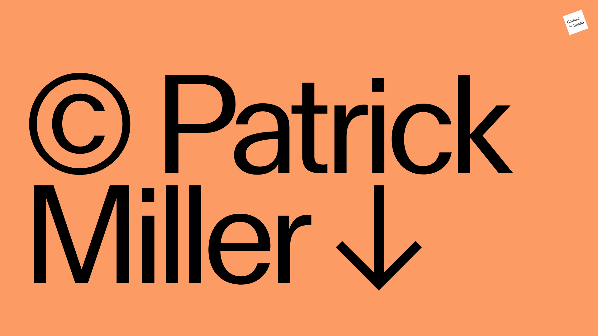
Patrick Miller Photography Portfolio Template
A minimalist, full-bleed photography portfolio featuring a split-screen grid, scroll-triggered section transitions, and integrated Swiper.js image carousels for project galleries.
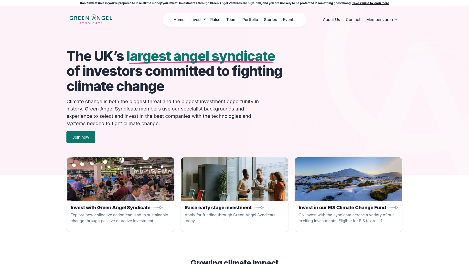
Green Angel Syndicate Investment Landing Page
A clean venture capital landing page featuring a hero section with card-based navigation, a four-column stat grid, and alternating split-layout content sections with image-text pairings.
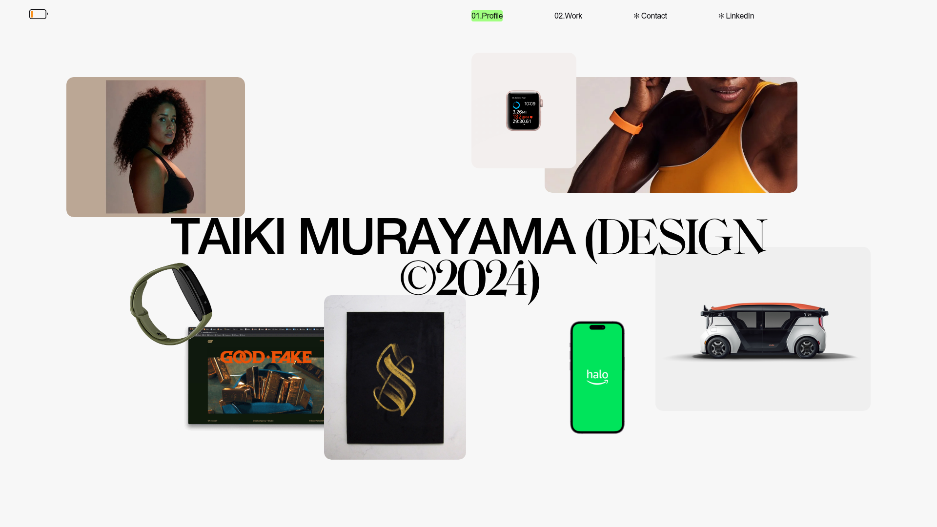
Taiki Murayama Portfolio Bento Grid
A minimalist designer portfolio featuring a dynamic bento-style layout for project imagery, integrated accordion project lists, and high-contrast typography.
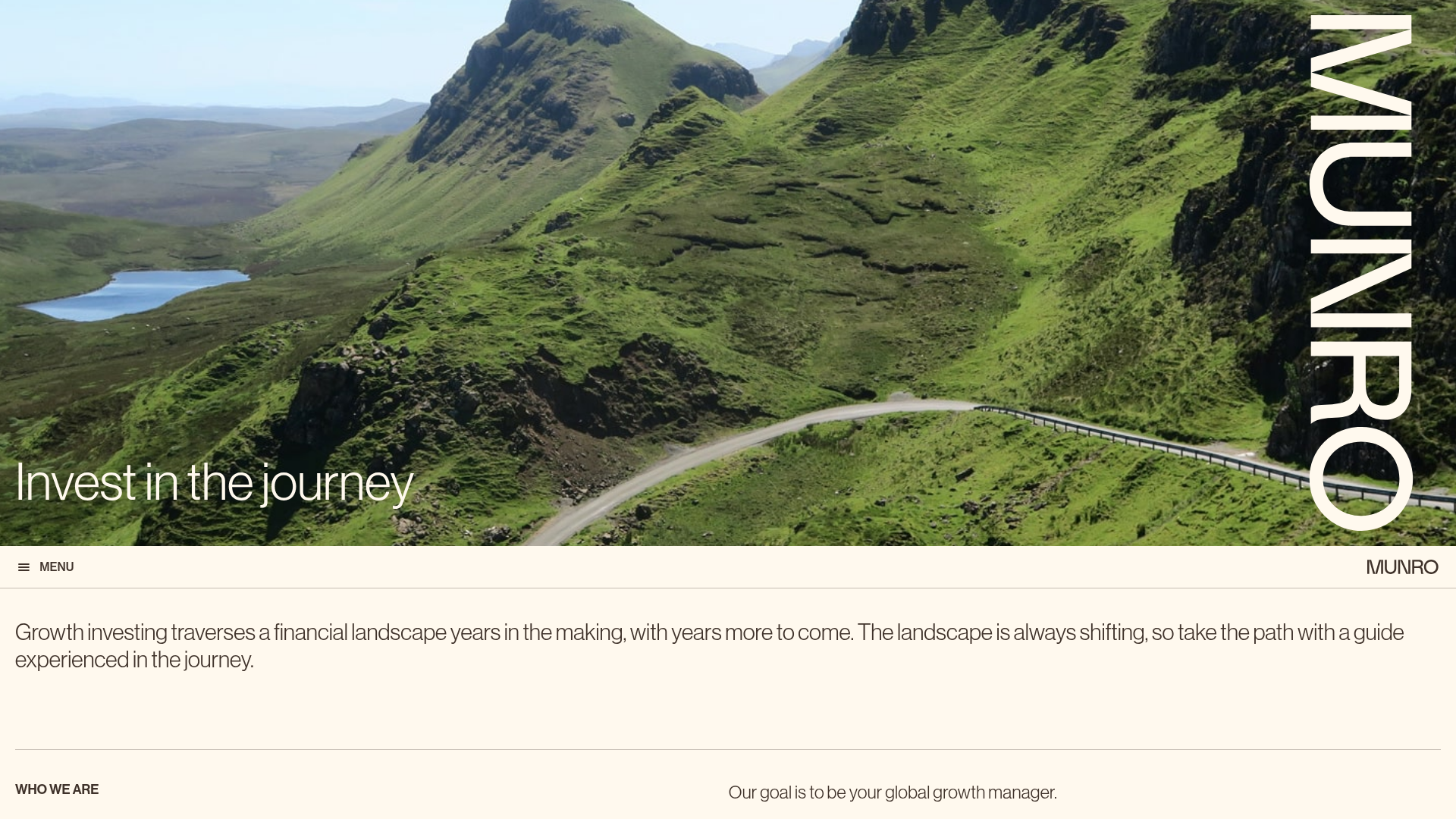
Munro Partners Financial Growth Landing Page
A professional financial services layout featuring a vertical typographic hero, animated stat counters, a data-driven fund performance table, and a colorful grid for news and investment themes.
