Hugo Ferradás Portfolio Site
A dark-themed portfolio featuring a creative director bio, sticky sidebar navigation, and a dynamic asymmetric grid of case study cards with animated hover reveals.
Overview
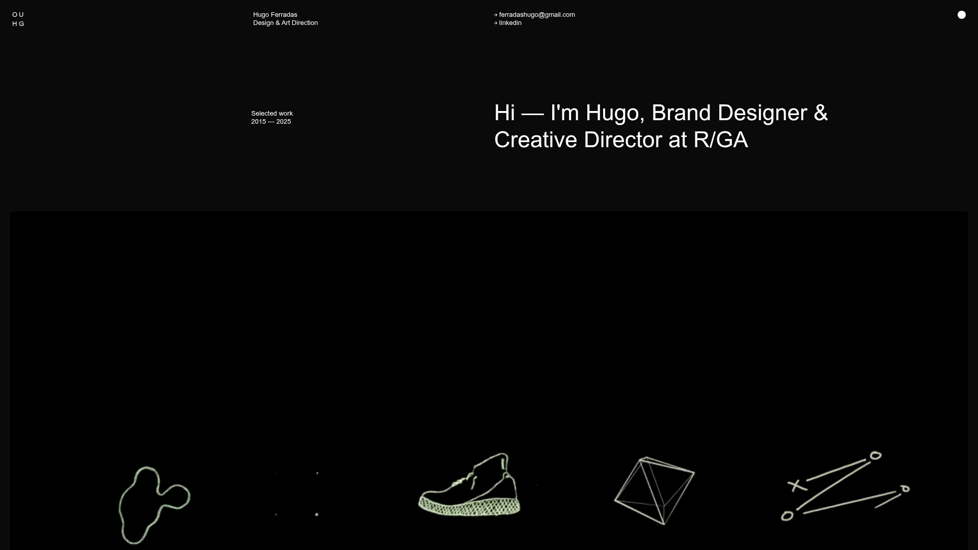
Hugo Ferradás’s portfolio is a sophisticated example of a dark-themed, grid-heavy layout designed for high-end creative direction and brand design showcases. It is an excellent clone reference for its masterclass in asymmetric layouts, sticky contextual navigation, and elegant hover states that prioritize visual storytelling over text density.
Design System
- Color Palette & Visual Hierarchy: The site uses a high-contrast monochromatic scheme with a deep black background (
#000000) and stark white text. This creates a gallery-like atmosphere where colorful project thumbnails and motion reels serve as the primary focal points. - Typography: Features a clean, Swiss-style sans-serif (resembling Helvetica or Inter) used with significant scale variation. Project titles are small and prefixed with dots, while the hero bio uses a large font-weight to establish immediate identity.
- Page Structure:
- Header: Minimalist navigation with contact links and current role.
- Intro: Split layout with a sticky sidebar on the left indicating "Selected Work" and a large typographic bio on the right.
- Hero Reel: A full-bleed video section for immediate visual impact.
- Project Grid: An unconventional asymmetric grid using a multi-column system (ranging from
col-4tocol-8) that mixes single large cards with stacked smaller cards to create visual rhythm.
- Reusable Components:
- Work Cards: Sophisticated components featuring a base image/GIF and a
.work-hover-contentlayer that reveals metadata and a secondary.hover-imageon interaction. - Sticky Sidebar: A
sticky-parentcontainer that keeps regional labels fixed while project content scrolls by.
- Work Cards: Sophisticated components featuring a base image/GIF and a
- Interaction & Motion: The site uses CSS variables (e.g.,
--animIndx) to stagger entrance animations. Hover states on project cards are triggered through CSS transitions, likely swapping image opacity or z-index to reveal secondary project details. - Implementation Clues: The HTML reveals a custom grid system (
col,push,medium-col) and the use of thehas-been-seenclass, suggesting an Intersection Observer implementation for scroll-triggered entrance animations.
Use Cases
- Who should clone this: Individual designers, creative directors, and boutique agencies wanting a "high-fashion" digital presence that feels curated rather than templated.
- Effective Remixes: This pattern works exceptionally well for photography portfolios, architectural firms, or video production houses where the work is highly visual and needs varying aspect ratios.
- Remix Directions:
- Layout: Swap the black background for a warm off-white or deep navy to shift the brand mood.
- Info Architecture: Repurpose the
work-cardlogic for a blog index or a product catalogue that requires "quick-look" secondary information on hover. - Sections: Isolate and clone the
sticky-parentlogic to provide helpful context during long vertical scolls.
- Clone Scope: A full-page clone is ideal for those needing a complete professional rebrand, but the asymmetric grid logic (
col-8paired with twocol-4stacks) is the most valuable individual pattern to extract.
Related Inspirations

Niklas Rosén Designer Portfolio Index
A minimalist, responsive grid-based portfolio index featuring a clean 16-column layout, typographic list components, and a custom dark mode transition.
Minimalist Dark Designer Portfolio Grid
A clean, dark-themed portfolio featuring a bold typography hero section and a staggered two-column image grid with subtle entrance animations.

Jakub Reis Portfolio Case Study Gallery
A dark-themed designer portfolio featuring a typography-focused loading animation and a staggered masonry grid for project case studies.
Break Maiden Agency Portfolio Hero
A high-impact dark mode hero section featuring oversized typography with inline GIF icons and a responsive grid for display-heavy case studies.

Dries Bos Creative Developer Portfolio
A high-interaction dark-mode portfolio featuring a grain-textured bento grid, marquee headers, theme switching, and a dynamic project list with hover-triggered image previews.
Patrick Miller Photography Portfolio Template
A minimalist, full-bleed photography portfolio featuring a split-screen grid, scroll-triggered section transitions, and integrated Swiper.js image carousels for project galleries.
