Linus Rogge Portfolio Work Gallery
A minimal, full-bleed case study grid featuring sticky typography, mix-blend-mode text effects, and integrated Mux video layers for high-impact project showcases.
Overview
This portfolio site uses a sophisticated, full-bleed case study grid that prioritizes immersive media and clean, architectural layout. It is a premier reference for cloning because it masters the "sticky content over scrollable media" pattern, using advanced blending modes to ensure legibility across diverse visual backgrounds.
Design System
- Color Palette & Visual Hierarchy: The primary palette is high-contrast monochrome (Black/White), relying on the case study imagery to provide color. A distinctive
mix-blend-differenceis applied to text layers, allowing headers to automatically invert their color (white to black and vice versa) based on the luminosity of the background image or video. - Typography: The system uses a clean, sans-serif typeface with a focus on hierarchy through weight and opacity. Headers (h2) are bold and compact, while sub-headers and descriptions utilize
text-balanceandleading-tightto maintain a professional, editorial look. - Page Structure & Flow: The sequence consists of full-height (70svh on mobile, svh on desktop) interactive links. Each project block is a
relativecontainer housing an absolute-positioned background (image or Mux video) followed by a vertical flex distribution of metadata. - Reusable Components:
- Sticky Media Cards: The main
<a href>blocks are the core asset, featuringsticky top-12headers that remain visible as the user begins to scroll past the media. - Integrated Video Layers: Reusable
<mux-player>configuration withloop,autoplay, andmutedattributes for seamless background motion. - Sub-grid Writing Section: A multi-column list layout (
md:col-start-4) for text-heavy content like blog posts.
- Sticky Media Cards: The main
- Interactions & Motion: The design utilizes
transition-opacityon hover states for list items. The main project blocks are designed as full-screen anchors, creating a high-impact, rhythmic scroll experience. - Responsive Behavior: The grid adapts from a single-column mobile view to a complex
base-gridwith up to 12 columns on desktop (md:col-span-9), ensuring the text remains legible in a narrowmax-w-2xscontainer. - Implementation Clues: Built with Next.js and Tailwind CSS, evidenced by utility classes like
inset-0,size-full, andobject-cover. Mux is used for performant video delivery.
Use Cases
- Who should clone this: Creative directors, independent designers, and video production agencies looking for a high-fidelity, media-first portfolio.
- Effective Remixes: This pattern can be adapted for luxury real estate showcases, architectural firm archives, or cinematic brand lookbooks where the visual assets must speak louder than the copy.
- Remix Directions: Swap the
mix-blend-differencehack for a background blur (backdrop-filter) if brand colors are too complex; expand the "Writing" section into a full documentation or project detail layout; replace full-bleed images with a containerized grid for more conservative corporate use. - Suggested Scope: A full-page clone is recommended to capture the rhythmic scroll and sticky typography effects, though the "Writing" grid section is a perfect standalone clone for clean footer or article directory sections.
Related Inspirations
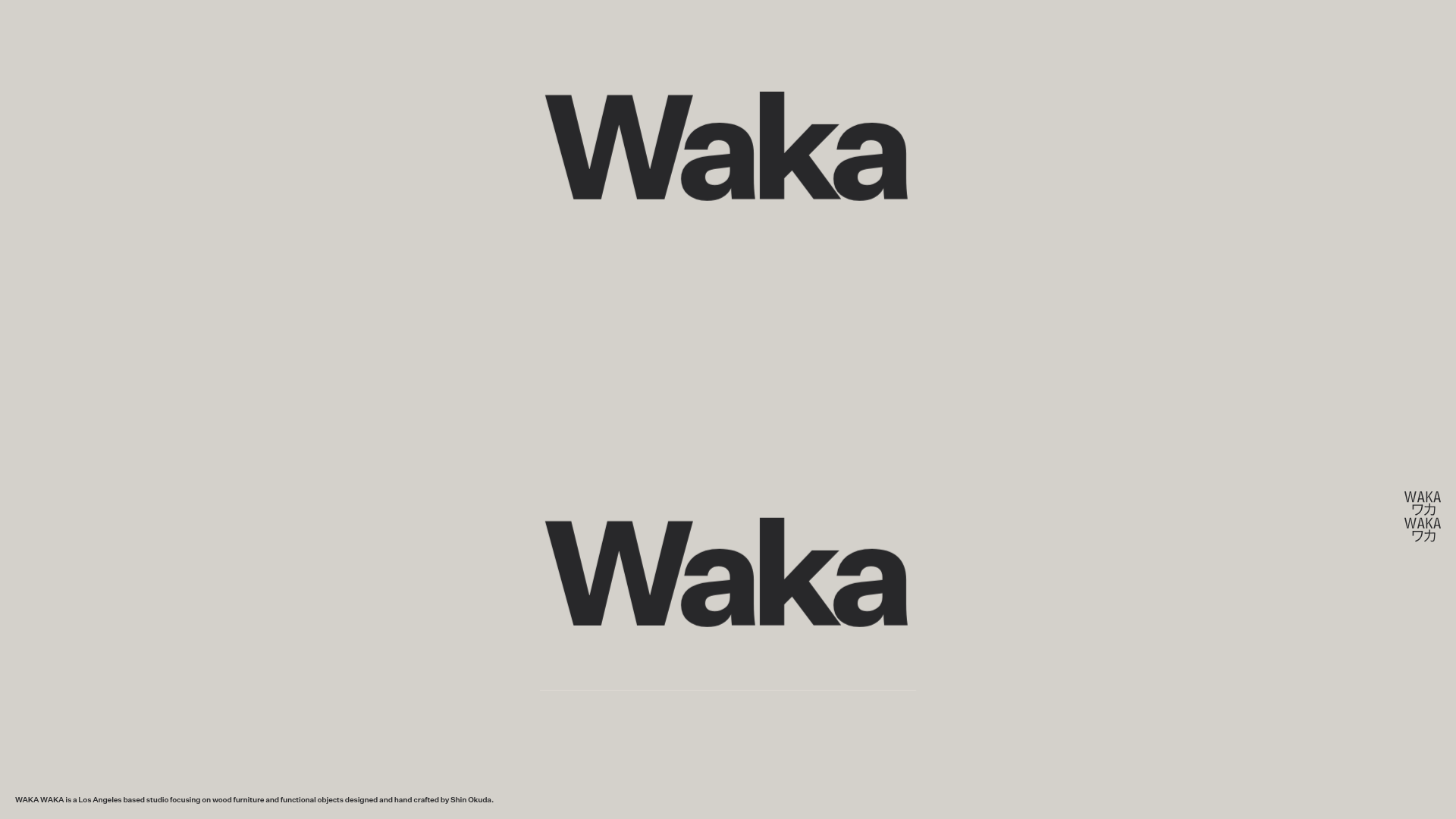
Waka Waka Furniture Portfolio
A minimalist design showcase featuring a custom cursor, parallax scroll effects, and a vertical image grid layout for high-end product displays.
Unknown Untitled Design Portfolio Screensaver
A minimalist, experimental design agency website featuring an automated image-layout screensaver and oversized typography overlays.
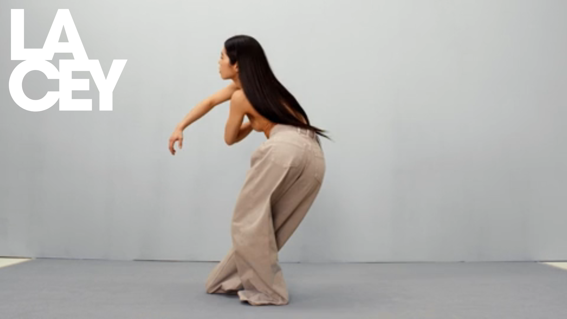
Lacey Studio Creative Portfolio Portfolio
A minimalist director's portfolio featuring a full-screen video hero, masonry-style grid with auto-playing video previews, and a sophisticated overlay navigation system.

Clase Agency Branding Portfolio
A minimalist design agency portfolio featuring a typographic hero section, full-width image articles, sticky title bars, and integrated scrolling text marquees for a clean editorial layout.

Ayaka B. Ito Creative Portfolio
A minimalist design portfolio featuring an immersive full-screen hero image, clean typographic navigation, and a structured layout for showcasing branding and editorial projects.
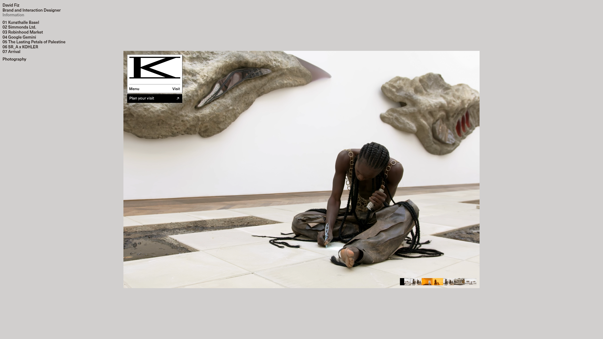
David Fiz Visual Design Portfolio
A minimalist portfolio featuring a fixed sidebar navigation paired with an immersive, full-screen media showcase and interactive project-specific image carousels.
