Minimal Error Page with reCAPTCHA
A minimalist error state container built with Next.js featuring a centered typographic heading and an invisible reCAPTCHA security integration.

Overview
This project features a stark, minimalist error state template used by a high-end confectionery brand. It provides a clean, high-contrast interface designed to communicate a system error while maintaining brand aesthetics and site security. It is an excellent reference for builders wanting to implement a lightweight, secure fallback page that avoids visual clutter.
Design System
- Color Palette & Visual Hierarchy: The design uses a warm, parchment-colored background (
#FDE9D1approximate) contrasted with a bold, crimson-red text (#B11E29approximate). The high contrast instantly signals an error state while remaining sophisticated. - Typography: The layout is dominated by a single, uppercase heading: "ERROR". The font is a narrow, condensed sans-serif with slight rounded terminals, conveying a modern but urgent tone. The scale is massive relative to the viewport, emphasizing the state change.
- Page Structure & Section Flow: The page uses a simple vertical flow within a
.wrapcontainer. The heading is the primary visual anchor, followed by a hidden security layer. The DOM shows a centered layout strategy that prioritizes readability. - Reusable Components: The core reusable element is the
grecaptcha-badgeintegration. The HTML reveals an invisible reCAPTCHA v2/v3 implementation configured as a fixed element (position: fixed) at the bottom right. This allows for bot protection even on static error pages. - Implementation Clues: The project is built with Next.js, as evidenced by the
__nextroot andnext-route-announcerelements. It utilizes absolute and fixed positioning for auxiliary UI elements (security badges) to keep the main viewport clear.
Use Cases
- Who should clone this pattern: Developers building refined e-commerce stores or portfolio sites who need a distraction-free 404 or 500 error page that doesn't break the brand's visual language.
- Effective Remixes: This pattern works well for maintenance mode pages, age verification gates, or secure access portals.
- Remix Directions:
- Brand Swap: Replace the condensed sans-serif with a serif typeface and change the red to a brand-specific primary color.
- Functionality: Add a "Return Home" link or a search bar beneath the text to improve user flow while maintaining the minimalist spacing.
- Suggested Clone Scope: This is ideal as a full-page clone. Because the logic is minimal and centered on a single typographic expression and a security plugin, it can be ported into any Next.js project as a global
error.tsxor404.tsxfile.
Related Inspirations

Google Holiday 100 Curator Landing Page
A minimalist e-commerce showcase featuring a wide hero section, clean search integration, and a bold typography-driven header designed for trending product collections.

Finn Pet Supplements Landing Page
An e-commerce landing page featuring high-contrast typography, a sticky brand logo banner, parallax scroll effects on product headers, and a clean product grid.
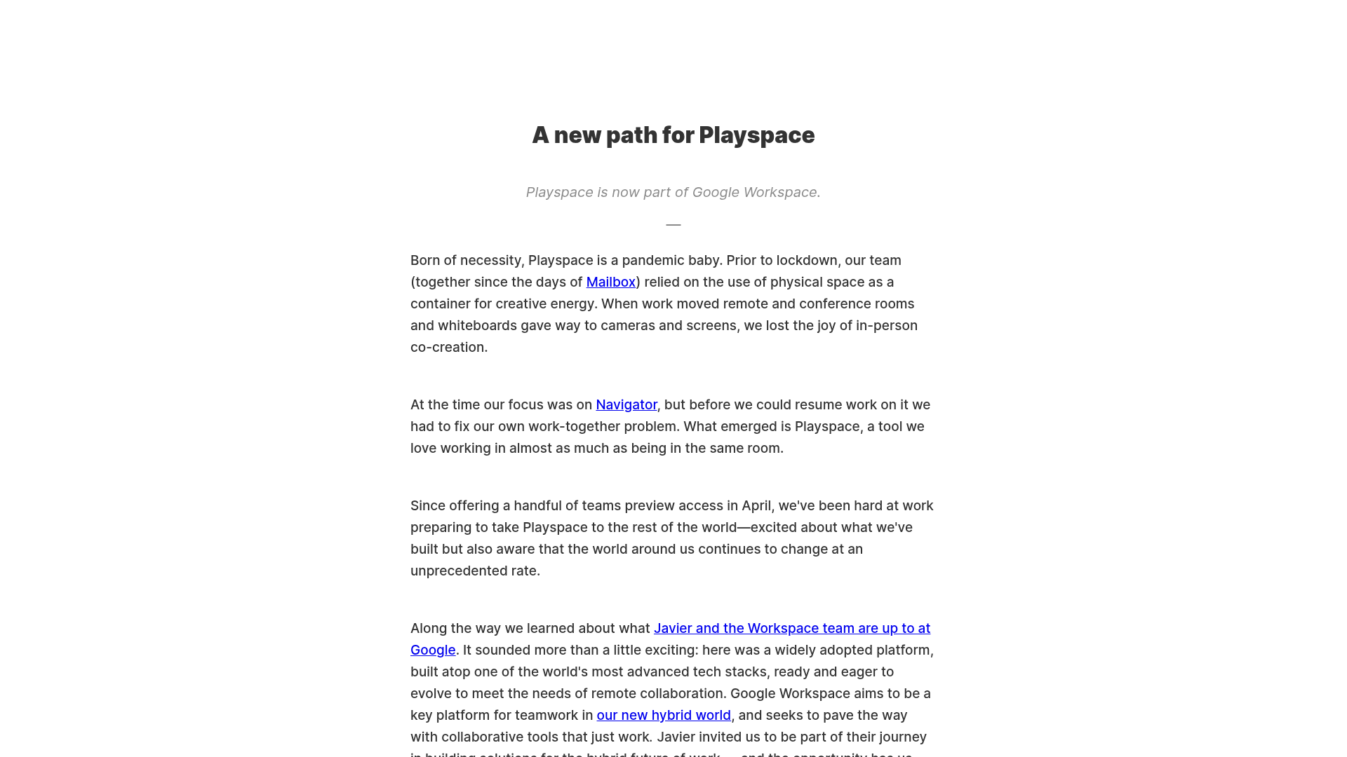
Playspace Acquisition Announcement Minimalist Layout
A clean, center-aligned announcement template featuring a vertical stack of rich text content and linked text elements on a neutral background.
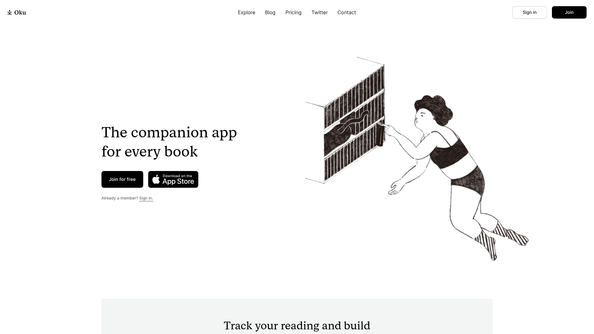
Oku Minimalist Book Tracking Landing Page
A clean, typography-focused landing page featuring a minimalist header, illustrated hero section, and clear call-to-action buttons for app downloads.

OpenWeb B2B Service Landing Page
A professional landing page layout featuring a central animated hero area, data visualization counters, a client logo grid, testimonial slider, and tabbed lead generation forms.

Slite SaaS Knowledge Base Landing Page
A clean SaaS hero section with a conversational headline, secondary call-to-action buttons, and a structured software interface preview featuring user testimonials.
