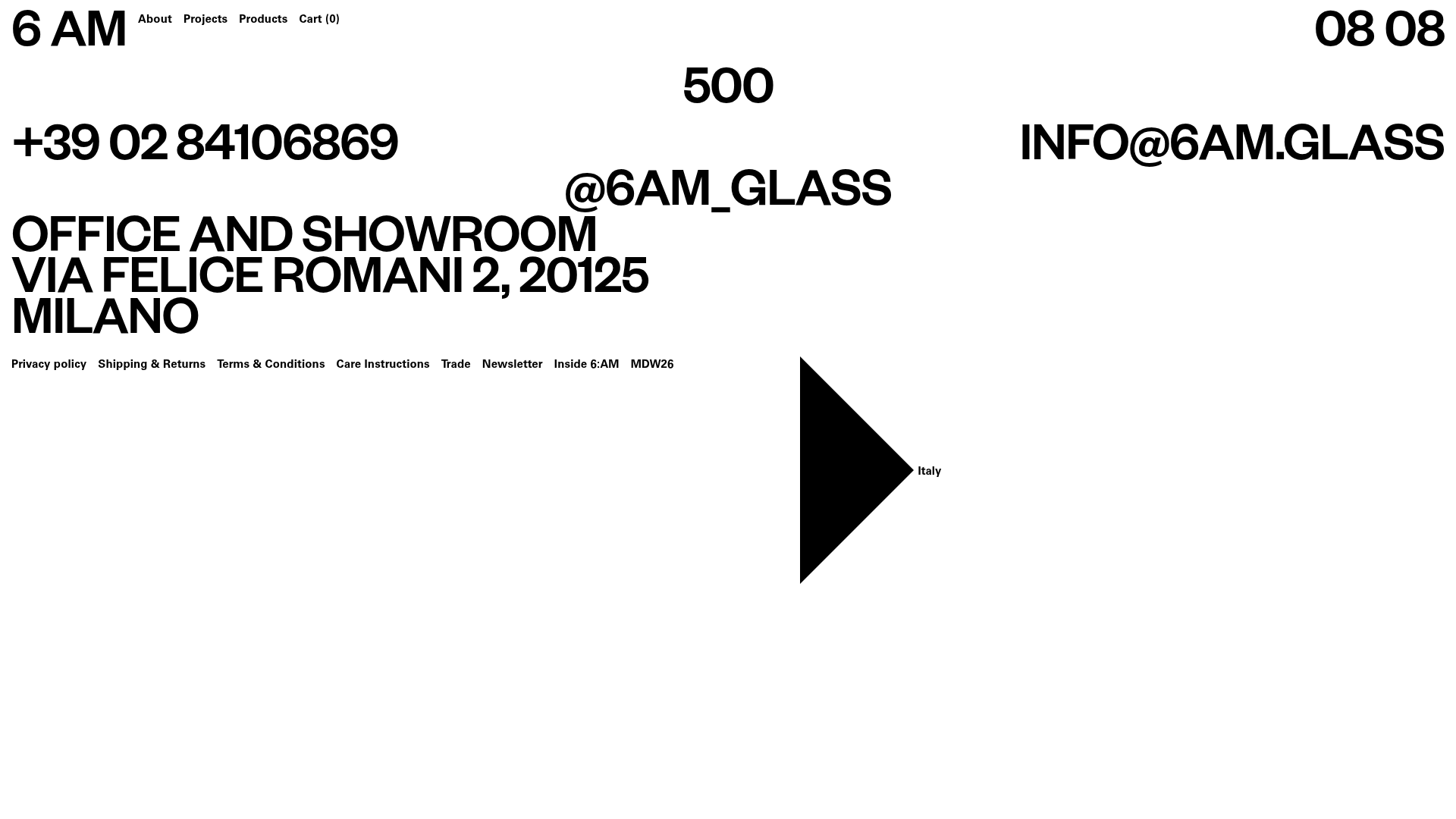
6:AM Glass Minimalist Server Error Page
A high-contrast, brutalist 500 error page featuring oversized typography, a fixed header with dynamic clock, and a structured footer contact layout.
Overview
This 500 server error page for 6:AM Glass demonstrates a high-impact, brutalist aesthetic that transforms a technical failure into a brand-consistent experience. It is a prime reference for cloning because it uses extreme typographic scale and asymmetric layouts to create a visually arresting interface with minimal assets.
Design System
- Color Palette & Visual Hierarchy: A strict monochromatic (Black #000000 on White #FFFFFF) palette. Hierarchy is established through raw font size rather than color, with the status code "500" and brand contact info dominating the visual field.
- Typography System: The design utilizes a robust, bold Sans-Serif (likely a variant of Helvetica or Inter). It features four distinct scales: oversized for the error code and contact headers, medium for the persistent logo/clock, and small for the navigation links and footer policy text.
- Page Structure:
- Header: Fixed-position bar containing the "6 AM" logo, horizontal text navigation, and a dynamic digital clock (HH MM format).
- Main Body: A centered, large-scale "500" error code.
- Contact Layer: Overlapping, large-scale text blocks containing a phone number, email, and physical address in Milan.
- Footer: A single-line horizontal strip of utility links (Privacy, Shipping, Newsletter) and a geometric polygon graphic (a black triangle/arrow pointing to "Italy").
- Reusable Components: The highly structured footer link bar, the dynamic HH:MM clock component, and the overlapping large-text contact layout are the primary candidates for reuse.
- Implementation Clues: The HTML reveals a Nuxt.js framework approach using a utility-first CSS methodology (
--space-s,typo-1). Layouts are managed via CSS Grid (--l-auto: minmax(0, 1fr)) to handle the precise spacing between oversized text elements.
Use Cases
- Who should clone this: Designers building for architectural firms, high-end furniture brands, or avant-garde fashion labels that prioritize a "less is more" brutalist identity.
- Effective Remixes: This pattern works well for landing pages of physical design studios or agency contact pages where the address and contact info need to feel like art.
- Practical Remix Directions: Swap the high-contrast black/white for brand specific duotones; replace the "500" with a product name or campaign year; adapt the utility footer for a minimalist e-commerce landing page.
- Suggested Clone Scope: A full-page clone is most effective here to maintain the specific spatial tension of the layout, though the fixed header/clock component is a versatile standalone element for any minimalist site.
Related Inspirations

Egstad Minimalist Design Portfolio
A refined Nuxt.js portfolio featuring bold variable typography, interactive canvas elements, and a clean grid-based layout for showcasing design work.
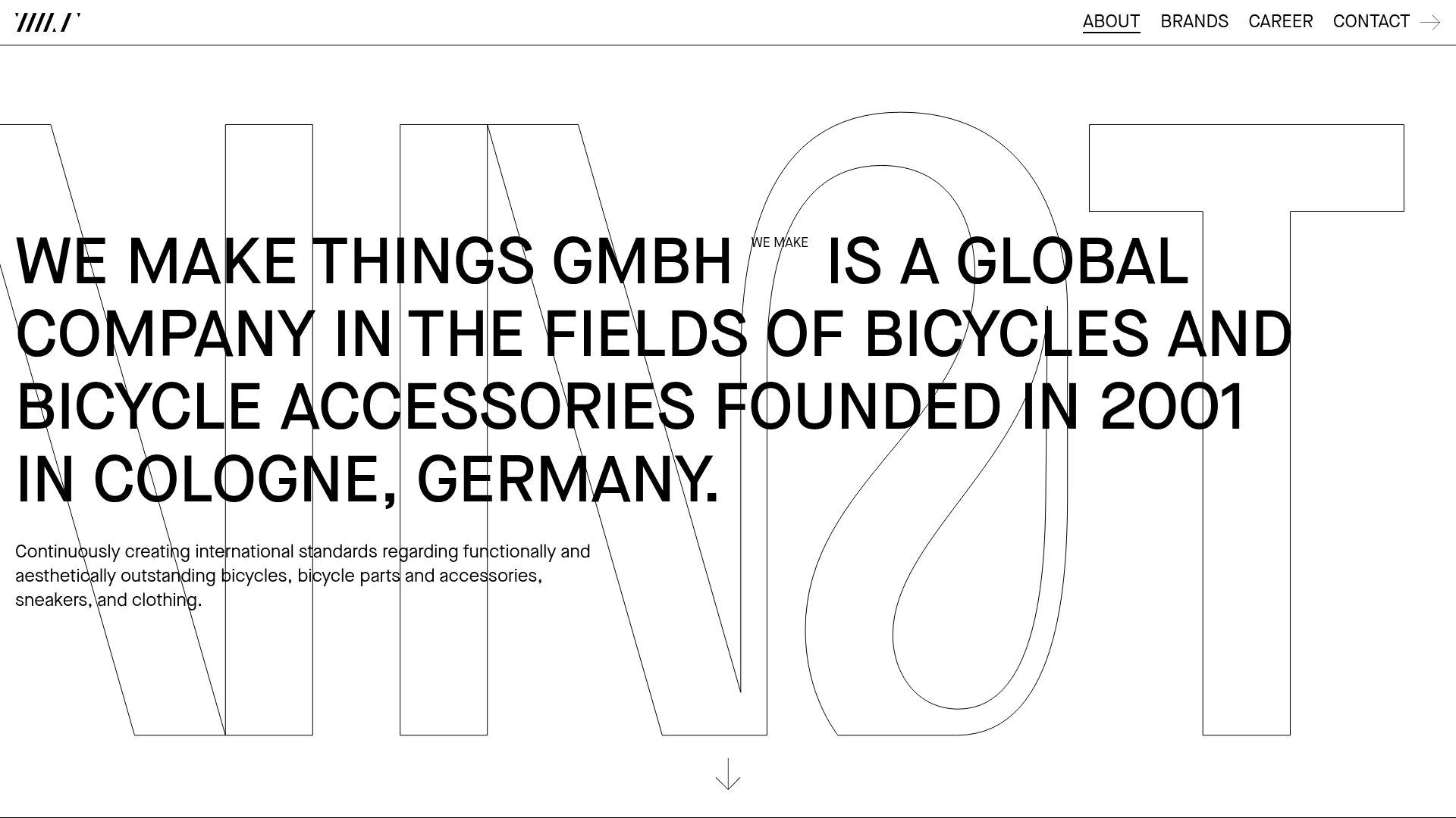
WE MAKE THINGS Corporate Portfolio
A minimalist corporate site featuring a bold typography-heavy hero section and an accordion-style brand list with integrated image galleries and external links.
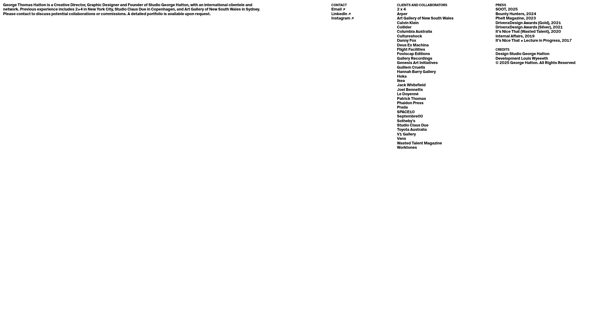
Minimal Text-Based Creative Director Portfolio
A clean, typography-focused landing page featuring a multi-column layout for bio, links, and client lists using simple CSS flex or grid structures.
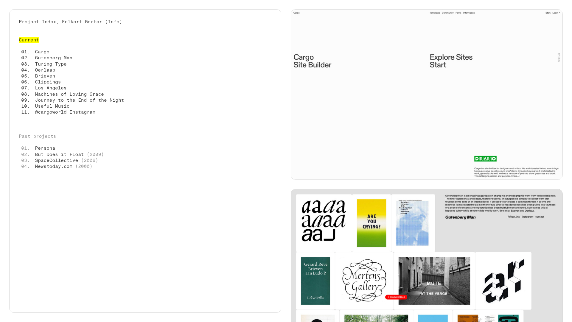
Folkert Gorter Minimalist Project Index
A clean, list-based portfolio layout featuring a pinned sidebar navigation, highlighted list items, and a vertical gallery grid of high-resolution graphic design work.
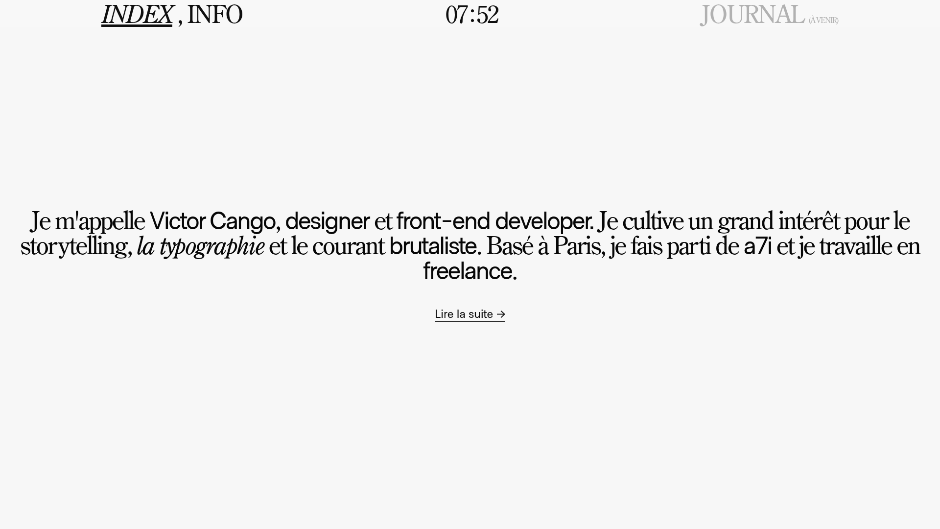
Victor Cango Brutalist Portfolio Hero
A minimalist brutalist hero section featuring a localized digital clock, typographic layout, and a full-screen canvas interaction with an embedded video texture.
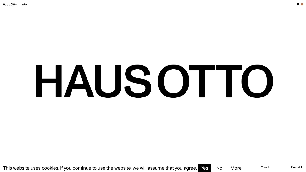
Haus Otto Minimalist Design Portfolio
A high-contrast minimalist landing page featuring bold oversized typography, a sticky navigation bar, and integrated cookie consent interaction patterns.
