WE MAKE THINGS Corporate Portfolio
A minimalist corporate site featuring a bold typography-heavy hero section and an accordion-style brand list with integrated image galleries and external links.
Overview
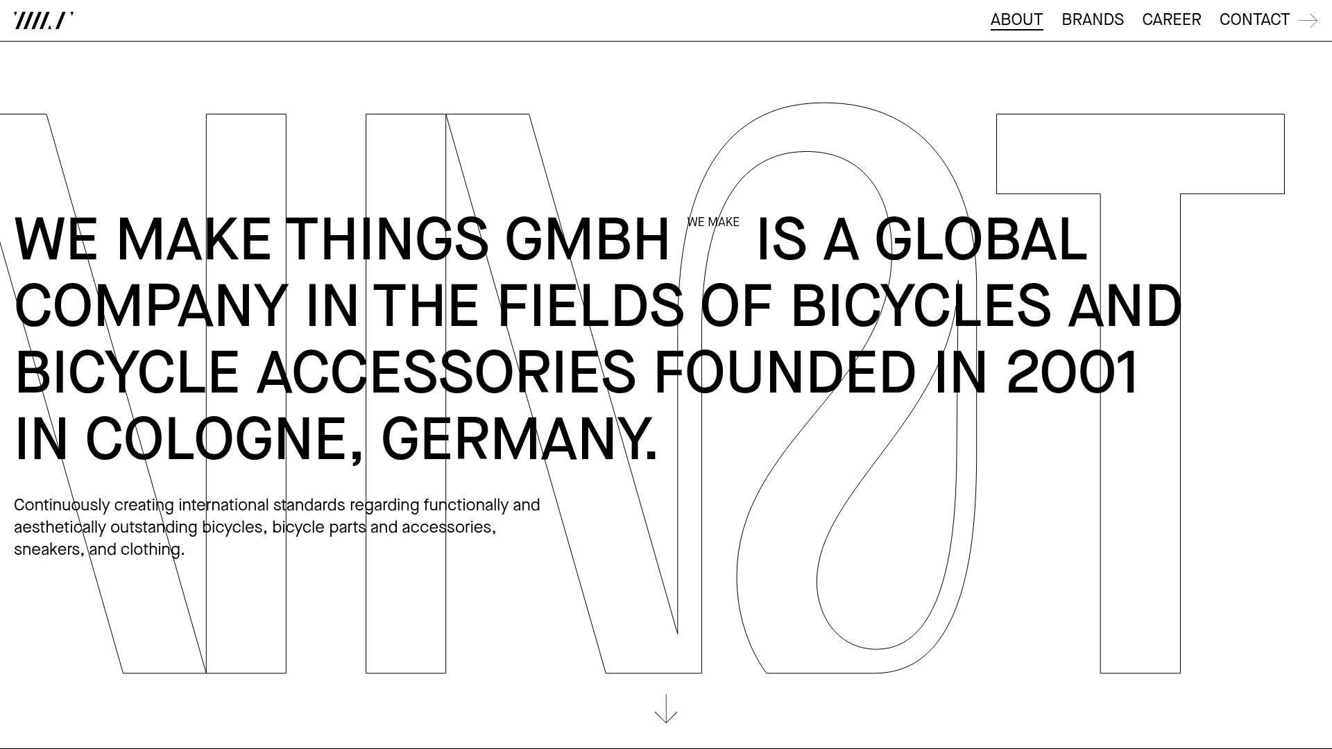
This corporate portfolio for WE MAKE THINGS GmbH is a masterclass in high-impact, minimalist typography. It leverages a clean, Swiss-inspired aesthetic to showcase a multi-brand bike manufacturing collective, making it an excellent reference for builders wanting to balance heavy text volume with an airy, professional feel.
Design System
- Color Palette & Visual Hierarchy: A strict monochrome (black and white) palette creates a timeless, high-contrast look. Hierarchy is established through extreme scale—using massive, outlined background text behind bold foreground headers to create depth without using color.
- Typography System: The site uses a robust Sans-Serif (reminiscent of Helvetica or Inter) in various weights. Navigation and headers use
text-uppercasefor a technical, industrial feel. A unique "WE MAKE" sub-label (thesmalltag) is consistently nested within headers for brand cohesion. - Page Structure: The flow consists of a hero "About" section with a large centered statement, followed by an expandable "Brands" list, a "Career" CTA section, and a dense multi-column footer.
- Reusable Components:
- Typography Hero: A centered H1 block with a scrolling indicator arrow.
- Accordion Brand List: The
brands-list-itemstructure is highly modular, featuring a header with a numeric identifier and a hidden/expandable content area containing a two-image gallery and descriptive text. - Grid Footer: A highly organized link grid for contact and social information.
- Interaction & Motion: The interface uses vertical scrolling with a clear secondary navigation anchor (
#brands). The brand list items function as accordions to keep the long list manageable while allowing deep dives into specific brand stories. - Implementation Clues: The HTML reveals a semantic structure using
<section>tags with specific IDs like#aboutand#brands. It uses utility-like classes (text-l,text-m,text-uppercase) and background images for gallery flexibility.
Use Cases
- Who should clone this: Agency portfolios, photography collectives, or manufacturing groups that need to present multiple sub-entities under one parent umbrella.
- Effective Remixes: This pattern works perfectly for "Year in Review" sites or long-form digital magazines where oversized typography can serve as a structural element.
- Remix Directions: Swap the monochromatic scheme for a high-saturation duo-tone to target a younger audience, or adapt the brand accordion into a project case study gallery where the images take more prominence over the text.
- Clone Scope: The hero section is a quick, high-value clone for landing pages. The full brand list is better for comprehensive corporate sites requiring a clean way to organize 10+ sub-categories.
Related Inspirations

Egstad Minimalist Design Portfolio
A refined Nuxt.js portfolio featuring bold variable typography, interactive canvas elements, and a clean grid-based layout for showcasing design work.
Minimal Text-Based Creative Director Portfolio
A clean, typography-focused landing page featuring a multi-column layout for bio, links, and client lists using simple CSS flex or grid structures.
6:AM Glass Minimalist Server Error Page
A high-contrast, brutalist 500 error page featuring oversized typography, a fixed header with dynamic clock, and a structured footer contact layout.
Folkert Gorter Minimalist Project Index
A clean, list-based portfolio layout featuring a pinned sidebar navigation, highlighted list items, and a vertical gallery grid of high-resolution graphic design work.
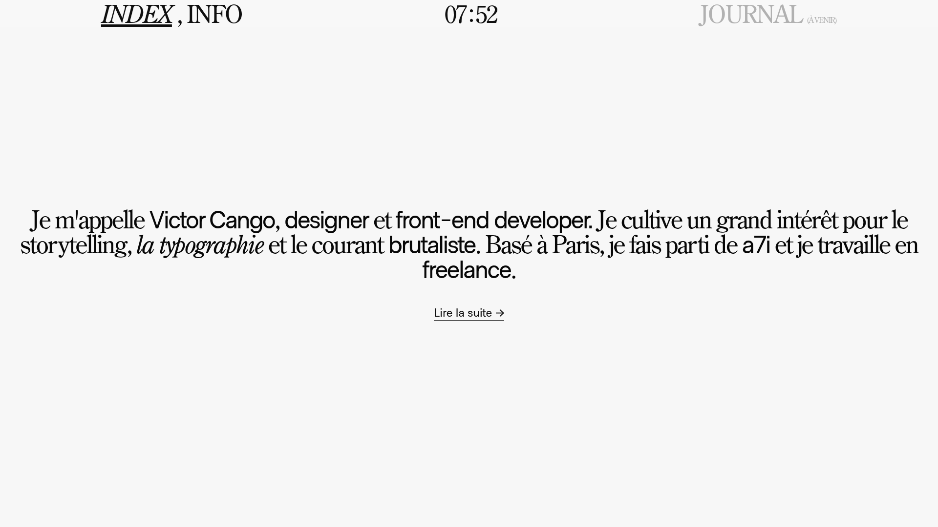
Victor Cango Brutalist Portfolio Hero
A minimalist brutalist hero section featuring a localized digital clock, typographic layout, and a full-screen canvas interaction with an embedded video texture.
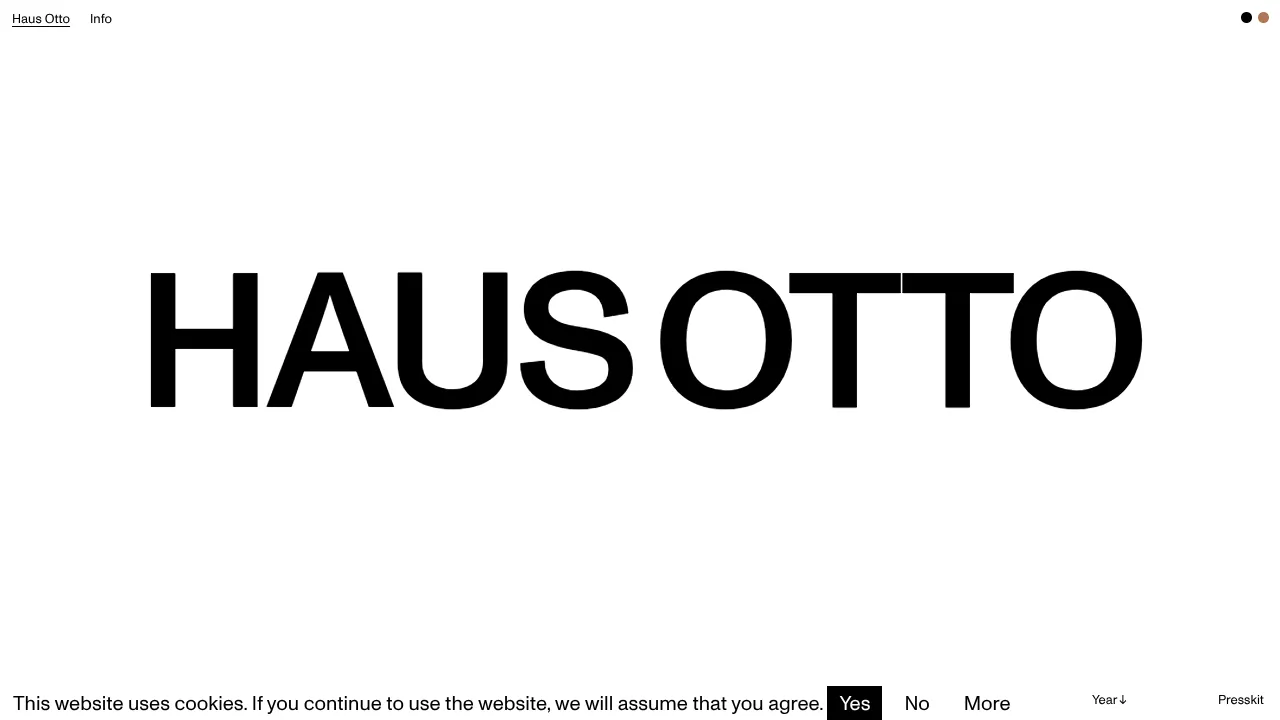
Haus Otto Minimalist Design Portfolio
A high-contrast minimalist landing page featuring bold oversized typography, a sticky navigation bar, and integrated cookie consent interaction patterns.
