Folkert Gorter Minimalist Project Index
A clean, list-based portfolio layout featuring a pinned sidebar navigation, highlighted list items, and a vertical gallery grid of high-resolution graphic design work.
Overview
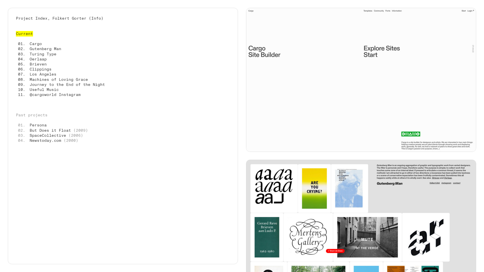
This minimalist project index portfolio by Folkert Gorter features a split-layout design that pairs a pinned, text-heavy sidebar with a large-scale vertical gallery. It is an excellent clone reference for creatives who want to balance a clear structured archive with an immersive, high-resolution visual showcase.
Design System
- Color Palette & Visual Hierarchy: The site uses a high-contrast monochromatic base (white background, black text) with a single functional accent color: a vibrant yellow (
rgb(255, 255, 0)) used as a highlight background to denote the 'Current' status. Hierarchy is established through spacing and color shifts, using a faded grey for 'Past projects'. - Typography: A utilitarian monospace font family is used throughout, likely to mirror the aesthetics of a directory or index. The scale is consistent across the navigation and project metadata, relying on line breaks and bold highlighting rather than significant size variations.
- Page Structure: The layout uses a fixed-position sidebar (
pinned-top fixed) on the left occupying roughly 1/3 of the width, while the right side serves as a scrollable feed. The feed contains a single-column<gallery-grid>of large, edge-to-edge images. - Reusable Components:
- The Pinned Index: A simple ordered list (
<ol>) inside a fixed-position container that serves as the primary navigation and site map. - The Gallery Grid: A vertical stack of
<media-item>components that feature full-width visual previews with clean hover transitions.
- The Pinned Index: A simple ordered list (
- Interaction & Motion: The sidebar is stationary while the content scrolls, creating a 'split-screen' effect. Hyperlinks are minimal, underlined or highlighted on hover to indicate interactivity.
- Implementation Clues: Built using the Cargo site builder, the HTML reveals a custom web-component-based structure (
<gallery-grid>,<media-item>) and heavy use of CSS variables for layout sizing (--fit-height,--pin-padding-top).
Use Cases
- Who should clone this pattern: Graphic designers, archivists, researchers, and photographers with a large body of work that needs to be organized chronologically or by status.
- Effective Remixes: It works well for agency portfolios where the index can represent different departments or for technical documentation where the sidebar serves as a table of contents for long-form case studies.
- Practical Remix Directions: Swap the monospace font for a serif to create a high-fashion editorial feel; adjust the 1/3-2/3 split-screen ratio for different content densities; or replace the yellow highlight with a brand-specific primary color.
- Suggested Clone Scope: A full-page clone is most effective to capture the specific fixed-vs-scroll physical interaction, though the sidebar index itself is a highly reusable navigation pattern for any documentation-heavy site.
Related Inspirations
Minimal Text-Based Creative Director Portfolio
A clean, typography-focused landing page featuring a multi-column layout for bio, links, and client lists using simple CSS flex or grid structures.

Egstad Minimalist Design Portfolio
A refined Nuxt.js portfolio featuring bold variable typography, interactive canvas elements, and a clean grid-based layout for showcasing design work.

Baubauwerk Minimal Agency Portfolio Homepage
A clean studio site featuring a centered text hero, scatter-plot filterable project gallery, and full-bleed image sections for case studies.
WE MAKE THINGS Corporate Portfolio
A minimalist corporate site featuring a bold typography-heavy hero section and an accordion-style brand list with integrated image galleries and external links.
Erno Works Minimalist Design Portfolio
A clean, typography-focused portfolio featuring a sticky grid layout, large editorial headers, and integrated video project thumbnails for dynamic case study previews.
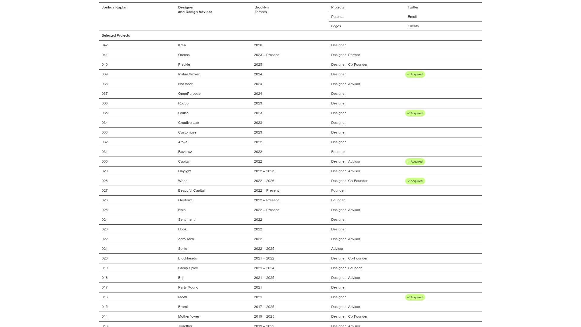
Joshua Kaplan Portfolio Index
A minimalist, text-only portfolio layout featuring an expansive tabular list of projects with horizontal rule separators and clean typography.
