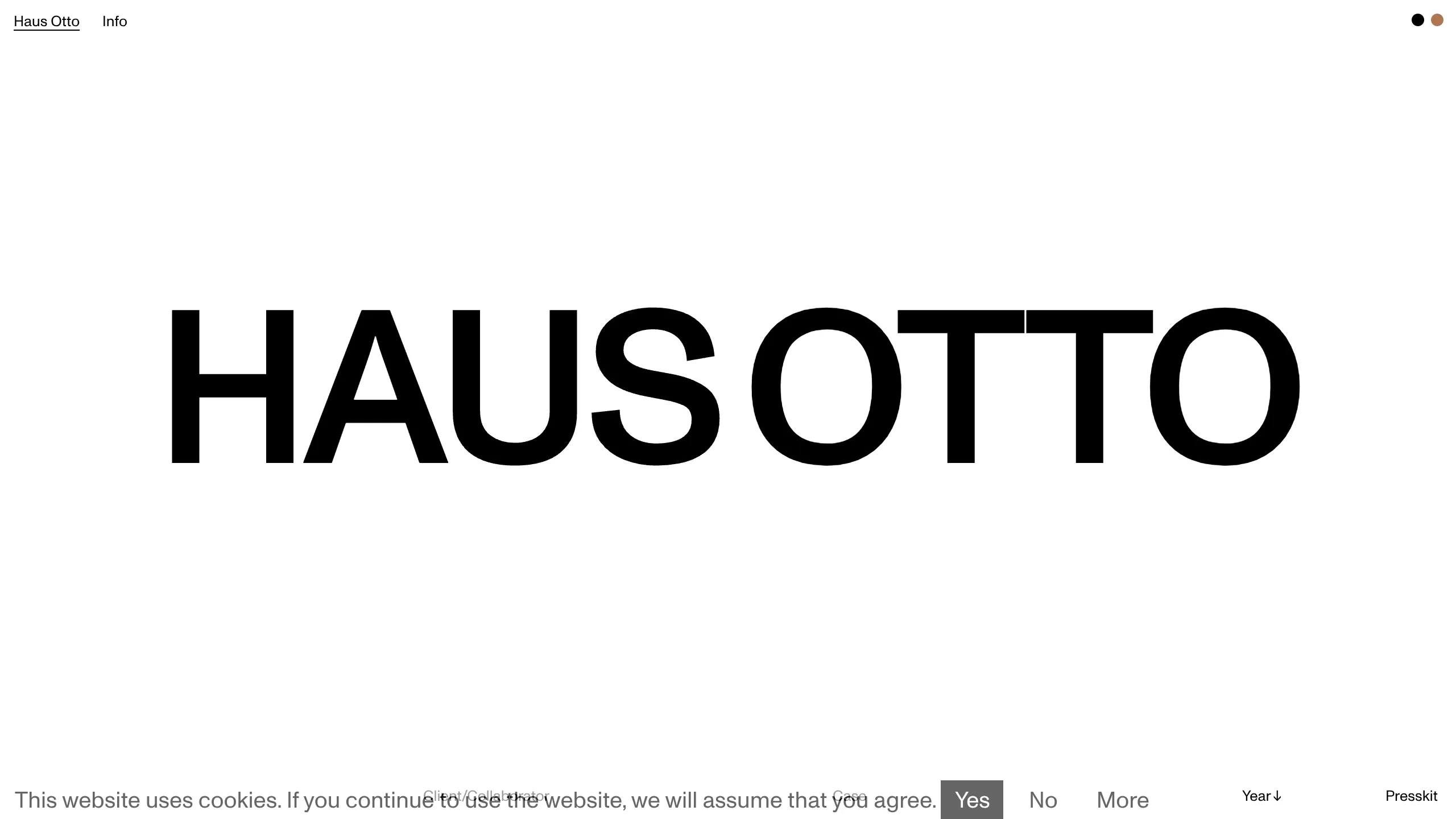
Haus Otto Minimalist Design Portfolio
A high-contrast minimalist landing page featuring bold oversized typography, a sticky navigation bar, and integrated cookie consent interaction patterns.
Overview
Haus Otto is a high-impact, minimalist design portfolio landing page that prioritizes bold brand identity through oversized typography and ample whitespace. It serves as an excellent reference for builders looking to master brutalist-lite aesthetics, sticky navigation frameworks, and discrete, non-intrusive cookie consent patterns.
Design System
- Color Palette & Visual Hierarchy: The design uses a high-contrast monochromatic scheme (solid black and white) with a focus on negative space to create drama. A single accent color (tan/beige) is reserved for a small toggle element in the top right, signaling interactivity.
- Typography System: The system is built on a heavy sans-serif typeface (likely a variant of Helvetica or Inter) used at a massive scale for the primary logo/hero text. Functional text (navigation and cookie bars) is much smaller, creating a clear hierarchical jump between brand identity and utility links.
- Page Structure: The layout follows a classic 100vh hero framework. At the top, a persistent sticky navigation bar houses the brand name and 'Info' link. The center is dominated by the 'HAUS OTTO' wordmark. The bottom features a fixed utility bar containing cookie consent and organizational metadata ('Year', 'Presskit').
- Reusable Components:
- The Hero Wordmark: A scalable SVG or text-based center element that creates instant brand recognition.
- Cookie Consent Bar: A horizontal footer strip with high-contrast button states (inverted black/white) that manages user interaction without obscuring content.
- Dual-Link Top Nav: A simple, minimalist header pattern that uses underlines sparingly for focus.
- Interaction Patterns: The UI utilizes 'inverse' hover states, as seen in the 'Yes' cookie button where white text sits on a black background, suggesting that other buttons will swap colors upon interaction.
- Responsive Behavior: The HTML structure suggests a fluid layout where the central typography will likely scale based on viewport width (vw), ensuring the wordmark remains the focal point across devices.
Use Cases
- Who should clone this pattern: Creative directors, architects, and studio owners who need a digital business card that feels premium and authoritative with minimal upkeep.
- Effective Remixes: This layout works perfectly for fashion lookbooks, experimental tech landing pages, or high-end furniture retail sites.
- Remix Directions:
- Color Play: Swap the white background for a dark mode (Navy/Silver) while maintaining the oversized typography.
- Architecture Adaptation: Replace the center wordmark with a vertically scrolling gallery of high-resolution project images while keeping the sticky header/footer intact.
- Suggested Clone Scope: A quick section clone of the footer utility bar is highly valuable for any project requiring a compliant but aesthetic cookie notice. A full-page clone is recommended for anyone wanting a ready-to-use boilerplate for a minimalist 'under construction' or 'launching soon' page.
Related Inspirations
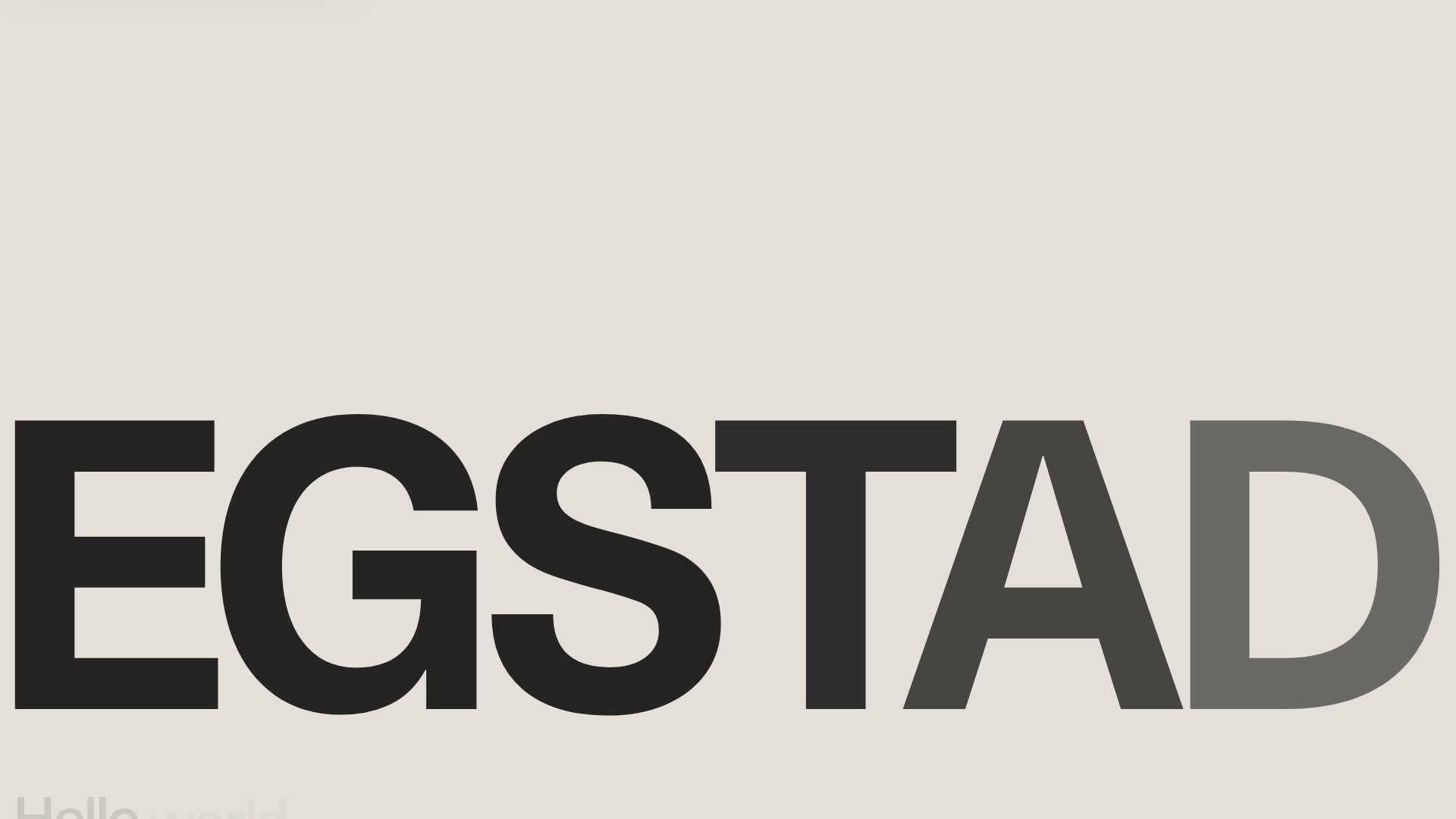
Egstad Minimalist Design Portfolio
A refined Nuxt.js portfolio featuring bold variable typography, interactive canvas elements, and a clean grid-based layout for showcasing design work.
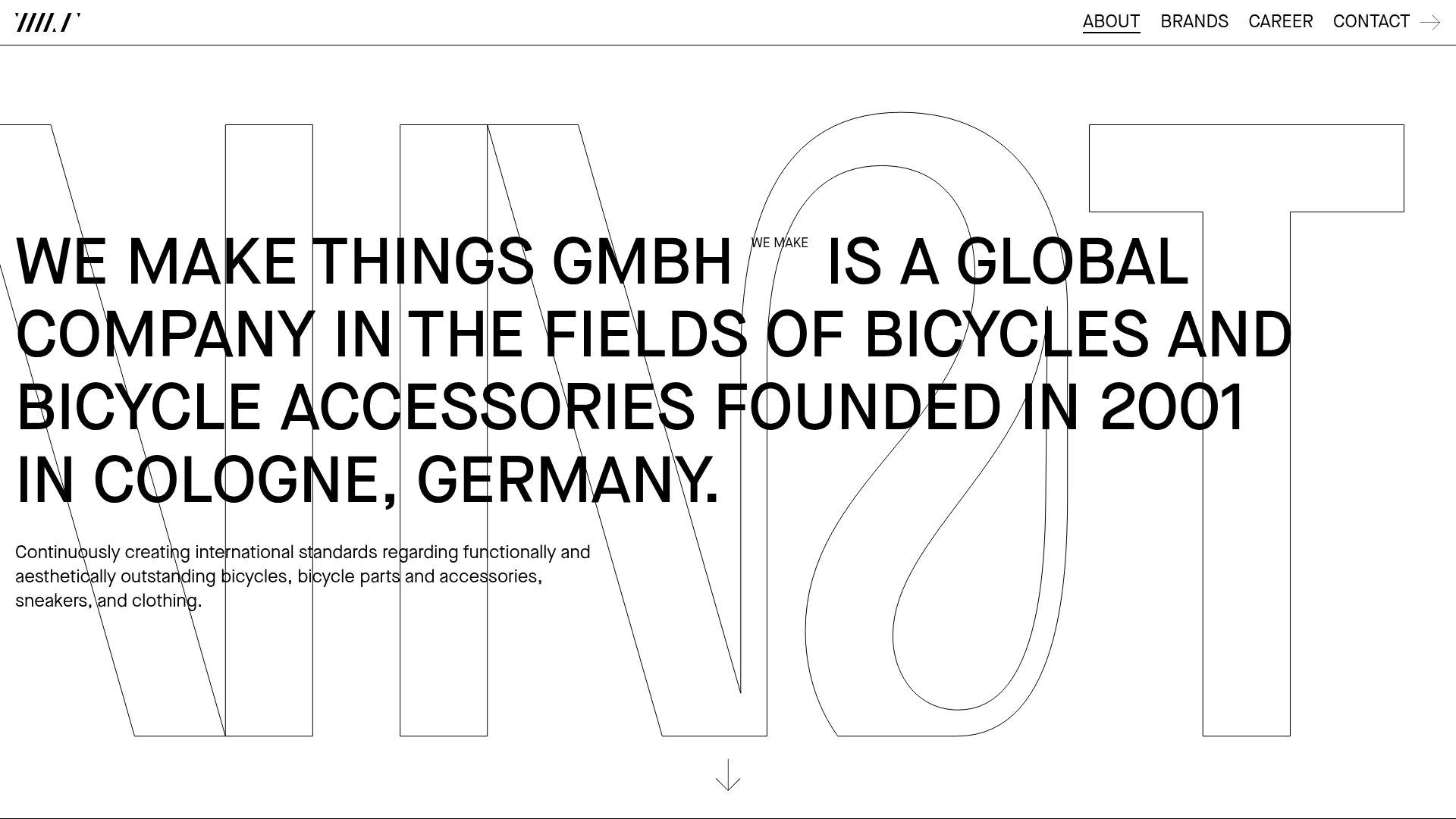
WE MAKE THINGS Corporate Portfolio
A minimalist corporate site featuring a bold typography-heavy hero section and an accordion-style brand list with integrated image galleries and external links.
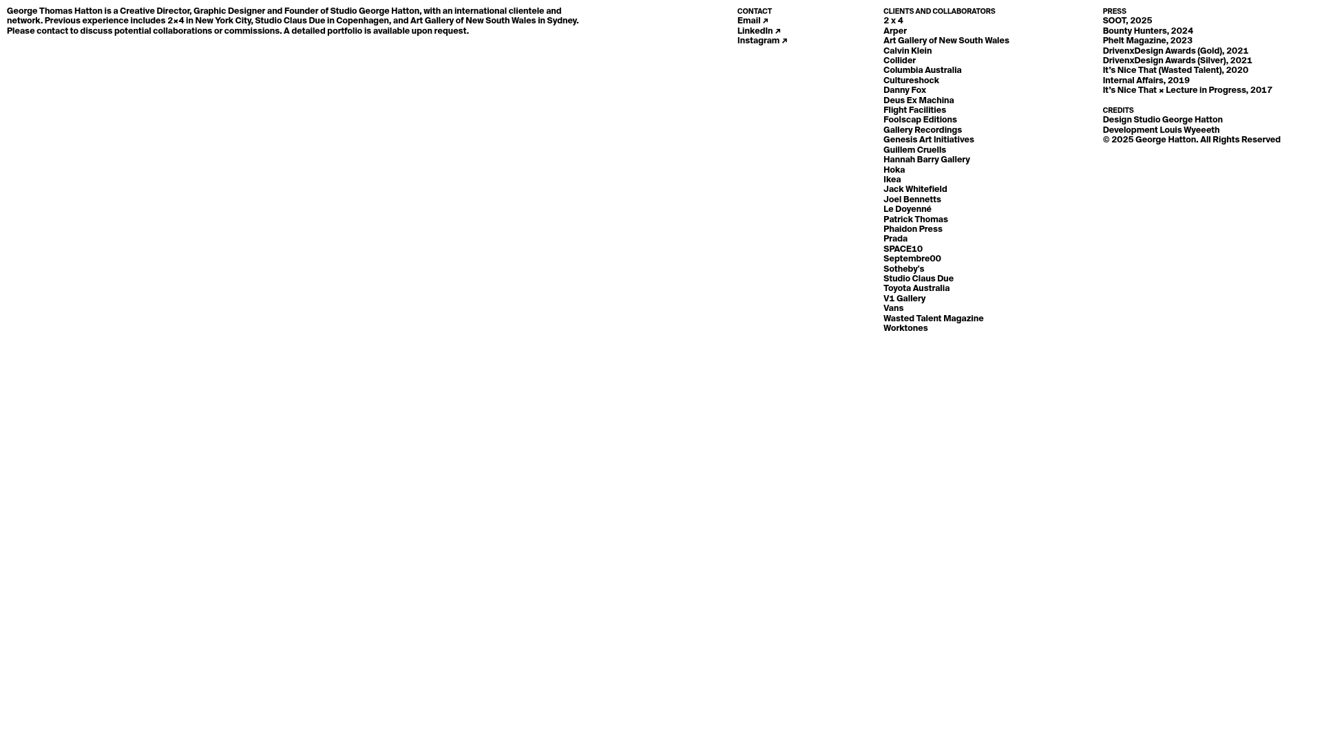
Minimal Text-Based Creative Director Portfolio
A clean, typography-focused landing page featuring a multi-column layout for bio, links, and client lists using simple CSS flex or grid structures.
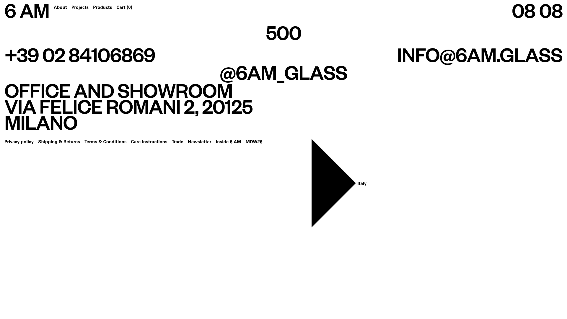
6:AM Glass Minimalist Server Error Page
A high-contrast, brutalist 500 error page featuring oversized typography, a fixed header with dynamic clock, and a structured footer contact layout.
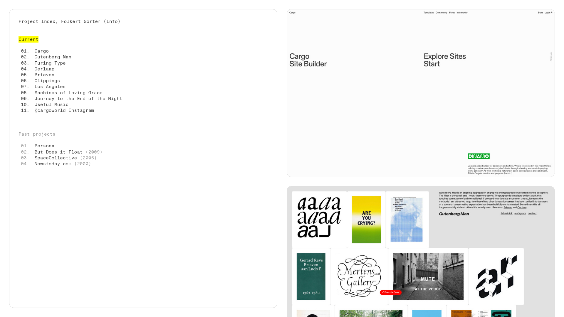
Folkert Gorter Minimalist Project Index
A clean, list-based portfolio layout featuring a pinned sidebar navigation, highlighted list items, and a vertical gallery grid of high-resolution graphic design work.
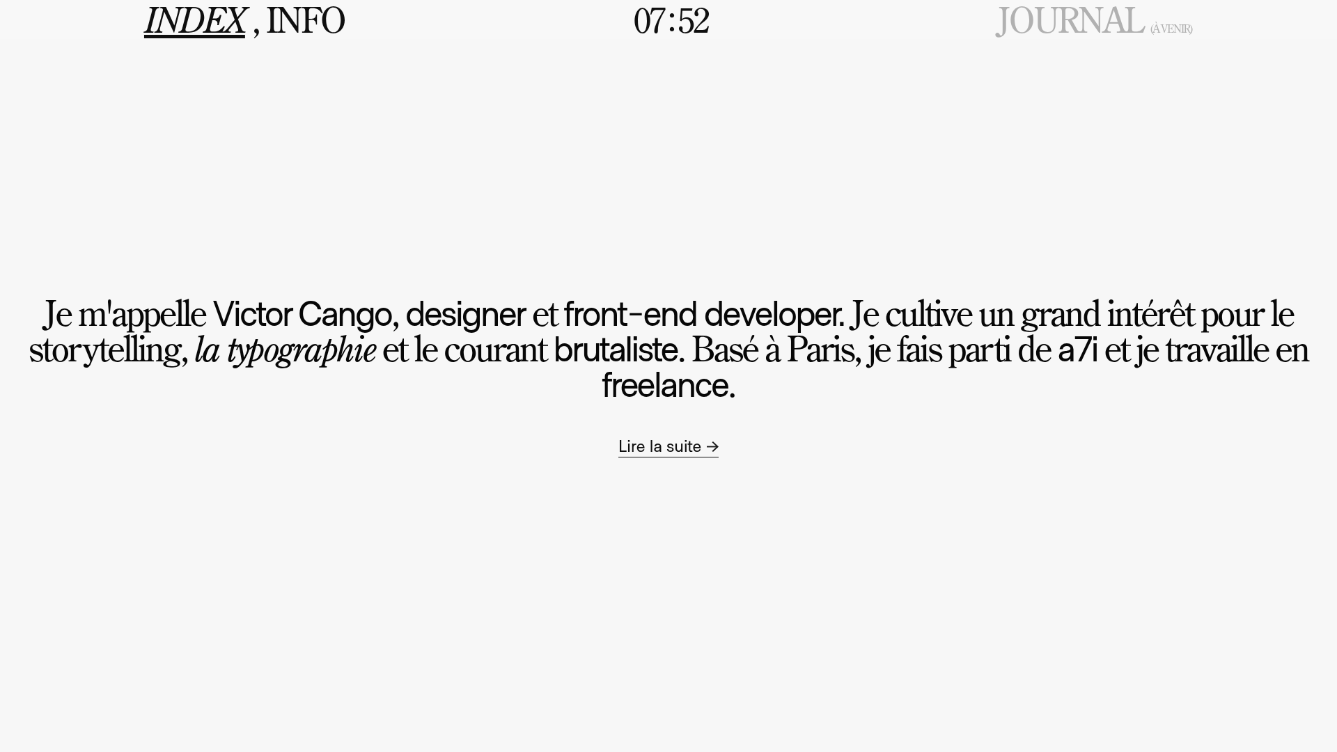
Victor Cango Brutalist Portfolio Hero
A minimalist brutalist hero section featuring a localized digital clock, typographic layout, and a full-screen canvas interaction with an embedded video texture.
