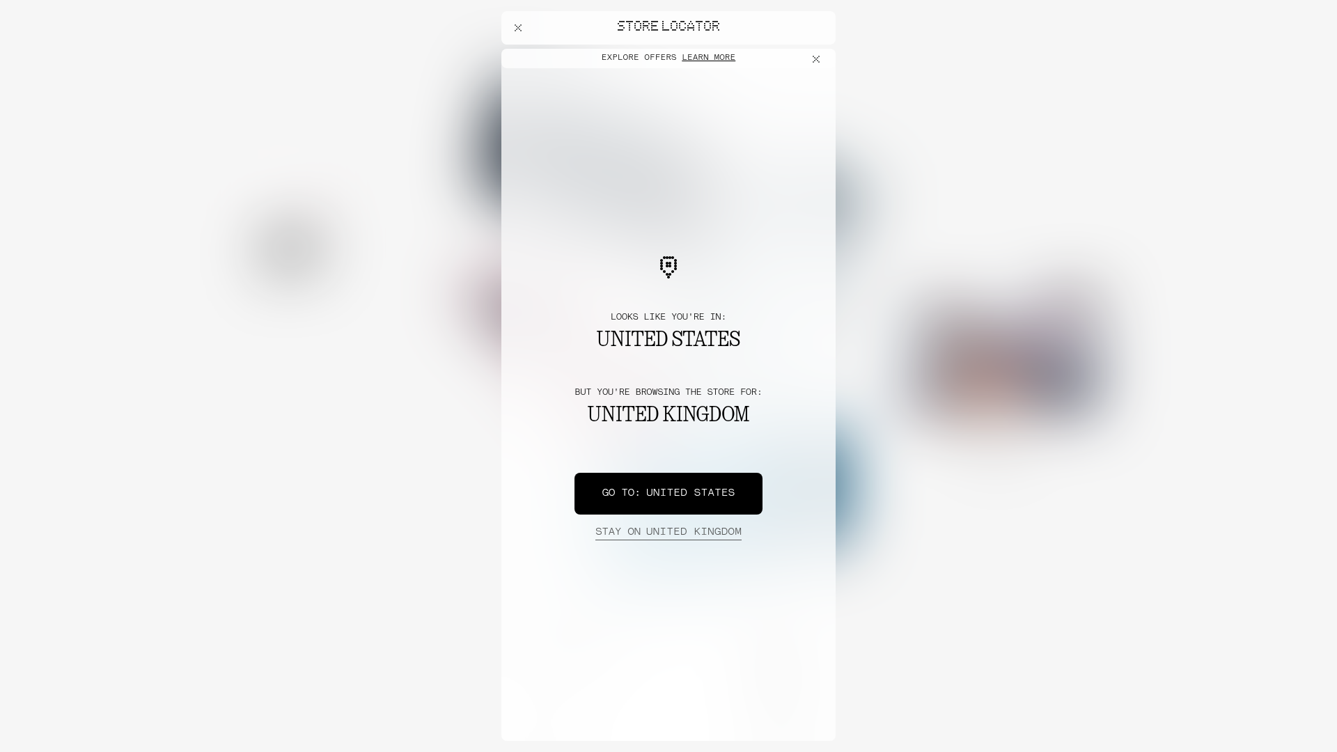
Nothing Tech E-commerce Store Mockup
A minimalist bento-grid landing page featuring localized store modals, dot-matrix typography, and high-contrast frozen-glass UI components for product discovery.
Overview
This mockup features a high-fidelity e-commerce storefront transition, specifically showcasing a localized store selector modal. It is an excellent reference for builders because it masterfully combines a minimal, retro-futuristic aesthetic with a sophisticated glassmorphism UI that prioritizes user flow and brand identity.
Design System
- Color Palette & Visual Hierarchy: The design uses a monochrome base (pure blacks and whites) layered over background imagery. The primary visual hierarchy is driven by contrast and the "frost-white-intense" (glassmorphic) container that provides focus against a blurred, high-energy background.
- Typography: The system utilizes a characteristic dot-matrix style (Lettera Mono LL) for utility text and a bold, high-contrast serif/technical hybrid for headings. The
uppercaseutility is heavily applied to secondary text (e.g., "LOOKS LIKE YOU'RE IN:") to maintain a technical, clean-room aesthetic. - Page Structure: The layout relies on a fixed-overlay modal (
fixed inset-0) that centers critical information. Behind the modal, thewidget-griduses a complex responsive column system (md:grid-cols-12) to manage product cards in a bento-style layout. - Reusable Components:
- Glass Containers: Elements like
.frost-white-intenseprovide a reusable pattern for overlays that work on any background. - Action Buttons: High-contrast solid black buttons for primary CTAs and minimalist underlined text links (
border-b border-grey-darker) for secondary actions. - Interactive Modal: A multi-step store locator logic that presents geographical mismatch scenarios elegantly.
- Glass Containers: Elements like
- Interaction & Motion: The HTML reveals the use of
will-change-transformandtransition-opacity, suggesting smooth fade-ins and parallax-ready product grids. Hover states on buttons use a simple opacity shift (hover:opacity-50) to maintain minimalism. - Implementation Clues: Built with Tailwind CSS utility classes (e.g.,
size-full,snap-start,inset-0). The product discovery buttons use a specific glassmorphism stack (frost-grey-low) to differentiate themselves from the content containers.
Use Cases
- Who should clone this pattern: Brand-focused e-commerce sites, tech hardware startups, and premium lifestyle apps looking for a unique "digital-physical" aesthetic.
- Remix Directions: Swap the dot-matrix font for a standard grotesque sans-serif to make it more corporate, or replace the glass containers with solid high-saturation colors for a "Neo-Brutalist" look. The localization modal can be adapted for any user-preference selection (language, currency, or dark/light mode toggle).
- Suggested Scope: Builders should prioritize cloning the glassmorphic modal and the underlying CSS grid system, as these provide the strongest foundation for a high-end product presentation.
Related Inspirations
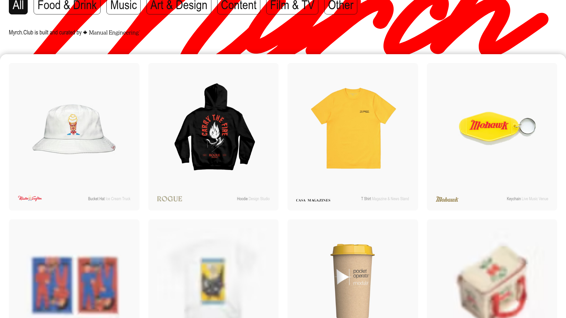
Myrch Club Merch Portfolio Gallery
A minimalist product display grid featuring category filtering buttons, clean hover-state cards, and a large-scale decorative background typography header.
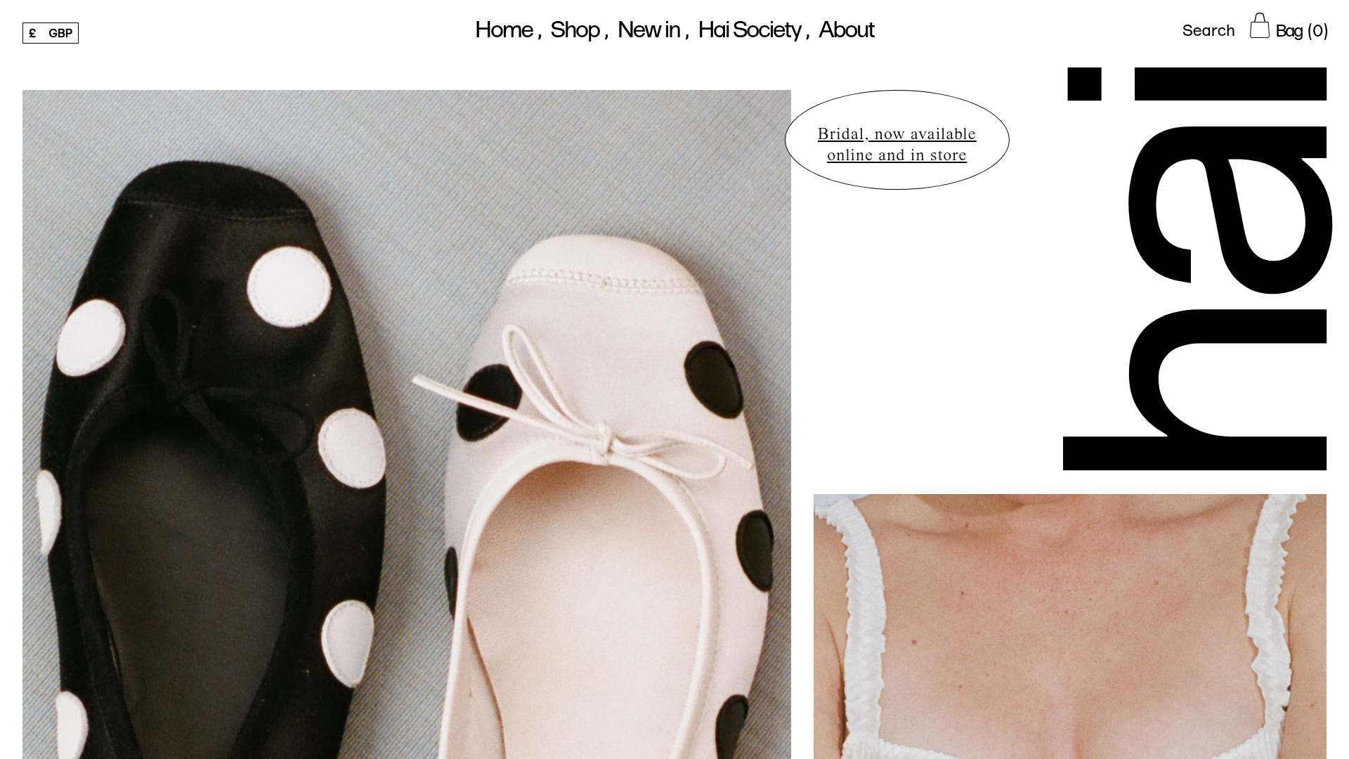
Hai Fashion E-commerce Product Grid
Minimalist boutique layout featuring asymmetrical product imagery, specialized typography, a floating circular call-to-action, and a clean grid for showcasing apparel and accessories.
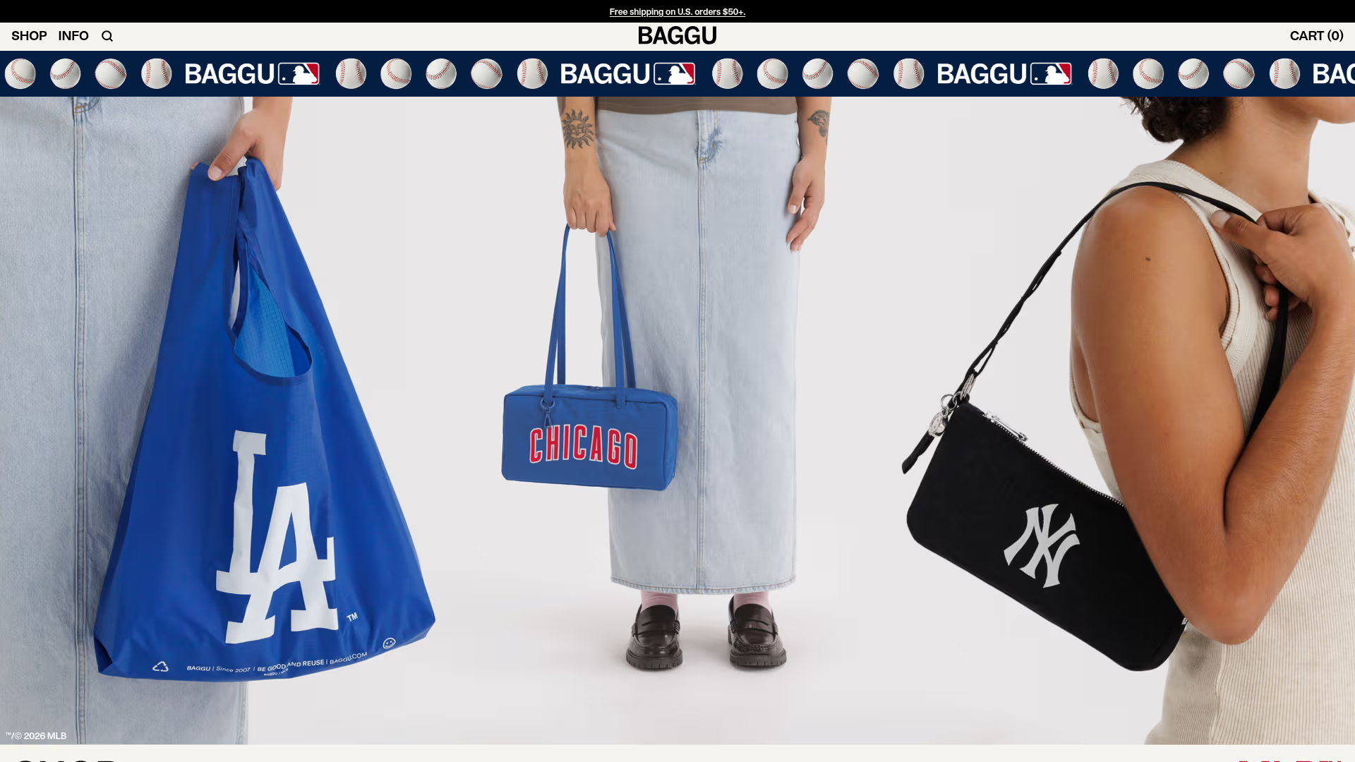
BAGGU Minimalist E-commerce Hero Template
A clean retail landing page layout featuring a full-width high-impact hero section, a sticky integrated banner, and a minimalist navigation header optimized for product launches.
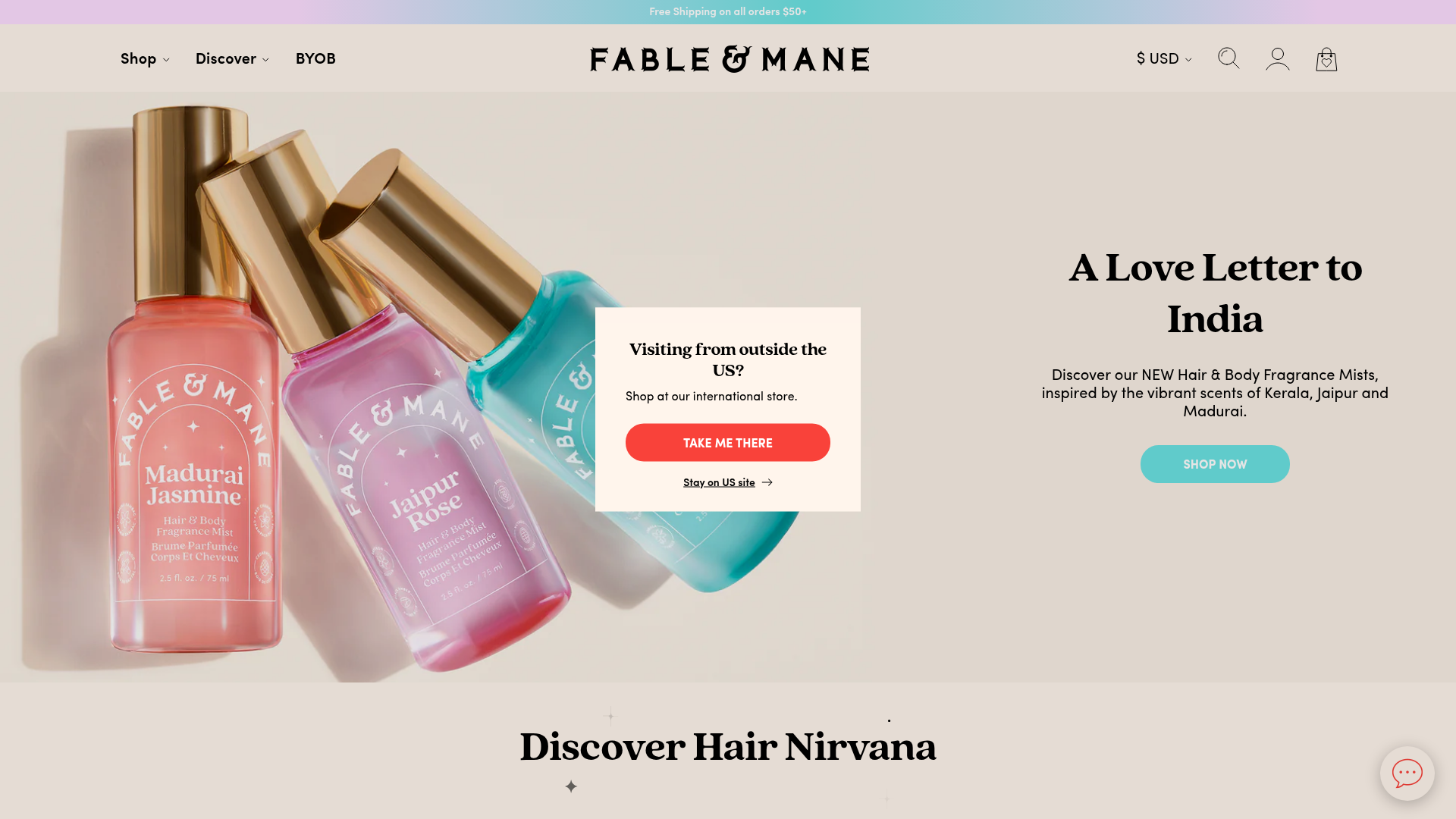
Fable & Mane Beauty Storefront
A clean e-commerce layout featuring a high-impact hero slider with localized entry popups and a product carousel with hover-triggered secondary images.
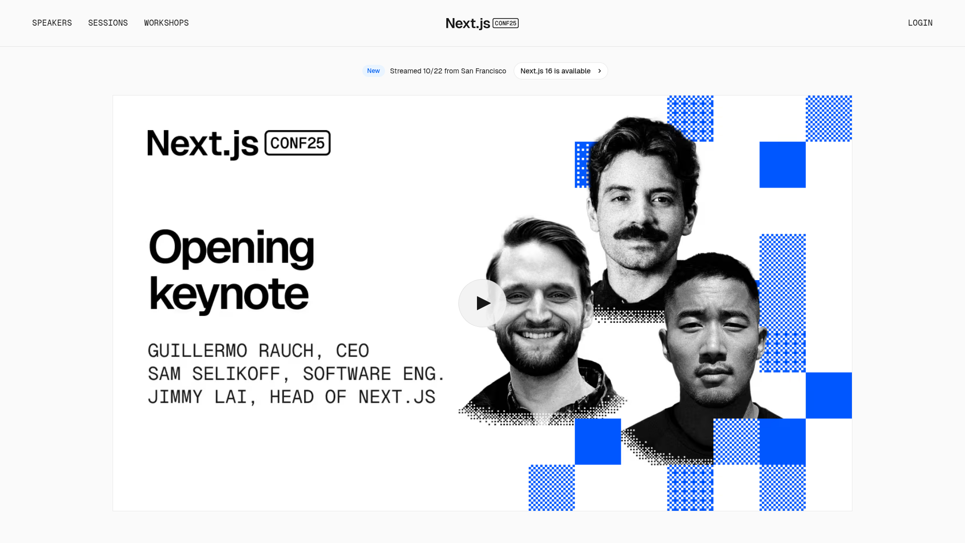
Next.js Conf Event Landing Page
A clean event landing page featuring a video hero section, minimal navigation headers, and a grid-based aesthetic for showcasing keynote speakers and sessions.
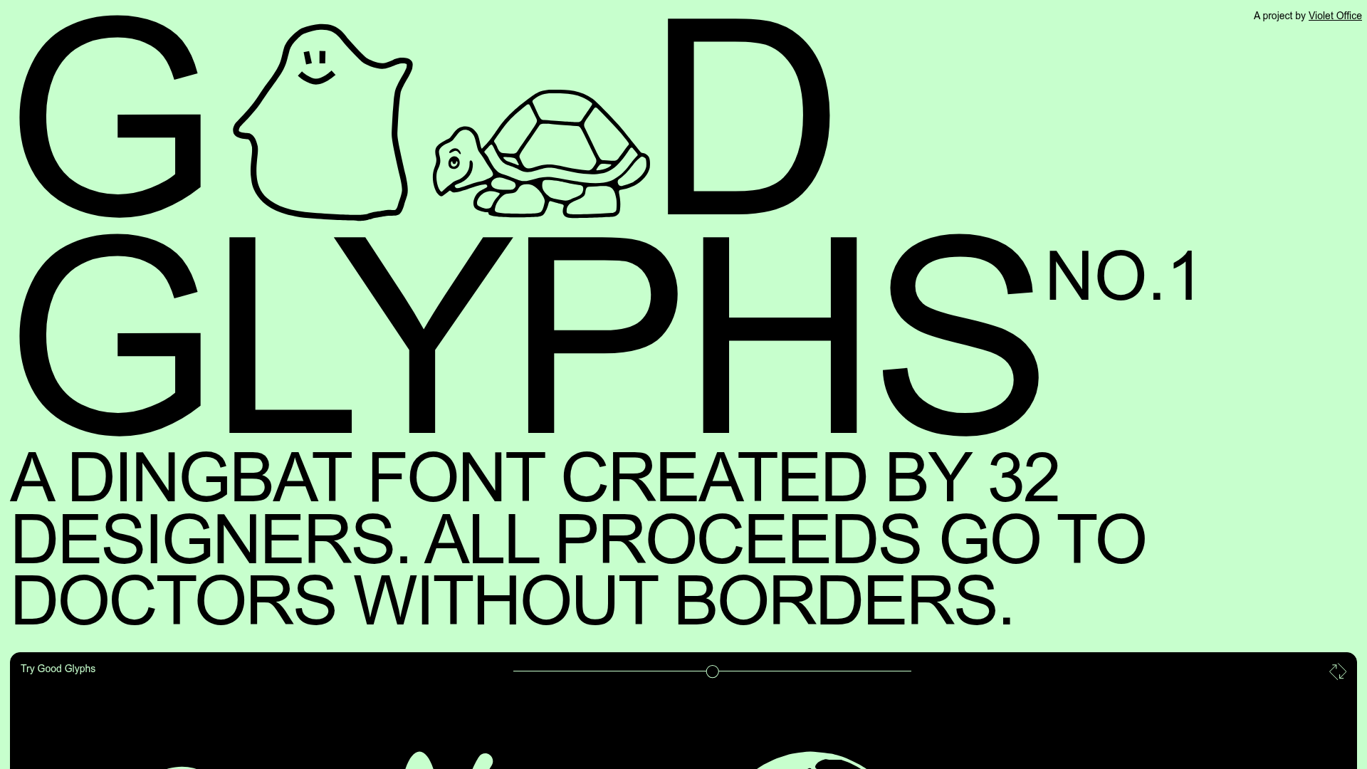
Good Glyphs Font Showcase Landing Page
A single-page layout featuring an interactive type tester, donation form with custom amount logic, and a contributor gallery using swiper-based glyph previews.
