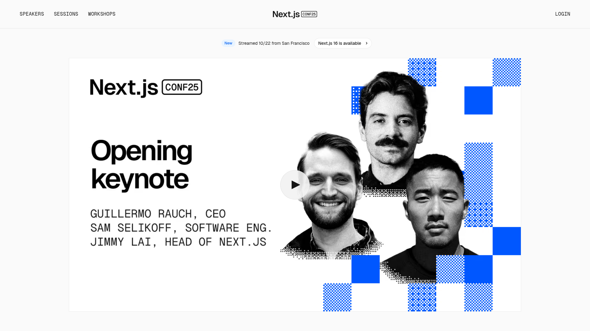
Next.js Conf Event Landing Page
A clean event landing page featuring a video hero section, minimal navigation headers, and a grid-based aesthetic for showcasing keynote speakers and sessions.
Overview
This is the landing page for the Next.js Conf, designed as a modern, high-impact hub for event streaming and information. It serves as an excellent reference for builders looking to create professional event marketing sites that balance high-contrast visual branding with functional content discovery.
Design System
- Color Palette & Visual Hierarchy: The site uses a high-contrast palette of white and black for core components, accented by a vibrant cobalt blue (
#0070f3) for interactive elements and brand accents. Visual hierarchy is established through massive typography for key headlines and a sophisticated "pixel grid" graphic language that breaks up the monochromatic layout. - Typography System: The design relies on a sans-serif stack focused on heavy weights for impactful headlines (e.g., "Opening keynote") and monospaced fonts (evoking terminal/code vibes) for speaker lists and secondary metadata. Letter spacing and line height are tight, reinforcing a modernist, technical aesthetic.
- Page Structure: The layout starts with a utility-focused navigation bar, followed by a status banner (indicating live stream status), and a dominant hero section containing a large video play-trigger and stylized speaker photography.
- Reusable Components:
- Navigation: A minimal header with clean text links and a central logo.
- Status Badge: A pill-shaped toggle for 'New' or 'Live' updates using a subtle blue background.
- Keynote Card: A composite element featuring grayscale portraits integrated with halftone patterns and an overlay play button.
- Interactive Button: The 'Next.js 16 is available' button serves as a template for secondary CTAs with subtle hover indicators.
- Interaction Patterns: The UI emphasizes clarity with clear hover states on text links and a centralized, large circular play icon that acts as the primary call to action for the hero section.
- Implementation Clues: The structure suggests a utility-first CSS approach (likely Tailwind) to manage the precise spacing and grid alignments, with a focus on semantic HTML for navigation and header roles.
Use Cases
- Who should clone this: Developers building developer-tool conferences, tech webinars, or digital product launch pages where authority and technical polish are paramount.
- Remix Directions:
- Brand Swap: Replace the cobalt blue and halftone patterns with a company’s primary brand color and custom SVG patterns to instantly shift the identity while keeping the robust layout.
- Information Architecture: Adapt the speaker list grid to become a featured products grid for an e-commerce landing page.
- Video Hub: Reuse the playback-centric hero section for a tutorial series or a high-end marketing video landing page.
- Clone Scope: Start with the Hero Section to master the balance between large-scale imagery and bold typography, then adopt the Navigation and Banner system for a consistent site-wide header framework.
Related Inspirations
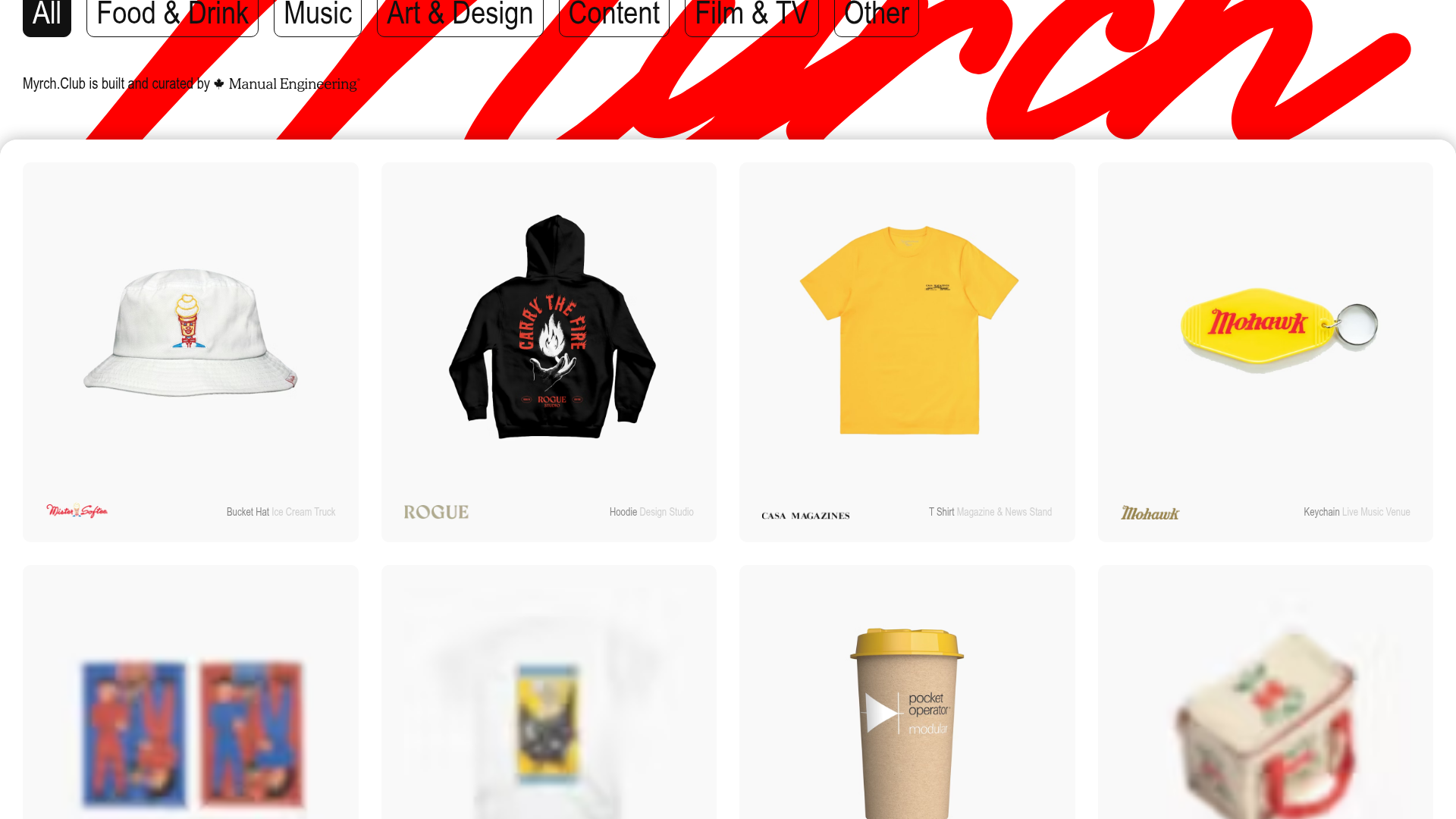
Myrch Club Merch Portfolio Gallery
A minimalist product display grid featuring category filtering buttons, clean hover-state cards, and a large-scale decorative background typography header.
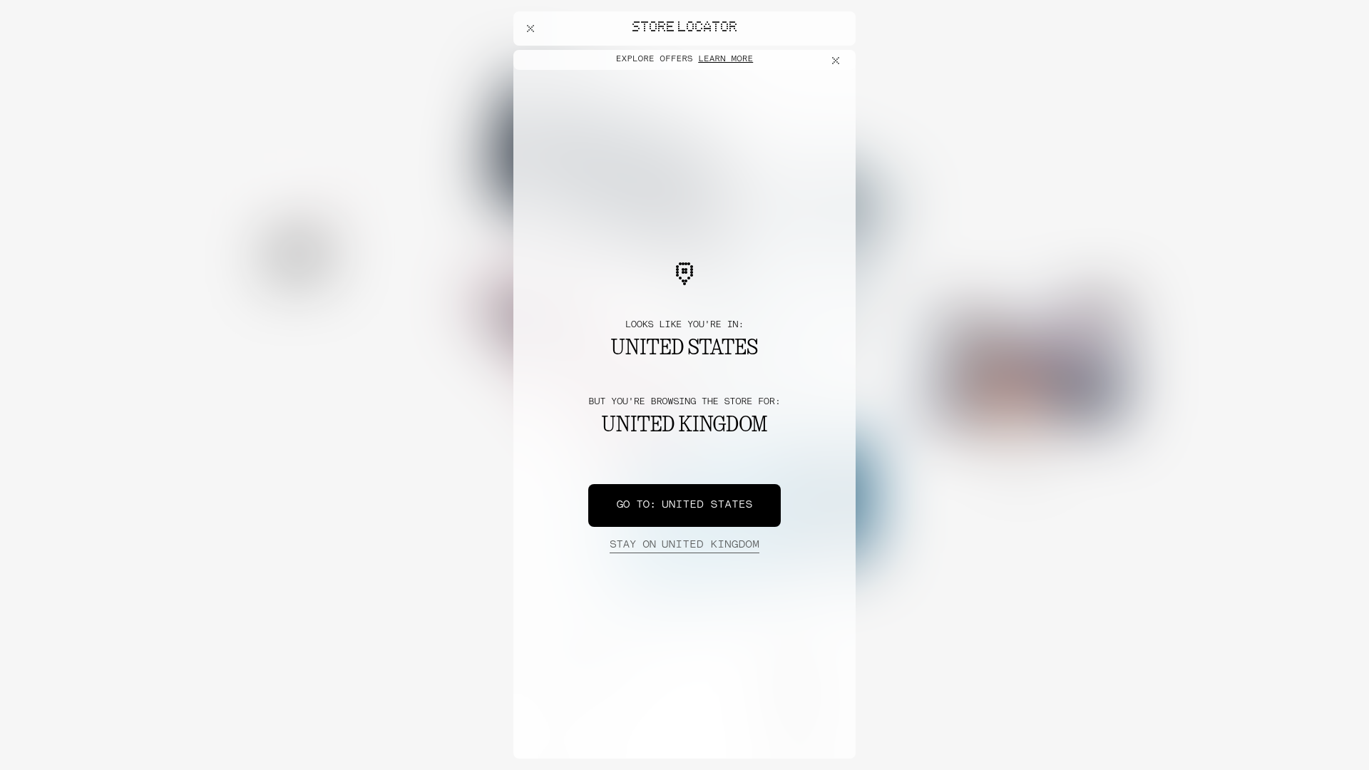
Nothing Tech E-commerce Store Mockup
A minimalist bento-grid landing page featuring localized store modals, dot-matrix typography, and high-contrast frozen-glass UI components for product discovery.

Good Glyphs Font Showcase Landing Page
A single-page layout featuring an interactive type tester, donation form with custom amount logic, and a contributor gallery using swiper-based glyph previews.
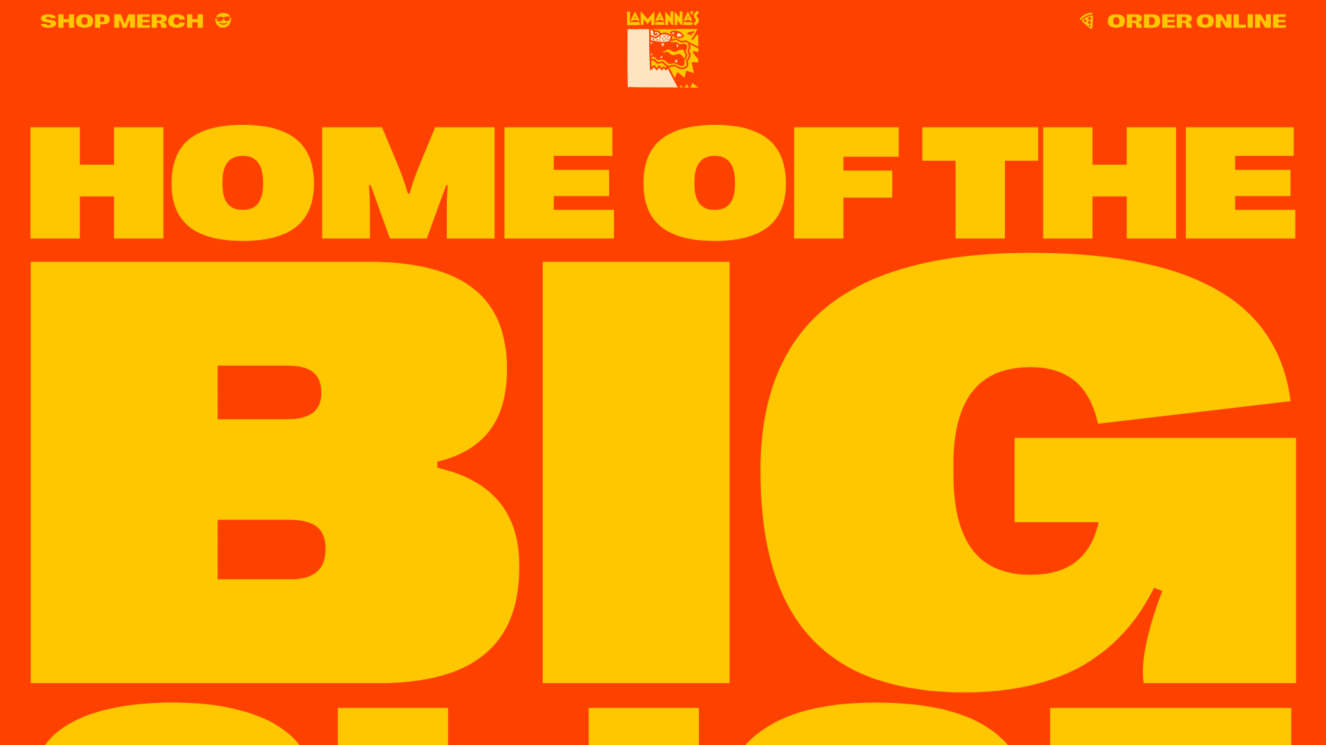
Lamanna's Bakery Vibrant Landing Page
A bold, high-contrast Italian bakery site featuring massive typography, parallax floating elements, marquee banners, and a flickity-powered product carousel.
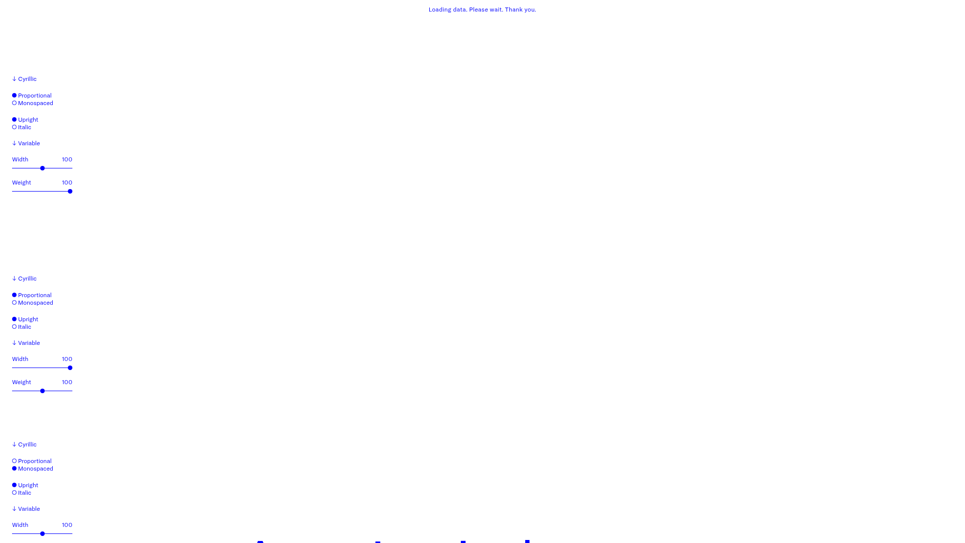
GT America Typography Tester
A layout-heavy landing page featuring interactive font testing toolkits with multi-language support, font-weight sliders, and content-editable text areas.
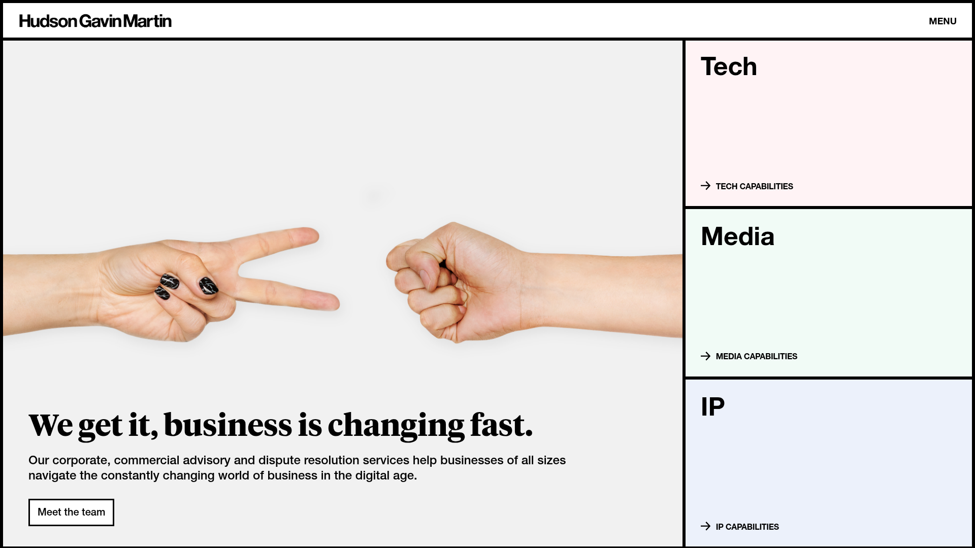
Hudson Gavin Martin Corporate Law Landing
A professional service homepage featuring a minimalist grid-based hero, color-themed navigation blocks, and a bento-style insights feed with subtle hover interactions.
