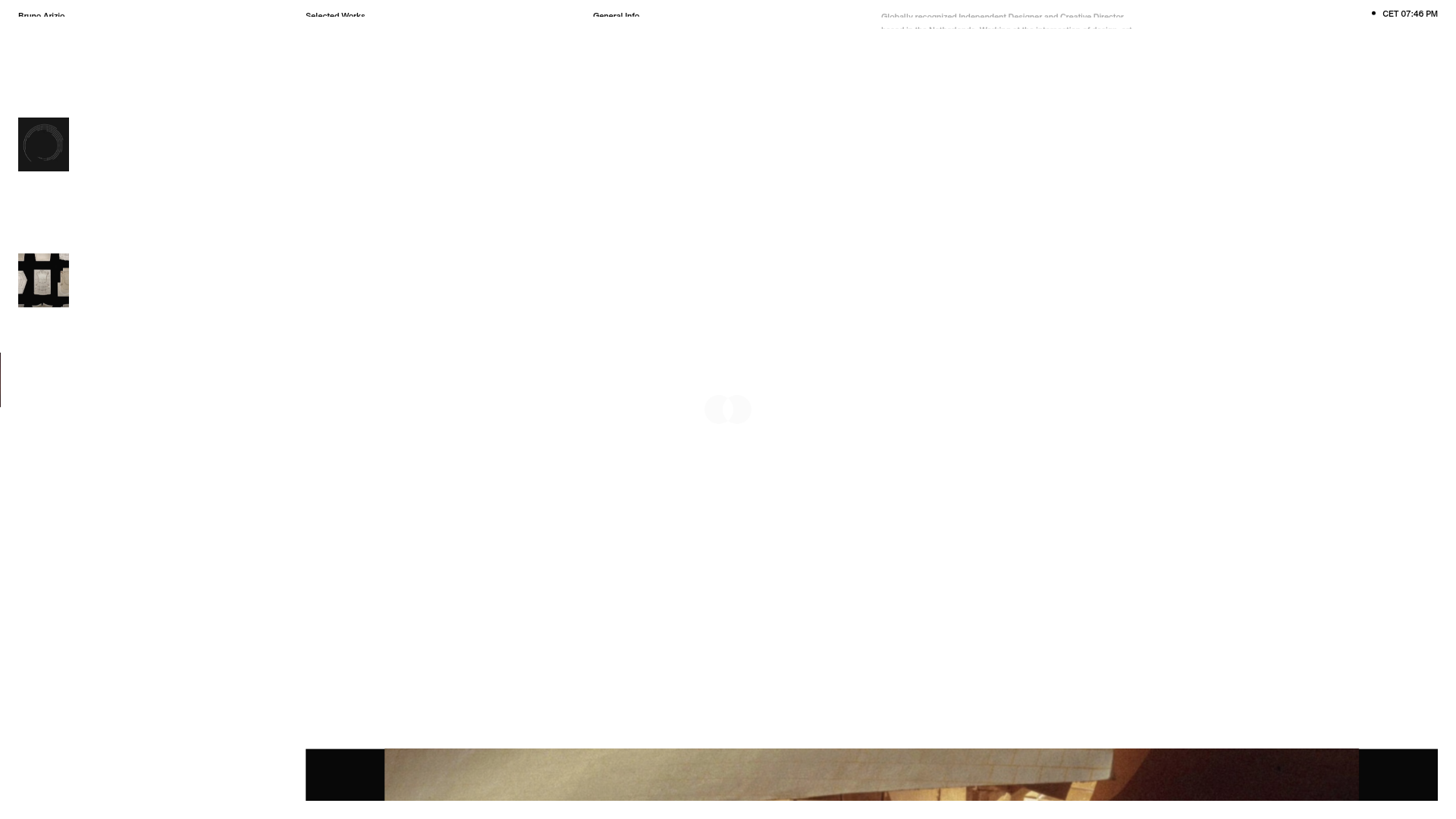
Bruno Arizio Designer Portfolio Website
A minimalist creative director portfolio featuring a clean typographic layout, side-aligned image previews, and high-contrast spacing patterns suitable for luxury or design showcases.
Overview
This website serves as a portfolio for Bruno Arizio, a globally recognized Independent Designer and Creative Director. It is a strong clone reference for its masterclass in minimalist whitespace, utility-first typography, and a unique vertical-sidebar image navigation that prioritizes visual assets without cluttering the viewport.
Design System
- Color Palette & Visual Hierarchy: The site uses a high-contrast monochromatic scheme, primarily deep blacks and stark whites. Visual hierarchy is achieved through extreme negative space, ensuring that even small text elements carry significant weight against the expansive canvas.
- Typography System: A clean, sans-serif typeface is used in a very small font size for labels and navigation (e.g., 'Selected Works', 'General Info'). Larger editorial copy is used for the introductory bio, keeping line heights tight to maintain a structured, block-like appearance.
- Page Structure: The layout follows a non-traditional grid. The header is split into four distinct columns: Name/Brand, primary navigation category, secondary info category, and a detailed bio snippet. The rightmost edge features a live timestamp, grounding the digital experience in real-world time.
- Reusable Components: The most valuable component to clone is the Left-Aligned Media Sidebar. It features small, square thumbnail previews of projects (e.g., the circular graphic and the stone architectural shot) that likely act as triggers for the main content area. The Four-Column Header is also a modular block worth reusing for information-dense landing pages.
- Interaction Patterns: Based on the layout, the central whitespace acts as a stage for large-scale media reveals triggered by the sidebar thumbnails. The design suggests a hover-heavy or scroll-reveal architectural flow where assets enter the frame centrally.
- Responsive Behavior: The four-column header structure is built for easy vertical stacking on mobile devices, ensuring the textual hierarchy remains intact when the width is restricted.
Use Cases
- Who should clone this: Creative directors, luxury architects, and high-end fashion brands looking for an 'anti-interface' aesthetic that feels more like a physical art gallery than a website.
- Remixing for products: Effectively remix this into a product landing page by replacing the project thumbnails with product detail close-ups and using the central stage for high-resolution 3D renders.
- Practical Directions: Adapt the information architecture by converting the 'General Info' column into a 'Contact/CTA' section. The live CET time display can be swapped for operational status or stock indicators for e-commerce contexts.
- Clone Scope: Start with a full-page clone to capture the delicate balance of the grid system, as the layout relies on the precise relationship between the peripheral navigation and the central void.
Related Inspirations
Vita Architecture Portfolio Landing Page
A minimalist, high-end architecture portfolio featuring a custom canvas-based image gallery, split-text animations, and a project slider with dynamic image masks.
Catherine Peacock Designer Portfolio Home
A minimalist portfolio layout featuring a vertically stacked masonry project grid, sticky navigation with animated icons, and offset typography.
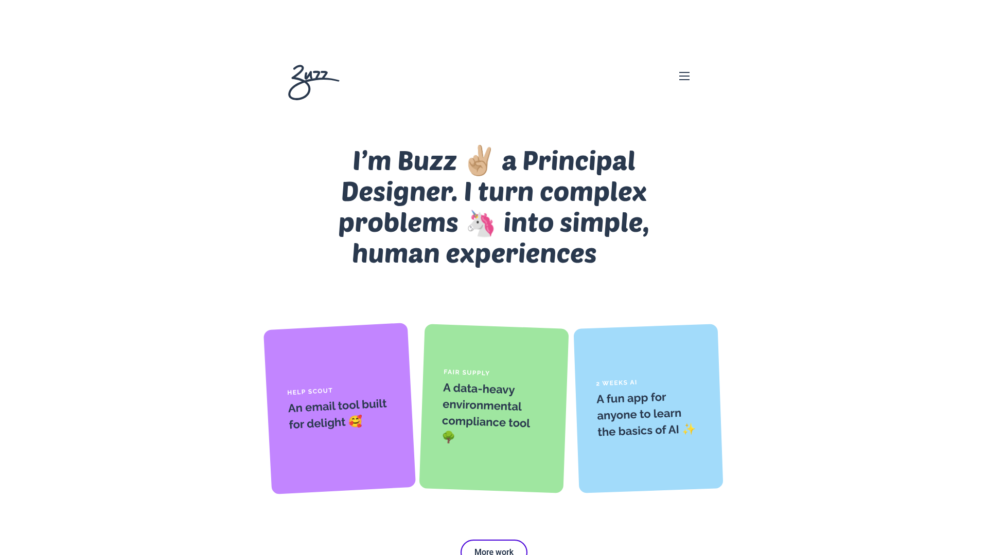
Buzz Usborne Designer Portfolio Landing
A minimalist portfolio layout featuring a large typography-driven hero section with animated emojis and a responsive grid of colorful, card-based project previews.
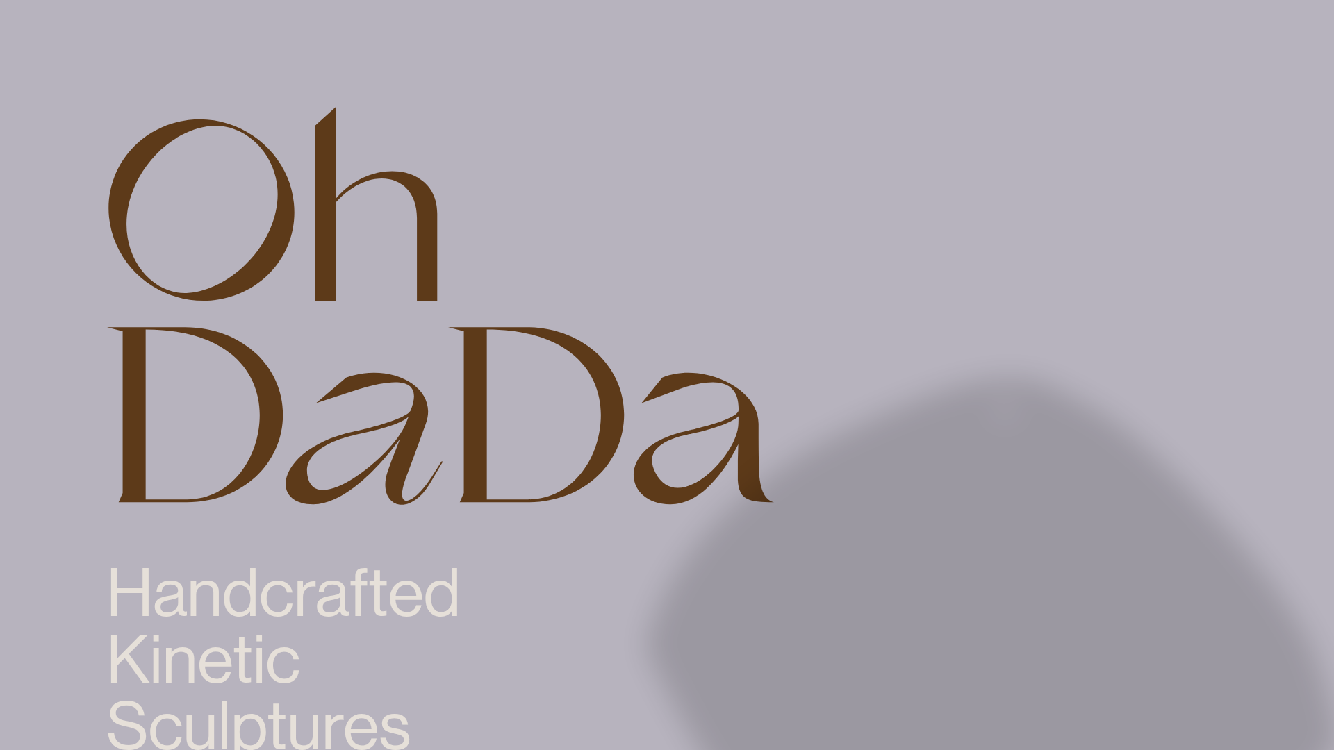
OhDaDa Handcrafted Kinetic Sculpture E-commerce
A minimalist Svelte-based store featuring a horizontal-scroll product showcase, transform-driven image gallery, and a full-screen sliding cart overlay.
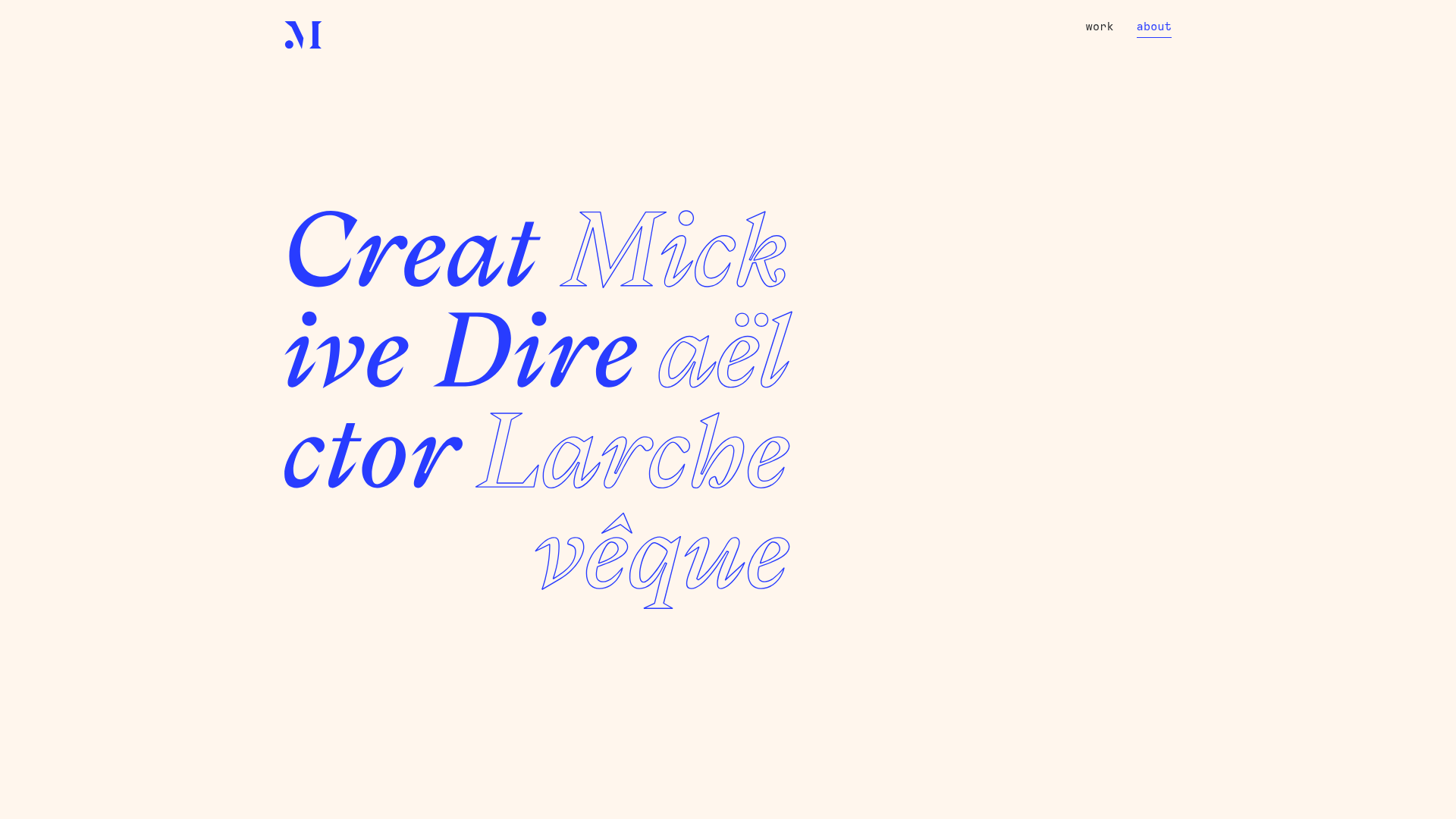
Mick Larchevêque Creative Director Portfolio
A minimalist portfolio featuring a typography-driven hero section with mixed solid and outlined fonts, a text-based project list, and full-screen layout transitions.
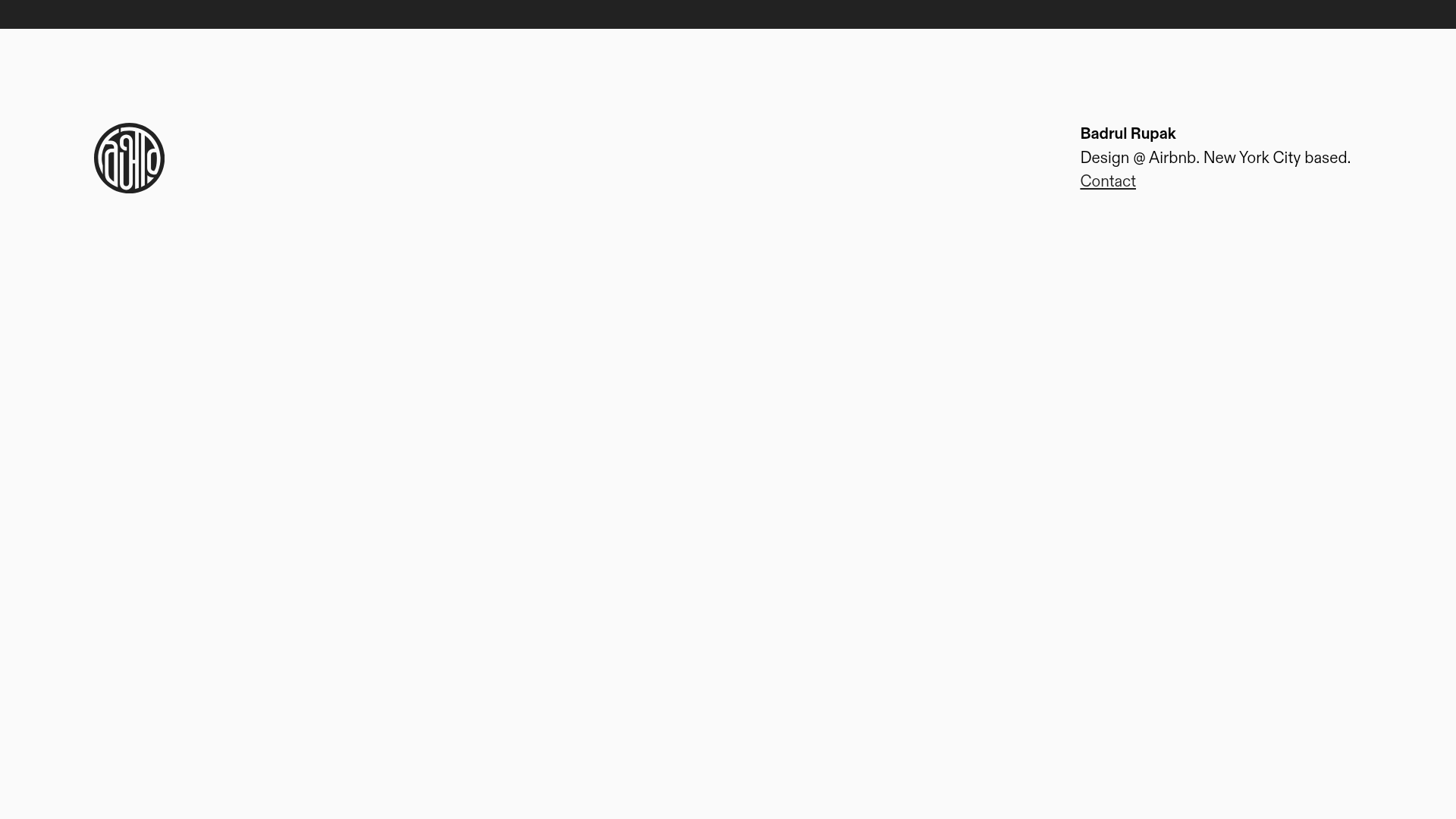
Badrul Rupak Minimal Portfolio Home
A minimalist personal portfolio layout featuring a fixed header with a four-column grid, integrated logo, and simplified typography for a clean professional presence.
