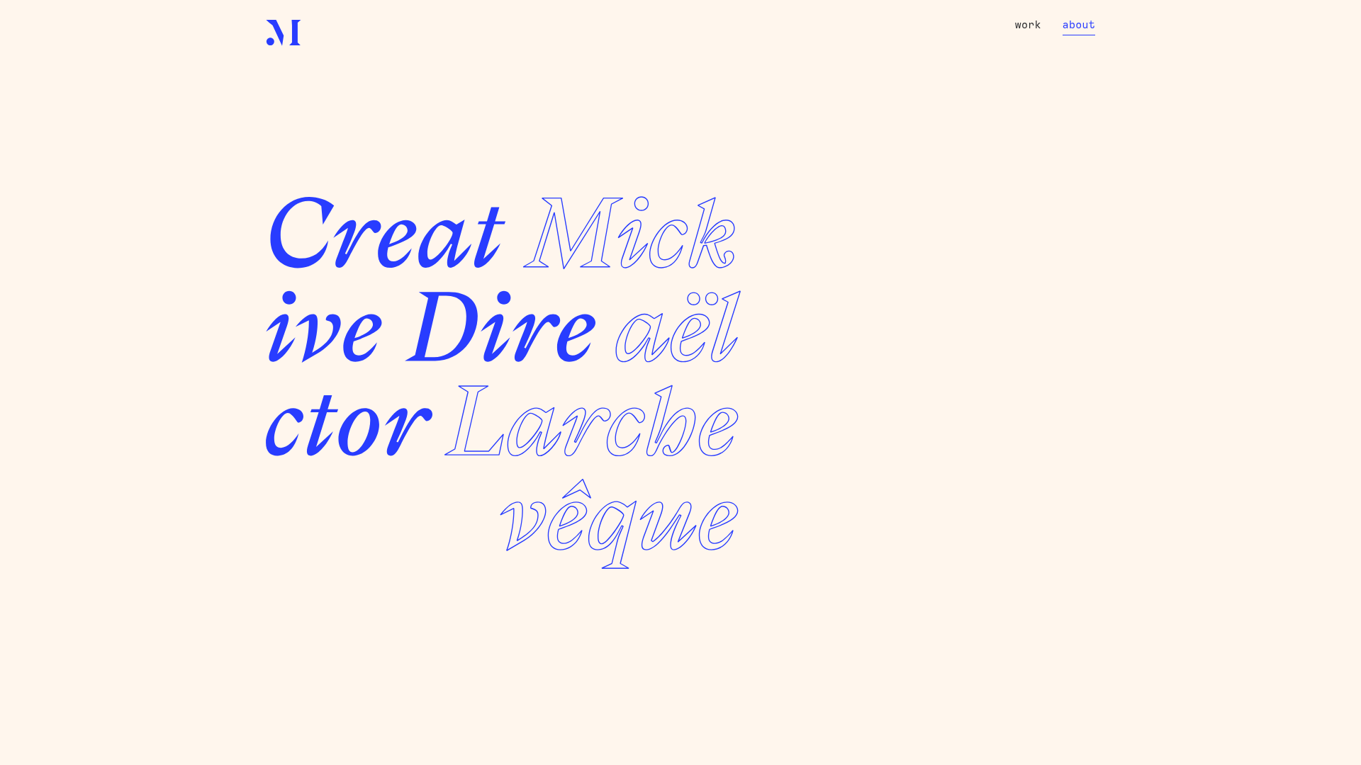
Mick Larchevêque Creative Director Portfolio
A minimalist portfolio featuring a typography-driven hero section with mixed solid and outlined fonts, a text-based project list, and full-screen layout transitions.
Overview
This minimalist portfolio for Creative Director Mick Larchevêque serves as a high-impact example of typography-centric web design. It demonstrates how to use a limited color palette and sophisticated font interplay to create a premium brand identity without relying on heavy imagery. It is an excellent clone reference for designers wanting to master layout white space and elegant full-screen transitions.
Design System
- Color Palette & Visual Hierarchy: The site uses a high-contrast pairing of a vibrant electric blue on a warm, off-white (cream) background. This creates a soft, editorial feel while maintaining high accessibility and visual punch. Hierarchy is established exclusively through font weight, scale, and the contrast between solid and outlined text.
- Typography System: The hero section features a large-scale serif font with extreme character styling. It utilizes two distinct styles: a bold, solid italic for professional titles ("Creative Director") and a delicate outlined italic for personal identifiers. The navigation and body text utilize a small-scale monospaced font, providing a "meta-data" or technical aesthetic that offsets the expressive hero type.
- Page Structure & Flow: The site follows a vertical sequence starting with a full-screen hero cover. As the user scrolls, they encounter a right-aligned introduction paragraph with emoji accents, followed by a full-screen Advanced Portfolio Grid (
apg-text) which lists projects as horizontal typographic links separated by line breaks. - Reusable Components: The most clone-worthy elements are the
semplice-coverhero block and the text-based project list. The minimal navigation bar (simple left-aligned logo and right-aligned text links) is a perfect template for "less-is-more" portfolios. - Interaction & Motion: The design employs a "reveal" logic on scroll, where sections fade in or scale slightly. CSS classes like
revealandtransition-wrapsuggest a smooth, staggered entry for elements. Project links use afade_bothmouseover effect, likely dimming other items to highlight the active selection. - Implementation Clues: Built using the Semplice portfolio framework (as indicated by classes like
semplice-coverandapg-post-text), the site relies on a structured modular container system for easy layout manipulation and responsive scaling.
Use Cases
- Who Should Clone: Visual designers, art directors, and copywriters who want their expertise (rather than just their case study images) to take center stage.
- Effective Remixes: This pattern works exceptionally well for boutique agencies or high-end freelancer landing pages. It can be adapted for a fashion lookbook where typography replaces a traditional image gallery.
- Remix Directions: Swap the electric blue for a neon green or deep burgundy to change the mood while keeping the cream background for an organic feel. Alternatively, replace the serif hero font with a brutalist sans-serif to pivot the aesthetic toward a more modern-tech vibe.
- Clone Scope: A quick clone of the hero section alone provides a world-class landing page header. A full-page clone is recommended for users wanting a cohesive, sophisticated end-to-end navigational experience.
Related Inspirations

Bruno Arizio Designer Portfolio Website
A minimalist creative director portfolio featuring a clean typographic layout, side-aligned image previews, and high-contrast spacing patterns suitable for luxury or design showcases.
Vita Architecture Portfolio Landing Page
A minimalist, high-end architecture portfolio featuring a custom canvas-based image gallery, split-text animations, and a project slider with dynamic image masks.
Catherine Peacock Designer Portfolio Home
A minimalist portfolio layout featuring a vertically stacked masonry project grid, sticky navigation with animated icons, and offset typography.
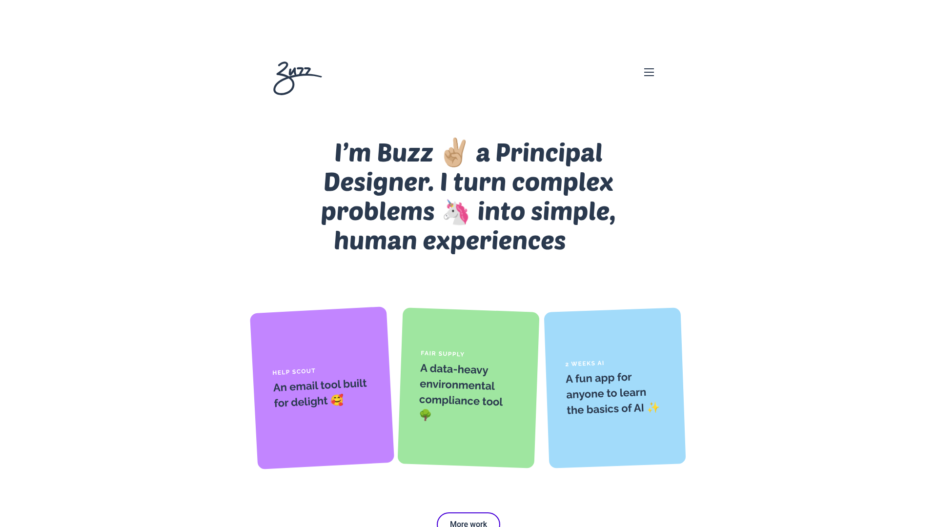
Buzz Usborne Designer Portfolio Landing
A minimalist portfolio layout featuring a large typography-driven hero section with animated emojis and a responsive grid of colorful, card-based project previews.
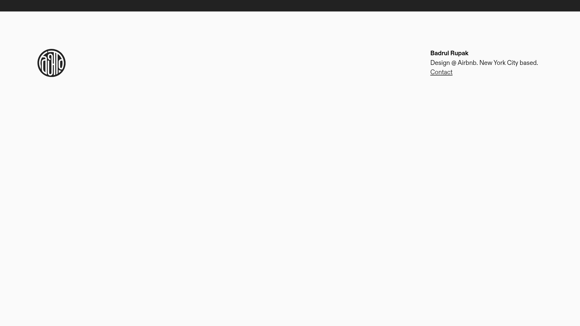
Badrul Rupak Minimal Portfolio Home
A minimalist personal portfolio layout featuring a fixed header with a four-column grid, integrated logo, and simplified typography for a clean professional presence.
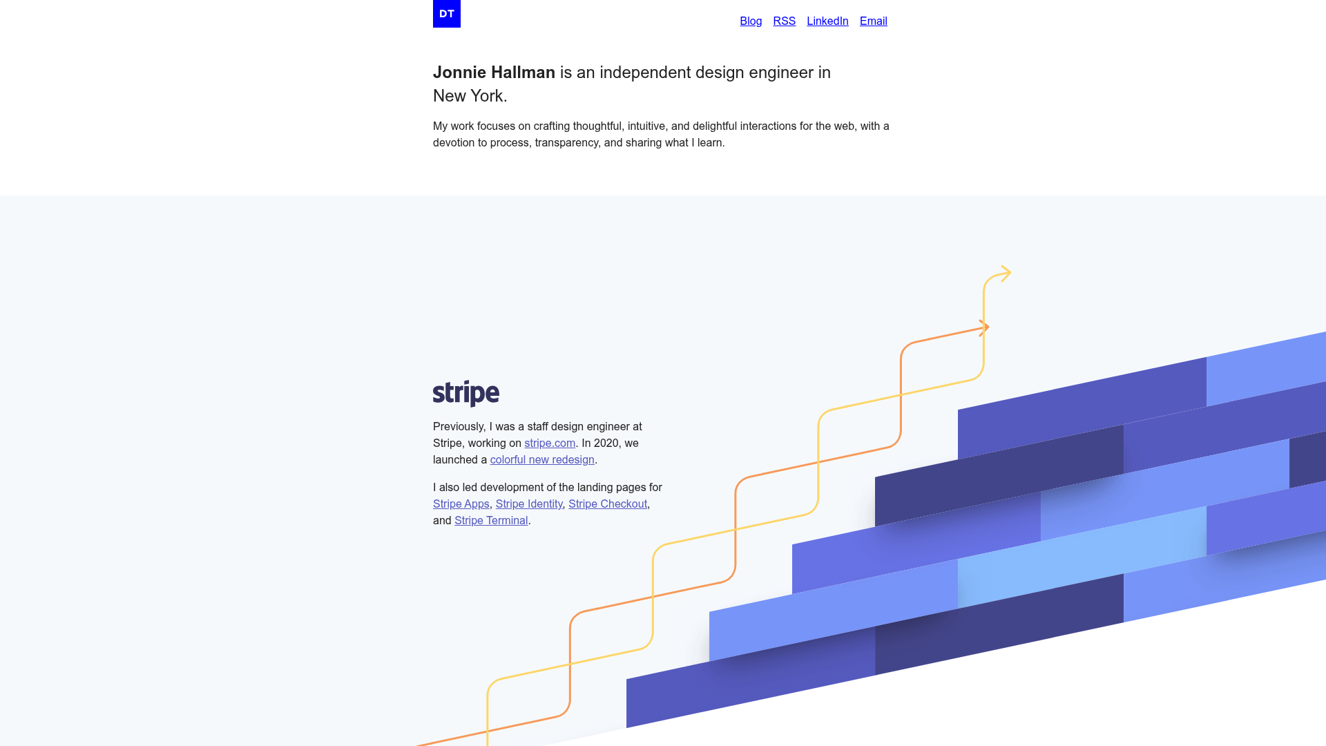
Jonnie Hallman Design Engineer Portfolio
A minimalist portfolio with high-impact scroll effects, including a sticky-stacked hardware component animation, parallax image layers, and unique branded section layouts.
