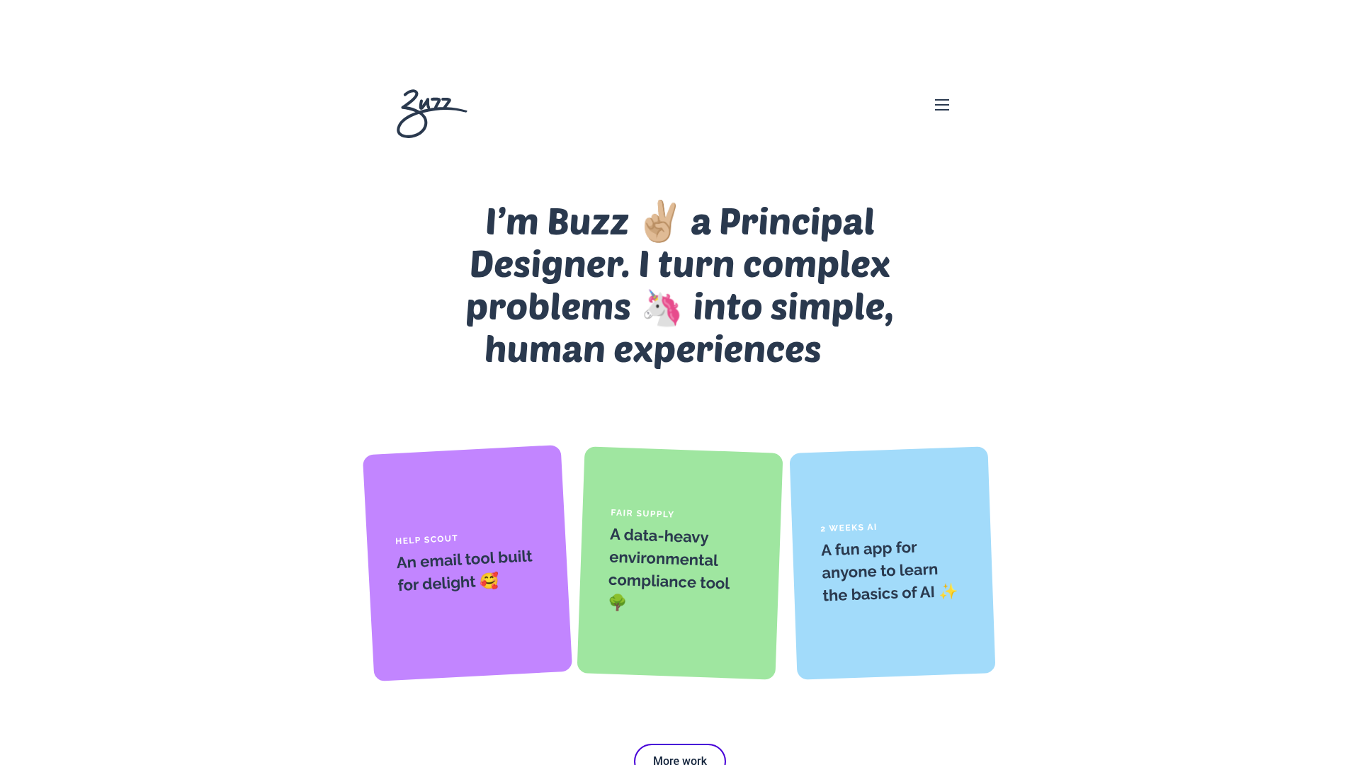
Buzz Usborne Designer Portfolio Landing
A minimalist portfolio layout featuring a large typography-driven hero section with animated emojis and a responsive grid of colorful, card-based project previews.
Overview
This portfolio landing page is a masterclass in minimalist, high-impact design for independent creative professionals. It captures attention through a bold, centered typographic hierarchy that replaces traditional imagery with expressive character and micro-interactions, making it an excellent reference for builders wanting to showcase a high-end personal brand with minimal asset overhead.
Design System
- Color Palette & Visual Hierarchy: The site uses a clean off-white/canvas background to let the content breathe. High-contrast dark slate typography is paired with a soft pastel secondary palette (lavender, mint green, sky blue) used exclusively for project cards to define distinct work categories.
- Typography: The design relies on a bold, rounded sans-serif font (likely a custom brand face) for the headline and card descriptions. The scale is dramatic, using a large font size for the hero statement to create an immediate focal point, while metadata on cards uses small, wide-tracked uppercase text for professional contrast.
- Page Structure: The layout follows a linear, single-column flow: a handwritten-style logo and hamburger menu in the nav, a centered hero statement, a horizontal/grid array of project cards, and a clear call-to-action (CTA) button at the bottom.
- Reusable Components:
- Hero Text Block: A responsive, multi-line typography component.
- Project Cards: Color-coded
<li>cards with rounded corners, internal spacing, and clear title/description hierarchy. - Pill Button: A simple, high-contrast CTA button with rounded edges.
- Interaction & Motion: The HTML reveals
lead-emojispans with transform data, indicating that emojis are likely animated (scaling/rotating) to add "delight." The cards feature a subtle rotation/tilt effect, creating a tactile, physical card feel. - Implementation Clues: The structure uses semantic HTML (
<figure>,<ul>,<li>) with utility-like classes (card purple,lrg,space-up-m), suggesting a custom CSS framework focused on flexible spacing and component-based styling.
Use Cases
- Who should clone this: Independent designers, copywriters, or developers who want a low-maintenance but high-personality site that doesn't require high-resolution photography.
- Effective Remixes: Software agencies could adapt this by swapping the emoji for custom icons and expanding the card grid for a larger team portfolio. It also works well for a "link-in-bio" replacement page.
- Remix Directions: Swap the rounded font for a sharp serif to transition from "friendly/human" to "luxury/editorial." Builders can also reuse the card component for a pricing section or a resource library.
- Suggested Scope: This is ideal for a full-page clone. The layout's strength is its cohesive simplicity; cloning just the hero or just the cards would lose the intentional balance of the minimalist aesthetic.
Related Inspirations
Bruno Arizio Designer Portfolio Website
A minimalist creative director portfolio featuring a clean typographic layout, side-aligned image previews, and high-contrast spacing patterns suitable for luxury or design showcases.
Vita Architecture Portfolio Landing Page
A minimalist, high-end architecture portfolio featuring a custom canvas-based image gallery, split-text animations, and a project slider with dynamic image masks.
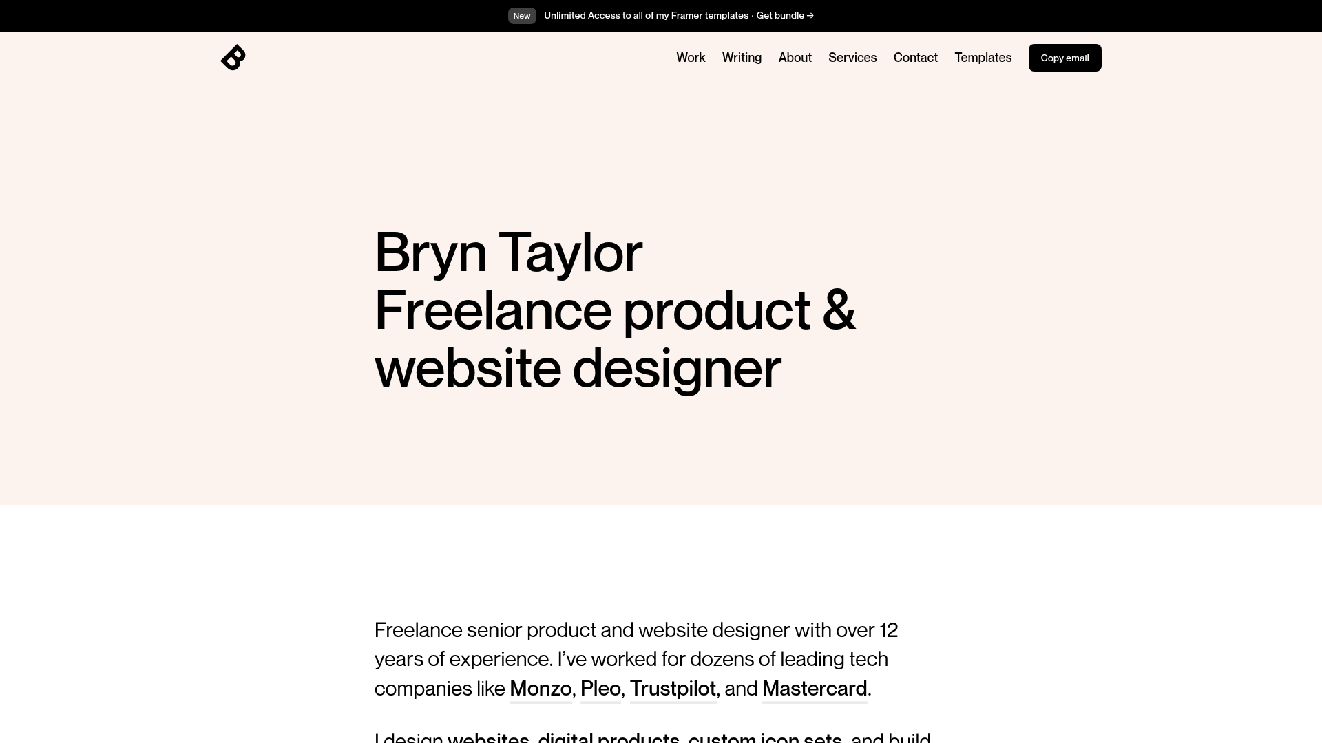
Bryn Taylor Portfolio Landing Page
A minimalist, typography-focused designer portfolio featuring a clean hero section, sticky navigation bar, and dark-mode 'Copy email' button.
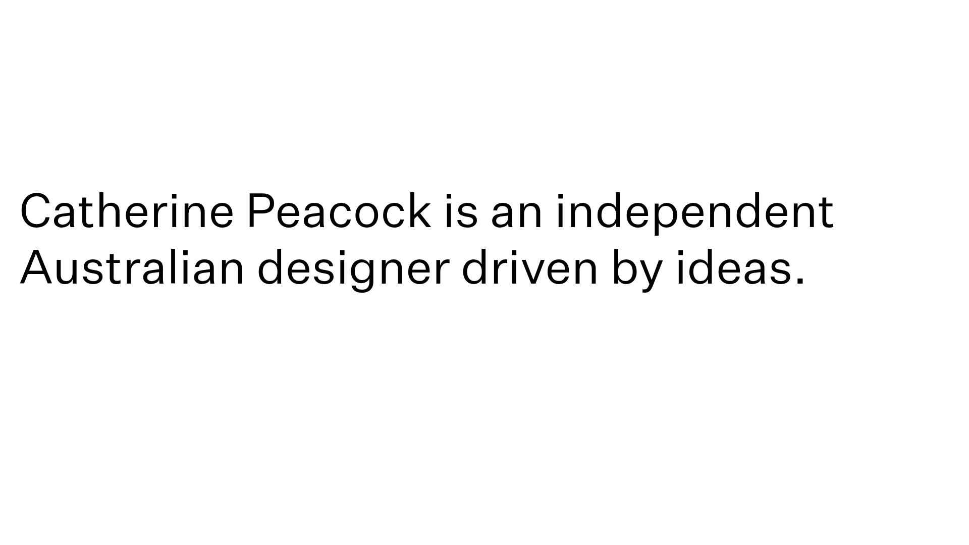
Catherine Peacock Designer Portfolio Home
A minimalist portfolio layout featuring a vertically stacked masonry project grid, sticky navigation with animated icons, and offset typography.
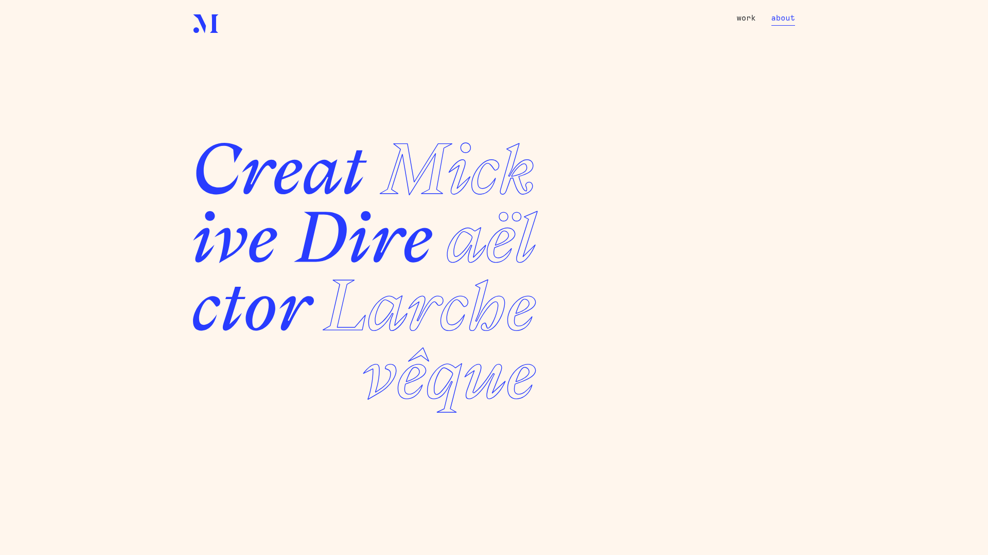
Mick Larchevêque Creative Director Portfolio
A minimalist portfolio featuring a typography-driven hero section with mixed solid and outlined fonts, a text-based project list, and full-screen layout transitions.
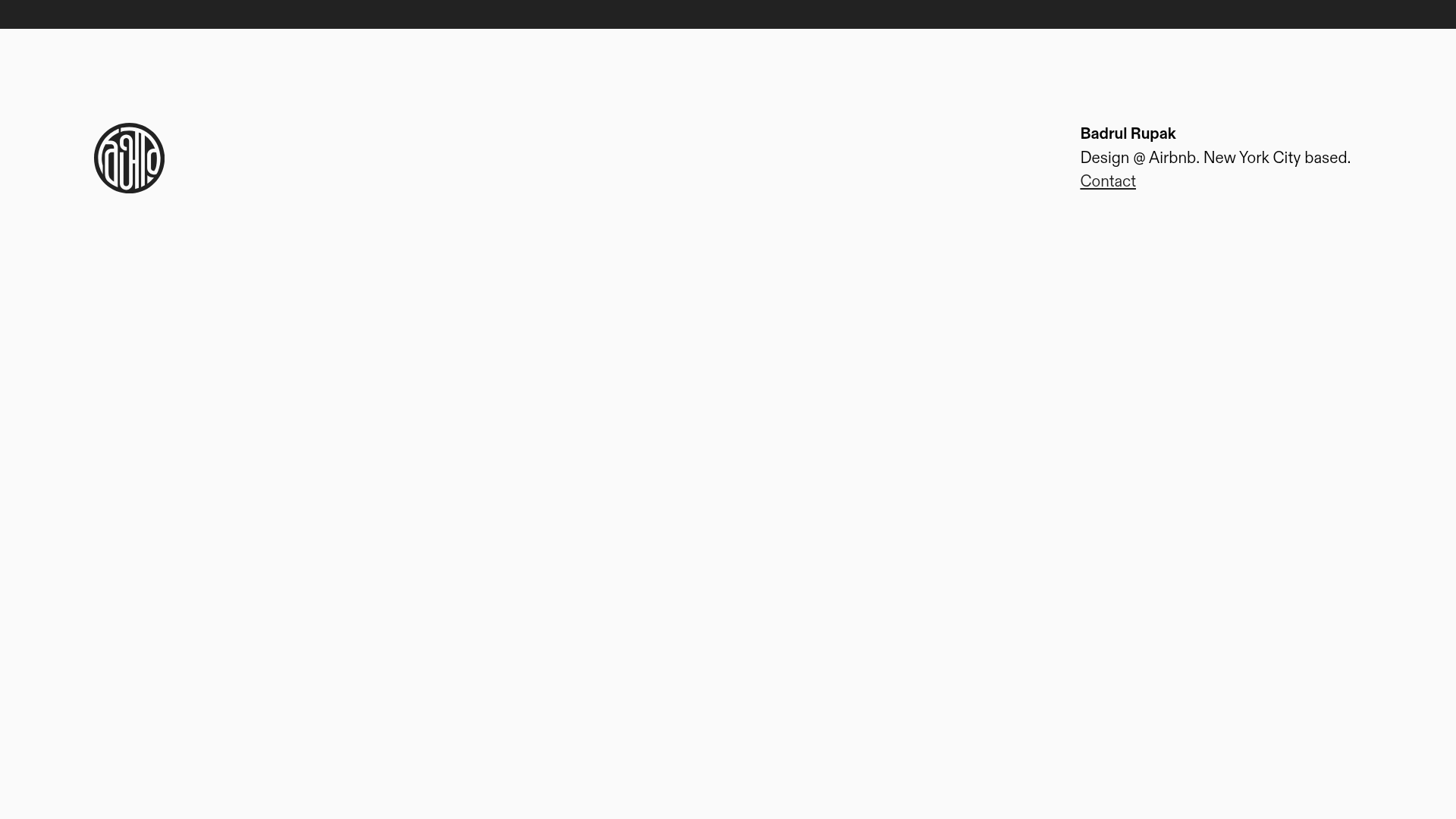
Badrul Rupak Minimal Portfolio Home
A minimalist personal portfolio layout featuring a fixed header with a four-column grid, integrated logo, and simplified typography for a clean professional presence.
