Vita Architecture Portfolio Landing Page
A minimalist, high-end architecture portfolio featuring a custom canvas-based image gallery, split-text animations, and a project slider with dynamic image masks.

Overview
Vita Architecture is a high-end, minimalist architectural portfolio that leverages immersive typography and a dynamic image-shuffling gallery. Built as a luxury landing page, it is a masterclass in using white space and layout to project brand authority, making it an excellent reference for high-ticket service providers and creative studios.
Design System
- Color Palette & Visual Hierarchy: The site uses a neutral, near-white base (
#fafafa) with sharp black typography. Visual hierarchy is driven by massive scale contrasts, where colossal serif headings dominate the screen, punctuated by floating, variable-sized imagery. - Typography System: A sophisticated serif font is used for primary headings (
.heading2), often broken into character-level spans (.split-letter) for animation. Secondary text and navigational links use a clean, uppercase sans-serif to create a modern, professional contrast. - Page Structure & Flow:
- Hero Section: Centered navigation and logo overlaying a high-performance canvas element.
- Tagline Section: A typographic intro text interspersed with positioned image thumbnails (
.home-tagline-image-wrapper). - Project Showcase: A centralized slider where project titles, descriptions, and locations transition in sync with a central large image and peripheral supporting thumbnails.
- Stats Section: A grid-based list (
.home-facts-list) containing numeric counters and animated separators. - Journal Section: A horizontal layout with large split-text titles and a scrolling photo gallery.
- Reusable Components: The
image-wrapper-slidesystem is a standout, allowing for a masked, multi-image transition within a single container. The.arrownavigation buttons are minimalist, text-based triggers that maintain the clean aesthetic. - Interaction & Motion Patterns: The website utilizes several high-end animation triggers including
scaleIn,splitIn(character-level reveal), andimageIn. The HTML indicates a scroll-driven animation architecture (data-scroll-animation) that allows elements to react as they enter the viewport. - Implementation Clues: The site is built using the Nuxt framework (as seen in
#_nuxt), utilizing Canvas for heavy visual rendering and custom scroll wrappers for smooth performance and transition timing.
Use Cases
- Who Should Clone This: Luxury real estate agents, architects, high-end interior designers, and boutique digital agencies looking for a "gallery first" presentation.
- Effective Remixes: This layout works exceptionally well for editorial storytelling; a fashion brand could remix the project slider into a seasonal lookbook with dynamic image masks.
- Practical Directions: Builders should focus on cloning the project slider's logic, where a single interaction updates four distinct content areas (image grid, title, description, and location) simultaneously. The typography scale can be adapted by swapping the serif font for a bold grotesk for a more tech-oriented portfolio.
- Suggested Scope: A full-page clone is best for those wanting to replicate the high-end feel of a custom-coded experience. Alternatively, the Typography + Image-in-Line component (
.home-tagline) is a perfect quick-clone for enhancing standard "About Us" sections.
Related Inspirations

Bruno Arizio Designer Portfolio Website
A minimalist creative director portfolio featuring a clean typographic layout, side-aligned image previews, and high-contrast spacing patterns suitable for luxury or design showcases.

Christopher Doyle Agency Portfolio Layout
A minimalist, typography-led portfolio featuring a wide-margin grid system, smooth fade-in animations, and simple image-focused project cards.
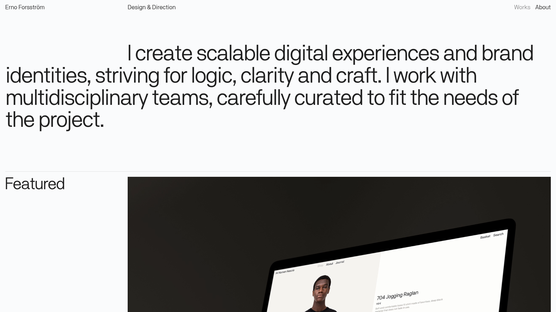
Erno Works Minimalist Design Portfolio
A clean, typography-focused portfolio featuring a sticky grid layout, large editorial headers, and integrated video project thumbnails for dynamic case study previews.

Catherine Peacock Designer Portfolio Home
A minimalist portfolio layout featuring a vertically stacked masonry project grid, sticky navigation with animated icons, and offset typography.
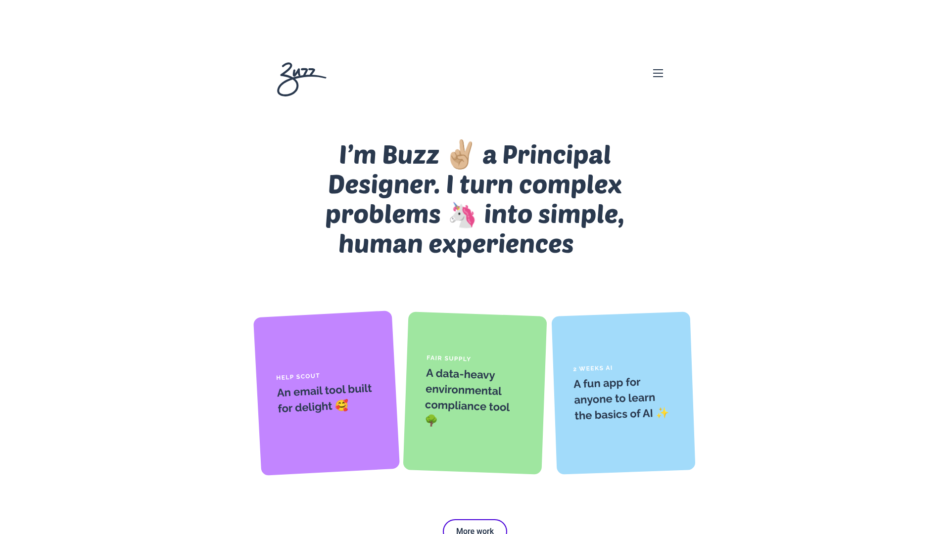
Buzz Usborne Designer Portfolio Landing
A minimalist portfolio layout featuring a large typography-driven hero section with animated emojis and a responsive grid of colorful, card-based project previews.
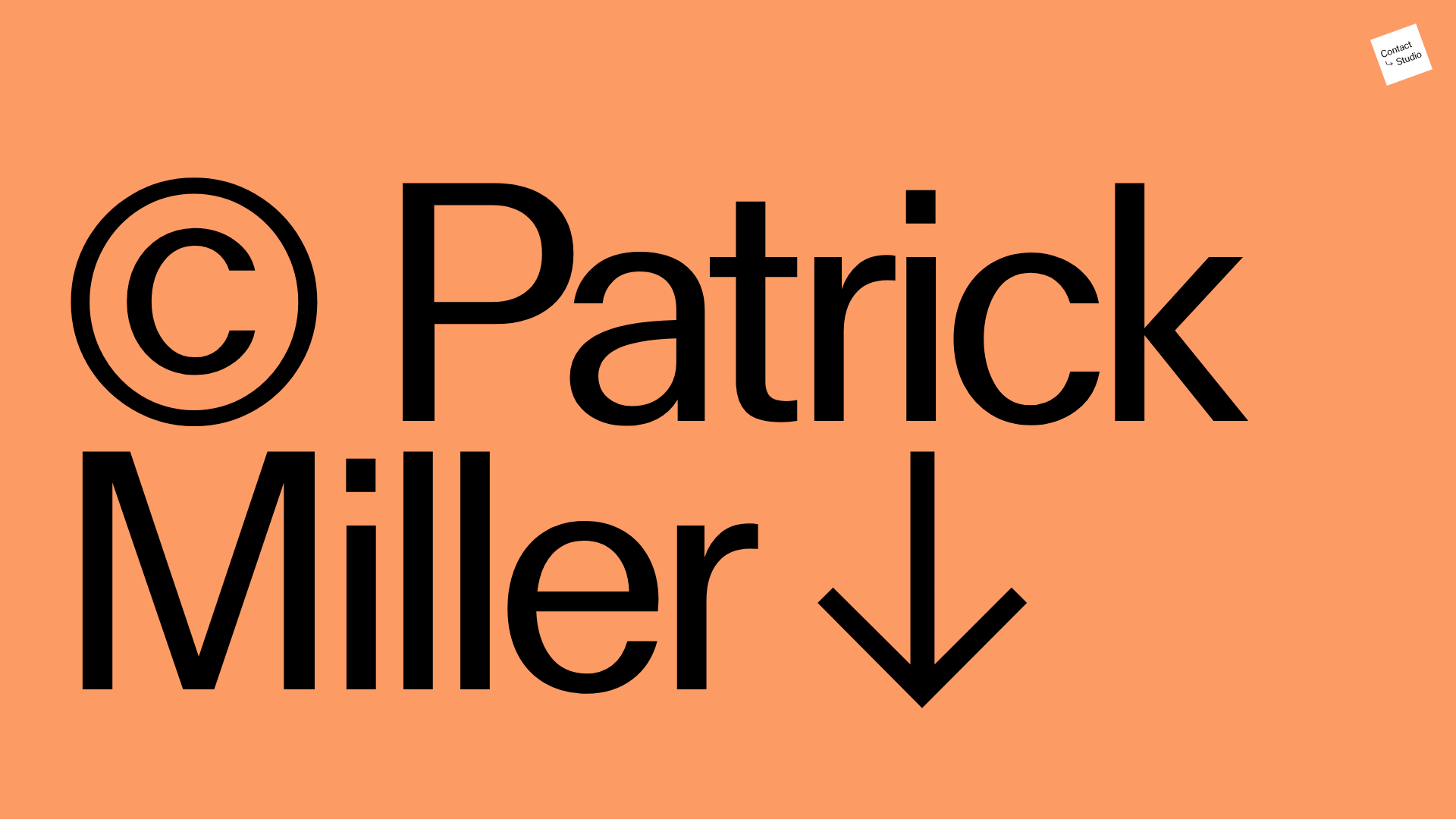
Patrick Miller Photography Portfolio Template
A minimalist, full-bleed photography portfolio featuring a split-screen grid, scroll-triggered section transitions, and integrated Swiper.js image carousels for project galleries.
