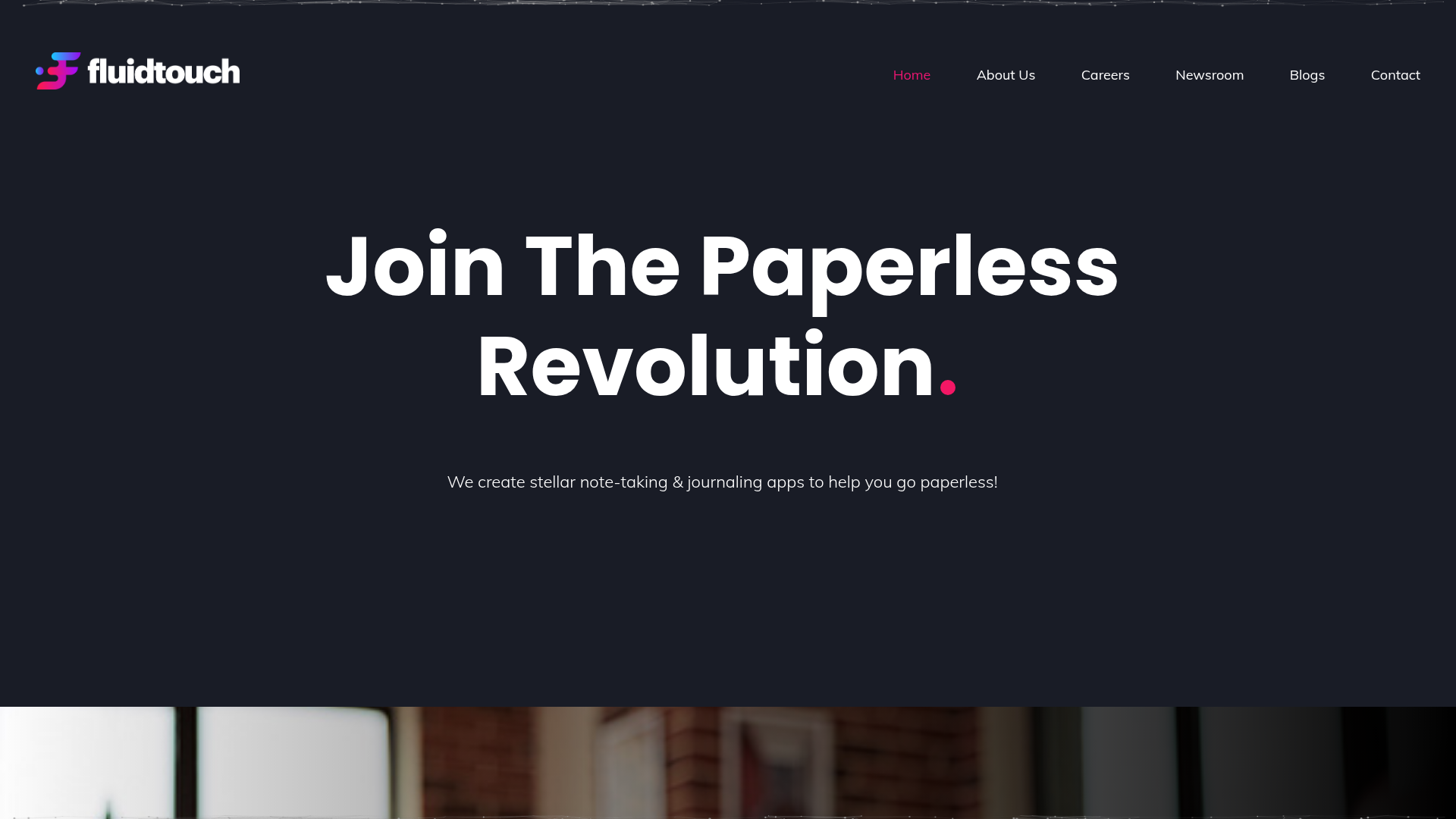
Fluid Touch Software Landing Page
A dark-themed product portfolio featuring a particle hero background, animated counter statistics, award badge carousel, and a featured media/news grid.
Overview
This website is a dark-themed corporate landing page for Fluid Touch, a software development company. It serves as an excellent clone reference because it successfully balances a high-end "tech" aesthetic using particle backgrounds with clean, conversion-focused product sections and social proof elements.
Design System
- Color Palette & Visual Hierarchy: The site utilizes a deep navy/charcoal background (
#13161croughly) to create a premium feel. High contrast is achieved through white primary text and bold accent colors: a vibrant pink/magenta for secondary emphasis (e.g., the period in the hero text) and subtle gradients for cards. - Typography: The system uses a clean, geometric sans-serif (resembling Montserrat or similar). Headings use a large scale with tight tracking and a thick font weight for impact, while body text uses a generous line height for readability against the dark background.
- Page Structure:
- Hero Header: A full-height section with
particles.jsand vertically centered text. - Corporate Intro: An "About Us" section using a side-by-side layout (text vs. abstract background).
- Social Proof: An infinite auto-scrolling logo carousel of awards and recognitions.
- Product Showcase: A triple-column grid featuring large application icons and "Discover More" buttons.
- Data Visualization: A full-width counter section displaying milestone statistics.
- Media/News: A masonry-style grid for external articles and press mentions.
- Hero Header: A full-height section with
- Reusable Components:
- The Hero Particle Container: The
#particles-jswrapper for an interactive background. - Product Cards:
service-colblocks with central icon alignment and specific hover states. - Article Cards:
blog_postlayouts that manage image-to-text ratios for external links. - Glassmorphism Buttons:
qb-buttonclasses with specific padding and weight for clear CTAs.
- The Hero Particle Container: The
- Interaction & Motion: The site heavily uses the
wow.jslibrary for scroll-triggered animations (fadeInUp, fadeInRight). There is a visible meteor-like animation in the background of the product section and a slider implementation viaslick-carouselfor awards. - Implementation Clues: The HTML reveals a dependency on Bootstrap-style grid systems (
col-lg-4,row), Slick Slider for carousels, andWOW.jsfor entrance animations.
Use Cases
- Who should clone this pattern: Software agencies, app developers, or SaaS companies looking to showcase an existing portfolio of digital products while maintaining a corporate identity.
- Remix Directions:
- Corporate to Creative: Swap the dark charcoal for a deep purple or navy to pivot towards a creative agency vibe.
- Portfolio Adaptation: Re-use the statistical counter section and the "In Media" grid for a personal brand or influencer site.
- Functional Tweaks: Replace the award carousel with client logos or tech stack icons for a B2B service focus.
- Suggested Clone Scope: A full-page clone is ideal for those needing a complete landing page structure, but the "Product Showcase" (
product-section) and "Milestone Counters" (counter-section) are the most effective individual modules to reuse in existing projects.
Related Inspirations
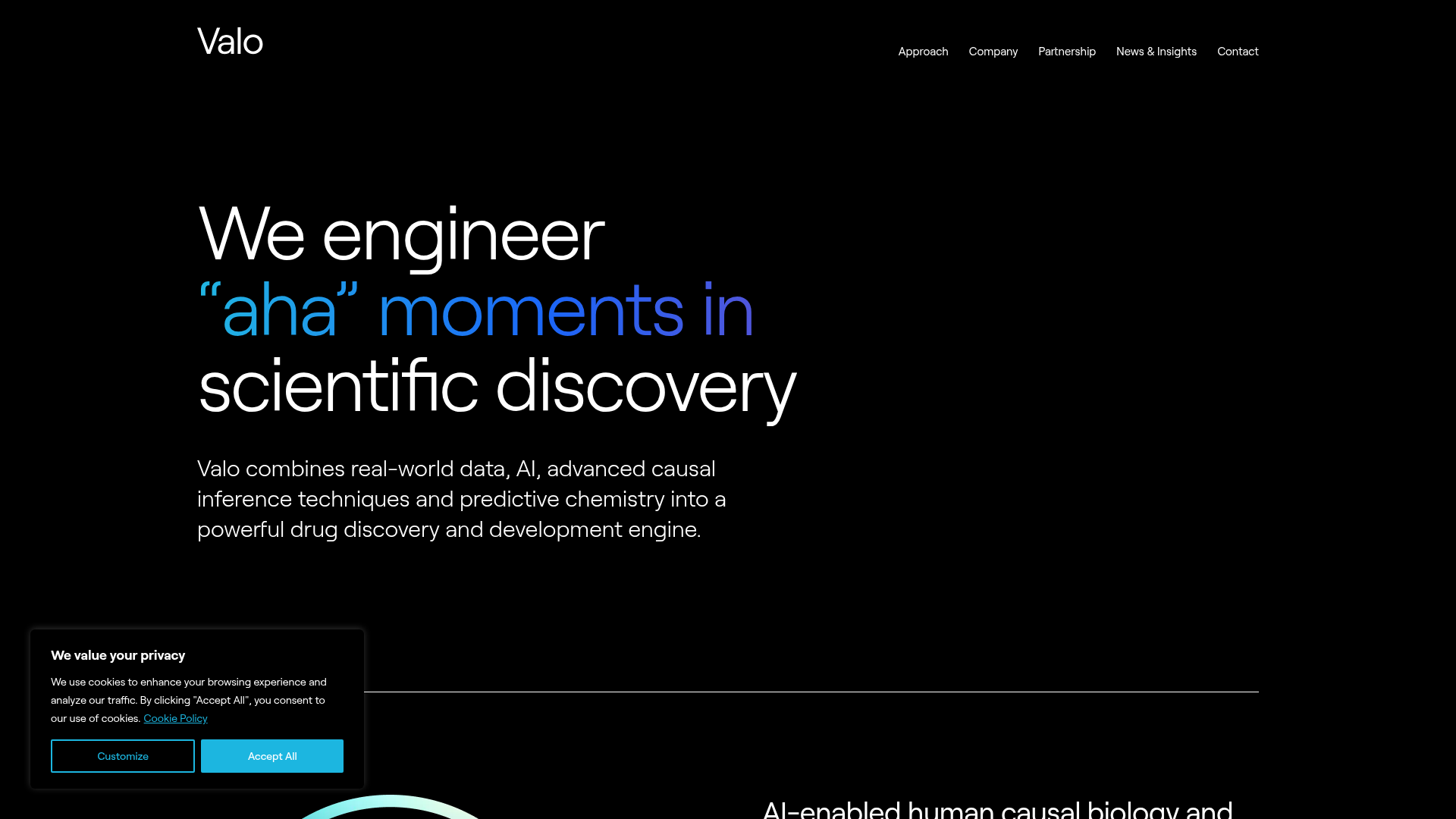
Valo Health AI Biotech Landing Page
A dark-themed high-tech landing page featuring an animated gradient text hero, modular content sections with glassmorphism effects, and distinct typography scales for bold storytelling.
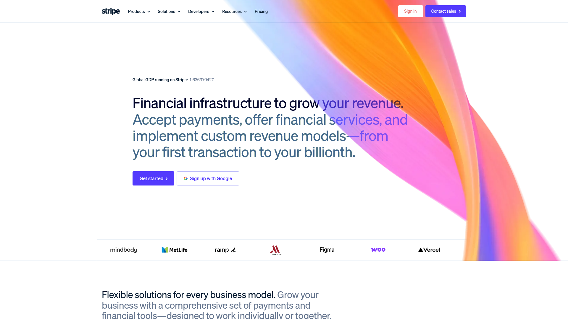
Stripe Modern SaaS Landing Page
A high-conversion landing page featuring a complex mesh-gradient hero, sticky navigation, and a horizontal logo wall for brand social proof.

GoCardless Payments Platform Landing Page
A dark-themed fintech landing page featuring a split-screen video hero, bento-style feature cards, a horizontal logo slider, and step-by-step accordion guides.
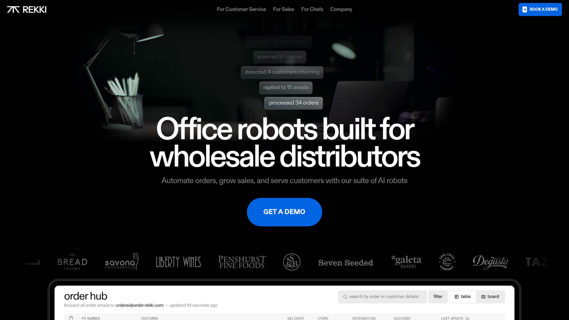
REKKI AI Automation SaaS Landing Page
A high-impact dark-mode landing page featuring a floating label hero section, marquee brand logos, an interactive dashboard UI preview, and card-based testimonial grids.
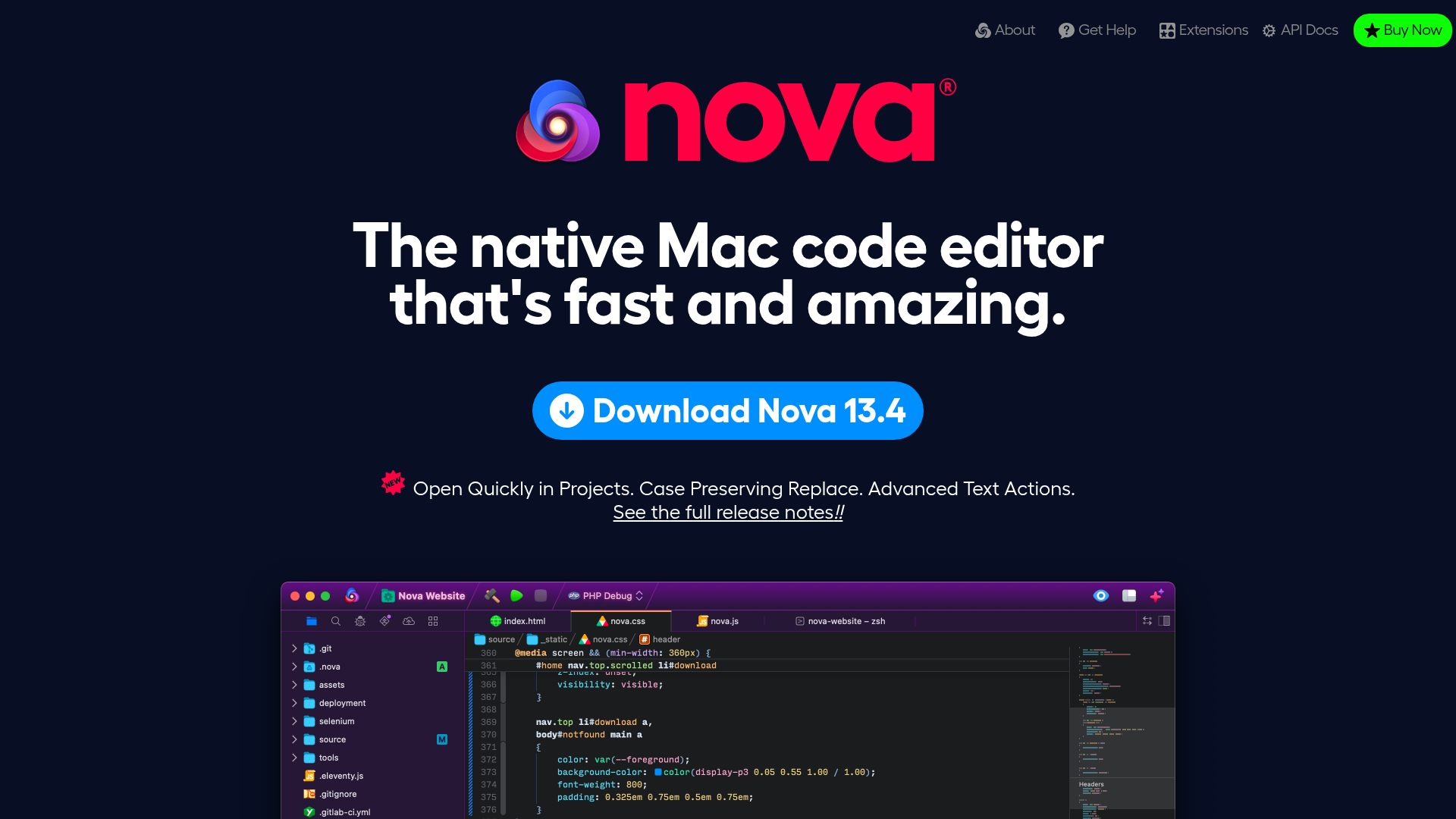
Nova Code Editor Product Landing Page
Dark-themed landing page featuring a starfield background, a flexible feature grid, interactive tabbed preference menus, and stylized product screenshot showcases with hoverable hotspots.
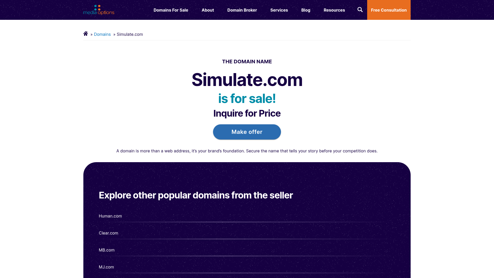
Domain For Sale Landing Page
A clean, centered landing page layout featuring a hero section for asset sales, a prominent CTA button, and a list-based showcase of related items.
