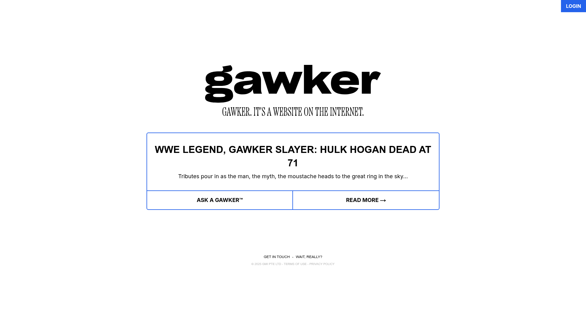
Gawker Minimalist News Landing Page
A clean, centered layout featuring a bold SVG logo, high-contrast typography, and a distinct bordered call-to-action card with a split-grid button design.
Overview
This is a high-impact, minimalist landing page for Gawker, designed with a focus on editorial irony and bold visual hierarchy. It is an excellent clone reference for sites that need to deliver a single, potent message or news headline with a striking, brutalist-lite aesthetic.
Design System
- Color Palette & Visual Hierarchy: The design uses a high-contrast white background with black primary text and vibrant blue (
#2563eb) accents. The blue is used strategically for borders and primary call-to-action buttons to draw the eye immediately to the center interactive card. - Typography System: The system pairs a heavy, customized serif logo with a classic serif subtitle ("Gawker. It's a website on the internet."). Headlines and buttons utilize a bold, all-caps sans-serif typeface to create a sense of urgency and modernity.
- Page Structure: The layout follows a strictly centered vertical flow: a fixed 'Login' button in the top right, a oversized centered brand logo, a centered mission statement, a focal feature card with a split-button footer, and a minimal text-based footer.
- Reusable Components:
- Feature Card: A rounded-corner container with a blue border and a split-grid footer featuring two equal-width action buttons.
- Utility Button: A simple blue rectangular button with white uppercase text.
- Split-Grid Footer: A functional pattern where the bottom of a container is divided into two distinct touch targets separated by a shared border.
- Responsive/Mobile Behavior: The implementation uses Tailwind CSS utility classes like
max-w-sm sm:max-w-xlfor the logo andflex-col sm:flex-rowadaptations. The headline text size shifts fromtext-xlon mobile totext-3xlon desktop to maintain readability. - Implementation Clues: The HTML confirms a modern stack using Tailwind CSS for layout and spacing. The structure heavily favors
flex-colcentering to ensure the content remains anchored in the viewport regardless of device size.
Use Cases
- Who should clone this: Editorial sites, satirical blogs, personal landing pages, or product waitlists that want a "loud but simple" entry point.
- Effective Remixes: This pattern can be adapted for link-in-bio pages by replacing the center headline section with a vertical list of grid buttons, or for event announcements where the headline is the date/time.
- Practical Directions: To remix, swap the blue border and accent color for a brand-specific primary hue. Change the serif subtitle to a monochromatic sans-serif to shift from a media/newspaper vibe to a tech/SaaS aesthetic.
- Clone Scope: The entire page is a manageable single-component clone. The high-value portion is the responsive central feature card with the integrated split-button footer.
Related Inspirations
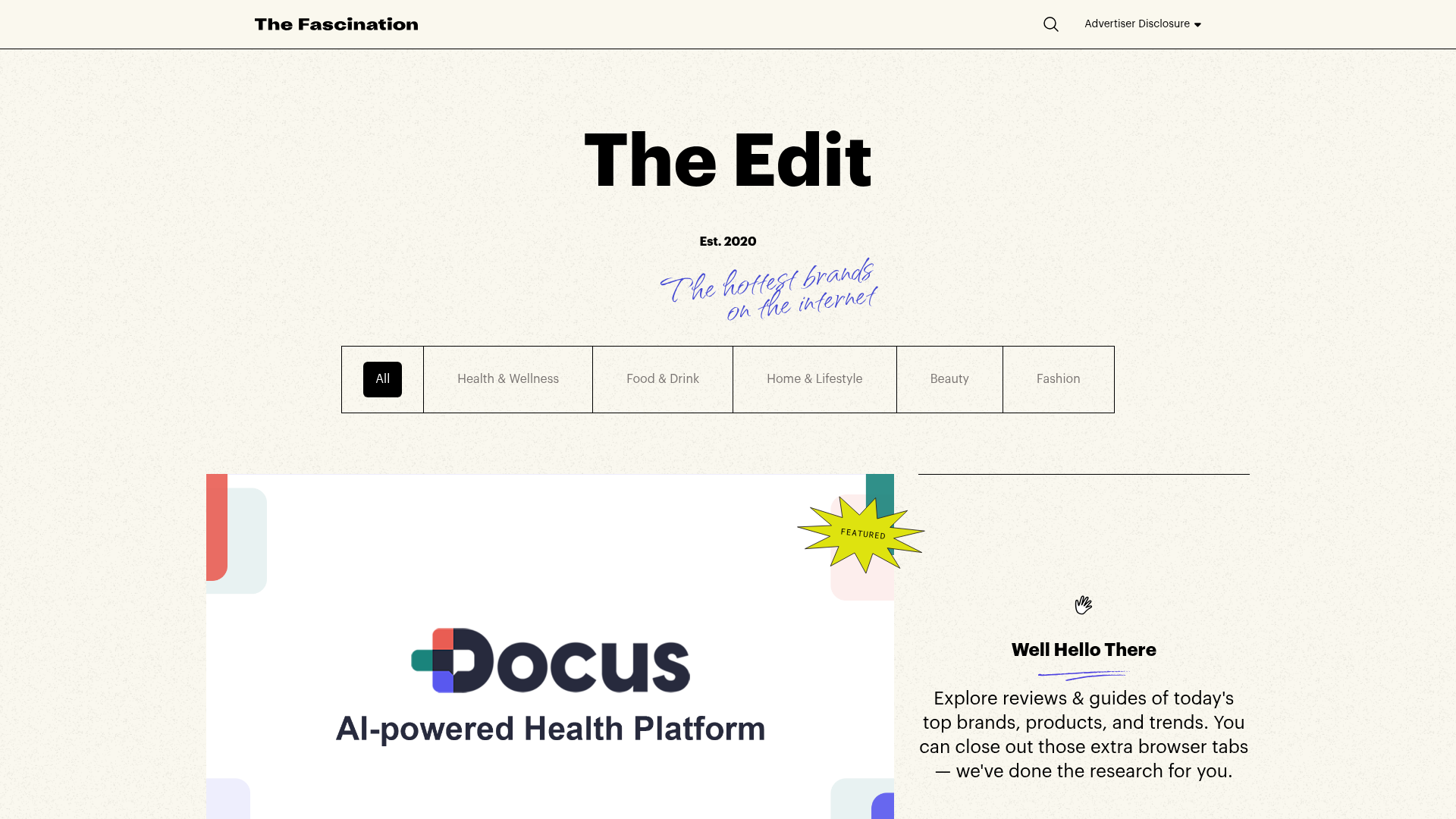
The Fascination Editorial Product Hub
A refined content marketplace layout featuring a minimalist bento-style grid, custom category filters, and modern hovering card interactions for brand reviews.
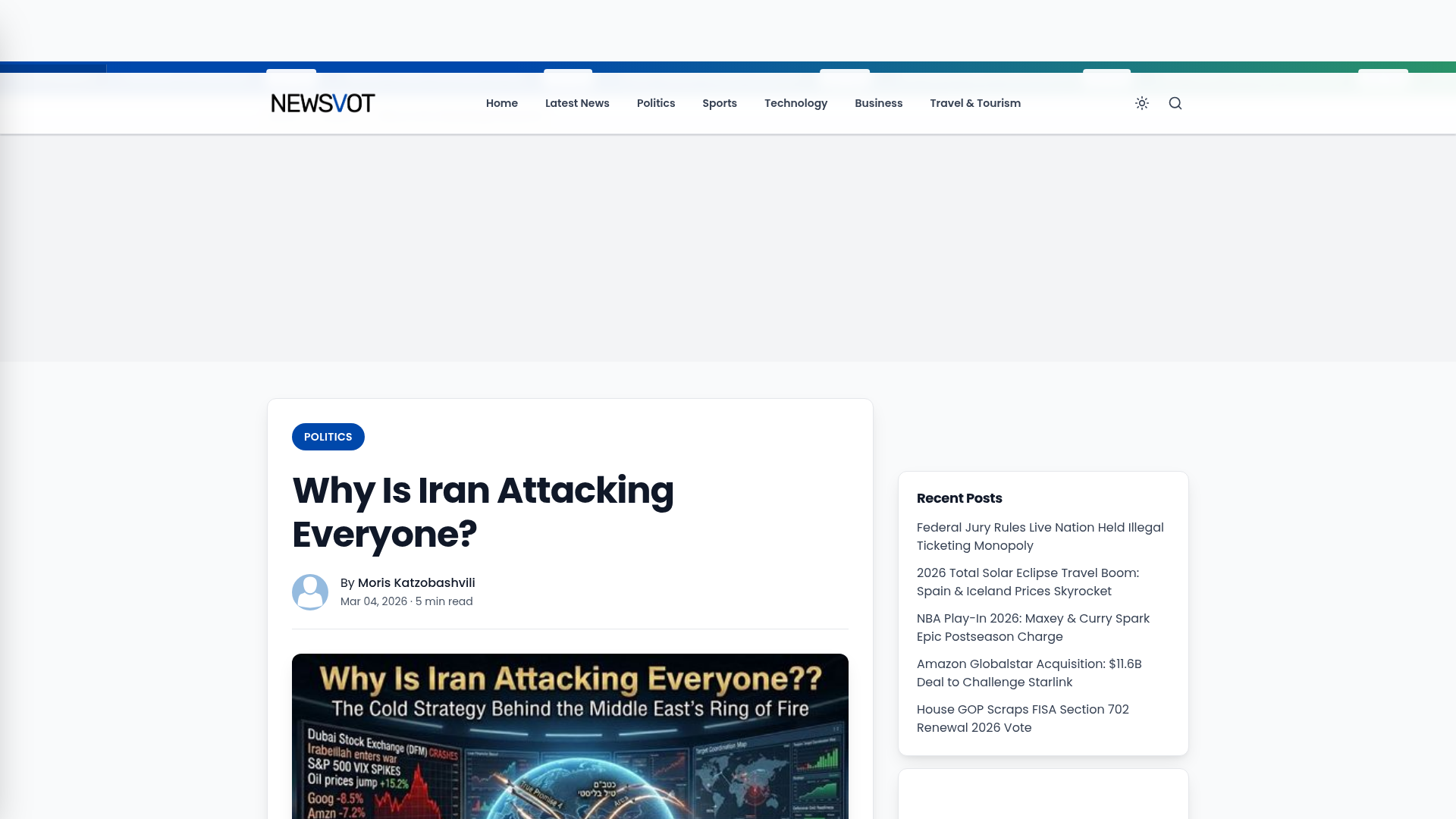
Newsvot Article View Template
A clean news article layout featuring a custom AI audio player, a live Polymarket ticker, an emoji reaction bar, and a sidebar for recent posts.
Schemas of Uncertainty Monogram Grid
A brutalist multi-column layout for text-heavy content featuring high-contrast typography, minimalist navigation, and a rhythmic vertical grid of essays.
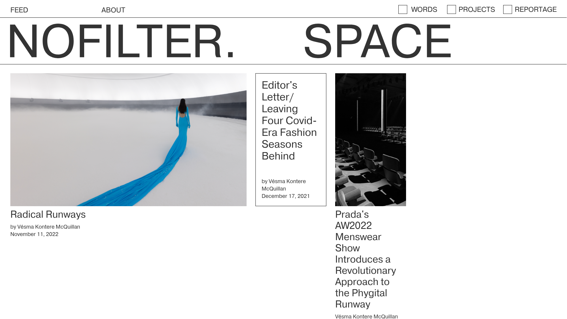
Nofilter.space Minimal Magazine Hub
A brutalist editorial layout featuring an asymmetrical multi-column grid, dynamic image placeholders, and a minimalist typography-focused navigation menu.
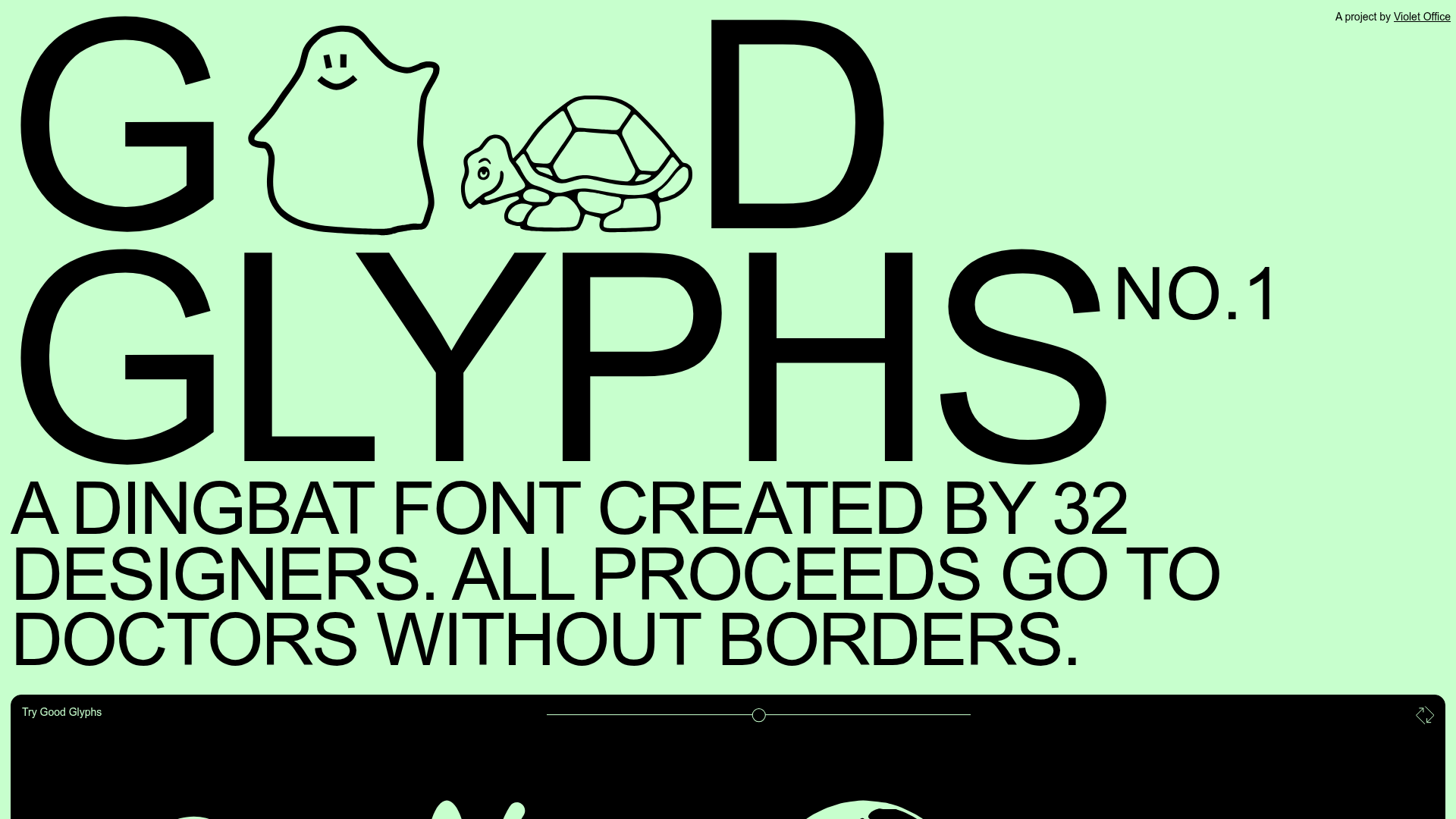
Good Glyphs Font Showcase Landing Page
A single-page layout featuring an interactive type tester, donation form with custom amount logic, and a contributor gallery using swiper-based glyph previews.

Context Gallery High-End Furniture Landing Page
A minimal editorial layout featuring a multi-column product carousel, designer biographies with image-text pairings, and a magazine-style content grid for curated design stories.
