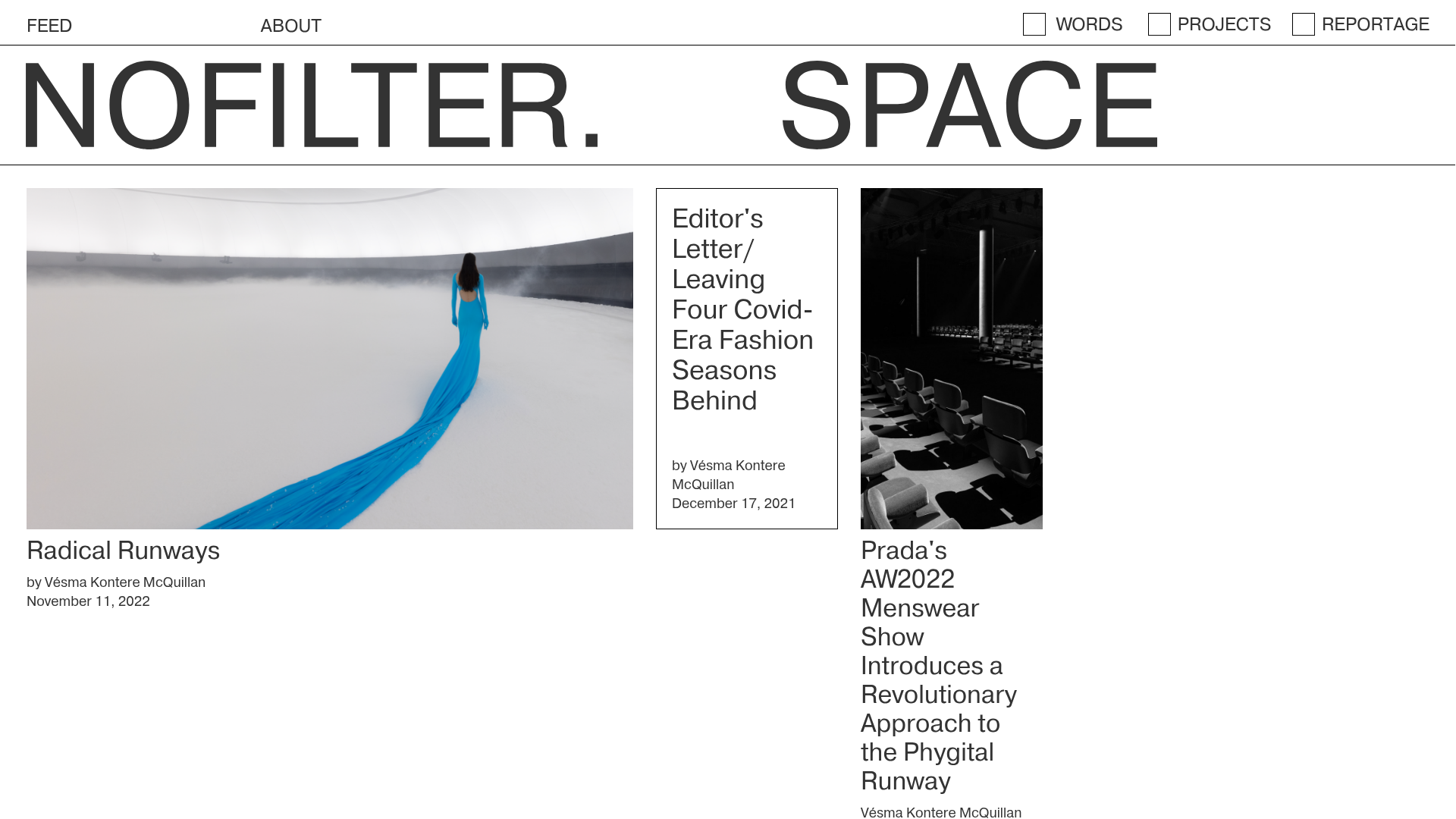
Nofilter.space Minimal Magazine Hub
A brutalist editorial layout featuring an asymmetrical multi-column grid, dynamic image placeholders, and a minimalist typography-focused navigation menu.
Overview
Nofilter.space is a brutalist editorial platform that utilizes a sophisticated, non-linear grid to showcase fashion and architectural research. Its strength as a clone reference lies in its ability to handle dense content mixtures—text-only essays, hero-style image features, and portrait reporting—without losing a cohesive, avant-garde aesthetic.
Design System
- Color Palette & Visual Hierarchy: A high-contrast monochromatic scheme of deep charcoal (#333) and pure white (#FFF). Primary hierarchy is established through extreme size differences rather than color, with a massive "NOFILTER. SPACE" header serving as the page's anchor points.
- Typography System: Primarily uses clean, Swiss-style sans-serifs (likely Helvetica or Inter derivatives). Titles use large, tight-tracking headers, while metadata (author, date) uses small, uniform scale for a technical, objective feel. Academic text cards feature distinct boxed borders to separate from image-heavy cards.
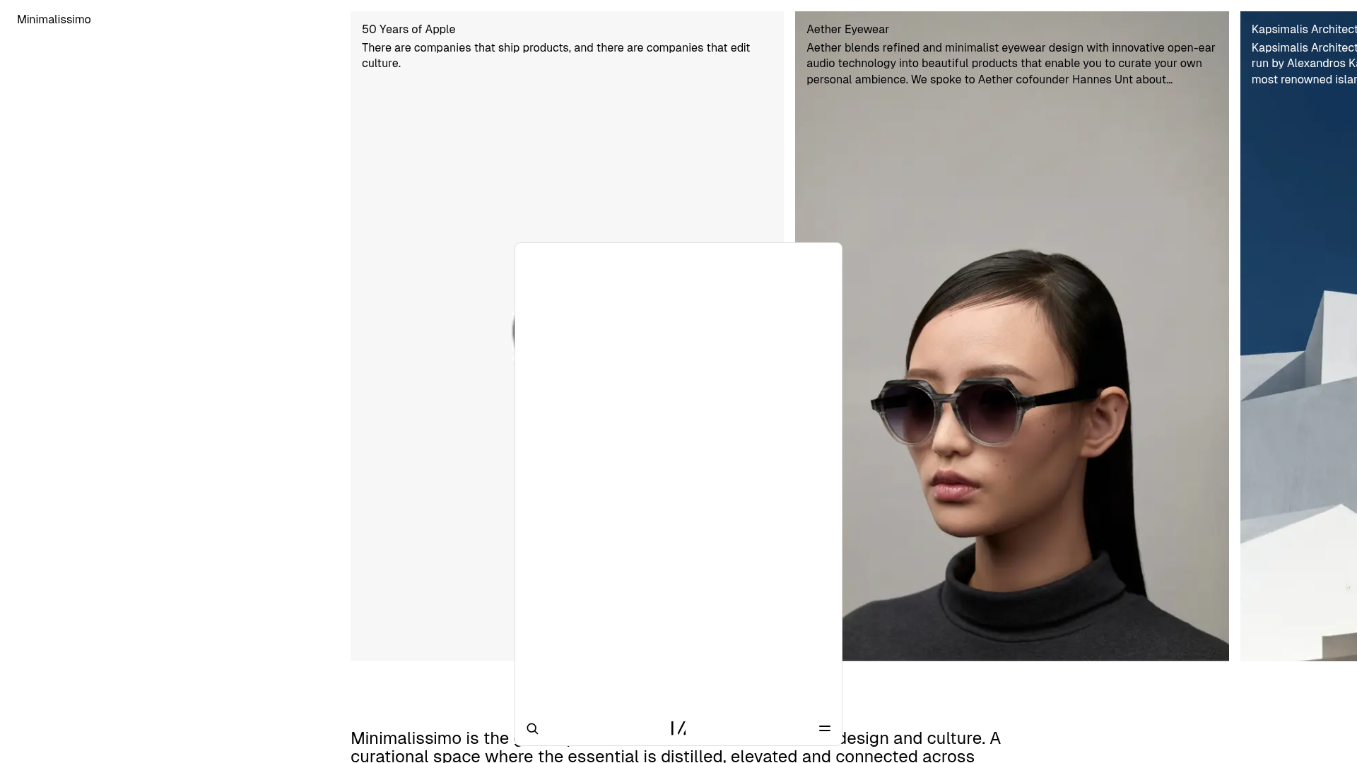
- Page Structure & Section Flow: The layout follows an asymmetrical multi-column flow. Large featured image blocks (
.div-block-18) occupy substantial width on the left, while vertical text boxes and portrait images occupy narrower columns on the right. This alternates vertically to create a rhythmic, magazine-like scrolling experience. - Reusable Components:
- The Hero Nav: Extremely minimalist top bar with wide spacing between 'Feed' and categories.
- Article Cards: Three specific types—Wide Image (Visual-first), Boxed Text (Theory/Academic), and Portrait Slender (Reportage).
- Checkbox Categories: Simple, functional navigation filters (Words, Projects, Reportage) using browser-default aesthetics consistent with brutalist design.
- Interaction & Motion: Based on the HTML, the site uses Webflow’s animation engine (
data-w-id) for subtle hover states on thumbnails and a standard transition for the mobile burger menu. - Implementation Clues: Built with Webflow, utilizing a
w-dyn-liststructure for CMS-driven content. The layout relies ondiv-blockwrappers with specific flex or grid settings to maintain the staggered column effect.
Use Cases
- Who should clone this: Independent publishers, design research labs, architecture firms, and high-fashion editorial teams seeking a "raw" or "unfinished" digital aesthetic.
- Effective Remixes: It is a perfect template for a portfolio where projects have varying amounts of visual assets—the asymmetrical grid prevents empty space from looking accidental.
- Remix Directions: Swap the monochrome for a highlighter-neon accent to lean into vaporwave trends, or tighten the grid gaps to create a more standard news-site feel. The typography can be easily swapped for a high-contrast serif (like Garamond) to move from "Brutalist" to "Luxury Editorial."
- Clone Scope: Beginners should clone the asymmetrical 3-column article row (
section-1) for individual sections. Advanced builders should clone the full CMS-driven page to understand the complex spatial relationships between differing content types.
Related Inspirations
The Fascination Editorial Product Hub
A refined content marketplace layout featuring a minimalist bento-style grid, custom category filters, and modern hovering card interactions for brand reviews.
Newsvot Article View Template
A clean news article layout featuring a custom AI audio player, a live Polymarket ticker, an emoji reaction bar, and a sidebar for recent posts.
Gawker Minimalist News Landing Page
A clean, centered layout featuring a bold SVG logo, high-contrast typography, and a distinct bordered call-to-action card with a split-grid button design.
Minimalissimo Design Gallery and Portfolio
A clean magazine-style layout featuring horizontal scroll sections for featured portraits, an balanced article grid, and a bottom-anchored floating navigation bar with integrated search.

Context Gallery High-End Furniture Landing Page
A minimal editorial layout featuring a multi-column product carousel, designer biographies with image-text pairings, and a magazine-style content grid for curated design stories.

Glein Minimalistic Bento Grid eCommerce
A clean, modular layout using a bento-style responsive grid of text teasers and large-scale product imagery for lookbooks and collection browsing.
