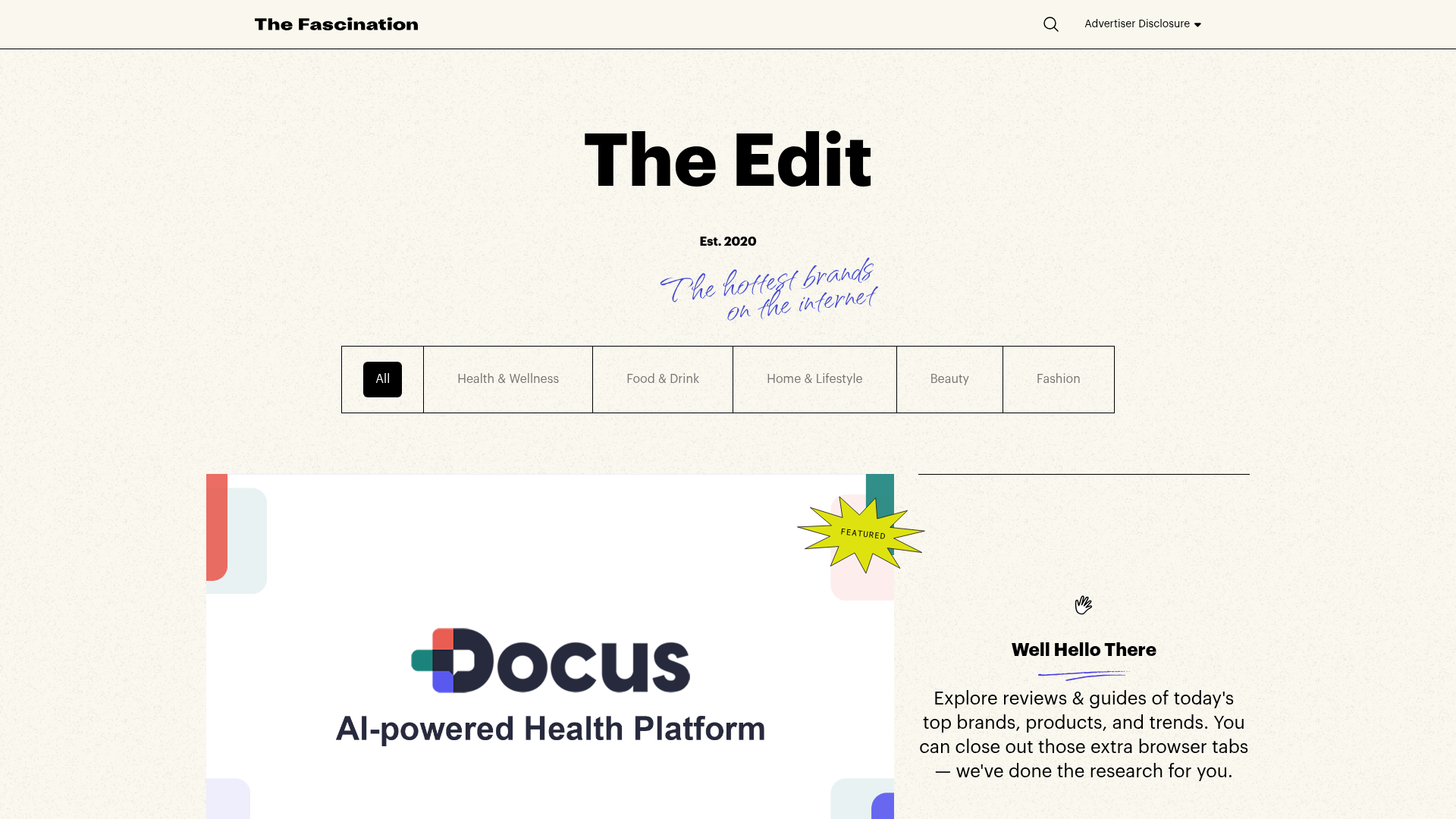
The Fascination Editorial Product Hub
A refined content marketplace layout featuring a minimalist bento-style grid, custom category filters, and modern hovering card interactions for brand reviews.
Overview
The Fascination Editorial Product Hub is a clean, sophisticated content marketplace that bridges the gap between digital magazines and product review sites. It serves as a high-conversion reference for builders needing an organized, category-heavy layout that maintains an premium lifestyle aesthetic through thoughtful typography and minimal grid lines.
Design System
- Color Palette & Visual Hierarchy: The system uses a high-contrast foundation of pure black (#000000) borders and text against a soft, textured off-white background (#f9f7f0). Accent colors like a deep periwinkle (#454ad3) are used sparingly for decorative cursive text, while a secondary bento palette of muted red, teal, and yellow appearing in the footer and hover states providing periodic pops of color.
- Typography: A bold, sans-serif headline font (Extra Bold) defines the "The Edit" branding, contrasted with a decorative, handwritten cursive script for secondary slogans. Body copy uses a functional, medium-weight sans-serif with generous leading to maintain readability across dense review grids.
- Page Structure: The layout follows a classic editorial flow: a minimalist header with a search icon and advertiser disclosure, a central hero area with brand taglines, a sticky horizontal category filter (All, Health, Food, etc.), and a bento-style post grid that alternates between 2/3 and 1/3 column widths.
- Reusable Components:
- The Category Filter: A segmented horizontal bar with shared borders and distinct active/inactive states.
- The Hover-Shadow Card: Blog cards feature a unique interaction where hovering displays a solid color background offset (translate-x-2, translate-y-2) behind the image.
- The Footer Stack: A modular footer using "teleport" targets for responsive column switching and a clean, single-line email signup form.
- Interaction Design: Beyond the offset-shadow image hover, the site features a "background-slide" text hover effect on titles (
bg-[length:0_130%]tobg-[length:100%_130%]) that creates a subtle underline animation. - Implementation Clues: The site is built using Tailwind CSS utility classes (prefixed with
tw-) and WordPress, utilizing a grid-based system for the editorial layout and responsive groups for mobile stacking.
Use Cases
- Who should clone this: Affiliate marketers, digital publishers, and brand agencies looking for a high-end way to organize a library of long-form articles and product guides.
- Effective Remixes: This pattern works exceptionally well for gift guides, luxury real estate listings, or high-end portfolio sites where the "expert curation" vibe is essential.
- Practical Directions: Builders can remix the bento grid by swapping the rigid black borders for softer shadows or varying the aspect ratios of the images to move from a "printed magazine" feel to a more "modern app" feel. The footer and navigation components are highly modular and can be extracted for standalone use.
- Suggested Clone Scope: Start with a quick section clone of the featured grid and the horizontal category bar. The full-page clone is recommended for high-volume content hubs where category-based navigation is the primary user journey.
Related Inspirations
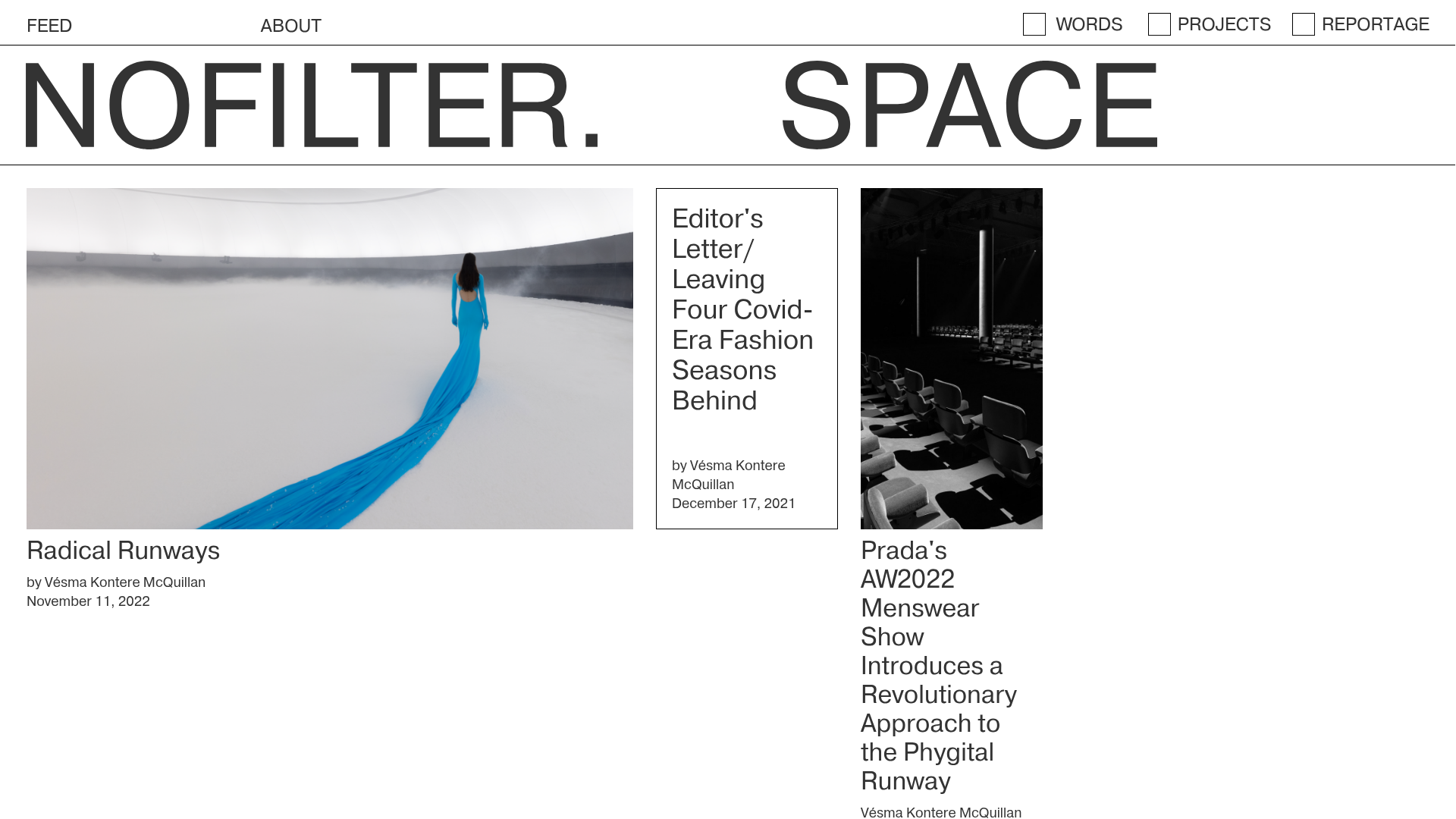
Nofilter.space Minimal Magazine Hub
A brutalist editorial layout featuring an asymmetrical multi-column grid, dynamic image placeholders, and a minimalist typography-focused navigation menu.
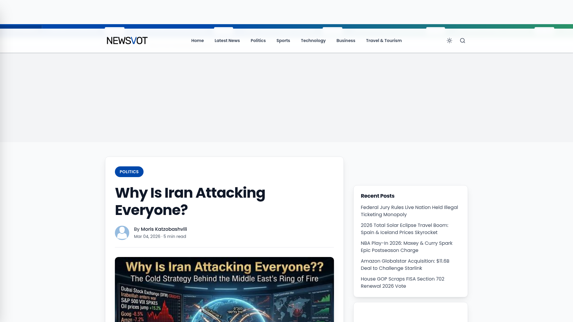
Newsvot Article View Template
A clean news article layout featuring a custom AI audio player, a live Polymarket ticker, an emoji reaction bar, and a sidebar for recent posts.
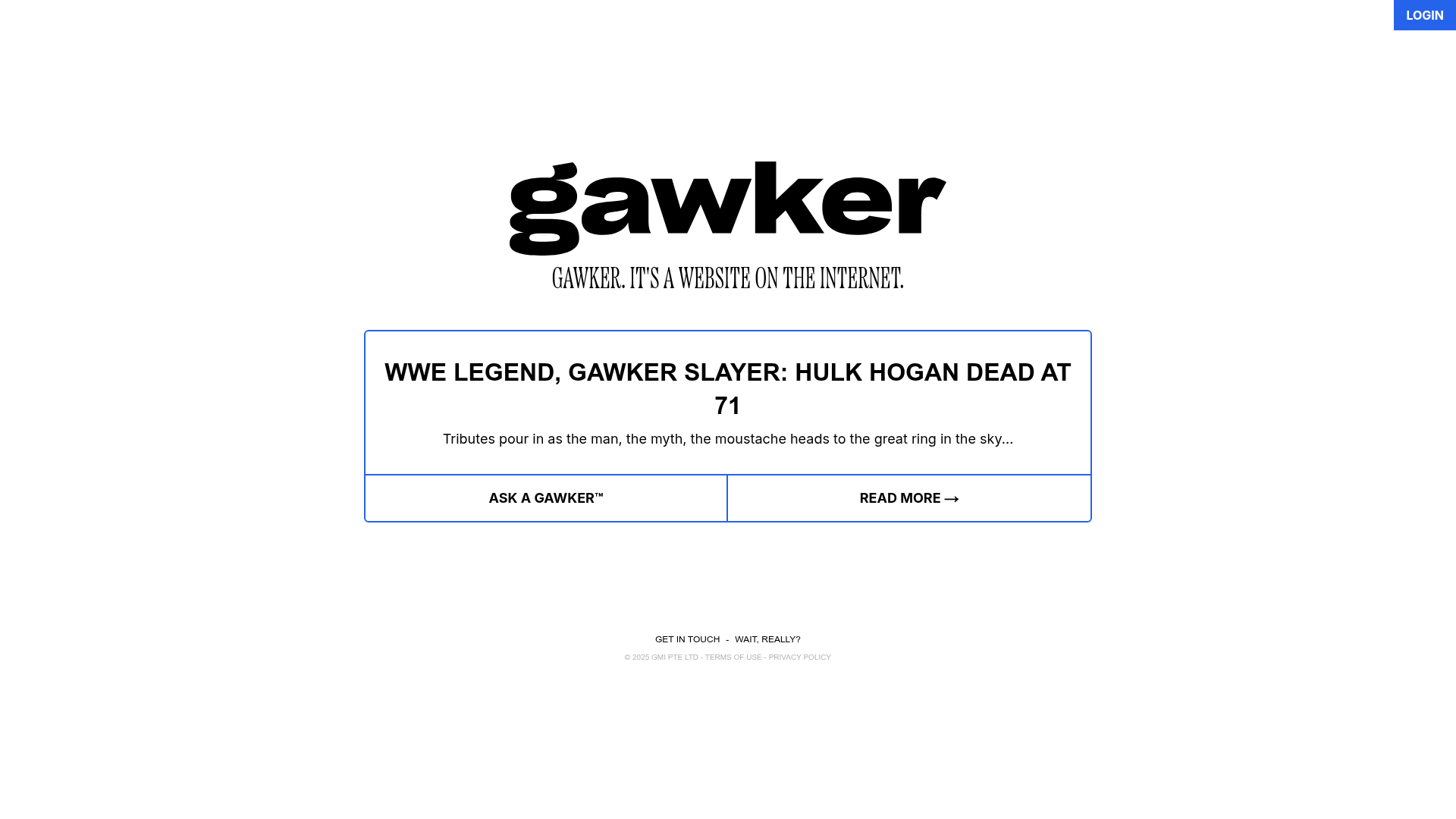
Gawker Minimalist News Landing Page
A clean, centered layout featuring a bold SVG logo, high-contrast typography, and a distinct bordered call-to-action card with a split-grid button design.
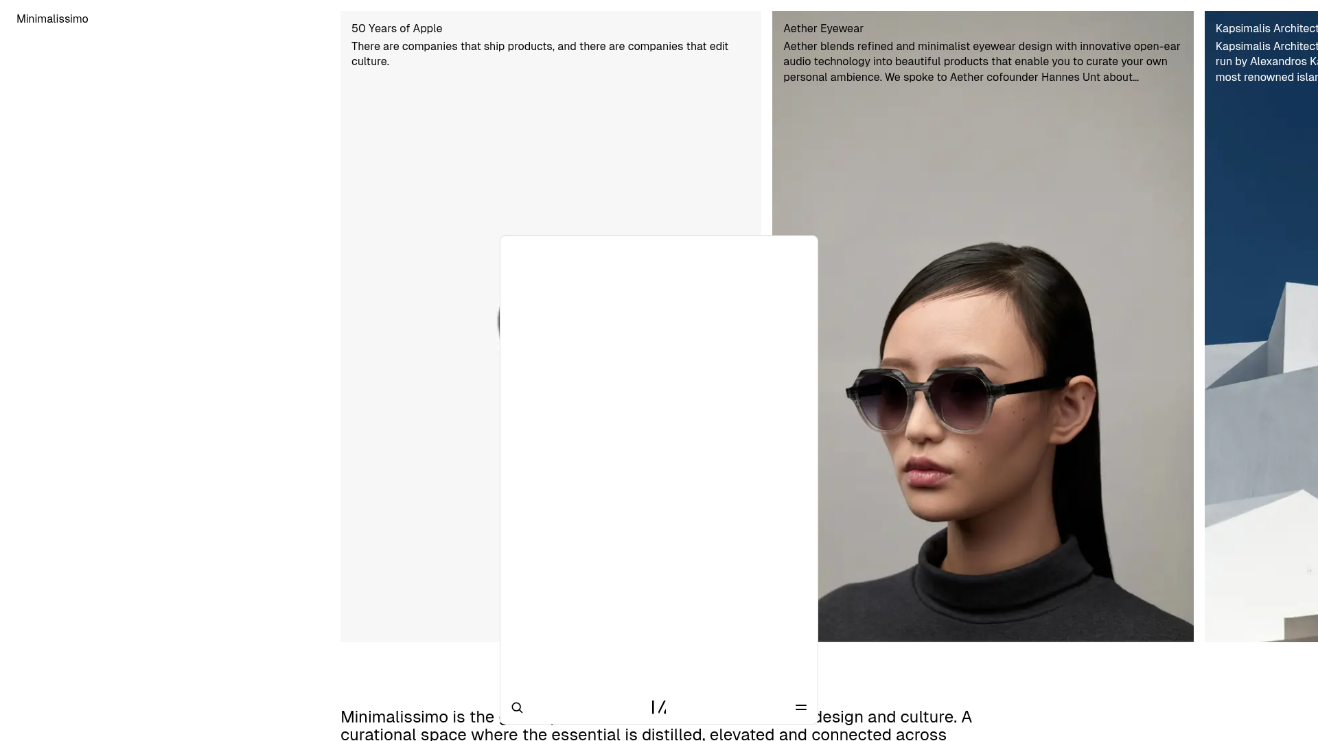
Minimalissimo Design Gallery and Portfolio
A clean magazine-style layout featuring horizontal scroll sections for featured portraits, an balanced article grid, and a bottom-anchored floating navigation bar with integrated search.

Context Gallery High-End Furniture Landing Page
A minimal editorial layout featuring a multi-column product carousel, designer biographies with image-text pairings, and a magazine-style content grid for curated design stories.

Glein Minimalistic Bento Grid eCommerce
A clean, modular layout using a bento-style responsive grid of text teasers and large-scale product imagery for lookbooks and collection browsing.
