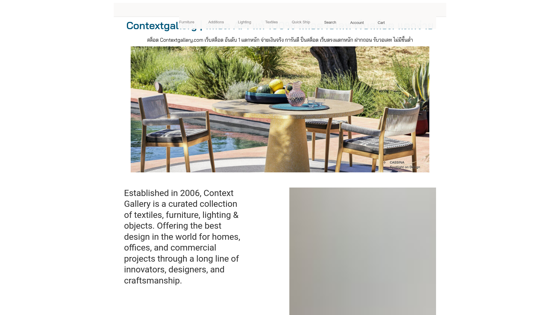
Context Gallery High-End Furniture Landing Page
A minimal editorial layout featuring a multi-column product carousel, designer biographies with image-text pairings, and a magazine-style content grid for curated design stories.
Overview
Context Gallery is a sophisticated e-commerce and editorial landing page for high-end furniture and textiles. It serves as a strong reference for high-ticket retail due to its "magazine" aesthetic that prioritizes white space, large-scale photography, and deep storytelling about designers and manufacturers alongside products.
Design System
- Color Palette & Visual Hierarchy: The design uses a minimalist monochromatic base (Pure White
#FFFFFFand Charcoal Black#000000) with subtle light grey borders (#EEEEEE) to delineate sections. Hierarchy is established through extreme contrast in font sizing and meticulous alignment rather than color. - Typography: The system features a blend of a high-contrast Serif for article titles and a clean, utilitarian Sans-Serif for navigation, labels, and product details. Use of uppercase letterspacing for section headers and lowercase italics for attributions (e.g., "for PP Møbler") creates an archival feel.
- Page Structure:
- Minimal Header: High-density navigation links paired with a clear brand mark.
- Hero/Intro: A high-impact landscape image followed by a two-column layout with a large-font mission statement.
- Curated Slider: An "Editors Picks" section featuring a vertical list of text-based selectors that control a large image carousel via a JavaScript slider (indicated by
js-slideshowandglidelibrary classes). - Designer Bio: A full-width vertical section split into columns for an image, short bio, and a product count link.
- The Journal: A 3-column grid for blog posts with consistent image aspect ratios.
- Reusable Components: The "Editors Picks" vertical toggle list and the Designer Biography block are prime candidates for cloning. The layout uses a strict 12-column grid system (
grid-12class) which is highly portable. - Interactions: Elements use opacity transitions (indicated by
transition-opacity) for hover states, particularly on the sidebar navigation buttons in the slider section, shifting from 50% to 100% opacity on hover. - Implementation Clues: Built using Elementor on WordPress, utilizing a utility-first CSS approach (likely Tailwind or a custom utility set) as evidenced by classes like
md:py-8,grid-colspan-3, andpy-4.
Use Cases
- Who should clone this: Brands in the luxury lifestyle space, architecture firms, or high-end bespoke craft studios that need to justify premium pricing through editorial context.
- Remixing: This pattern can be effectively adapted into a digital lookbook for fashion brands or a sophisticated portfolio for specialized service providers (e.g., custom home builders).
- Directions: Replace the furniture focus with art gallery collections or luxury real estate listings. The "Designer Biography" block can be remixed as an "About the Artist" or "Expert Profile" section.
- Clone Scope: A section-based clone of the "Editors Picks" slider and the "The Journal" grid is recommended for those wanting to add an editorial layer to an existing standard e-commerce site.
Related Inspirations

Glein Minimalistic Bento Grid eCommerce
A clean, modular layout using a bento-style responsive grid of text teasers and large-scale product imagery for lookbooks and collection browsing.

Basic.Space E-commerce Gallery Clone
A minimalist product marketplace featuring a clean sticky navigation bar, nested flyout menus, and a horizontally scrollable product carousel with hover-state image switching.

Ashley & Co Lifestyle E-commerce
An elegant Shopify-based storefront featuring a split-screen animated hero, horizontal ticker-tape collection carousel, and dynamic mega-menus with scent-specific color switching and image previews.
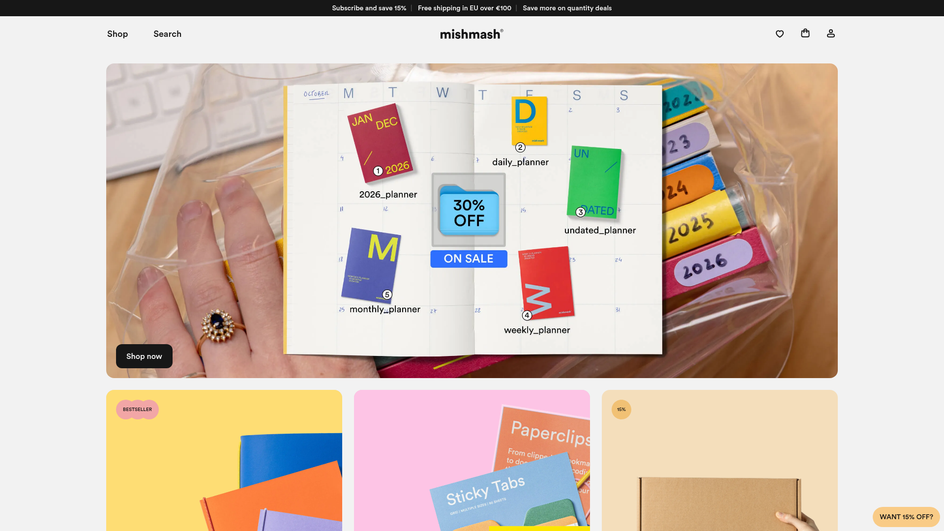
Mishmash Stationery E-commerce Layout
A clean retail template featuring rounded image grids, a multi-column comparison section with custom iconography, and a responsive products carousel.
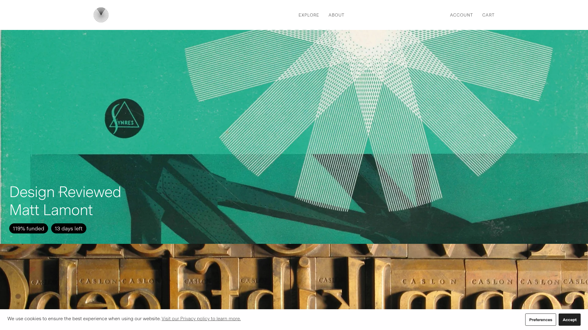
Volume Crowdfunding Book Gallery
A minimalist editorial storefront featuring full-width high-resolution image cards, status pills for campaign progress, and a clean typography-focused navigation layout.
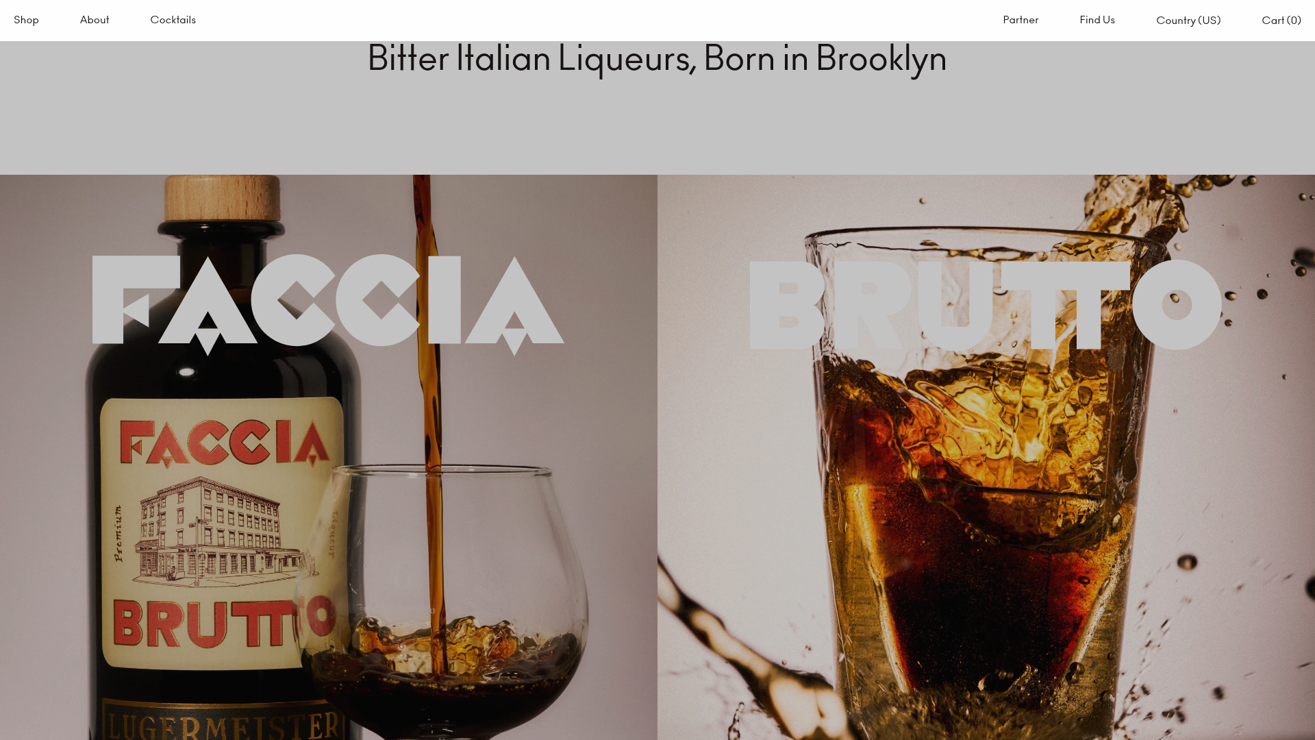
Faccia Brutto Spirits E-commerce Showcase
A refined Shopify layout featuring a split-hero landing, monochromatic bento grid product layouts, and a slide-out cart interaction with a heavy focus on typography-driven design.
