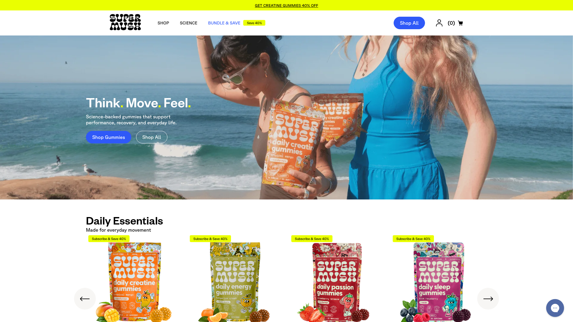
SuperMush Mushroom E-commerce Storefront
A vibrant Shopify-style layout featuring a full-width image hero with overlaid typography and a responsive product carousel with quick-add functionality and promotional tags.
Overview
SuperMush is a vibrant mushroom-based supplement store that utilizes a high-energy, contemporary e-commerce aesthetic. It is a powerful reference for brands looking to combine lifestyle photography with functional shopping features like quick-add carousels and detailed ingredient showcases.
Design System
- Color Palette & Visual Hierarchy: The site uses a neutral off-white background (#f5f4f1) to let product colors pop. Bold blue (#2f59f8) is used for primary CTAs and accents, while neon yellow (#eaff00) serves as a high-contrast highlight for sales, tags, and hover states. The visual hierarchy uses oversized imagery followed by density-rich product grids.
- Typography: The system relies on bold sans-serif headings for a modern, punchy feel. Functional text uses a clear body font (approx. 16px) with specialized styles like
.tw:heading-48for impact. Punctuation in hero headings is often color-accented to reinforce brand playfulness. - Page Structure & Flow: The layout flows from a full-width video/image hero to a responsive product carousel, followed by a brand-trust logo bar ("Find us at"), a tabbed feature showcase, and finally an ingredient deep-dive.
- Reusable Components:
- Product Cards: Feature image overlays with rounded promotional pills, star ratings, and integrated "Add to cart" buttons.
- Featured Showcase (Tabs): An accordion-style component that switches associated media/text on the right side of the screen.
- Floating Action Buttons: A bottom-right chat/support bubble for persistent customer engagement.
- Interaction & Motion: Interactive elements utilize heavy hover states; buttons transition from blue to neon yellow with black text. The product carousels use Swiper.js for smooth horizontal scrolling on both desktop and mobile.
- Responsive Behavior: On mobile, the header collapses into a hamburger menu, and the multi-column product grid transitions into a 2-up grid with simplified pagination controls (e.g., "1/3" labels with arrows).
- Implementation Clues: The HTML confirms a Tailwind CSS framework (indicated by
tw:prefixes) integrated within a Shopify environment, using standard semantic classes and accessibility layers likeskip-to-main-content.
Use Cases
- Target Audience: Supplement brands, functional food startups, and lifestyle wellness companies that need to balance scientific credibility with an approachable, Gen-Z-friendly brand identity.
- Remix Directions: Swap the vibrant blue/neon palette for earthy tones to create an organic or artisanal feel. The "Featured Showcase" section can be effectively remixed to explain complex manufacturing processes or multi-step product usage.
- Clone Scope: A full-page clone is ideal for brands with high-quality lifestyle photography. For a smaller scope, the responsive product carousel and the "Daily Essentials" grid provide excellent modularity for any standard e-commerce home page.
Related Inspirations
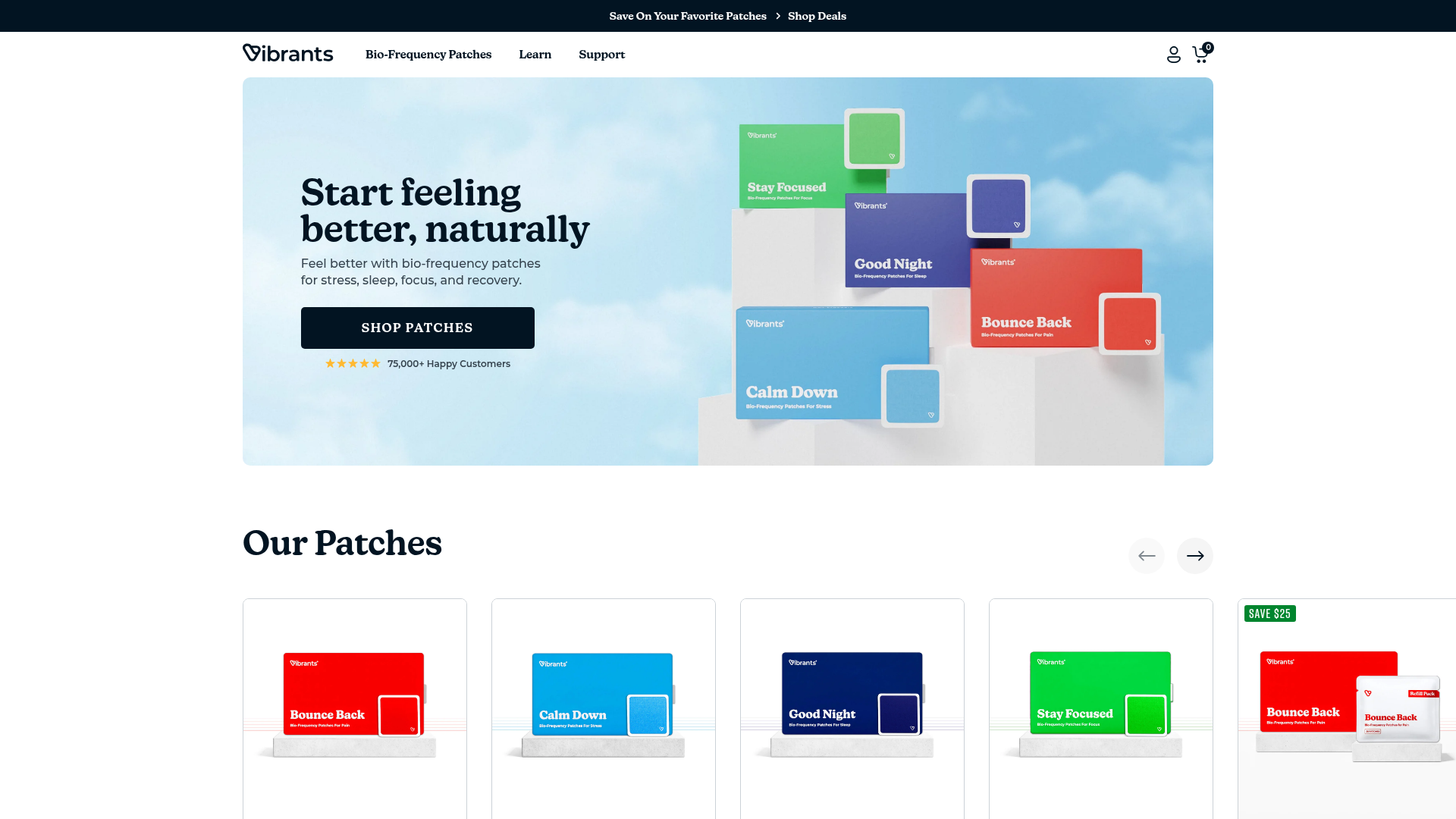
Vibrants Wellbeing E-commerce Landing Page
A clean Shopify-style landing page featuring a full-width hero with overlaid product cards, a horizontal product slider, and interactive cart drawer with utility progress bars.
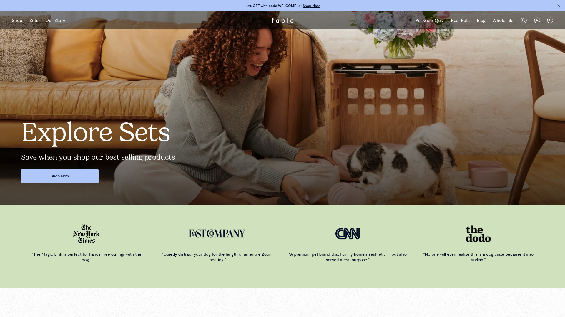
Fable Pets E-commerce Landing Page
A minimalist lifestyle pet brand template featuring a high-impact hero section, a clean logo trust bar, and a centered navigation menu.
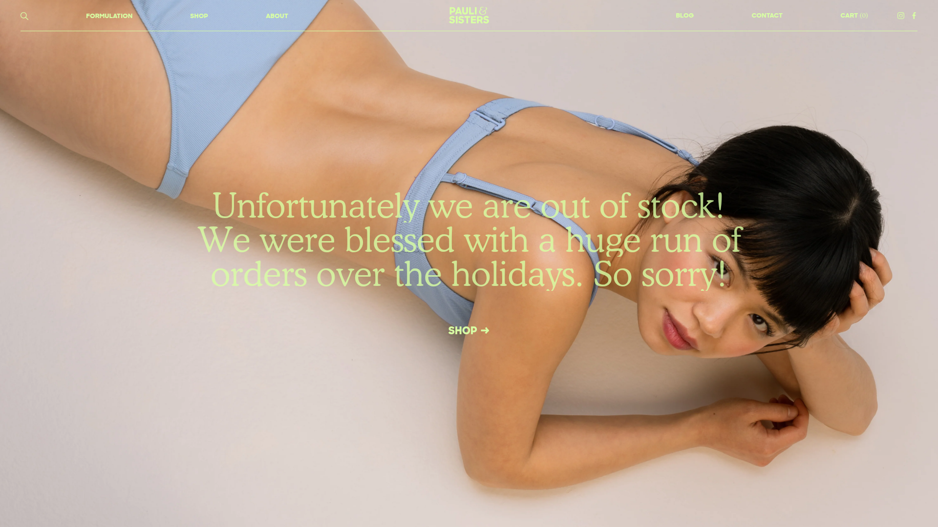
Pauli & Sisters Landing Page
A minimalist e-commerce design featuring a full-width hero image with large overlapping serif text, an interactive ingredient explorer, and a clean split-block layout.
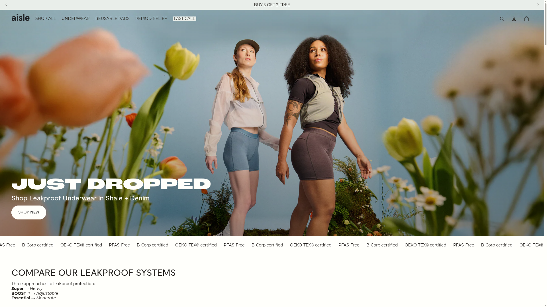
Aisle E-commerce Landing Page
A clean Shopify-based layout featuring a high-impact split hero section, a scrolling marquee for trust badges, and interactive product cards with variant swatches and image carousels.
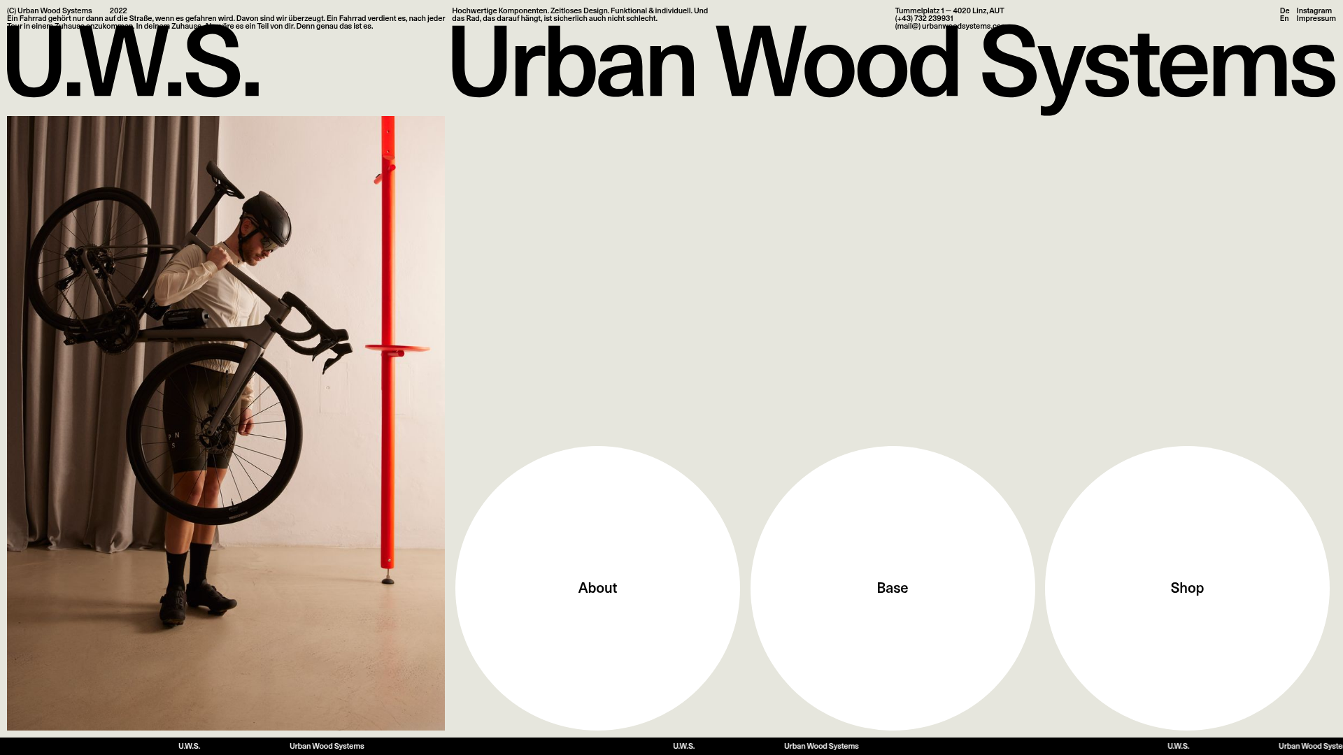
Urban Wood Systems Minimal Landing Page
A minimalist layout featuring a large-scale SVG header, a scrolling text ticker footer, and a clean navigation grid with large circular hover-active buttons.
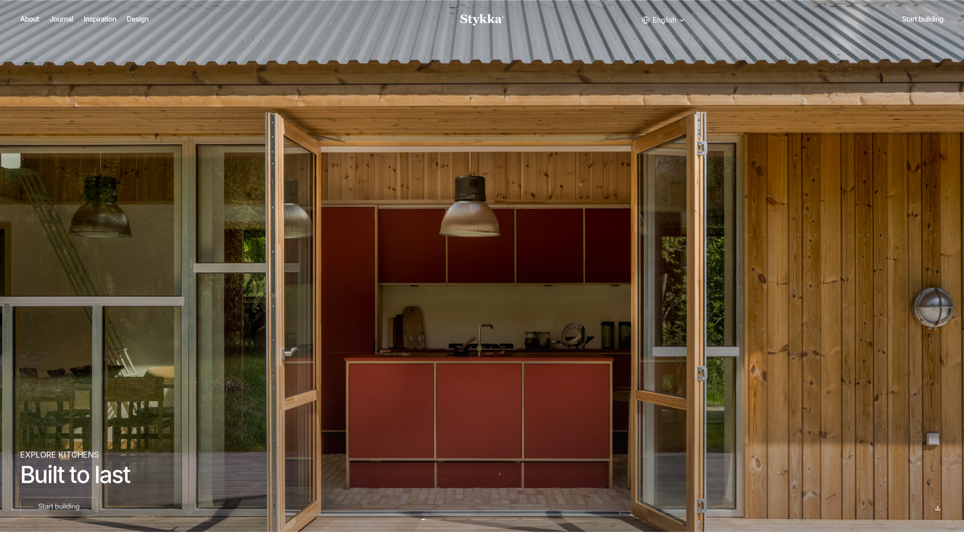
Stykka Modular Furniture Landing Page
A minimalist industrial design featuring a full-screen vertical navigation slider, oversized imagery, and interactive content cards for modular product storytelling.
