Mr. Marcel School Design Portfolio
A creative education site featuring artistic geometric headers, card-based course layouts, slider-driven testimonial sections, and a structured calendar for academic scheduling.
Overview
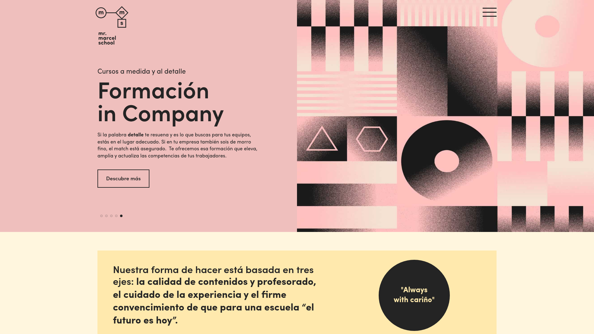
Mr. Marcel School is a creative design portfolio and educational platform characterized by its sophisticated use of geometric art, grain textures, and a modular layout. It serves as an excellent reference for builders looking to create high-end educational sites or creative services portfolios that balance bold artistic expression with structured, data-driven content like course calendars.
Design System
- Color Palette & Visual Hierarchy: The site uses a muted, "nuanced" palette featuring soft pink (
#f7c8b9), light yellow (#eee1d3), and cream backgrounds contrasted against deep charcoal/black for text and secondary sections. The hierarchy is established through a mix of large-scale geometric illustrations and clean, white-space-heavy text blocks. - Typography: The system relies on a modern sans-serif (Kensei 02) with high-contrast weights. Headings (
h2,h3) are bold and often capitalized, while metadata use smaller, wide-spaced caps for a professional, Swiss-design aesthetic. - Page Structure & Section Flow:
- Split-Screen Hero: Text content on the left and a responsive swiper-slider featuring geometric art on the right.
- Three-Key-Axis Section: A simple horizontal flex-row with a distinct circular call-out ("Always with cariño").
- Categorized Cards: Vertical course type cards with SVG icon overlays.
- Dynamic Course Grid: Three-column layout for upcoming courses featuring pricing and duration.
- Academic Calendar: A four-column grid of date-focused cards for scheduling.
- Activity & Blog Sliders: Horizontal carousels for events and news.
- Reusable Components:
- Outlined Buttons: Minimalist
the_button outlinedclass with hover states. - Course Cards: Complex containers with
post_type_nametags, pricing rows, and duration metadata. - Teacher Rhombus: Unique diamond-cut circular profile images for the faculty section.
- Outlined Buttons: Minimalist
- Interaction & Motion: The site uses Swiper.js for smooth fade transitions and horizontal sliding. Hover effects include
course_icon_hover(switching between black and white SVG icons) and subtle outlined button transitions. - Implementation Clues: Built using a horizontal grid system (Bootstrap-style
col-lg-Xclasses) and the Swiper.js library for all interactive carousels. The structure uses semantic IDs like#homepage_introand#next_coursesto define clear thematic sections.
Use Cases
- Who should clone this: Designers building educational platforms, creative agencies, or workshop organizers who want to move away from standard corporate layouts toward something more "boutique" and artistic.
- Effective Remixes: Specialized training centers (coding bootcamps, craft workshops) can adapt the course grid and calendar components. High-end consulting firms can remix the split-screen hero and teacher profile sections to showcase expertise.
- Remix Directions: Swap the grain-textured geometric art for high-resolution photography to shift the tone from "artistic" to "professional." The color palette can be shifted to high-contrast monochrome for a more brutalist aesthetic without losing the layout structure.
- Clone Scope: A full-page clone is recommended to capture the transition between artistic headers and functional data grids, but the "Next Courses" grid and the "Academic Calendar" are highly reusable standalone sections.
Related Inspirations
Hourly App Landing Page
A minimalist iOS app landing page featuring a bold typographic hero, responsive grid-based screenshot displays, and custom SVG illustrations with CSS animations.
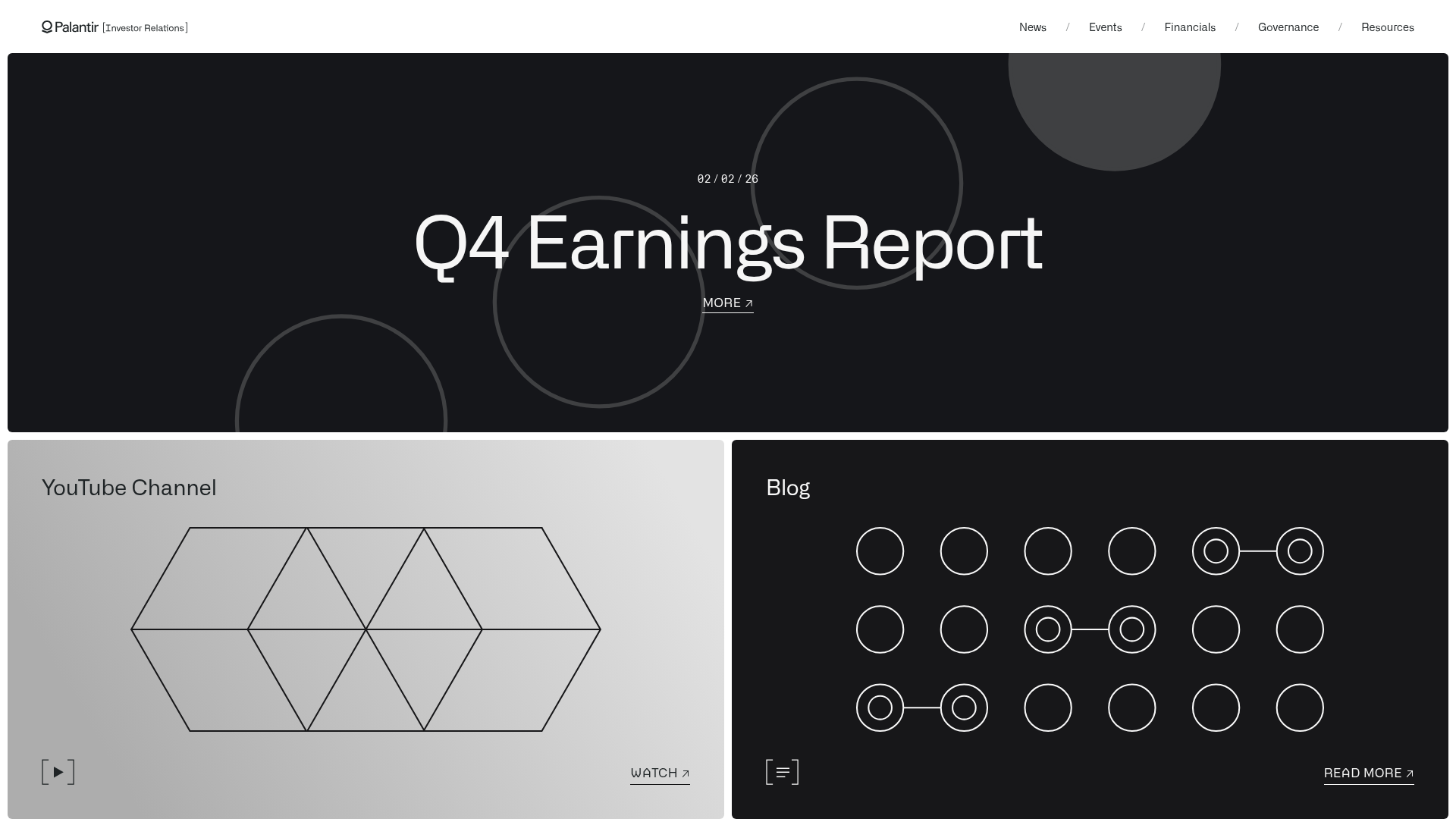
Palantir Investor Relations Minimal Portal
A high-contrast dark-mode layout featuring a full-width hero carousel over a geometric bento grid with external links and abstract SVG motifs.
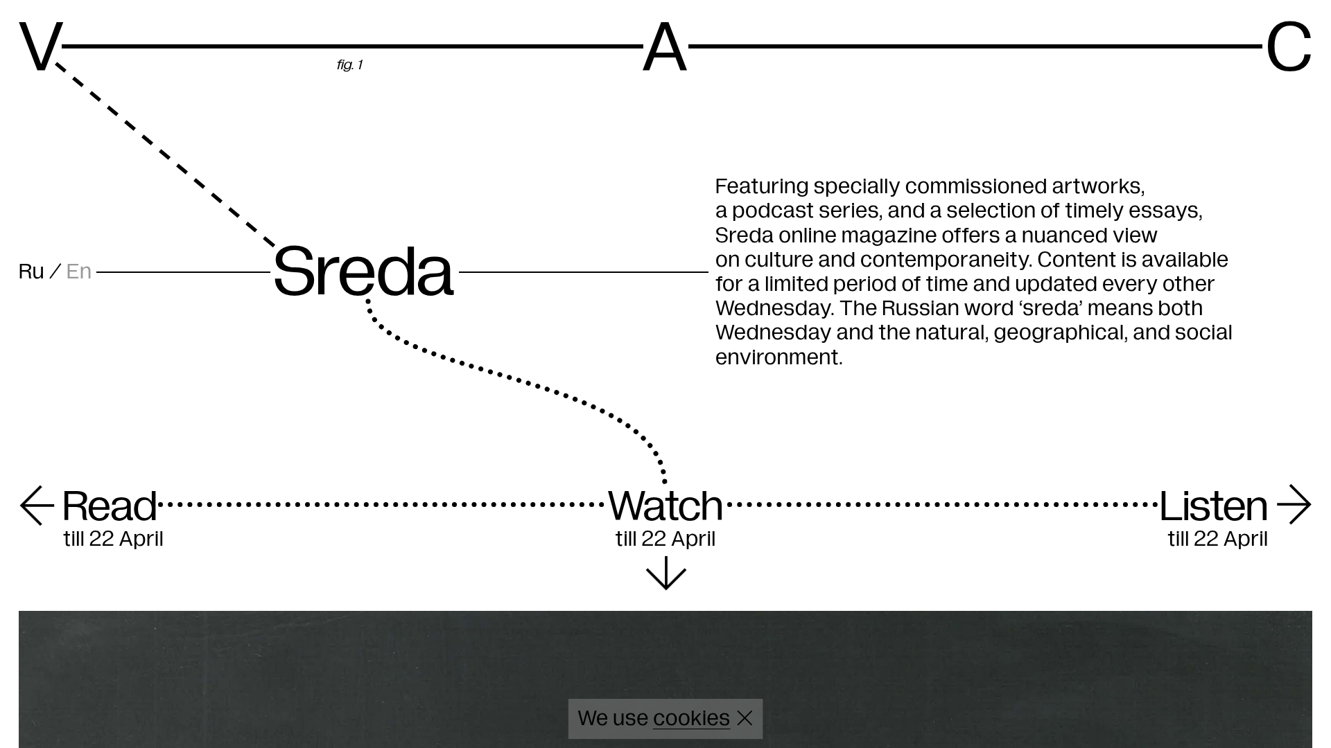
V–A–C Sreda Online Magazine Hub
Minimalist art magazine layout featuring a conceptual typographic header, interactive vertical navigation for mixed media content, and a clean grid for high-resolution archival imagery.
Gustavo Faria Minimalist Portfolio Index
A clean, list-based portfolio layout featuring hover-triggered image previews, a sticky sidebar with biography, and a typography-driven project archive.
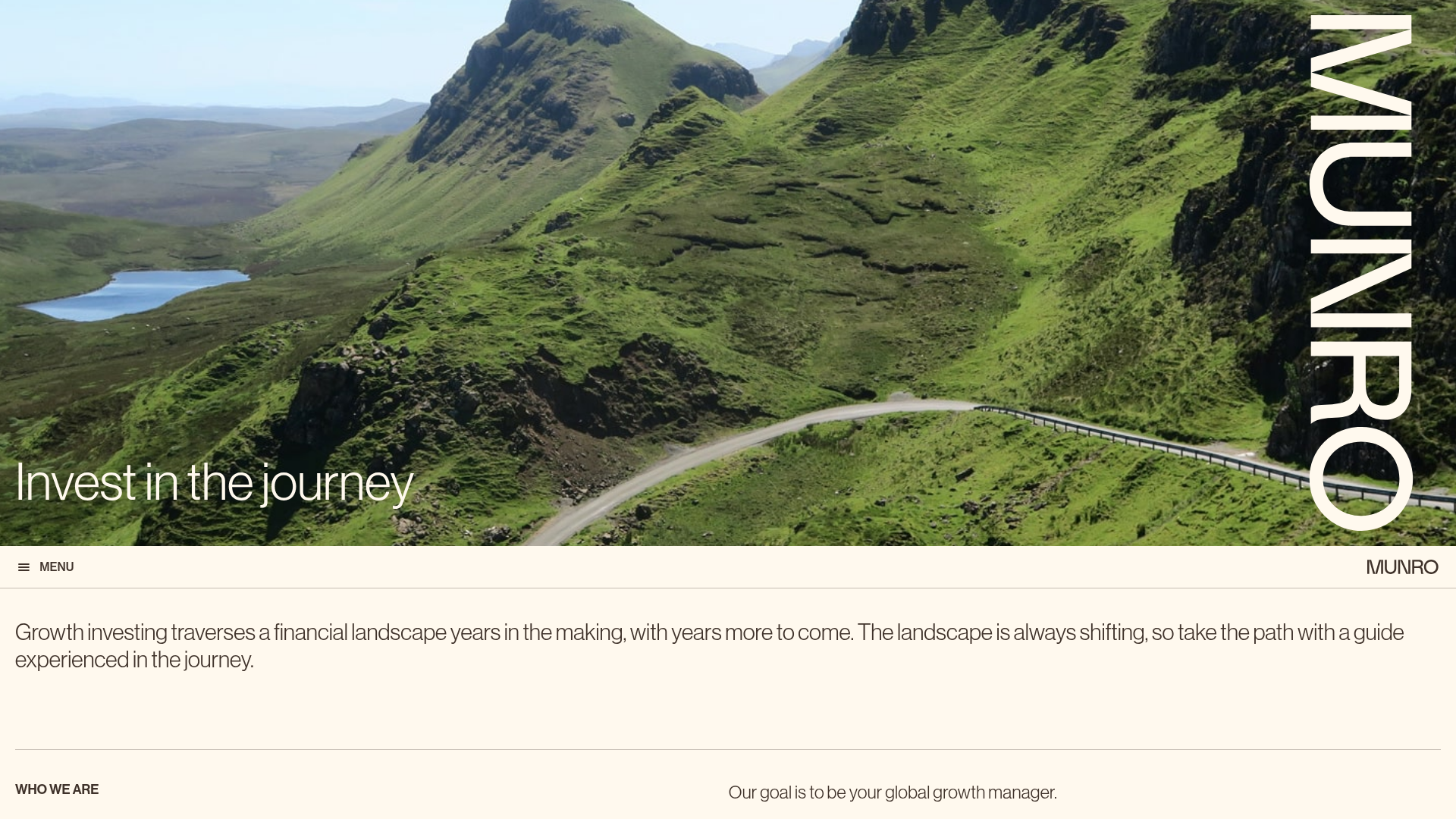
Munro Partners Financial Growth Landing Page
A professional financial services layout featuring a vertical typographic hero, animated stat counters, a data-driven fund performance table, and a colorful grid for news and investment themes.
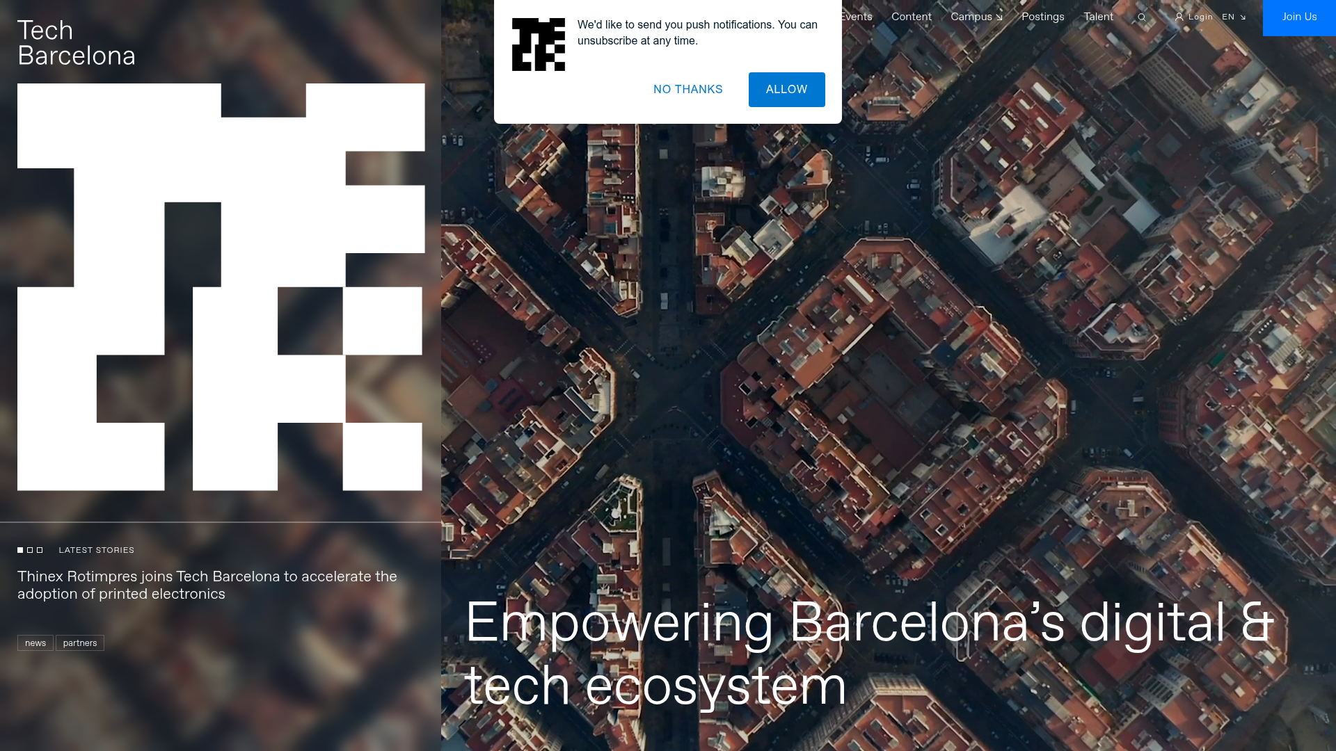
Tech Barcelona Ecosystem Hub Landing Page
A refined landing page layout featuring an immersive video background hero, marquee-style scrolling badges, and card-based sections for events and community projects.
