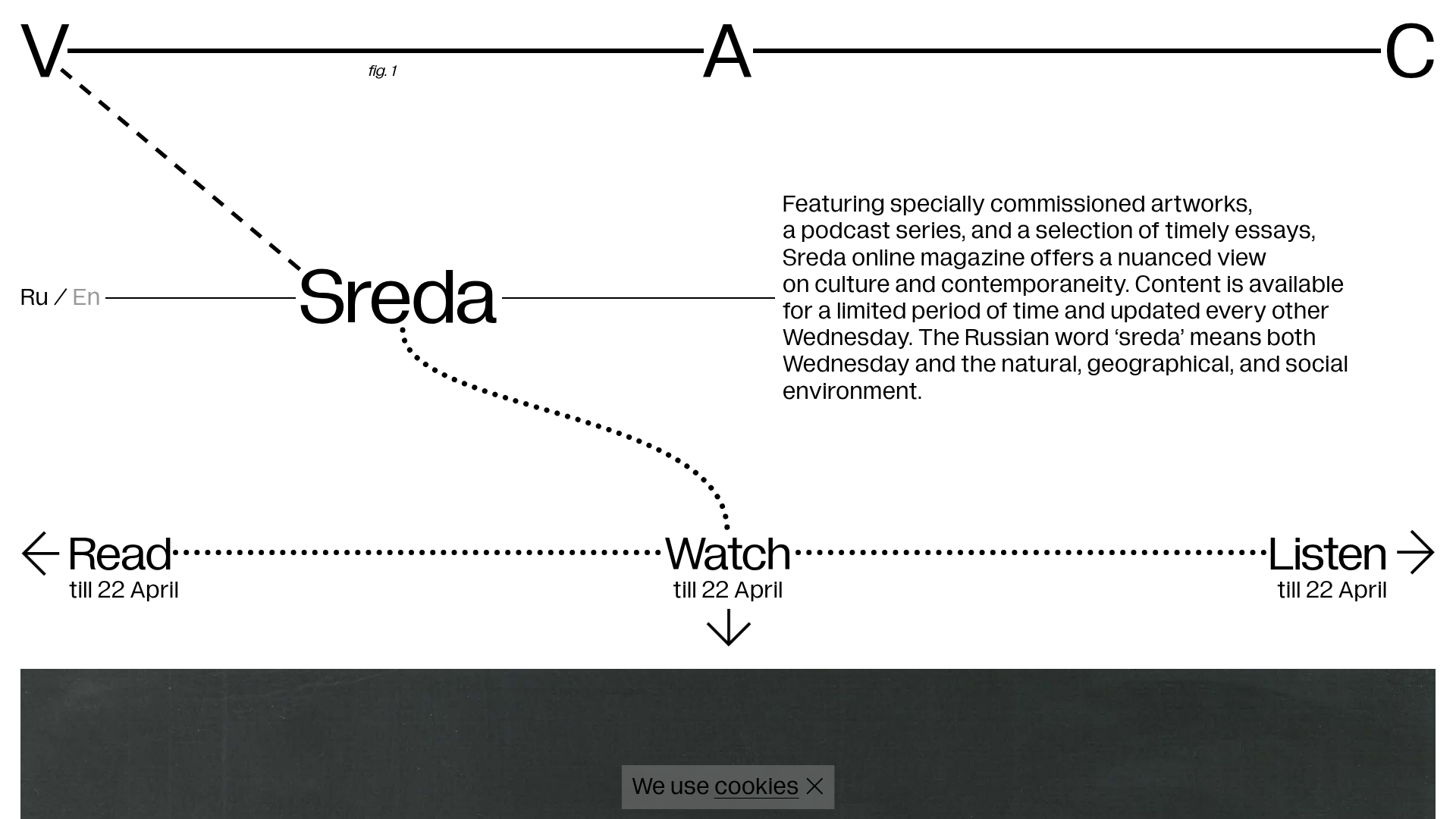
V–A–C Sreda Online Magazine Hub
Minimalist art magazine layout featuring a conceptual typographic header, interactive vertical navigation for mixed media content, and a clean grid for high-resolution archival imagery.
Overview
V–A–C Sreda is a minimalist digital magazine hub that utilizes conceptual typography and expansive white space to house mixed-media art content. Its design is a premier reference for high-end portfolio sites or cultural archives because it treats website navigation as a diagrammatic art piece itself, blending informational hierarchy with avant-garde aesthetics.
Design System
- Color Palette & Visual Hierarchy: A stark, high-contrast monochrome palette (Black #000000, White #FFFFFF) focuses attention entirely on typography and imagery. Visual hierarchy is established via font scale and diagrammatic lines rather than color, creating a "blueprint" or architectural feel.
- Typography: The system relies on a clean, humanist Sans-Serif (likely Helvetica or similar) with diverse weights. Scale is used dramatically, from the oversized "V—A—C" header characters to small-caps and italicized body copy for academic-style citations.
- Page Structure & Section Flow: The layout follows a non-traditional vertical flow:
- Diagrammatic Header: A conceptual navigation area with dashed lines connecting the brand name to content categories.
- Info Block: A descriptive paragraph with high line-height for readability.
- Triptych Navigation: Horizontal links ("Read", "Watch", "Listen") anchored by expiry dates.
- Dynamic Content Area: Large-scale archival imagery followed by a multi-column grid containing metadata and long-form descriptions.
- Footer: A minimalist multi-column footer with newsletter sign-up and legal disclaimers.
- Reusable Components:
- The Diagram Header: A set of absolute-positioned text nodes connected by SVG or CSS borders/dashed lines.
- Category Nav: Text links with sub-text (e.g., "till 22 April") and arrow affordances.
- Newsletter Form: A stripped-back input field with an icon-based submit button.
- Implementation Clues: The HTML reveals the use of
Next.jsandStyled Components(evidenced by classes likesc-1jru7fp-0). It uses a specific grid system (stk-grid,stk-layout_12col) for the archival content sections.
Use Cases
- Who should clone this: Independent galleries, experimental art magazines, and architectural portfolios seeking a "meta-modern" aesthetic.
- Effective Remixes:
- Portfolio Site: Use the diagrammatic header to connect "Project Categories" to "About Me."
- E-commerce: Adapt the horizontal "Watch/Read/Listen" bar into a category filter for curated product collections.
- Remix Directions: Replace the stark black/white with a muted pastel palette for a softer editorial look, or replace the dashed lines with solid neon vectors for a more technical/engineering feel.
- Clone Scope: Start with the Diagrammatic Header and Navigation for a high-impact landing page. A full-page clone is best suited for content-heavy sites that want to prioritize archival imagery over complex UI widgets.
Related Inspirations

Forner Studio Minimalist Agency Landing Page
A minimalist design featuring a large-scale liquid typography layout, high-contrast dark theme, and a clean grid-based navigation structure.

Egstad Minimalist Design Portfolio
A refined Nuxt.js portfolio featuring bold variable typography, interactive canvas elements, and a clean grid-based layout for showcasing design work.
Bruno Arizio Designer Portfolio Website
A minimalist creative director portfolio featuring a clean typographic layout, side-aligned image previews, and high-contrast spacing patterns suitable for luxury or design showcases.
Mr. Marcel School Design Portfolio
A creative education site featuring artistic geometric headers, card-based course layouts, slider-driven testimonial sections, and a structured calendar for academic scheduling.
The Fascination Editorial Product Hub
A refined content marketplace layout featuring a minimalist bento-style grid, custom category filters, and modern hovering card interactions for brand reviews.
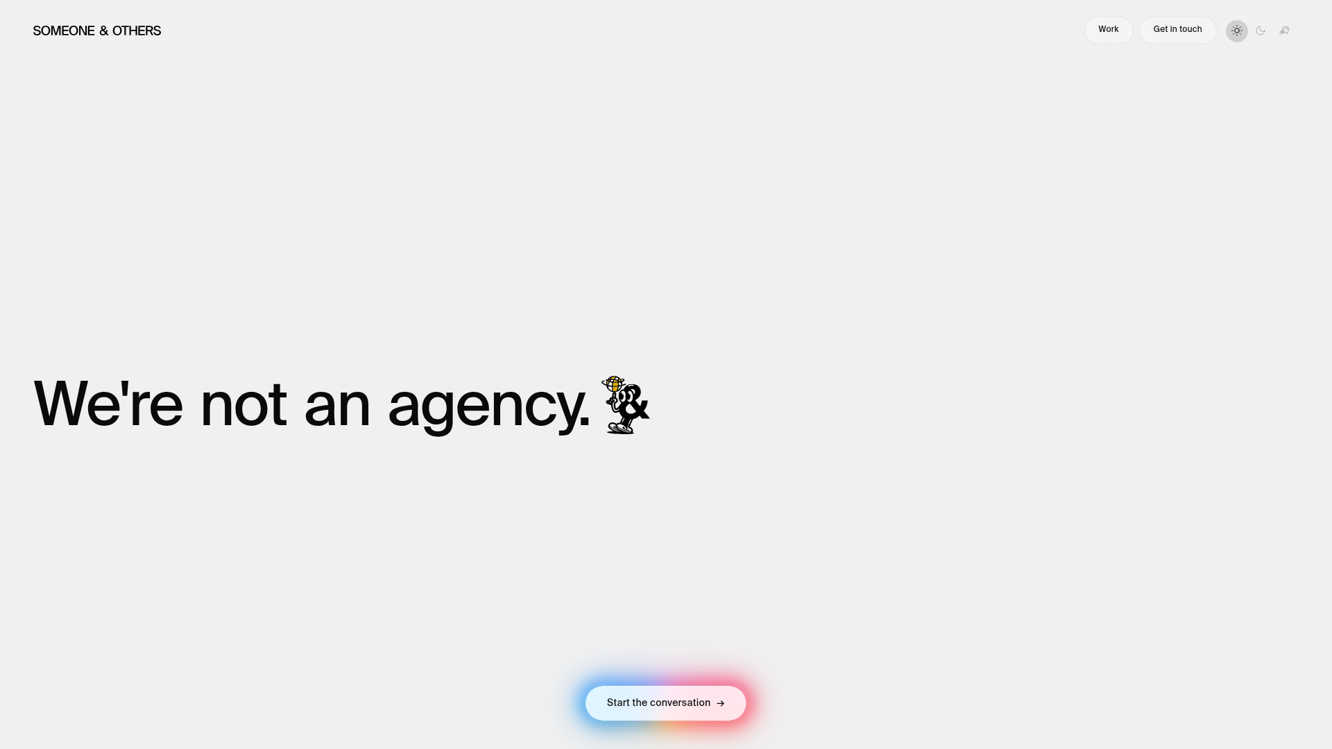
Someone & Others Studio Landing Page
A minimalist studio portfolio featuring scroll-reveal typography, overlapping sticky case study cards, and a vibrant glassmorphism CTA with animated glow rings.
