Gustavo Faria Minimalist Portfolio Index
A clean, list-based portfolio layout featuring hover-triggered image previews, a sticky sidebar with biography, and a typography-driven project archive.
Overview
This minimalist portfolio index features a high-impact, typography-driven list view that prioritizes project velocity and visual discovery. It is an excellent clone reference for designers wanting to showcase a high volume of work using a clean, systematic layout that balances density with interactive delight.
Design System
- Color Palette & Visual Hierarchy: The design utilizes a high-contrast monochromatic base (#FFFFFF background, #000000 text) with subtle grays (#DCDCDC) for secondary metadata. High-saturation imagery and GIFs provide the only color, creating a dynamic "pop" effect against the neutral grid.
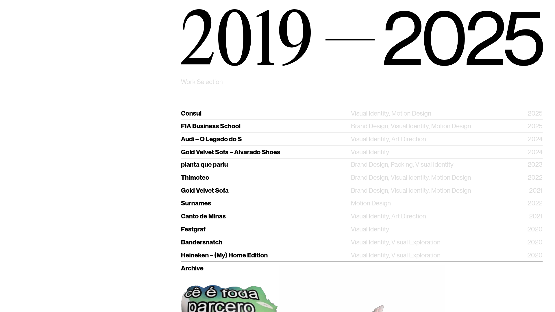
- Typography System: The site uses a mix of serif and sans-serif fonts to distinguish between temporal scales and project details. A massive serif display font (likely
custom_49610) marks the timeline start ("2019"), while a sleek, wide-tracking sans-serif (custom_21879) handles the list items and headers. Hierarchy is established through extreme scale shifts (142px years vs. 12px project titles). - Page Structure & Section Flow: The layout is split into a fixed sidebar (left 30%) containing biographical text and navigation, and a scrollable archive (right 70%). The archive begins with a large date header ("2019-2025") followed by a "Work Selection" list and a footer section with social links and contact info.
- Reusable Components:
- Project List Row: Each row contains a project title (bold), service categories (light gray), and the execution year.
- Sticky Sidebar: A persistent container for bio and site navigation, ensuring context is never lost during scrolling.
- Footer Links: A clean horizontal arrangement of bolded text links ("Email", "LinkedIn", "Behance").
- Interaction & Motion Patterns: The core interaction is the hover-triggered preview. Hovering over a list item or a specific "(Hover Here)" zone activates hidden absolute-positioned
animation-containerdivs, displaying project-specific images or looping videos (blobs) in the center of the frame. - Responsive Behavior: The HTML structure indicates a
mag viewer-type-horizontalsetup, suggesting a layout that adapts by stacking the fixed sidebar above the content list on smaller screens. - Implementation Clues: Built using Readymag, the site relies on absolute positioning within a
content-boundscontainer. It employspolyfill-stickyfor fixed elements and uses a series ofwidget-text-v3andwidget-shapecomponents for the structured index.
Use Cases
- Who should clone this: Creative directors, agencies, or independent designers with a large body of work who want a "no-fluff" index that feels curated and professional.
- What products can remix it: Architecture firm archives, fashion lookbooks, or digital product studios needing a chronological work list.
- Practical remix directions: Swap the serif display headers for a bold brutalist sans-serif to change the brand voice; adapt the hover-preview logic to trigger small modal overlays instead of full-screen center images; or reuse only the project list component for a more standard blog index.
- Suggested clone scope: A full-page clone is ideal to preserve the relationship between the fixed bio and the interactive list, though the project row pattern can be extracted individually for modular use.
Related Inspirations
Patrick Miller Photography Portfolio Template
A minimalist, full-bleed photography portfolio featuring a split-screen grid, scroll-triggered section transitions, and integrated Swiper.js image carousels for project galleries.
Cup of Couple Editorial Portfolio
A high-fashion editorial layout featuring a sticky compartmentalized header, a horizontal marquee carousel, and a mixed-width masonry grid with marquee typography effects.
Taiki Murayama Portfolio Bento Grid
A minimalist designer portfolio featuring a dynamic bento-style layout for project imagery, integrated accordion project lists, and high-contrast typography.
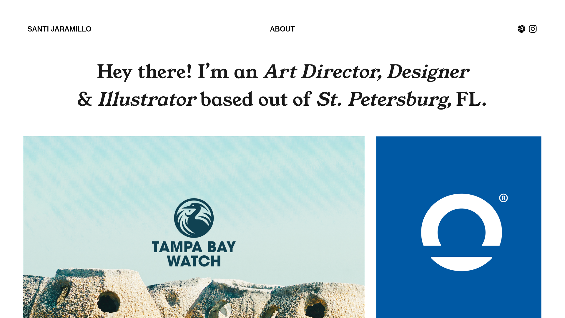
Santi Jaramillo Design Portfolio Page
A minimalist portfolio layout featuring a large typography-driven hero section with hover-triggered GIFs and an asymmetrical justified grid for project thumbnails.
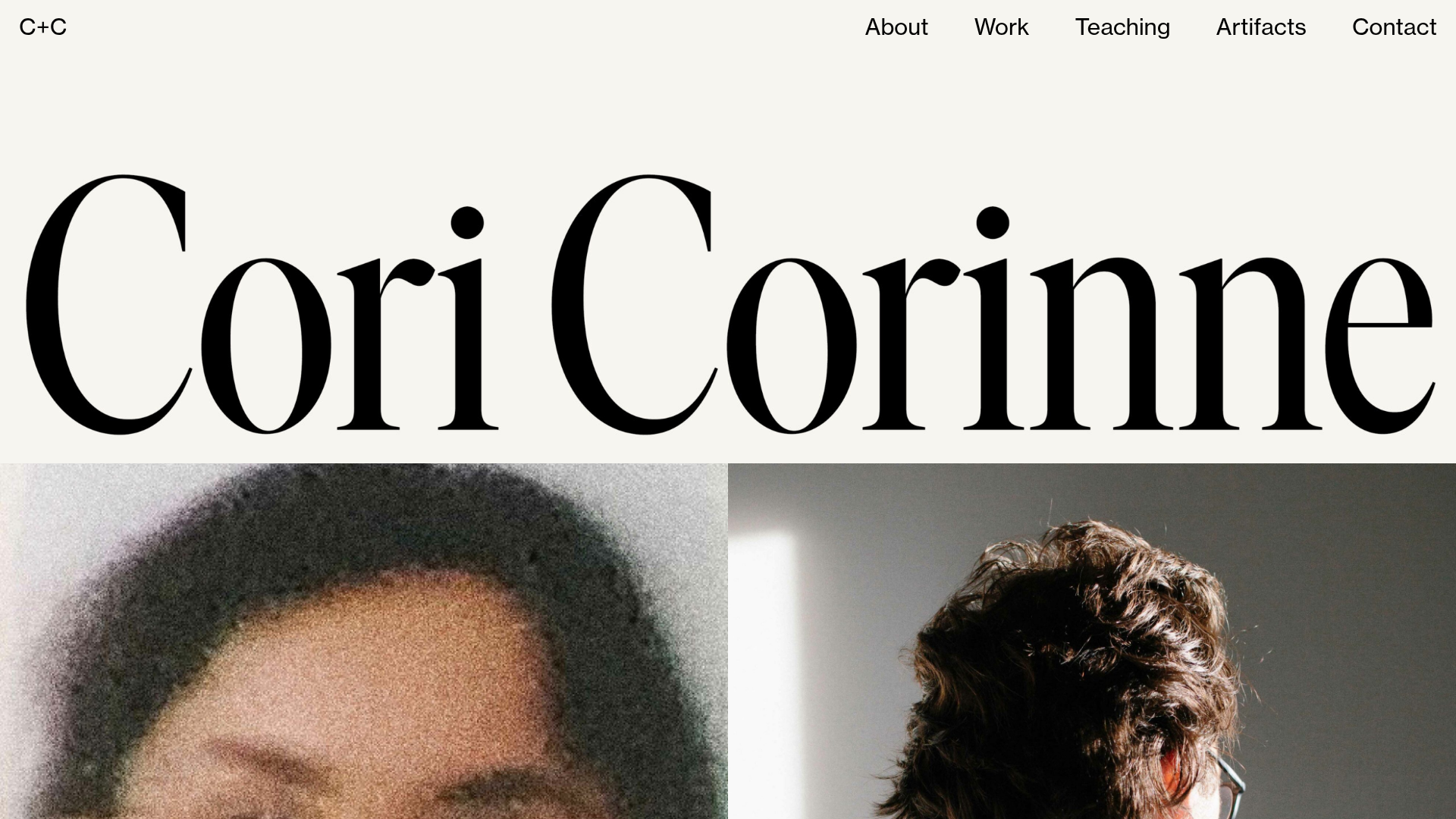
Cori Corinne Minimalist Portfolio Home
A clean, typography-focused layout featuring a massive serif hero header, two-column image grid, and text-based navigation for a high-end editorial feel.
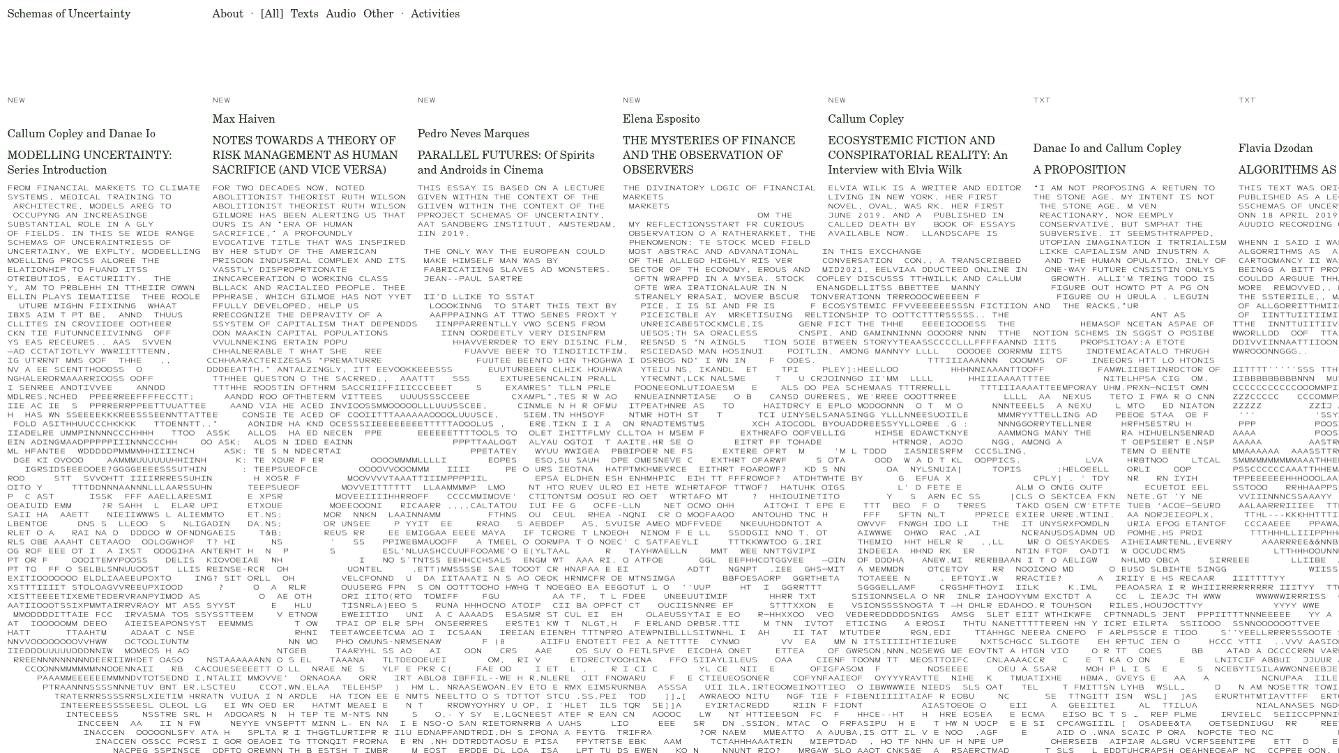
Schemas of Uncertainty Monogram Grid
A brutalist multi-column layout for text-heavy content featuring high-contrast typography, minimalist navigation, and a rhythmic vertical grid of essays.
