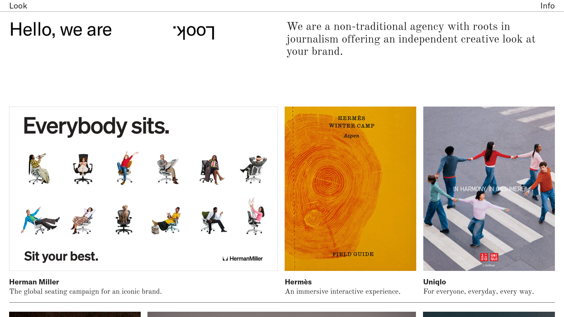
Look Agency Architectural Portfolio
A minimalist creative agency portfolio featuring a sticky header, logo-based splash hero, and a masonry-style image grid for detailed case studies.
Overview
This portfolio for Look Agency is an exercise in extreme minimalism, utilizing a high-contrast black-and-white aesthetic to frame high-fidelity brand photography. It serves as a strong reference for creators seeking to build a "quiet" UI that allows the work itself to provide the visual interest, characterized by a sophisticated use of negative space and a non-traditional hero layout.
Design System
- Color Palette & Visual Hierarchy: A simple dual-palette of pitch black (#000000) text on a stark white (#FFFFFF) background. Hierarchy is established through size and placement rather than color, with large-scale headlines and medium-weight body copy creating a clean, editorial feel.
- Typography: The system uses a clean, modern sans-serif for secondary text and project titles (resembling Inter or Helvetica) paired with a high-contrast serif for the body description, giving it a journalistic, high-fashion aesthetic. Headlines like "Hello, we are" use a large, tight-tracked sans-serif.
- Page Structure & Section Flow: The layout begins with a sticky navigation header, followed by a hero section split into asymmetrical columns. The content then flows into a masonry-style
gallery-justifygrid where different image aspect ratios are harmonized into clean rows. - Reusable Components:
- Sticky Navigation: A ultra-thin top bar with "Look" (logo) and "Info" (link) anchored to the viewport edges.
- Asymmetrical Hero: A three-part grid containing a statement, a mirrored logo graphic, and a descriptive paragraph.
- Dynamic Image Grid: Components like
<media-item>and<figcaption>that handle varied metadata and aspect ratios while maintaining a consistent gutter.
- Interaction & Motion: The HTML indicates a "pinned" behavior for headers and footers using
pinned-topandpinned-bottomclasses. Hover states on images are implied vialinkedclasses, likely triggering subtle opacity or scale shifts. - Responsive Behavior: The system uses
mobile-row-height="10000%"andmobile-gutter="1.5rem"in the code, suggesting the masonry grid collapses into a single-column vertical stack on smaller screens to ensure legibility of captions.
Use Cases
- Who Should Clone: Design studios, fashion photographers, and boutique creative agencies who need a portfolio that feels curated and high-end.
- Remix Directions: Replace the black-and-white theme with soft pastels for a lifestyle brand, or substitute the serif body font for a mono-spaced font to pivot into a technical or architectural consultancy.
- Practical Application: The asymmetrical hero section can be remixed to feature a video reel instead of the mirrored logo, providing more immediate visual impact while keeping the intellectual layout.
- Clone Scope: A full-page clone is recommended to capture the specific balance of the sticky header and the justified image grid, as the layout relies on the relationship between whitespace and image density.
Related Inspirations

Clase Agency Branding Portfolio
A minimalist design agency portfolio featuring a typographic hero section, full-width image articles, sticky title bars, and integrated scrolling text marquees for a clean editorial layout.

Lundqvist & Dallyn Studio Portfolio
Minimalist design studio portfolio featuring a custom video loader, world clock navigation, and a fluid masonry-style grid for high-quality photography and type design showcases.

AcolorBright Design Agency Portfolio
Minimalist bento-style portfolio layout featuring numerical section headers, horizontally scrolling project teasers, and a clean grayscale client logo grid.
Manna Architects Minimalist Portfolio Grid
A clean, single-page architecture portfolio featuring a centered intro, a varied multi-column image gallery with captions, and a detailed project service breakdown.
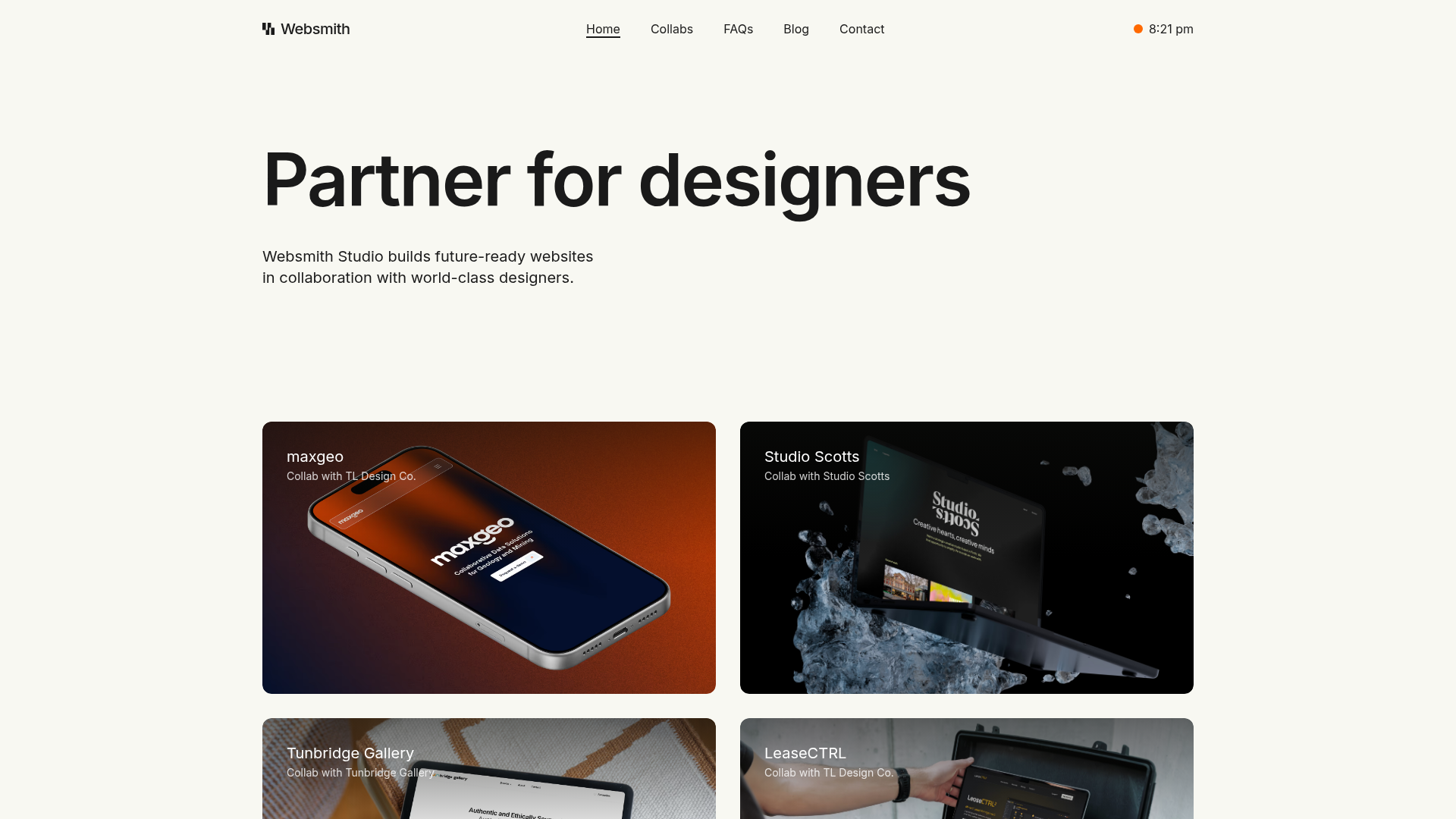
Websmith Studio Portfolio Site Template
A clean studio portfolio featuring a responsive bento-style project grid, interactive process cards, and a split-screen testimonial section built with Tailwind CSS.
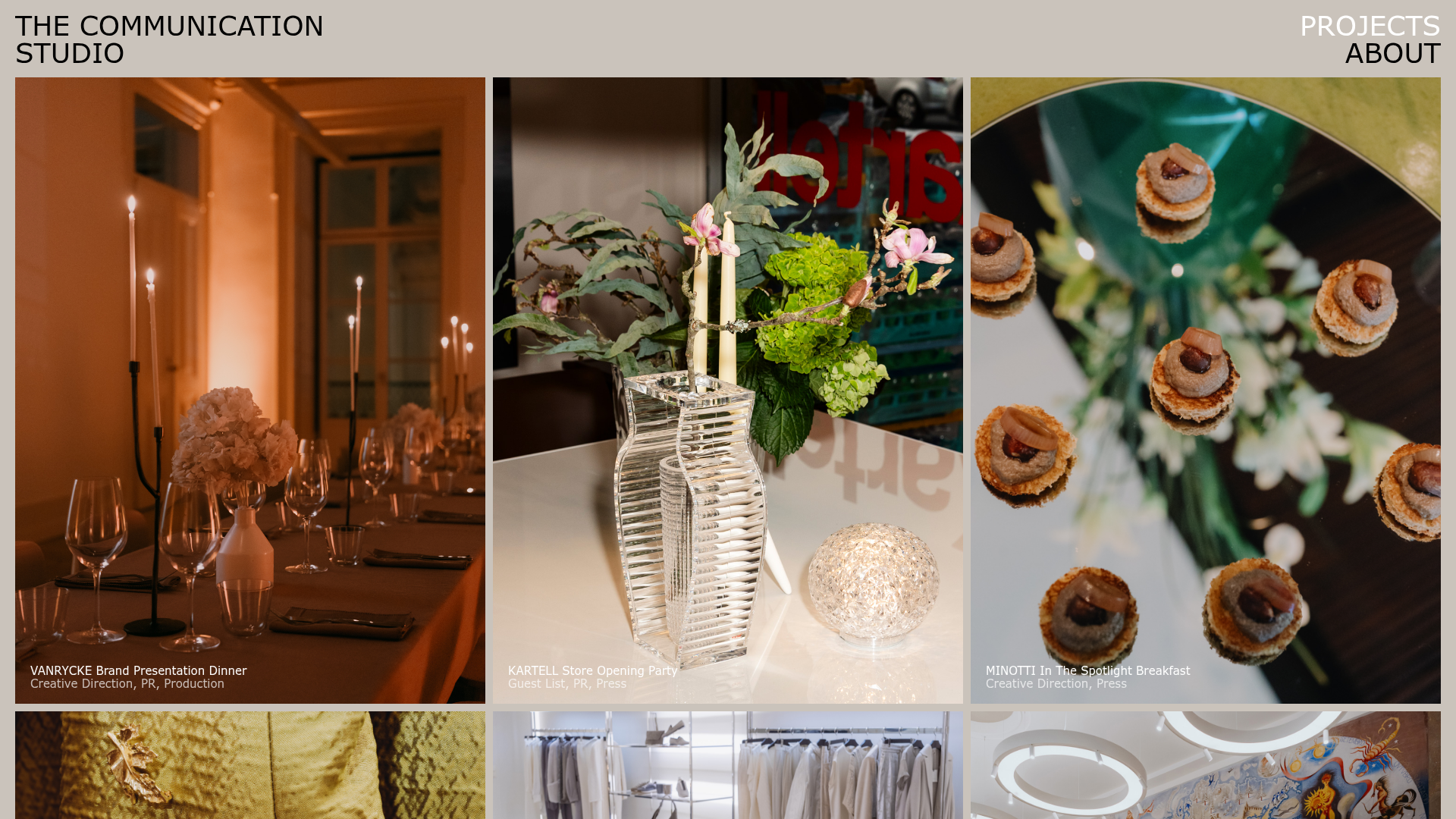
The Communication Studio Portfolio Grid
A minimalist creative agency portfolio featuring a gapless image grid with image-swap hover effects and Tailwind-based reveal animations.
