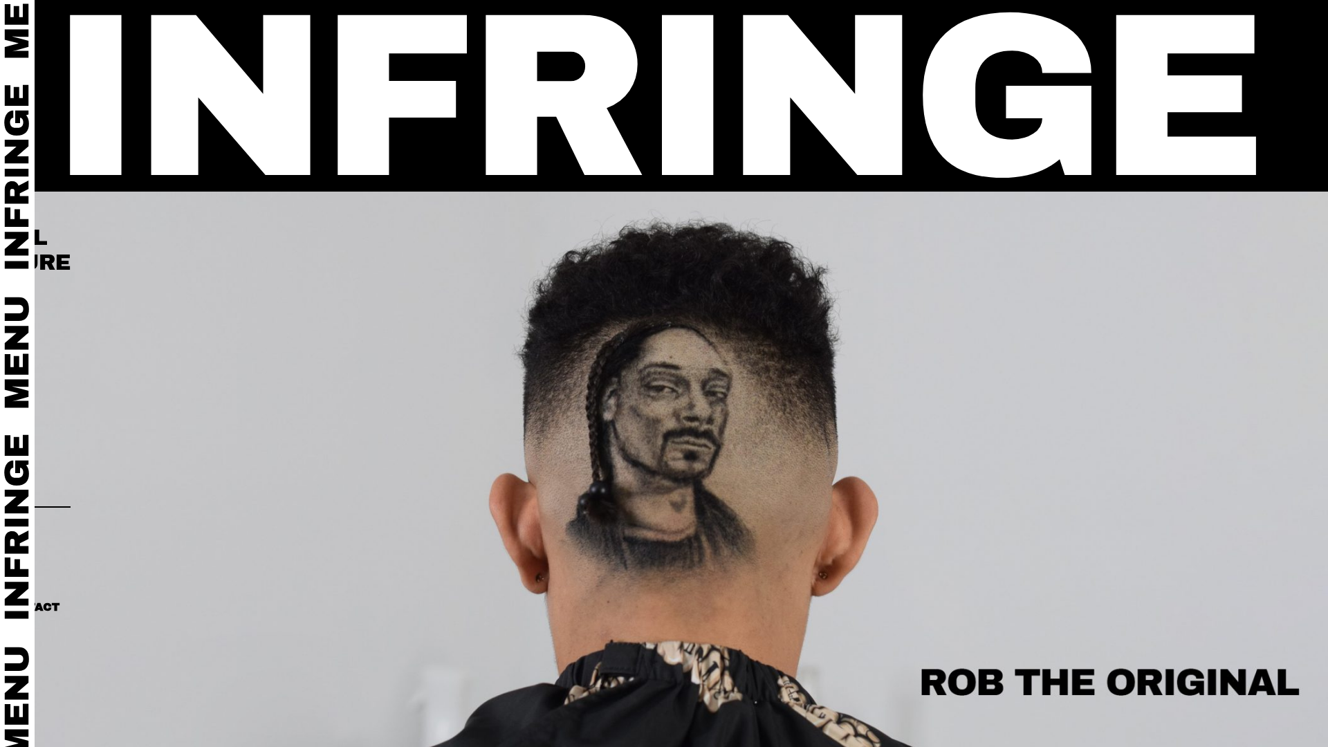
Infringe Hair Culture Portfolio Gallery
A minimalist, high-impact portfolio featuring a vertical sticky marquee sidebar and full-screen image scrolls that toggle between desktop and mobile assets.
Overview
Infringe is a minimalist, high-impact portfolio site dedicated to hair culture, utilizing an experimental editorial layout. It is a standout reference for builders seeking to create an immersive visual experience using large-scale imagery and a unique vertical marquee navigation system.
Design System
- Color Palette & Visual Hierarchy: The site uses a high-contrast monochrome base (Black
#000000and White#FFFFFF) with a striking functional accent of bright yellow (#ffff01) for the footer marquee. Hierarchy is driven by extreme scale; massive typography demands immediate attention, while imagery fills the remaining viewport. - Typography System: Heavy, condensed sans-serif fonts define the brand identity. The word "INFRINGE" acts as both a header and a graphic element. The HTML reveals a
page-headingclass used for the primary brand link, emphasizing bold weight and uppercase styling. - Page Structure & Section Flow: The layout is vertically oriented. A sticky left-hand sidebar containing a vertical marquee (
.marq1) persists as the user scrolls through a series of full-width image blocks (.singleImgWhite). The sequence ends with a "Back to home" marquee at the bottom. - Reusable Components:
- Vertical Sticky Marquee: A unique
.marqueesidebar that provides persistent navigation without cluttering the main canvas. - Dual-Asset Image Containers: The
.multiple-imageswrapper contains bothmulti-desktop-imageandmulti-mobile-imageclasses, demonstrating a robust method for serving device-specific art direction.
- Vertical Sticky Marquee: A unique
- Interaction & Motion: The site uses marquee animations (
.marquee-go) to create a sense of continuous motion. Image containers serve as large hit areas for navigation to sub-portfolios. - Responsive Behavior: The HTML employs classes like
img-desk-visible-onlyandimg-mobile-hideto control visibility. On mobile, the vertical sidebar likely collapses into a standard top header (.mobile-global-header) with a toggle menu. - Implementation Clues: The structure uses a standard
wrapperandcontainer-fluidsetup, indicating a layout built on a grid system but customized with absolute or sticky positioning for the marquee elements.
Use Cases
- Who should clone this pattern: Creative agencies, fashion photographers, and editorial designers who want a site that feels like a premium print magazine.
- Effective Remixes: High-end boutique e-commerce (replacing portfolio links with product categories) or architectural firms looking to showcase scale and texture.
- Practical Remix Directions: Swap the high-contrast yellow for a brand-specific accent color; adapt the vertical marquee to show project titles instead of just the brand name; or reuse the dual-image asset logic to ensure high-quality, art-directed photography across all devices.
- Suggested Clone Scope: The vertical marquee sidebar is the most unique asset for a quick section clone. For a total brand overhaul, cloning the entire full-screen scroll logic provides a sophisticated foundation for visual storytelling.
Related Inspirations
Julia Johnson Photography Portfolio Website
A creative portfolio featuring a masonry-style image grid, overlapping oversized typography, and a minimalist full-screen navigation overlay.
True Terrors Creative Developer Portfolio
A high-impact typography-driven portfolio featuring marquee animations, custom grid overlays, horizontal scroll case study rows, and a brutalist digital garden layout.
Numbered Studio Creative Portfolio Landing
A high-fashion agency landing page featuring a full-screen hero image with big serif typography, smooth scroll animations, and a varied-grid case study layout.
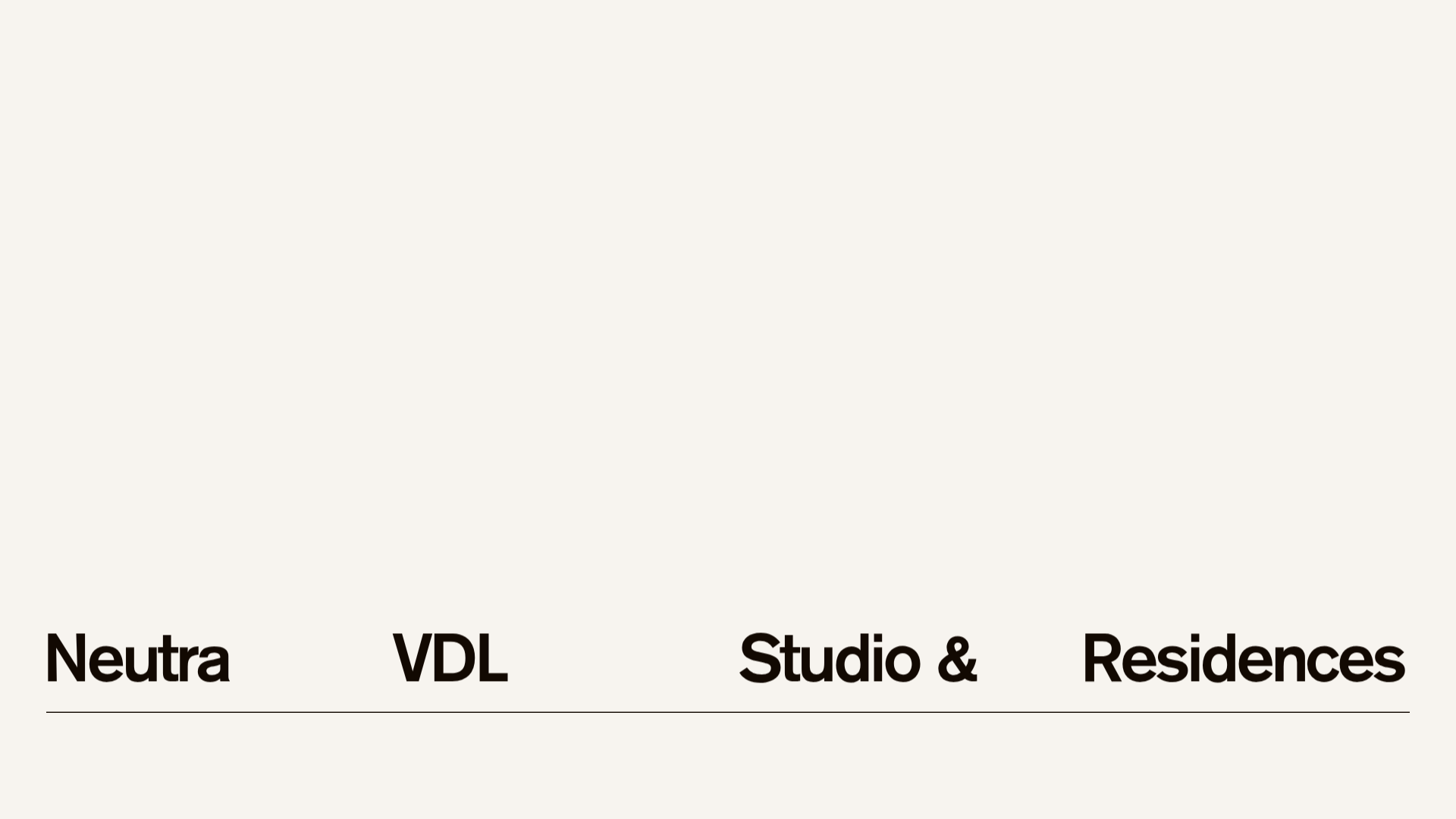
Neutra VDL Minimal Archive Layout
A refined museum site featuring a typography-focused overlay menu, sticky multi-column content sections, and an interactive image gallery with asset metadata details.
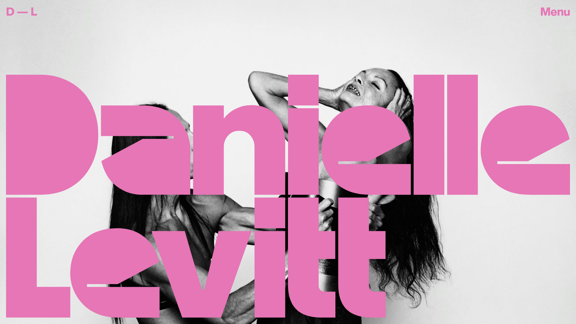
Danielle Levitt Portfolio Hero Layout
A high-impact photography landing page featuring giant typographic overlays, a full-screen image splash, and an interactive horizontal project slider with varied aspect ratios.
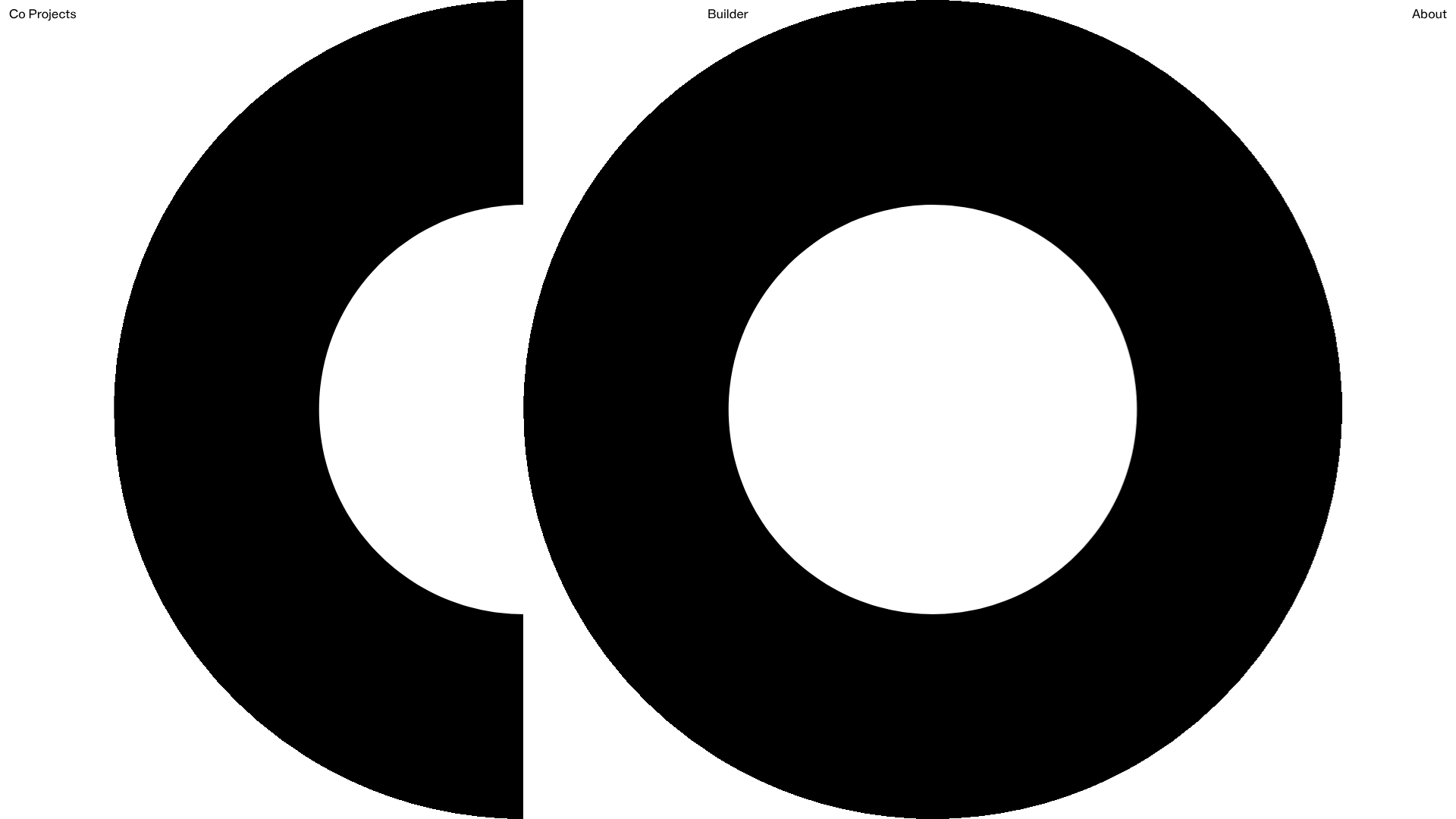
Co Projects Design Portfolio
Minimalist case study layout featuring a bold kinetic typography landing state, responsive staggered grid, sticky section headers, and a scroll-triggered image revealing interaction pattern.
