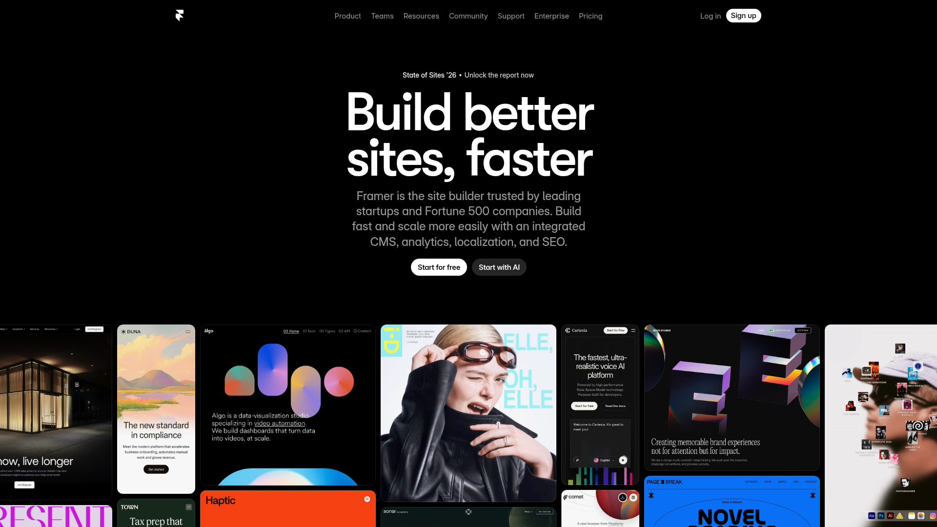
Framer Hero and Showcase Portfolio
A dark-themed landing page featuring a centered typography hero, integrated CMS/AI CTAs, and a horizontal scrollable masonry grid of site previews.
Overview
This is a high-impact, dark-themed hero section and portfolio showcase modeled after the Framer homepage. It is an excellent clone reference for its sophisticated use of centralized typography and a visually dense, horizontal masonry grid that effectively displays a vast creative portfolio in a compact space.
Design System
- Color Palette & Visual Hierarchy: The design utilizes a high-contrast 'true black' (#000000) background to make white typography and vibrant portfolio thumbnails pop. Hierarchy is established through extreme scale, with the primary H1 dominating the viewport.
- Typography System: Features a clean, geometric sans-serif (Inter style). The 'Build better sites, faster' headline uses tight letter spacing and varying font weights to create a bold, modern editorial feel.
- Page Structure: The layout follows a classic 'Z' pattern at the top for navigation, followed by a centered 'V' funnel: headline, sub-headline, and dual call-to-action (CTA) buttons. Below the fold, it transitions into a dense multi-row horizontal gallery.
- Reusable Components:
- Pill Buttons: High-contrast primary buttons (white background) paired with secondary outlined/translucent buttons.
- Status Badge: A small, centered 'pill' badge above the header for announcements.
- Showcase Cards: Rounded-corner cards of varying aspect ratios that form a continuous masonry strip.
- Interaction Patterns: The project suggests a significant focus on horizontal scrolling or automated carousels for the gallery. Based on the layout, it likely uses staggered entry animations for the cards.
- Responsive Behavior: The nav bar is designed to collapse into a streamlined header, while the multi-column gallery likely shifts to a single or double-row vertical scroll on mobile to maintain legibility of the thumbnail content.
Use Cases
- Who should clone this: Design agencies, SaaS startups looking for a 'premium' aesthetic, and individual portfolio creators who want to showcase many visual projects at once.
- Effective Remixes: This pattern can be effectively adapted for mobile app landing pages, photography portfolios, or directory sites where visual discovery is more important than long-form text.
- Remix Directions: Replace the dark background with a soft monochromatic gradient for a more 'light' tech brand feel. The horizontal gallery can be remixed to link directly to case studies or used as a testimonial section with customer logos and quotes.
- Suggested Clone Scope: For a quick win, clone the hero section (H1 + CTA group). For a full landing page project, the integration of the horizontal masonry grid is the most valuable technical piece to replicate.
Related Inspirations

GoCardless Payments Platform Landing Page
A dark-themed fintech landing page featuring a split-screen video hero, bento-style feature cards, a horizontal logo slider, and step-by-step accordion guides.
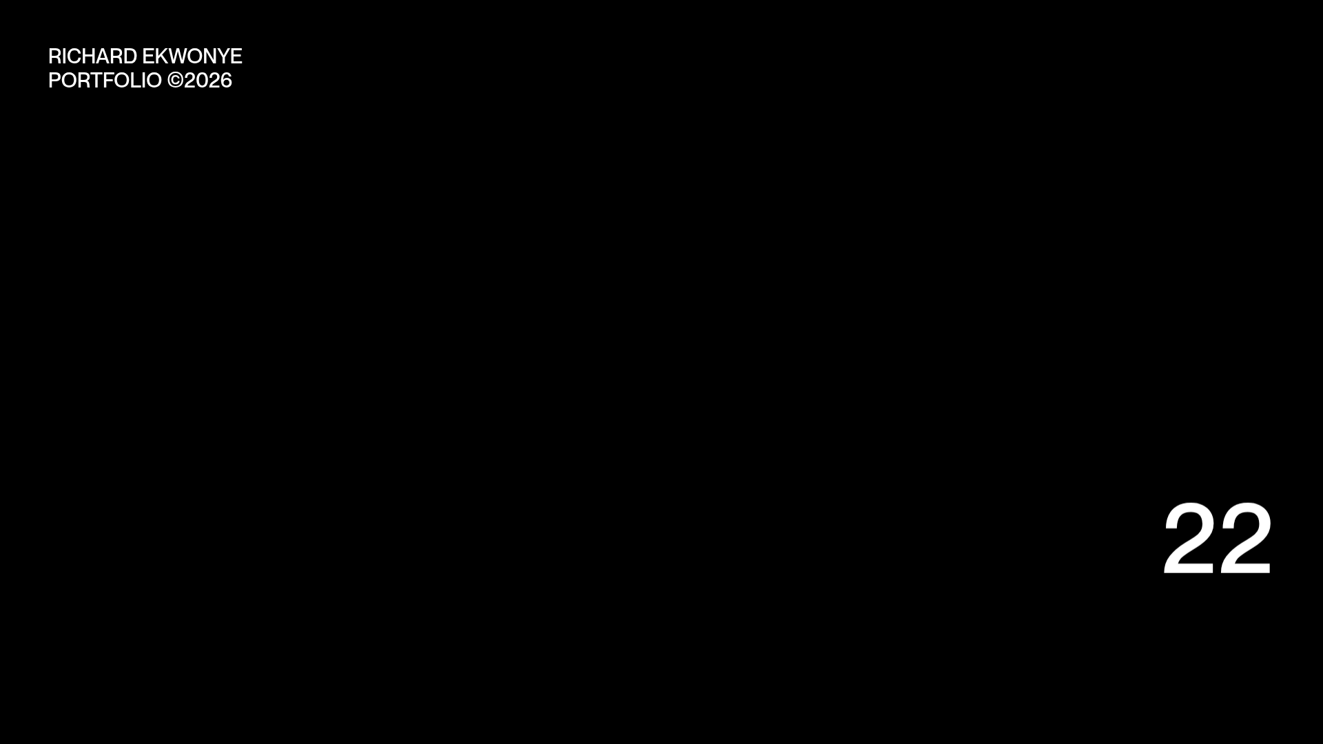
Richard Ekwonye Minimalist Portfolio Landing
A dark-themed minimalist portfolio featuring a high-contrast typography-based loading sequence and large numerical progress counters for modern creative showcases.
Linear Product Features Landing Page
A premium dark-themed landing page featuring a minimalist aesthetic, bento style icon grids, sleek typography, and high-contrast call-to-action buttons.
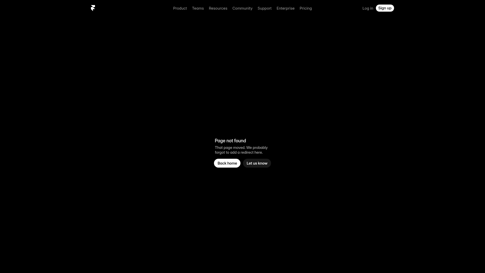
Framer Dark 404 Error Page
A minimalist dark mode error page featuring a clean centered layout, monochromatic navigation, and pill-shaped call-to-action buttons.
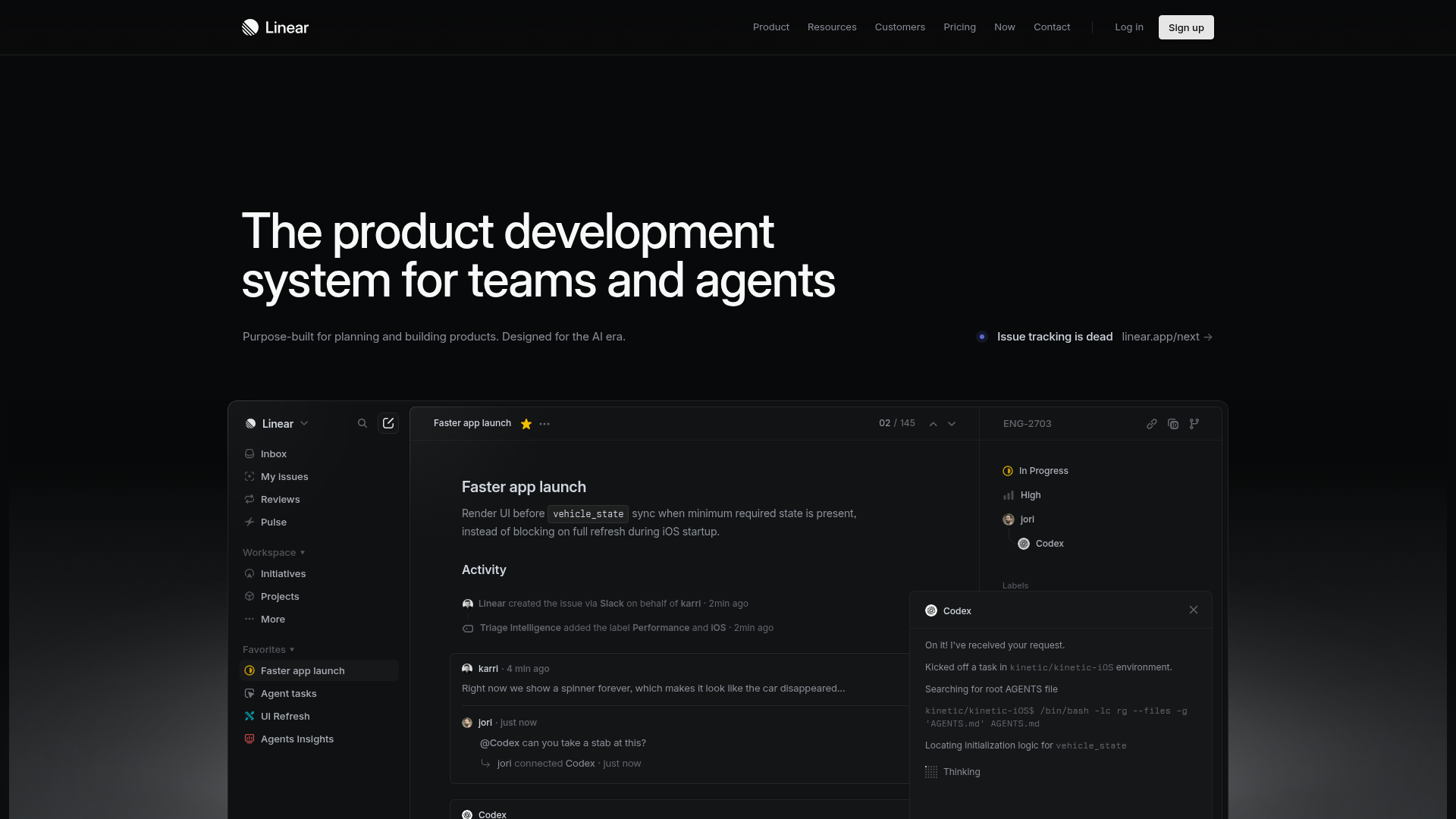
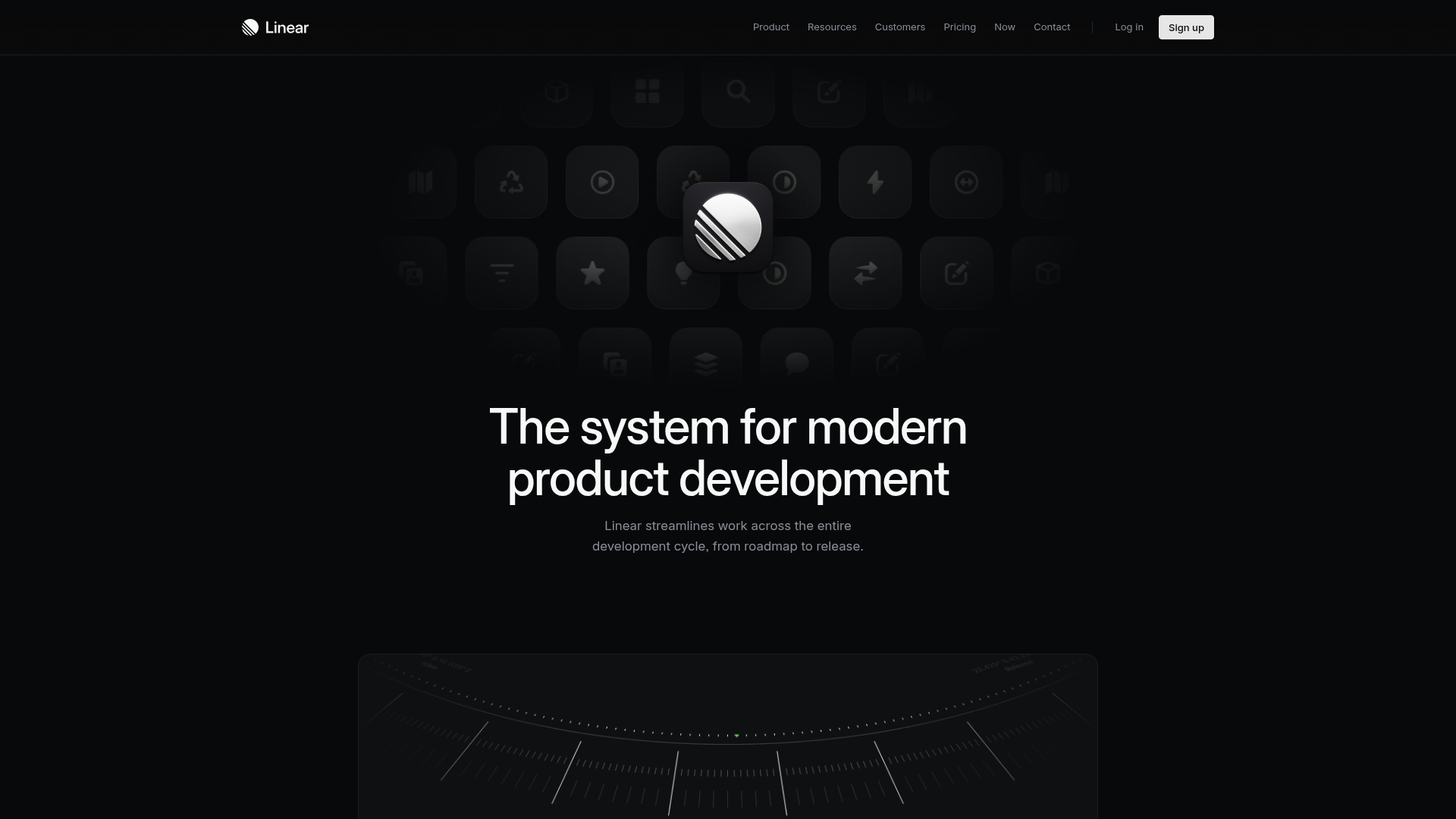
Linear Product Development System Landing Page
A high-fidelity dark-themed landing page featuring a complex dashboard UI mockup, glassmorphism effects, and a sophisticated sidebar navigation layout.
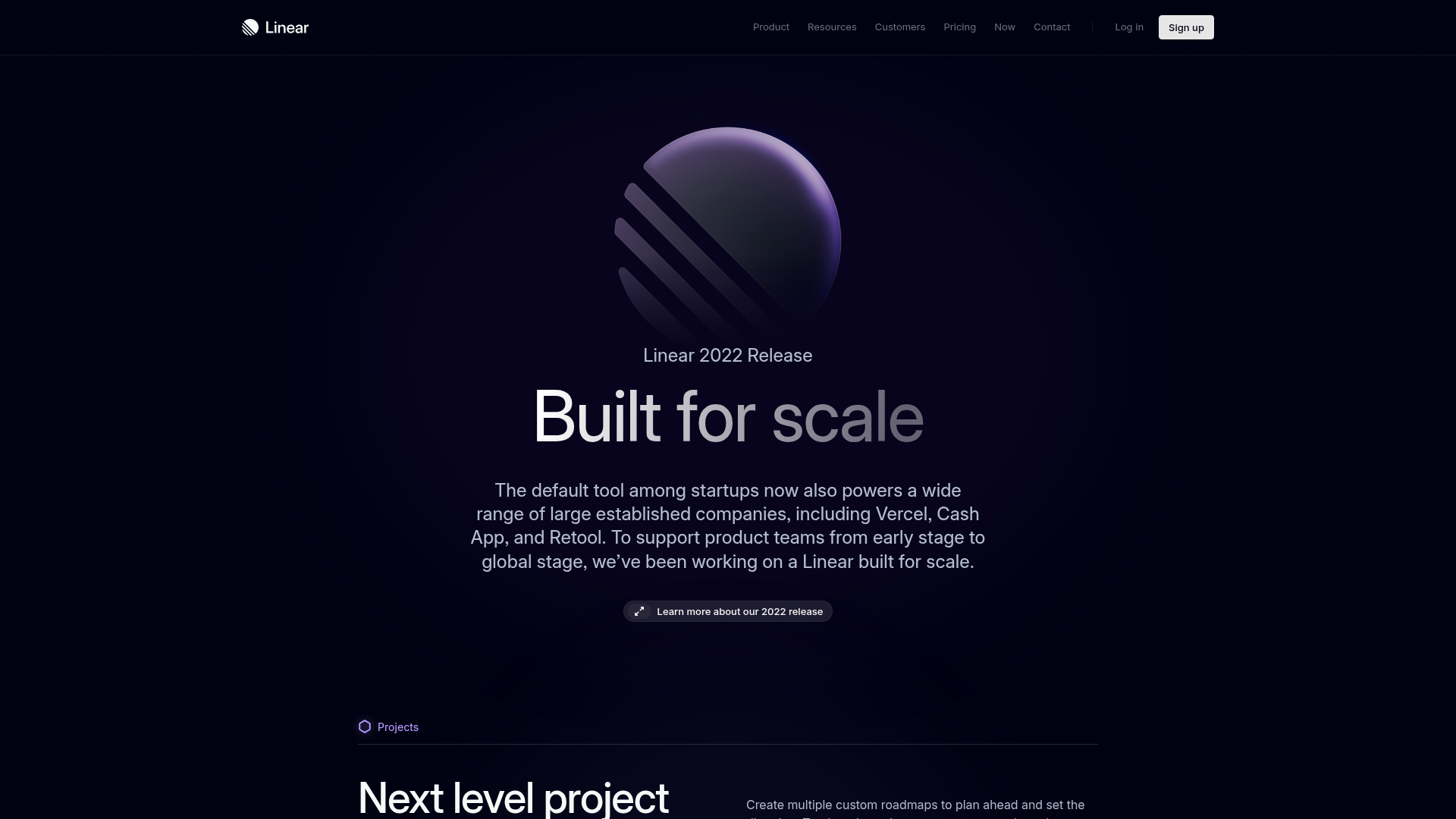
Linear 2022 Product Release Page
A high-end dark mode product launch page featuring a 3D glassmorphic logo, sleek typography, and a structured layout for feature announcements.
