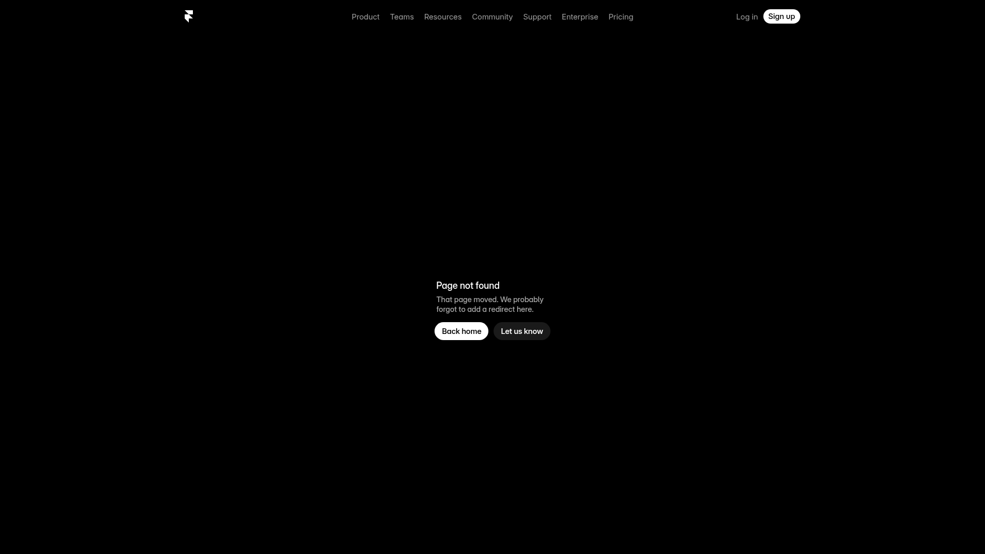
Framer Dark 404 Error Page
A minimalist dark mode error page featuring a clean centered layout, monochromatic navigation, and pill-shaped call-to-action buttons.
Overview
This minimalist dark mode 404 error page is a masterclass in functional simplicity and brand consistency. It serves as an excellent clone reference for builders looking to implement a distraction-free, professional recovery state that guides users back to core product value without visual clutter.
Design System
- Color Palette & Visual Hierarchy: The design uses a high-contrast monochromatic palette with a true black (
rgb(0, 0, 0)) background. Hierarchy is established through brightness: primary text is pure white, supporting text is a muted grey (rgb(168, 168, 168)), and the primary CTA uses a high-visibility white background. - Typography: The system utilizes "Inter Variable," a clean sans-serif. Headings are set with a tight letter-spacing (
-0.02em) and significant font weight (560) to create a modern, tech-focused aesthetic. The scale is modest, prioritizing readability over aggressive display sizes. - Page Structure: The layout follows a classic vertical stack: a global sticky navigation header (logo left, links center, CTAs right) followed by a vertically and horizontally centered hero container for the error message.
- Reusable Components:
- Pill Buttons: Two distinct variants are worth cloning—a solid white "Action" button with black text and a ghost-style button with a subtle white border/background-alpha (
rgba(255, 255, 255, 0.1)) for secondary actions. - Navigation Bar: A clean, balanced header component that uses simple text links and a high-contrast "Sign up" pill button.
- Pill Buttons: Two distinct variants are worth cloning—a solid white "Action" button with black text and a ghost-style button with a subtle white border/background-alpha (
- Implementation Clues: Built on Framer, the page uses a responsive grid system with defined breakpoints (1200px, 810px). The buttons use rounded corners (
100pxborder-radius) and subtle backdrop filters for a premium feel.
Use Cases
- Who should clone this: SaaS developers and designers building sophisticated, "Pro"-tier utility applications where a clean, dark aesthetic is preferred.
- Effective Remixes: This pattern can be effectively remixed for other system-level pages like "Maintenance Mode," "Success/Thank You" screens, or minimalist "Login/Sign-up" portals.
- Practical Directions: To remix code, builders should maintain the layout but swap the monochromatic palette for brand specific primary/secondary colors. The pill button component is highly reusable across an entire site to maintain button style consistency.
- Suggested Scope: A full-page clone is recommended as the 404 page is a contained, low-complexity environment that allows for quick deployment of a polished brand touchpoint.
Related Inspirations
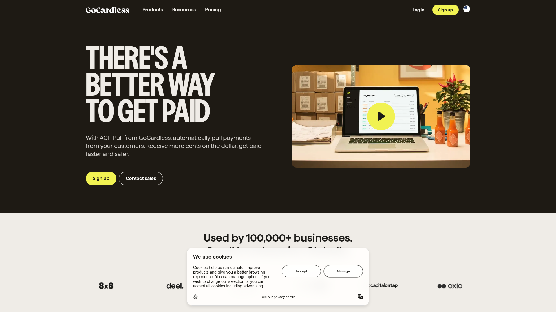
GoCardless Payments Platform Landing Page
A dark-themed fintech landing page featuring a split-screen video hero, bento-style feature cards, a horizontal logo slider, and step-by-step accordion guides.
Linear Product Features Landing Page
A premium dark-themed landing page featuring a minimalist aesthetic, bento style icon grids, sleek typography, and high-contrast call-to-action buttons.
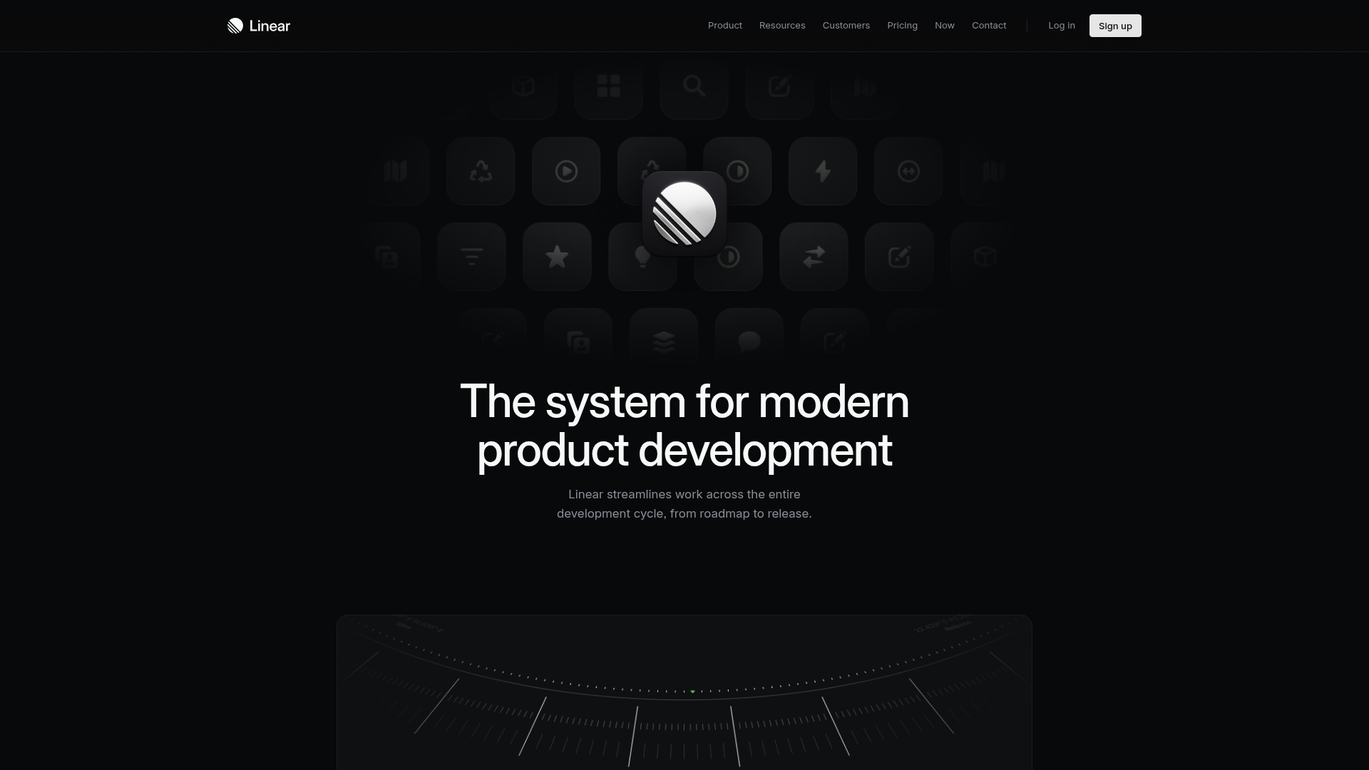
Linear Product Development System Landing Page
A high-fidelity dark-themed landing page featuring a complex dashboard UI mockup, glassmorphism effects, and a sophisticated sidebar navigation layout.
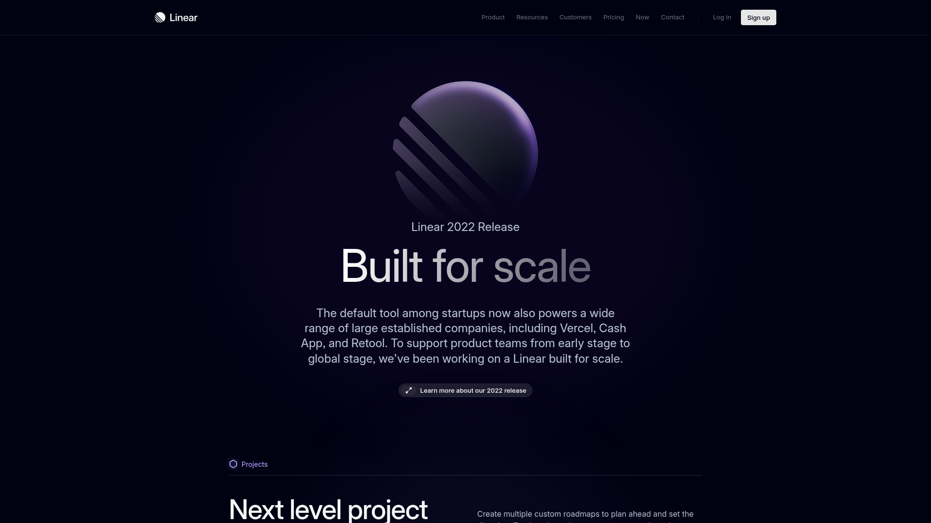
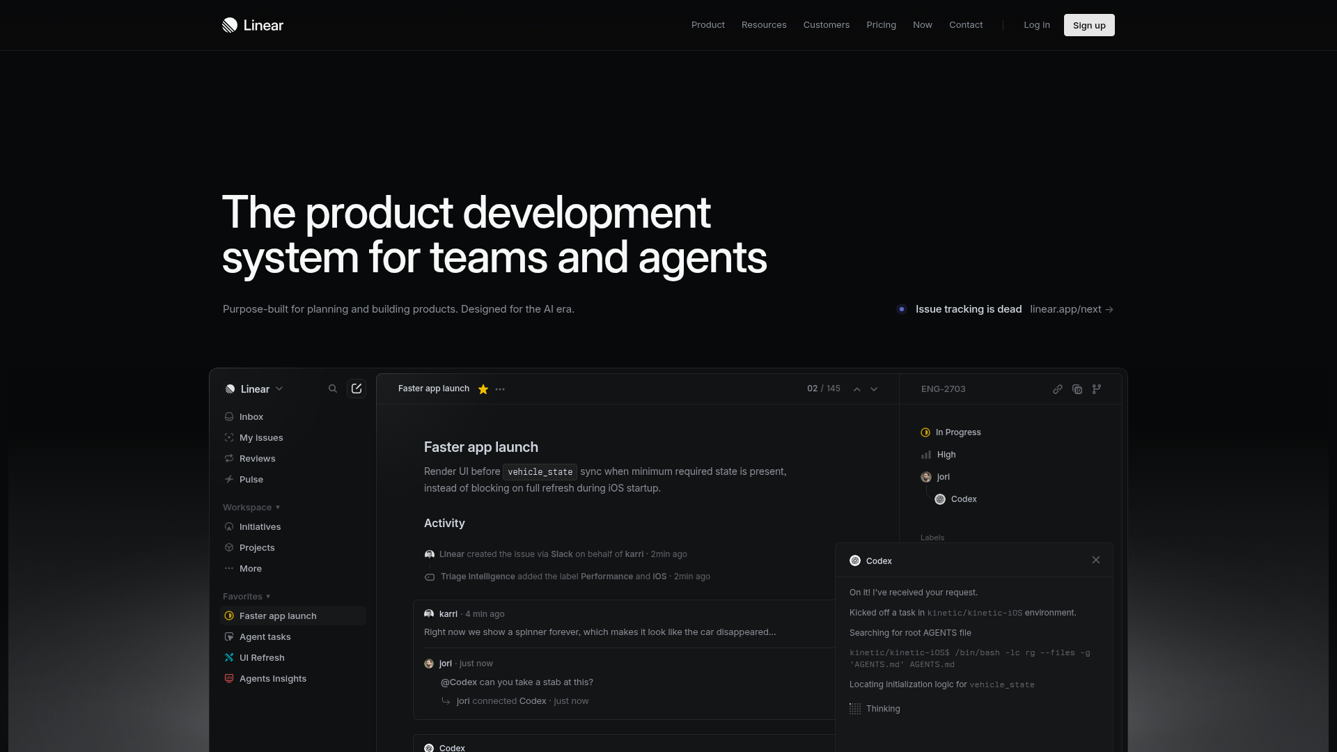
Linear 2022 Product Release Page
A high-end dark mode product launch page featuring a 3D glassmorphic logo, sleek typography, and a structured layout for feature announcements.
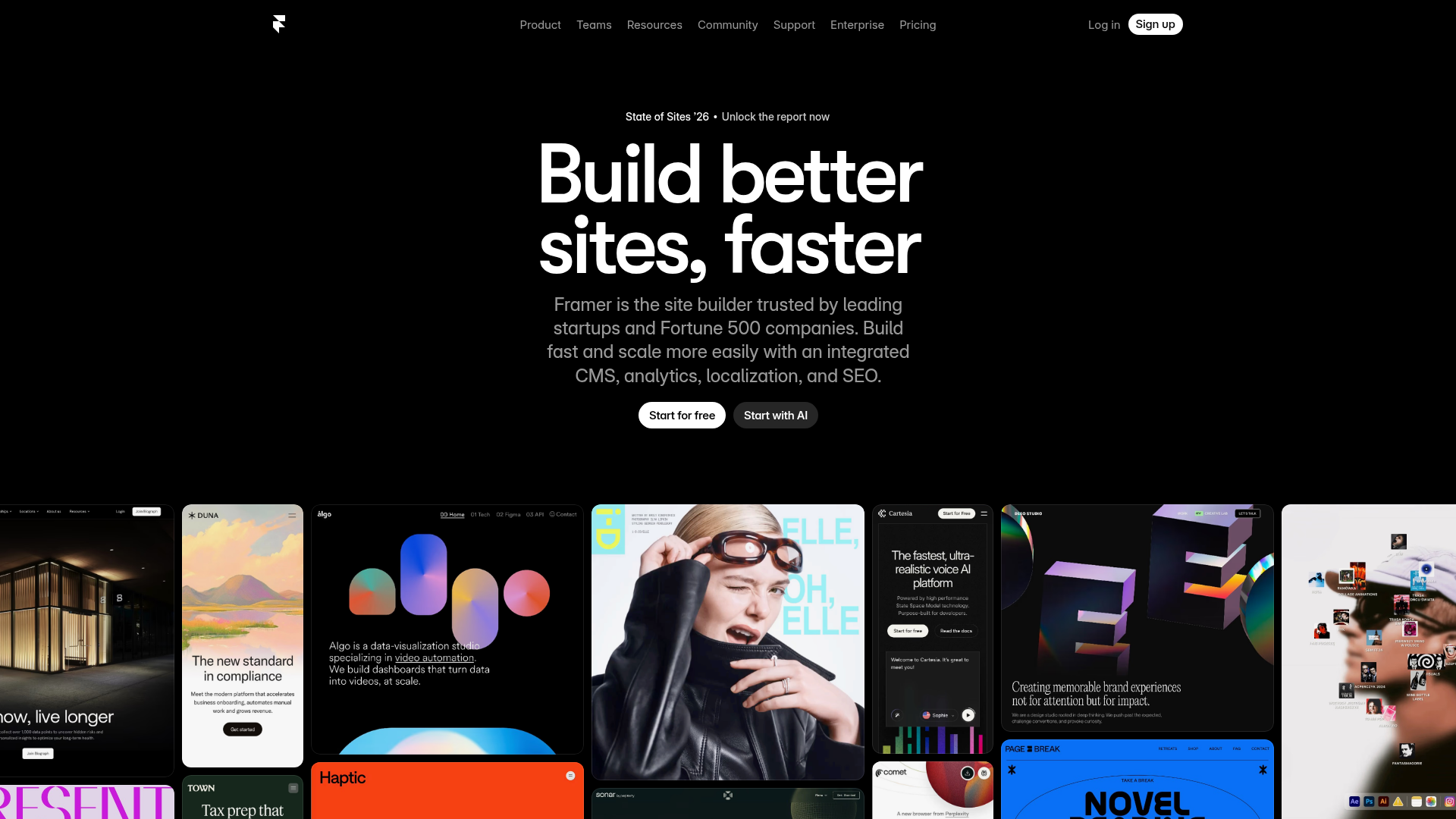
Framer Hero and Showcase Portfolio
A dark-themed landing page featuring a centered typography hero, integrated CMS/AI CTAs, and a horizontal scrollable masonry grid of site previews.
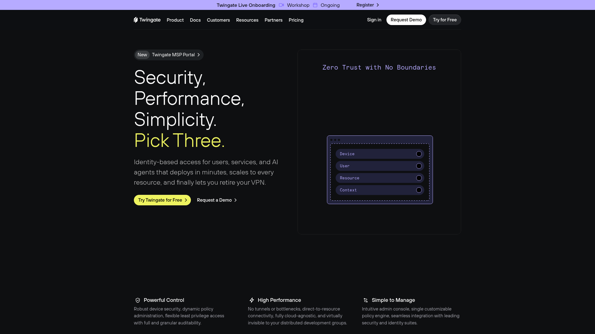
Twingate Zero Trust Security Landing Page
A dark-themed SaaS landing page featuring a high-contrast hero section with a two-column layout, call-to-action buttons, and a clean three-column feature grid.
