Linear Product Development System Landing Page
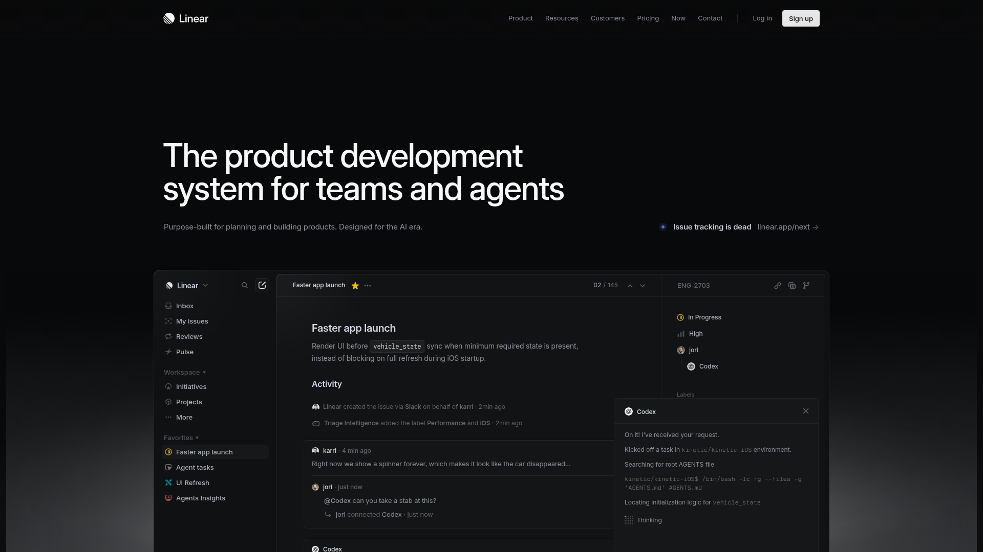
A high-fidelity dark-themed landing page featuring a complex dashboard UI mockup, glassmorphism effects, and a sophisticated sidebar navigation layout.
Overview
Linear is a high-performance project management tool known for its minimalist, developer-centric aesthetic and "pro-tool" feel. This landing page is a premier reference for cloning because it masters the high-contrast dark mode aesthetic and complex dashboard UI simulation within a marketing context.
Design System
- Color Palette & Visual Hierarchy: The design uses a deep black background (
#000000) as the primary canvas, creating a high-contrast environment for white text and subtle gray accents. Visual hierarchy is achieved through opacity levels (e.g., secondary text in muted grays) and thin, 1px border strokes to delineate the "app window" from the landing page background. - Typography: The typography uses a clean, sans-serif font (likely Inter or a custom variant). Headings feature tight letter spacing and large scales for impact, while the UI mockup uses a smaller, monospaced-adjacent functional scale for data-dense information.
- Page Structure: The layout leads with a massive hero headline followed by a centered call-to-action bar ("Issue tracking is dead"). Below this, a large-scale high-fidelity mockup occupies the majority of the viewport, simulating the actual application interface.
- Reusable Components:
- Sidebar Navigation: A multi-level sidebar with icons, collapsible categories (Workspace, Favorites), and status indicators.
- Glassmorphic Toasts: The "Codex" AI interaction window demonstrates sophisticated layering with semi-transparent backgrounds and subtle border glows.
- Modern Header: A minimalist top navigation with a distinct "Sign up" button featuring a high-contrast white background and rounded corners.
- Implementation Clues: The HTML structure reveals a clean, semantic approach with a
<nav>for global links and a highly structured container for the application mockup, utilizing flexbox for the sidebar-content split.
Use Cases
- Who should clone this: SaaS developers building developer tools, AI agents, or productivity software that requires a "power user" aesthetic.
- Effective Remixes: This pattern works exceptionally well for technical documentation sites, sophisticated analytics dashboards, or project management alternatives.
- Remix Directions:
- Thematic Swap: Transition the dark mode to a "high-contrast light mode" using the same spacing and border logic.
- Navigation: Deep-link the sidebar items to different product features to create an interactive product tour.
- Information Architecture: Replace the internal "Issue" details in the mockup with data relevant to your specific niche (e.g., code snippets for a dev tool or supply chain data for logistics).
- Suggested Clone Scope: Start with the Hero Section and Mockup Container. Replicating the precise border-radius and subtle shadowing of the central app window provides the highest visual ROI for a professional-looking landing page.
Related Inspirations

GoCardless Payments Platform Landing Page
A dark-themed fintech landing page featuring a split-screen video hero, bento-style feature cards, a horizontal logo slider, and step-by-step accordion guides.
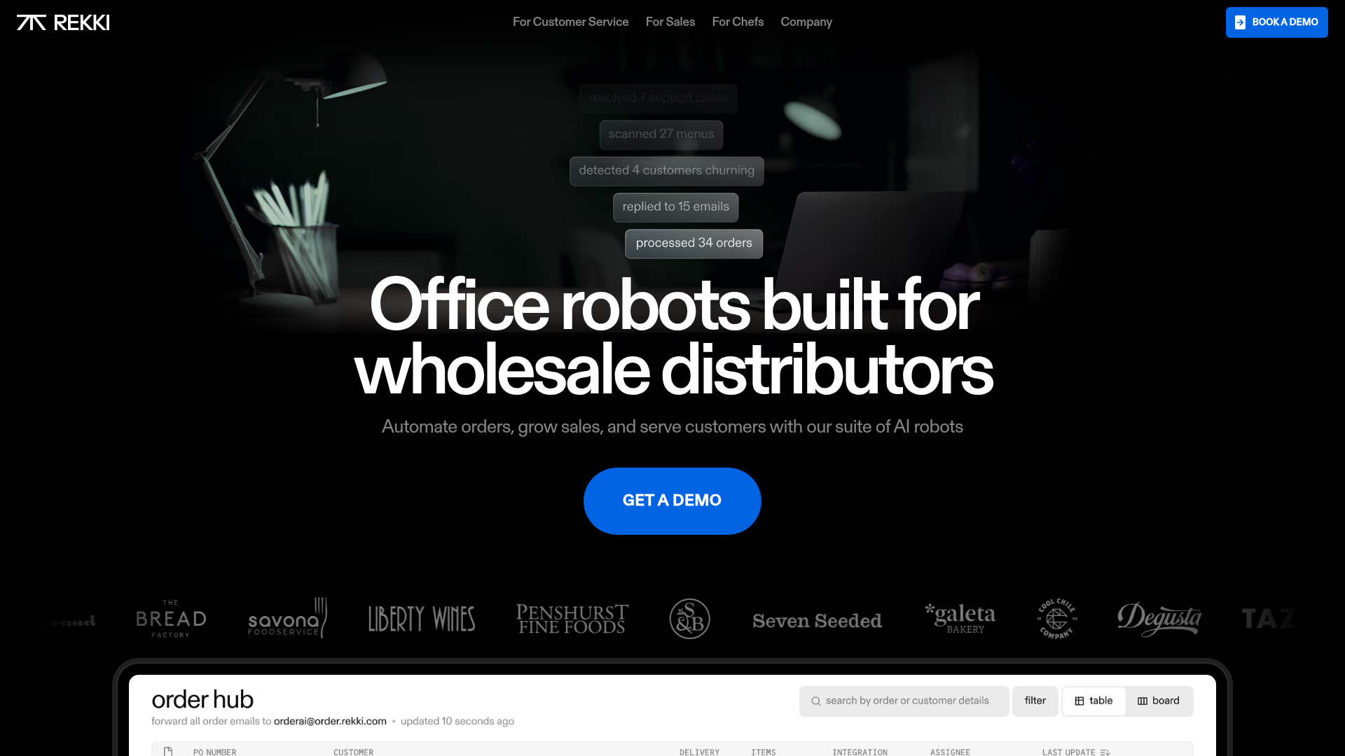
REKKI AI Automation SaaS Landing Page
A high-impact dark-mode landing page featuring a floating label hero section, marquee brand logos, an interactive dashboard UI preview, and card-based testimonial grids.
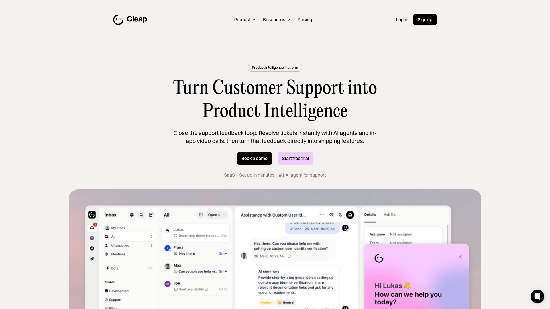
Gleap Product Intelligence Platform Landing
A SaaS template featuring a central video hero, comparison pricing tables, tabbed feature navigation, and a testimonial grid with major brand logos.
Linear Product Features Landing Page
A premium dark-themed landing page featuring a minimalist aesthetic, bento style icon grids, sleek typography, and high-contrast call-to-action buttons.
Framer Dark 404 Error Page
A minimalist dark mode error page featuring a clean centered layout, monochromatic navigation, and pill-shaped call-to-action buttons.
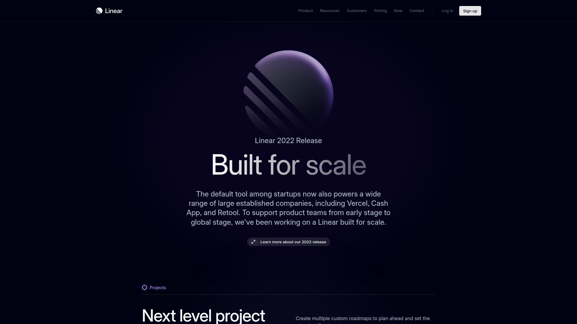
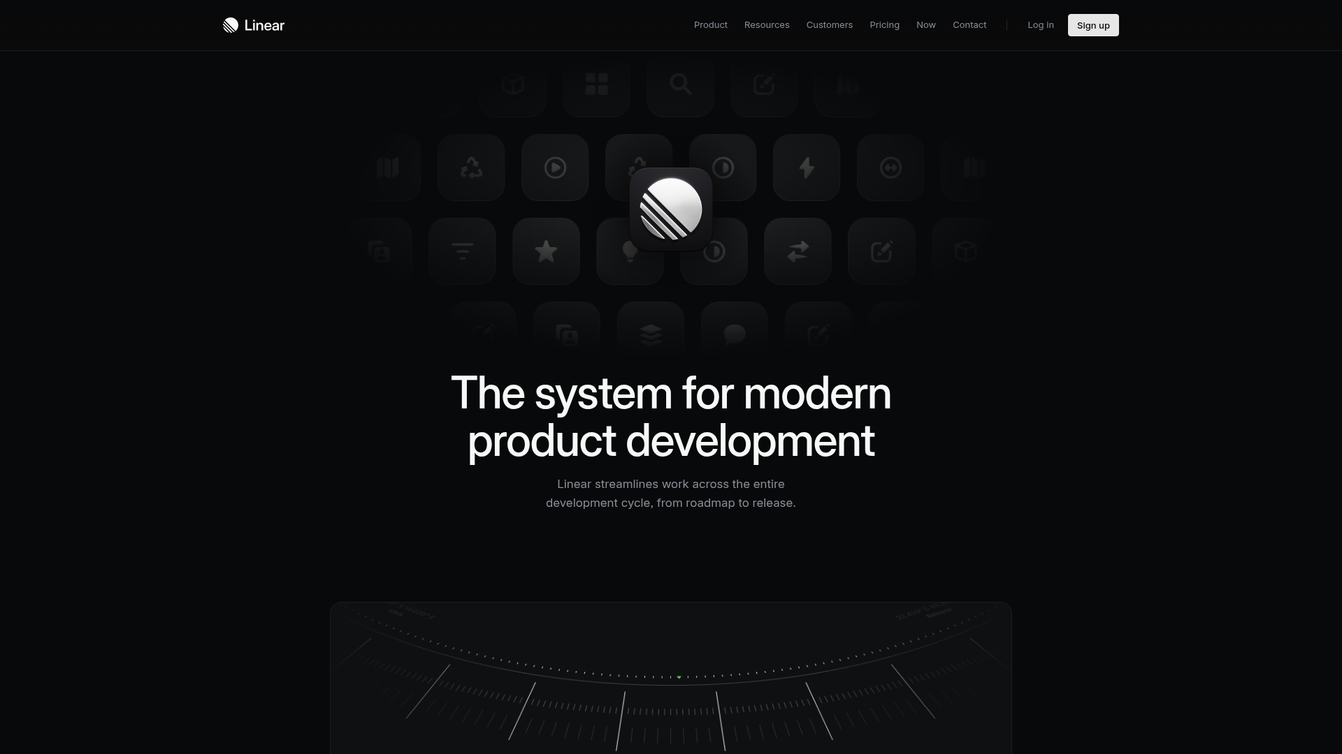
Linear 2022 Product Release Page
A high-end dark mode product launch page featuring a 3D glassmorphic logo, sleek typography, and a structured layout for feature announcements.
