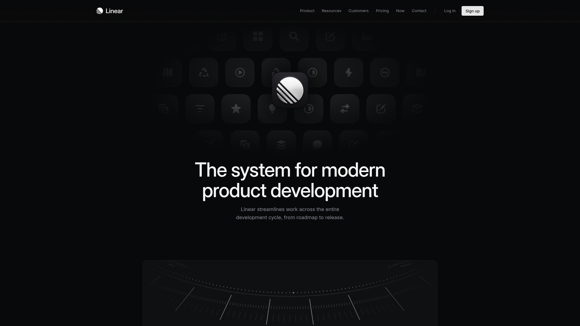
Linear Product Features Landing Page
A premium dark-themed landing page featuring a minimalist aesthetic, bento style icon grids, sleek typography, and high-contrast call-to-action buttons.
Overview
This landing page is a masterclass in minimalist, high-end SaaS design, specifically tailored for project management and developer tools. It leverages a dark-themed aesthetic with a focus on deep shadows, subtle gradients, and custom iconography to convey a sense of precision and speed. Builders should clone this for its sophisticated use of white space and its ability to communicate complex product capabilities through a clean, hierarchical layout.
Design System
- Color Palette & Visual Hierarchy: The palette is dominated by a pure black background (#000000) with various shades of dark gray for surfacing components. Text follows a strict hierarchy: pure white for primary headings, light gray for secondary descriptions, and dimmed gray for secondary navigation links. High contrast is used sparingly to draw attention to the white "Sign up" CTA.
- Typography System: The site uses a clean, sans-serif typeface (likely a custom variation of Inter or a similar grotesque face). Headings feature tight letter spacing (tracking) and high font weights, while body text uses generous line height to maintain readability against the dark background.
- Page Structure: The layout follows a high-impact vertical flow: a global navigation bar, a central hero section with a signature graphic, followed by feature-specific blocks. The icon grid above the hero text uses a bento-style arrangement with subtle rounded corners and inner shadows to create a 3D glassmorphism effect.
- Reusable Components: Priority components to clone include the navigation bar with translucent blurring, the tiered icon grid for visual branding, and the standardized feature text blocks that pair a bold title with a concise sub-description.
- Interaction & Motion: The design emphasizes a static, refined feel, though the HTML suggests the use of Framer Motion or similar libraries for entrance animations. The "Sign up" button uses a distinct solid fill to separate it from the ghost-style navigation links.
- Implementation Clues: Based on the screenshot, the layout relies heavily on CSS Flexbox and Grid to manage the alignment of icons and centered text. The iconography is likely implemented as SVGs or custom font icons for crisp rendering at all scales.
Use Cases
- Who should clone this: Developers and designers building developer tools, enterprise software, or creative productivity apps that want to signal "premium" and "high-performance" qualities.
- Remix Directions: This pattern is highly effective for technical landing pages. A builder could remix it by swapping the monochrome palette for a brand-specific accent color (e.g., deep purple or electric blue) while keeping the layout structure intact. The icon grid can be easily adapted to showcase different feature sets or integration logos.
- Suggested Scope: For a fast deployment, clone the navigation and hero section. For a more comprehensive build, capture the entire information architecture to ensure a consistent narrative flow across product feature descriptions.
Related Inspirations
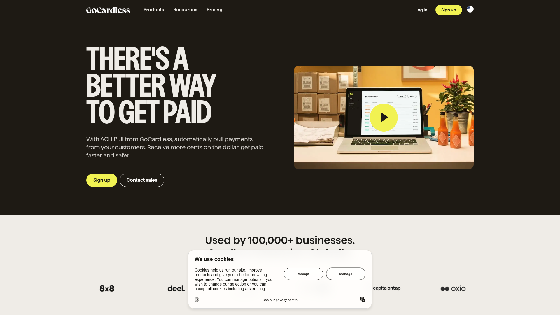
GoCardless Payments Platform Landing Page
A dark-themed fintech landing page featuring a split-screen video hero, bento-style feature cards, a horizontal logo slider, and step-by-step accordion guides.
Mono X7 Minimalist Product Landing
A dark-themed Vue.js product page featuring a full-screen loading state, animated ticker text, interactive Three.js container, and a localized minimalist content layout.
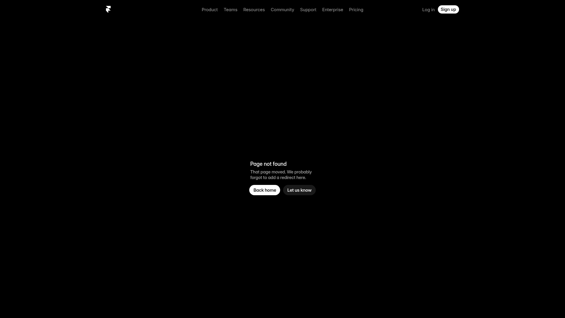
Framer Dark 404 Error Page
A minimalist dark mode error page featuring a clean centered layout, monochromatic navigation, and pill-shaped call-to-action buttons.
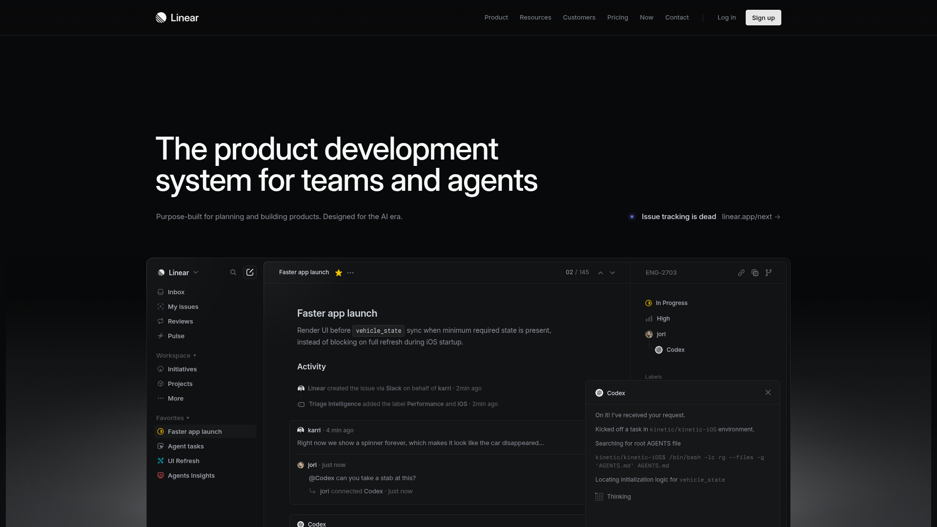
Linear Product Development System Landing Page
A high-fidelity dark-themed landing page featuring a complex dashboard UI mockup, glassmorphism effects, and a sophisticated sidebar navigation layout.
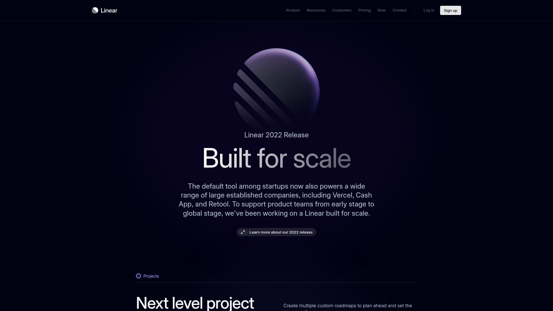
Linear 2022 Product Release Page
A high-end dark mode product launch page featuring a 3D glassmorphic logo, sleek typography, and a structured layout for feature announcements.
Framer Hero and Showcase Portfolio
A dark-themed landing page featuring a centered typography hero, integrated CMS/AI CTAs, and a horizontal scrollable masonry grid of site previews.
