Xandra Alvarez Allende Photography Portfolio
A minimalist photography site featuring a marquee-style title bar, a staggered vertical image flow, and a full-screen light-box gallery for individual works.

Overview
Xandra Alvarez Allende's portfolio is a high-impact, minimalist photography showcase defined by its bold typography and unconventional staggered layout. It serves as an excellent reference for builders wanting to create visually-driven personal brands where the identity—expressed through a massive ticker-style header—is as important as the content.
Design System
- Color Palette & Visual Hierarchy: The site uses a high-contrast monochromatic base (black and white) to ensure photography remains the focal point. Hierarchy is established through extreme scale, with the artist's name acting as both the primary branding element and a persistent interface anchor.
- Typography System: A heavy, geometric San-Serif (reminiscent of Archivo or Inter Bold) is used for the marquee and headers. Smaller body copy is set in a similar sans-serif for readability. The hierarchy uses a "--big" utility class for expressive Spanish intro text, creating a brutalist yet professional aesthetic.
- Page Structure & Flow:
- Dynamic Interface Layer: A persistent footer/header containing a carrousel-text marquee with the artist's name and scroll progress indicator.
- Introductory Summary: A multi-line bold text block using
__linespans for controlled typographic fragments. - Bio/Contact Info: A simple two-column layout for narrative text and a contact list with emojis.
- Photography Grid: A long-form vertical gallery using a staggered, non-uniform grid to create a "scrapbook" feel.
- Lightbox: A dedicated full-screen overlay (
#Windows) for immersive viewing.
- Reusable Components:
carrusel-text: A marquee title bar that could be repurposed for site-wide navigation or news tickers.block-thumb: An image container with a custom--aspect-ratioCSS variable used to maintain layout stability during lazy loading.interface__guides: Background grid lines (visible in HTML) that provide a subtle framework for aligning elements.
- Interaction & Motion: The marquee utilizes a
__progress-scrollcounter that updates in real-time. Images feature adata-class="image3D"attribute, suggesting subtle parallax or hover-tilt effects once loaded. - Implementation Clues: The code uses a sophisticated custom layout engine rather than a standard CSS grid, evidenced by the explicit
heightandaspect-ratiocalculations injected into the style attributes of image wrappers.
Use Cases
- Who should clone this: Photographers, creative directors, and editorial designers who want a site that feels like a physical magazine or modern art gallery.
- Effective Remixes:
- Fashion Lookbooks: Replace the artist name with a collection title and use the staggered grid for lifestyle shots.
- Architecture Portfolios: Leverage the
aspect-ratiocontrolled blocks to handle a mix of ultra-wide panoramas and vertical detail shots without breaking the layout flow. - Creative Agencies: Adapt the interactive marquee to display a list of clients or services while maintaining the minimalist aesthetic.
- Suggested Scope: A full-page clone is best to preserve the relationship between the persistent interface guides and the staggered content. However, the
carrusel-textmarquee and the staggeredul-photosgrid are excellent individual sections to remix into more traditional layouts.
Related Inspirations
Bruno Arizio Designer Portfolio Website
A minimalist creative director portfolio featuring a clean typographic layout, side-aligned image previews, and high-contrast spacing patterns suitable for luxury or design showcases.

Vita Architecture Portfolio Landing Page
A minimalist, high-end architecture portfolio featuring a custom canvas-based image gallery, split-text animations, and a project slider with dynamic image masks.
Patrick Miller Photography Portfolio Template
A minimalist, full-bleed photography portfolio featuring a split-screen grid, scroll-triggered section transitions, and integrated Swiper.js image carousels for project galleries.

OhDaDa Handcrafted Kinetic Sculpture E-commerce
A minimalist Svelte-based store featuring a horizontal-scroll product showcase, transform-driven image gallery, and a full-screen sliding cart overlay.
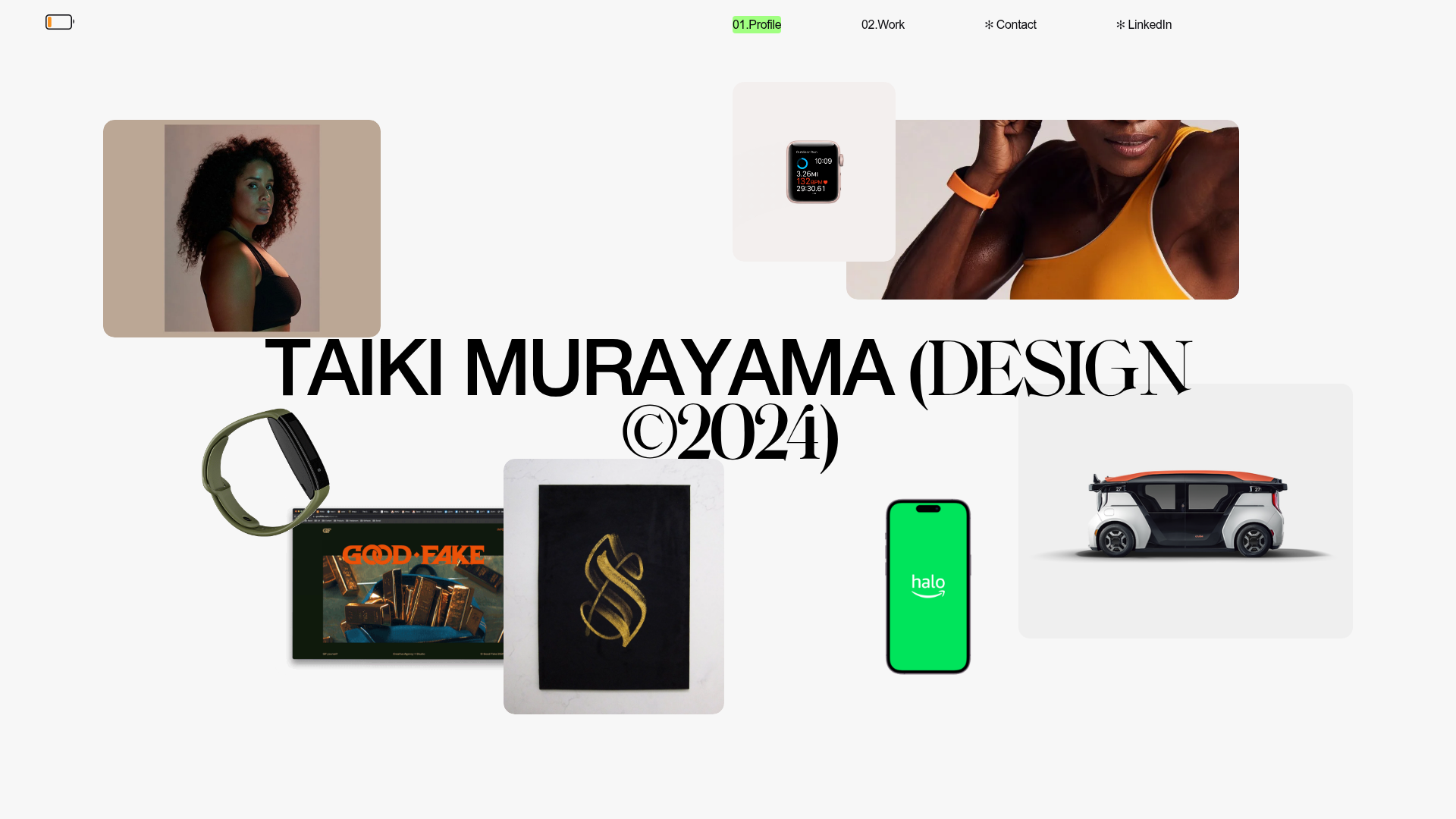
Taiki Murayama Portfolio Bento Grid
A minimalist designer portfolio featuring a dynamic bento-style layout for project imagery, integrated accordion project lists, and high-contrast typography.
Artworld Agency Artist Portfolio Directory
A minimalist creative agency landing page featuring a typographic artist cloud, interactive category filtering, and image-on-hover card reveals in a clean, high-contrast layout.
