Artworld Agency Artist Portfolio Directory
A minimalist creative agency landing page featuring a typographic artist cloud, interactive category filtering, and image-on-hover card reveals in a clean, high-contrast layout.
Overview
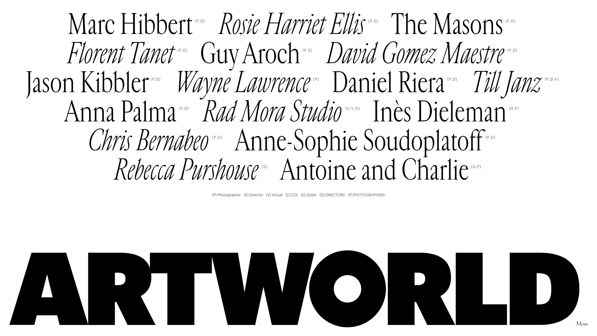
Artworld Agency’s landing page is a masterclass in minimalist, typography-driven directory design, featuring a center-aligned "cloud" of artist names that serves as the primary navigation. It is a strong reference for creators wanting to build high-end portfolios or agency rosters that prioritize individual talent through a clean, interactive interface. The site excels at using white space and massive footer branding to create a bold, professional aesthetic.
Design System
- Color Palette & Visual Hierarchy: The base design is strictly monochrome (black text on a white background), focusing all visual attention on the typography. Depth is added through dynamic "splash" colors (e.g.,
#FFD612,#77060C) and image overlays that appear on interaction, shifting the site from a document-like feel to a rich media experience. - Typography System: The design uses a sophisticated mix of serif and sans-serif fonts. Artist names in the cloud (
.artist-title) use a high-contrast serif with varying weights and styles (italics vs. upright) to create visual texture. The footer features a massive, ultra-bold sans-serif wordmark ("ARTWORLD"), while functional elements like categories and the menu button use a small, clean sans-serif for utility. - Page Structure & Section Flow: The layout is unconventional, placing the primary navigation (artist list) in the center of the viewport. Below this is a horizontal filter bar of categories (Photographer, Director, CGI, etc.), and the page terminates in an oversized sticky-style footer containing the brand logo and a minimal menu toggle.
- Reusable Components:
- Interactive Artist Links: The
.home-artistcomponent is essential; it pairs a text link with a hidden.artist-covercontainer that holds either an image or a video. - Floating Filter Bar: A clean
<ul>list (#filters) that uses data-attributes for category sorting. - Logo Footer: A high-impact, full-width responsive SVG logo for brand reinforcement.
- Interactive Artist Links: The
- Interaction & Motion Patterns: The core mechanic is an "image-on-hover" reveal. When a user hovers over an artist's name, the corresponding
standard,fullheight, orfullscreencover image/video becomes visible behind or near the text. The HTML indicates the use ofbarba.jsfor seamless page transitions and a preloader for asset-heavy content. - Implementation Clues: The site uses a class-based filtering system (e.g.,
data-filter=".photographer") likely powered by Isotope or specialized CSS grid logic. The use ofdata-srcandpreload="none"on videos suggests a focus on performance for a media-heavy directory.
Use Cases
- Who should clone this pattern: Creative agencies, talent management firms, film production houses, and independent curation platforms.
- Products for remixing: Digital galleries, speaker lineups for conferences, or fashion lookbooks where the visual "vibe" is as important as the information.
- Practical remix directions:
- Brand Swap: Replace the serif artist cloud with a brutalist mono-spaced font for a tech or underground music directory.
- IA Adaptation: Use the central cloud as a "Services" menu where hovering reveals a case study image for that specific service.
- Quick Section Clone: The footer branding and the horizontal filter bar are highly modular and can be adapted to any minimalist landing page.
- Suggested clone scope: A full-page clone is recommended to capture the specific relationship between the central interactive cloud and the bottom-heavy branding.
Related Inspirations
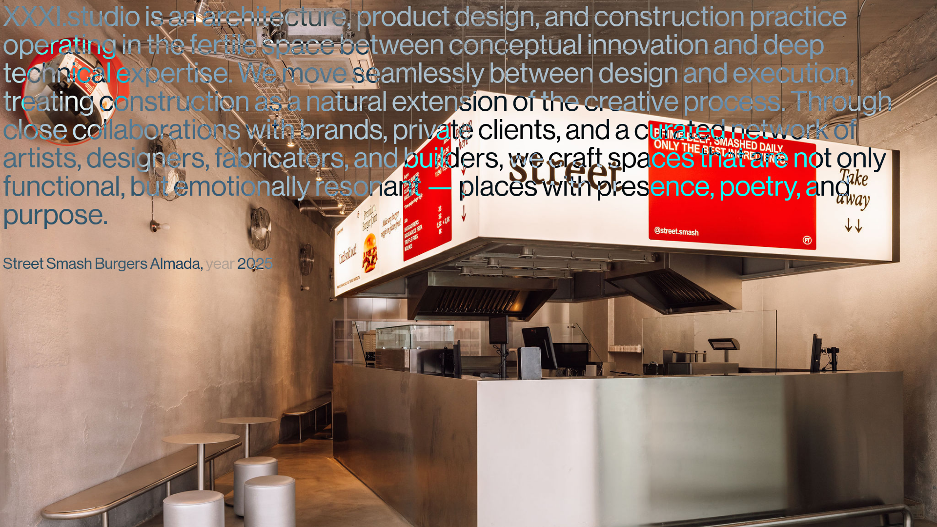
XXXI Studio Architecture Portfolio Showcase
A minimalist design portfolio featuring high-contrast overlapping typography, sticky project captions, and a dynamic masonry-style image grid for architectural storytelling.

Christopher Doyle Agency Portfolio Layout
A minimalist, typography-led portfolio featuring a wide-margin grid system, smooth fade-in animations, and simple image-focused project cards.

Clase Agency Branding Portfolio
A minimalist design agency portfolio featuring a typographic hero section, full-width image articles, sticky title bars, and integrated scrolling text marquees for a clean editorial layout.
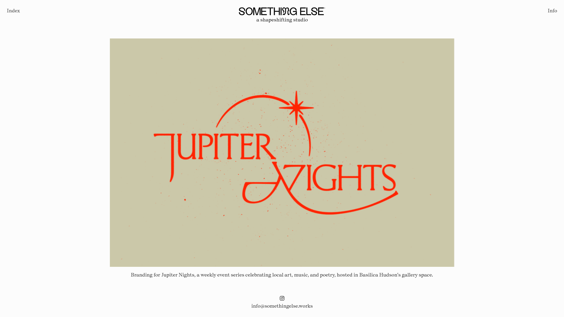
Something Else Portfolio Slideshow
A minimalist design studio portfolio featuring a full-width image and video slideshow with large-scale typography, sticky navigation, and centered captions.
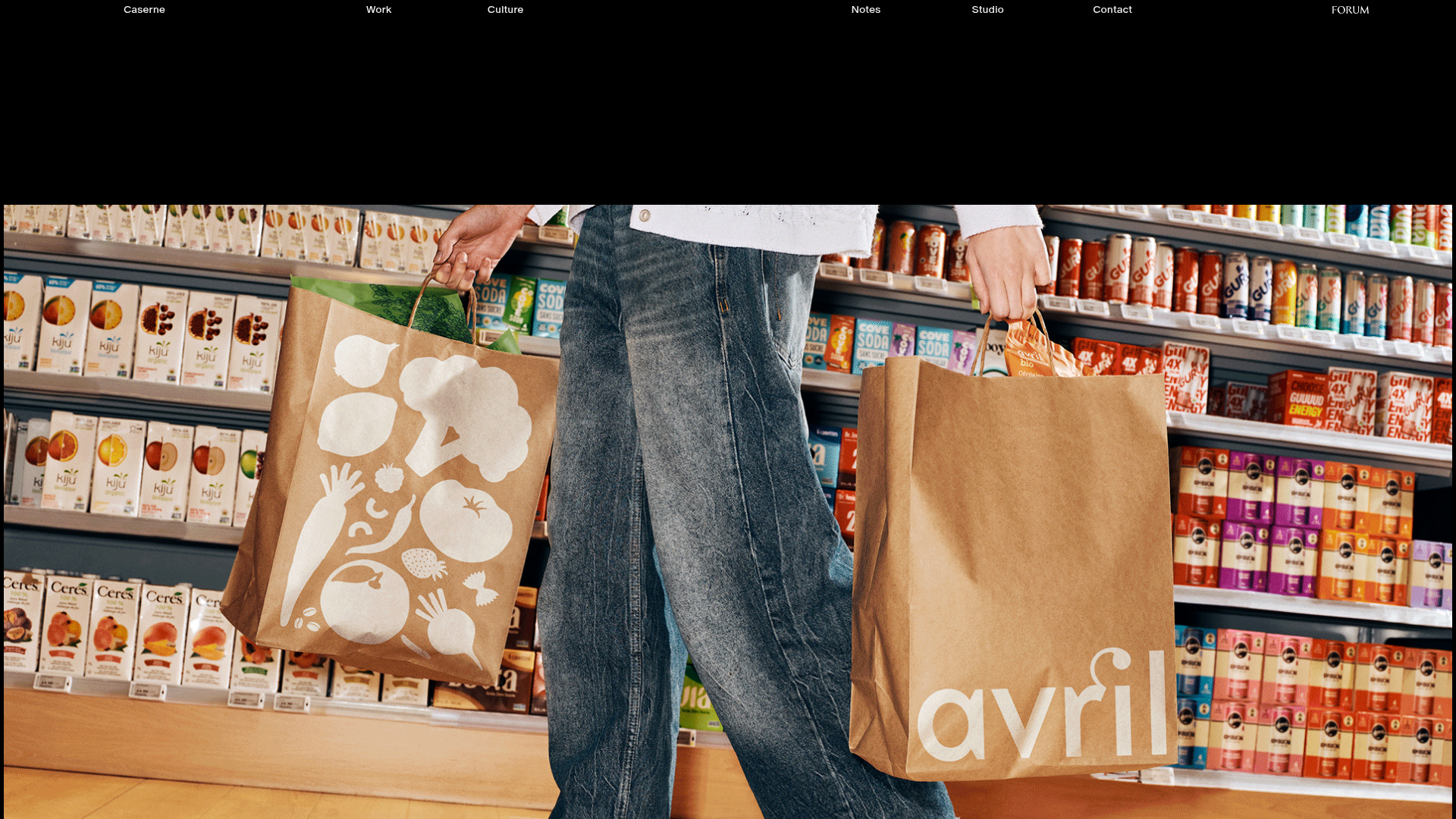
Caserne Design Studio Portfolio
A minimalist, high-impact portfolio featuring a dynamic masonry grid of project thumbnails with overlay text and a clean, oversized typography-driven footer.

Vita Architecture Portfolio Landing Page
A minimalist, high-end architecture portfolio featuring a custom canvas-based image gallery, split-text animations, and a project slider with dynamic image masks.
