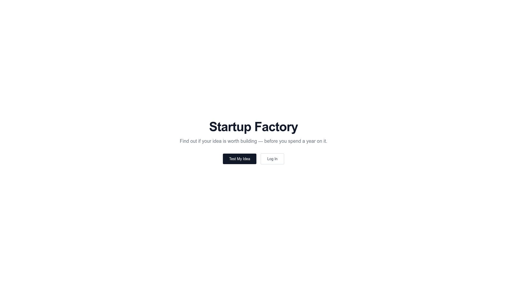
Startup Factory Minimal Hero Landing
A clean, centered landing page template featuring a bold display heading, concise subtext, and a primary CTA button pair on a stark white background.
Overview
This minimalist landing page serves as a high-conversion hero section designed to validate ideas quickly. It utilizes a centered layout and stark white space to eliminate distractions, making it a perfect reference for early-stage SaaS, waitlist pages, or product-hunt launches that require a "less is more" aesthetic.
Design System
- Color Palette & Visual Hierarchy: The design uses a grayscale monochromatic palette. It features a stark white background (
bg-white), dark neutral text for headers (text-gray-900), and medium gray for subtext (text-gray-500). Hierarchy is established through contrast, with the primary CTA using high-contrast black-on-white and the secondary button using a subtle border. - Typography: The system leans on a modern sans-serif stack. The main header uses
text-5xlwithfont-semiboldandtracking-tightfor a tight, authoritative feel. Body text usestext-lgto ensure readability without competing with the headline. - Layout Structure: The page uses a centered flexbox container (
flex items-center justify-center) that spans the full viewport height (min-h-screen). The content is constrained by amax-w-xlcontainer to maintain optimal line lengths for reading. - Reusable Components:
- Primary Button: Solid dark background (
bg-gray-900) with medium weight text and standard padding (px-6 py-2.5). - Secondary Button: Outlined style (
border border-gray-300) with a subtle hover state (hover:bg-gray-50).
- Primary Button: Solid dark background (
- Implementation Clues: The HTML reveals a utility-first CSS approach (Tailwind CSS), making it extremely easy to copy-paste and adjust spacing or typography tokens.
Use Cases
- Who should clone this: Founders looking to set up a "Coming Soon" or validation page in under 30 minutes; developers wanting a clean, boilerplate hero section that doesn't dictate a specific brand aesthetic.
- Effective Remixes: This pattern works exceptionally well for newsletter signups (replace the CTA pair with an email input and button), link-in-bio pages, or simple redirect portals.
- Practical Remix Directions:
- Brand Swap: Replace the grayscale palette with brand-specific primary colors for the main CTA and headline.
- Content Expansion: Keep this hero section as the top-of-fold and stack feature grids or testimonial blocks below it.
- Media Integration: Add a subtle background gradient or a small product logo above the main heading.
- Suggested Scope: A full-page clone is best for 1:1 validation landing pages, while the centered content block (
max-w-xl) is a great snippets for any centered hero layout.
Related Inspirations

OpenWeb B2B Service Landing Page
A professional landing page layout featuring a central animated hero area, data visualization counters, a client logo grid, testimonial slider, and tabbed lead generation forms.
403 Forbidden Access Page
A minimalist, centered HTTP 403 error status page layout suitable for clean and simple server-side response templates.
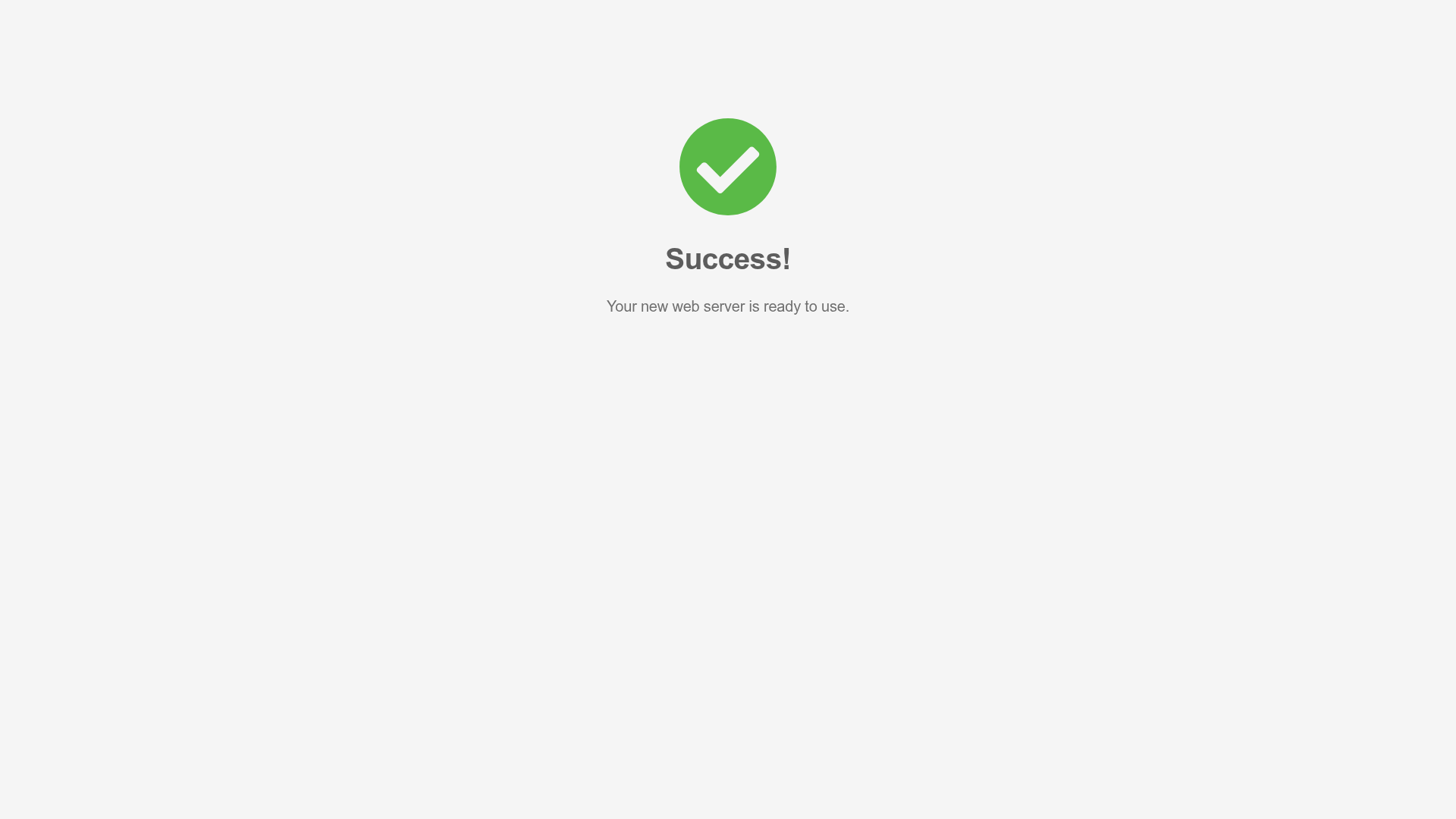
Minimal Animated Success Landing Page
A clean, centered confirmation screen featuring a large green icon, a bold heading, and smooth fade-in entry animations.
Nonymous Coming Soon Placeholder Page
A minimalist blank landing page featuring a simple 'Coming soon' text layout suitable for basic domain parking or initial placeholder deployment.
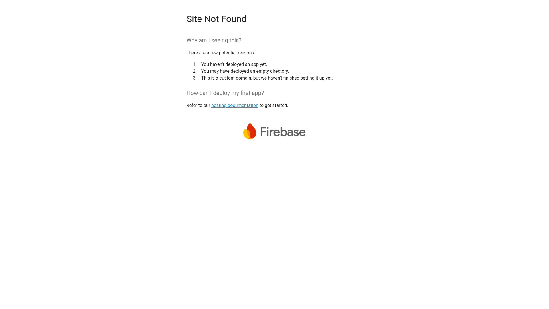
Firebase Hosting Site Not Found
A minimal placeholder layout for 404 error states including a centered logo, numbered troubleshooting guide, and linked utility text.
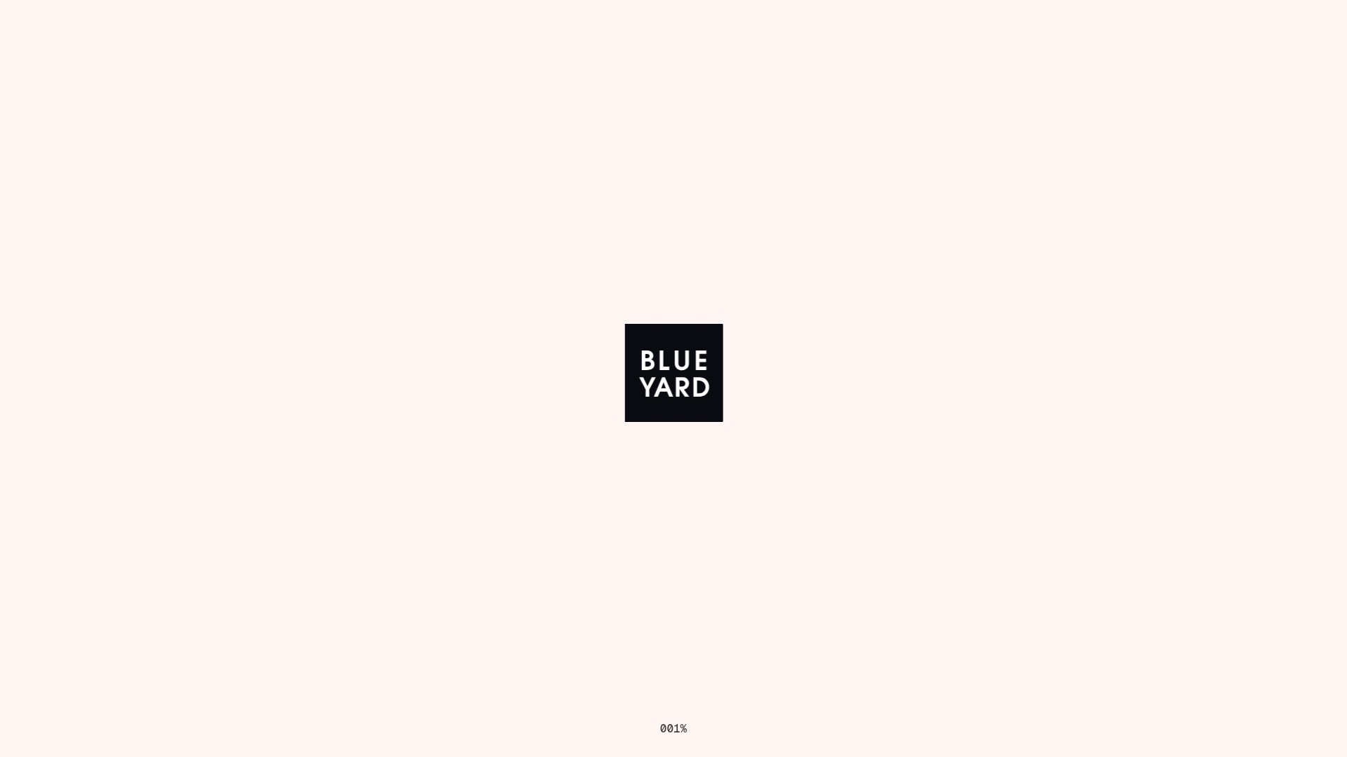
BlueYard Minimal Logo Splash Page
A terminal-style minimalist loading screen featuring a centered logo block and a discreet bottom-aligned percentage progress indicator for high-end landing pages.
