Simone Sniekers Fashion Portfolio Gallery
A minimalist fashion portfolio featuring a full-width image slider, CSS-based color gradients, and a hidden off-canvas bio panel for stylists and creatives.
Overview
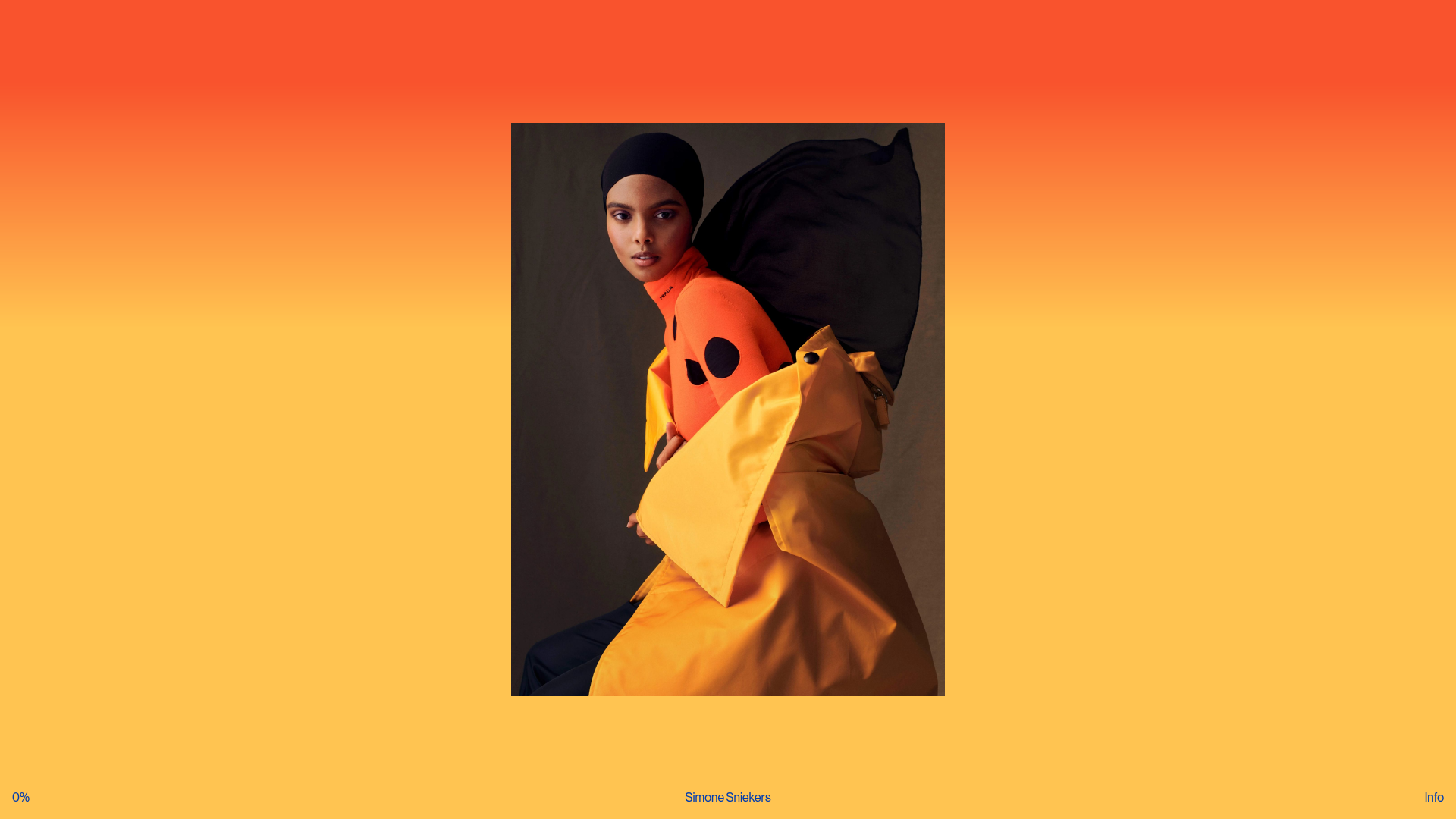
This fashion portfolio for Simone Sniekers is a masterclass in minimalist, high-impact gallery design centered around a full-bleed immersive experience. It uses a horizontal slide-based architecture where each image sits within a dynamic CSS-gradient background that samples the dominant color of the photograph, making it an excellent reference for high-end creative portfolios.
Design System
- Color Palette & Visual Hierarchy: The visual core is a vibrant, full-window linear gradient (e.g., orange-to-yellow) that shifts to complement the active image. Text is kept minimal and rendered in a deep navy blue, creating a sharp contrast against the warm backgrounds. The image itself holds clear priority, centered as the primary focal point.
- Typography: The system uses a clean, utilitarian sans-serif. Information is presented in a small, uniform scale at the edges of the screen (0%, Simone Sniekers, Info), utilizing lowercase and thin weights to maintain a non-intrusive UI.
- Page Structure: The layout consists of a fixed header/footer overlay for navigation and metadata, wrapped around a central
<article>stack. Each article contains a<figure>with anobject-fit: containimage and a hidden or context-aware<figcaption>. - Reusable Components:
- The Dynamic Stage: A full-height container that adjusts the background based on a
--dominantColorCSS variable. - The Minimalist Nav Bar: A three-point footer layout (progress indicator, title, and 'Info' toggle).
- Off-Canvas Bio Panel: The HTML reveals a
css-1fay59zdiv containing contact details and credits, intended to overlay the gallery without disrupting the aesthetic flow.
- The Dynamic Stage: A full-height container that adjusts the background based on a
- Interaction & Motion: The site uses a horizontal scroll/swipe mechanic to navigate between images. Transition patterns suggest fluid shifts in the background gradient as the user moves between articles.
- Implementation Clues: Built with Next.js (
__nextid) and styled-components or Emotion (css-class prefixes). Images are served via Sanity.io CDN, optimizing for high-resolution responsive delivery.
Use Cases
- Who should clone this: Editorial photographers, fashion stylists, art directors, and jewelry designers who want their work to be the sole focus of the browsing experience.
- Product Remixes: This pattern works effectively for high-end real estate listings, digital art NFTs, or lookbooks for boutique clothing brands where visual storytelling outweighs text-heavy descriptions.
- Practical Remix Directions:
- E-commerce: Change the 'Info' panel into a quick-add-to-cart drawer while maintaining the immersive background.
- Architecture: Swap the vibrant gradients for muted, architectural grays and utilize the central frame for wide-angle project photography.
- Navigation: Replace the 0% progress indicator with a more traditional discrete dot-navigation if the collection is small.
- Clone Scope: A full-page clone is recommended to preserve the relationship between the background gradients and the central frame, though the minimalist footer is a great standalone utility for any full-screen web app.
Related Inspirations
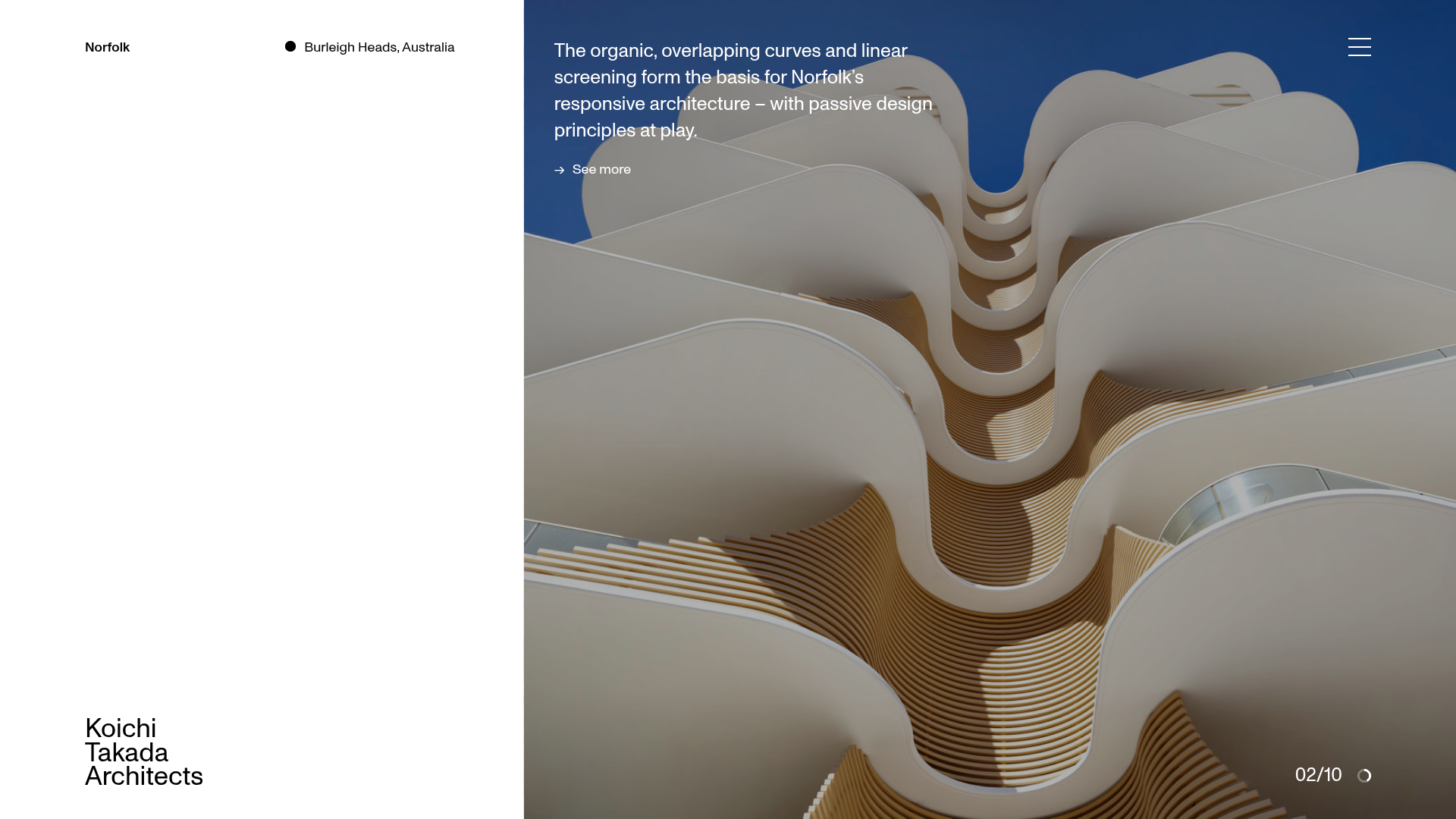
Koichi Takada Architects Portfolio Home
A high-end architectural portfolio featuring a split-screen layout with an interactive project slider, sticky typography, and smooth transition animations.
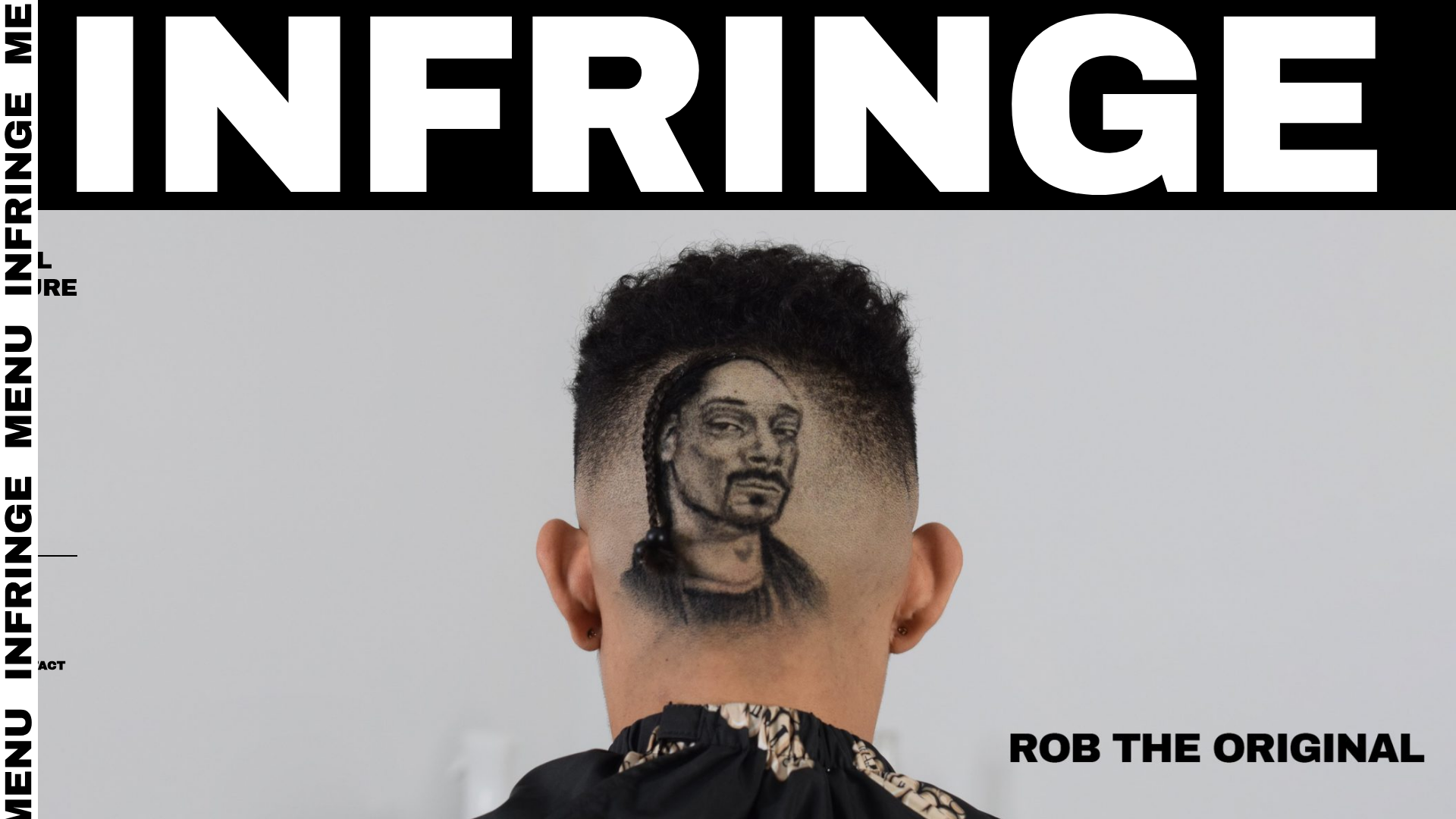
Infringe Hair Culture Portfolio Gallery
A minimalist, high-impact portfolio featuring a vertical sticky marquee sidebar and full-screen image scrolls that toggle between desktop and mobile assets.
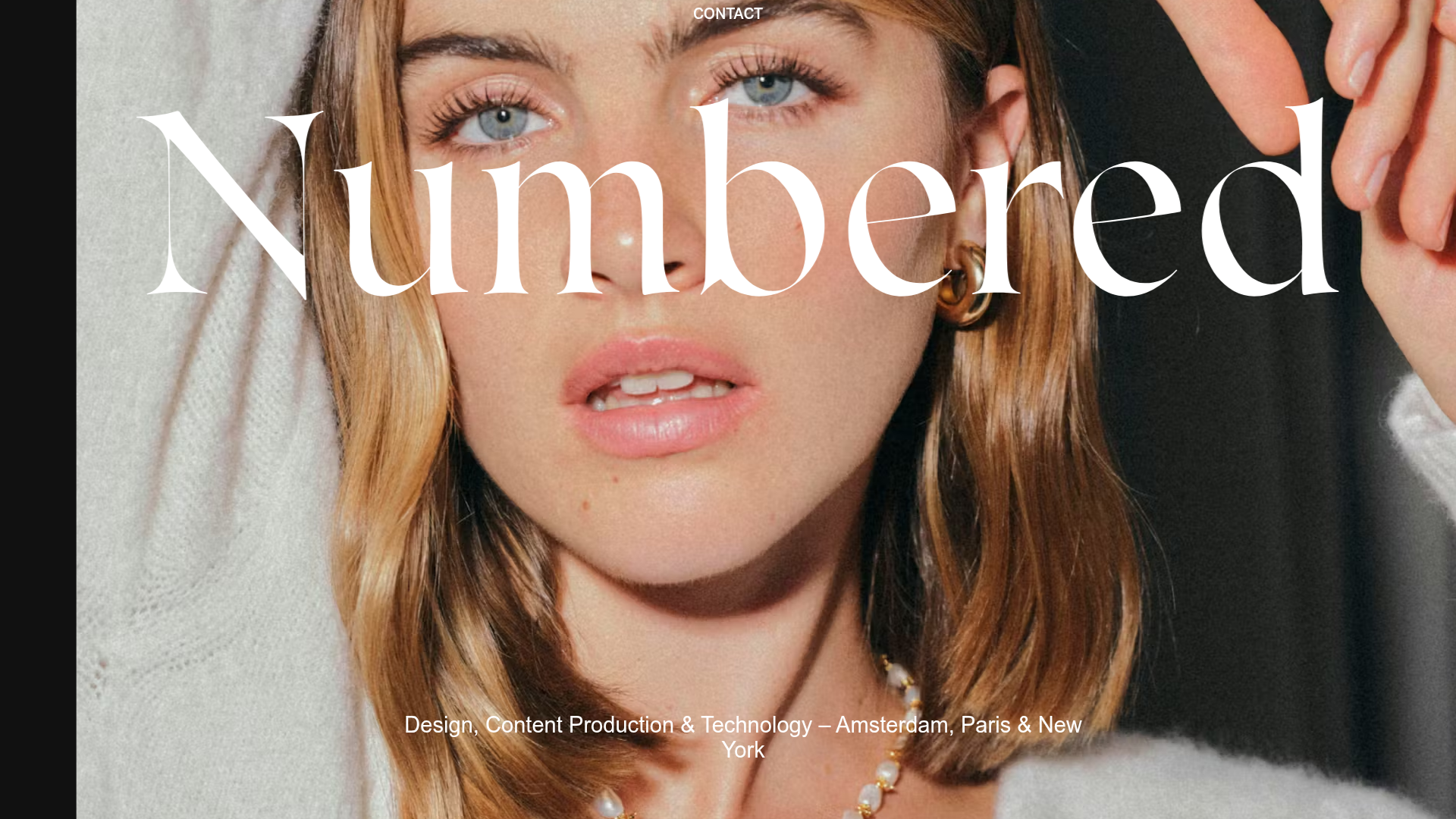
Numbered Studio Creative Portfolio Landing
A high-fashion agency landing page featuring a full-screen hero image with big serif typography, smooth scroll animations, and a varied-grid case study layout.
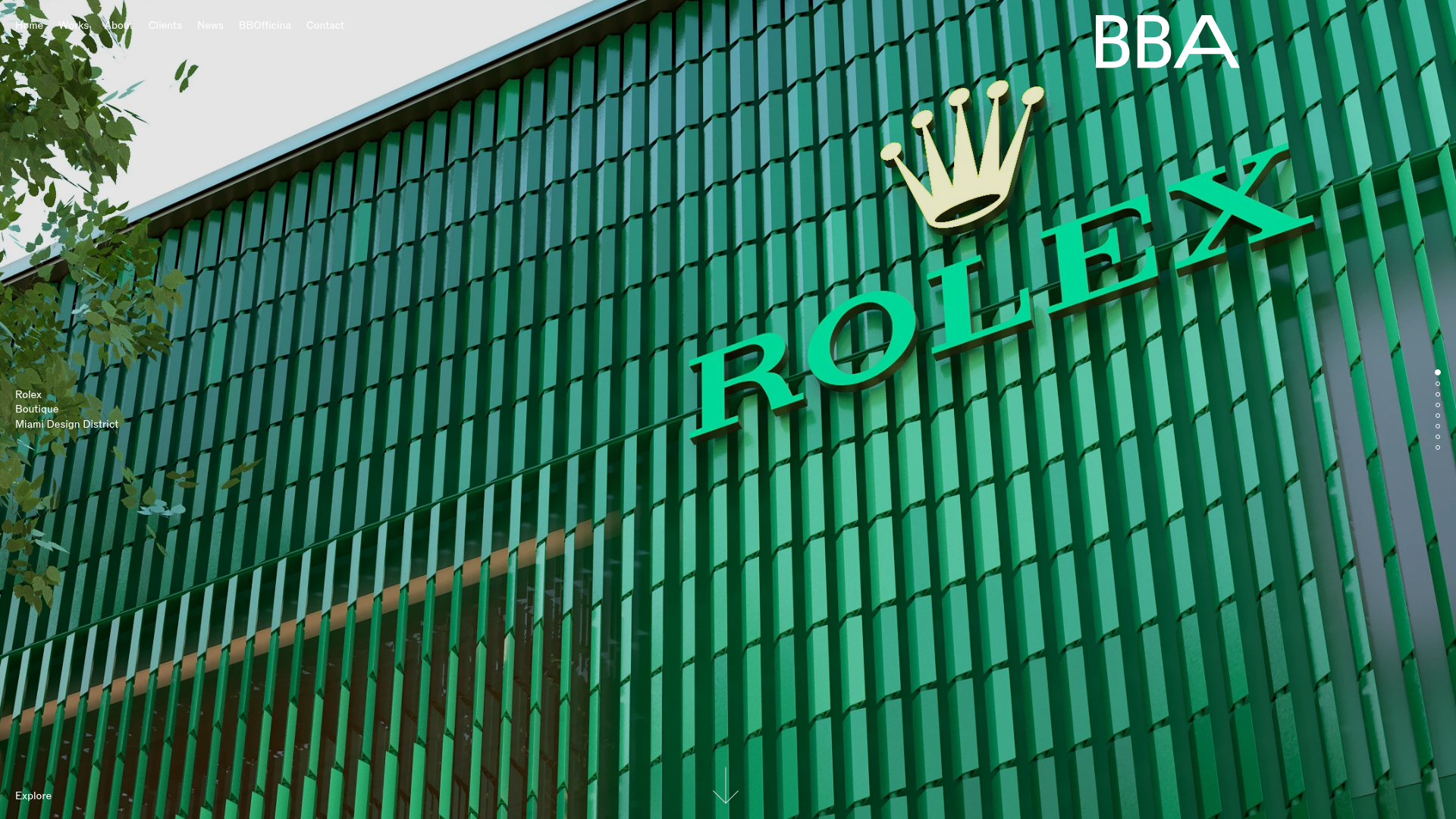
BBA Studio Full-Screen Portfolio Slider
An architectural portfolio featuring an Embla Carousel with vertically scrolling full-screen image slides, dot navigation, and overlaid typography for high-end luxury brand showcases.
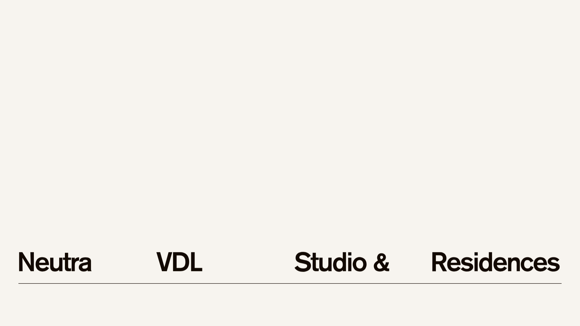
Neutra VDL Minimal Archive Layout
A refined museum site featuring a typography-focused overlay menu, sticky multi-column content sections, and an interactive image gallery with asset metadata details.
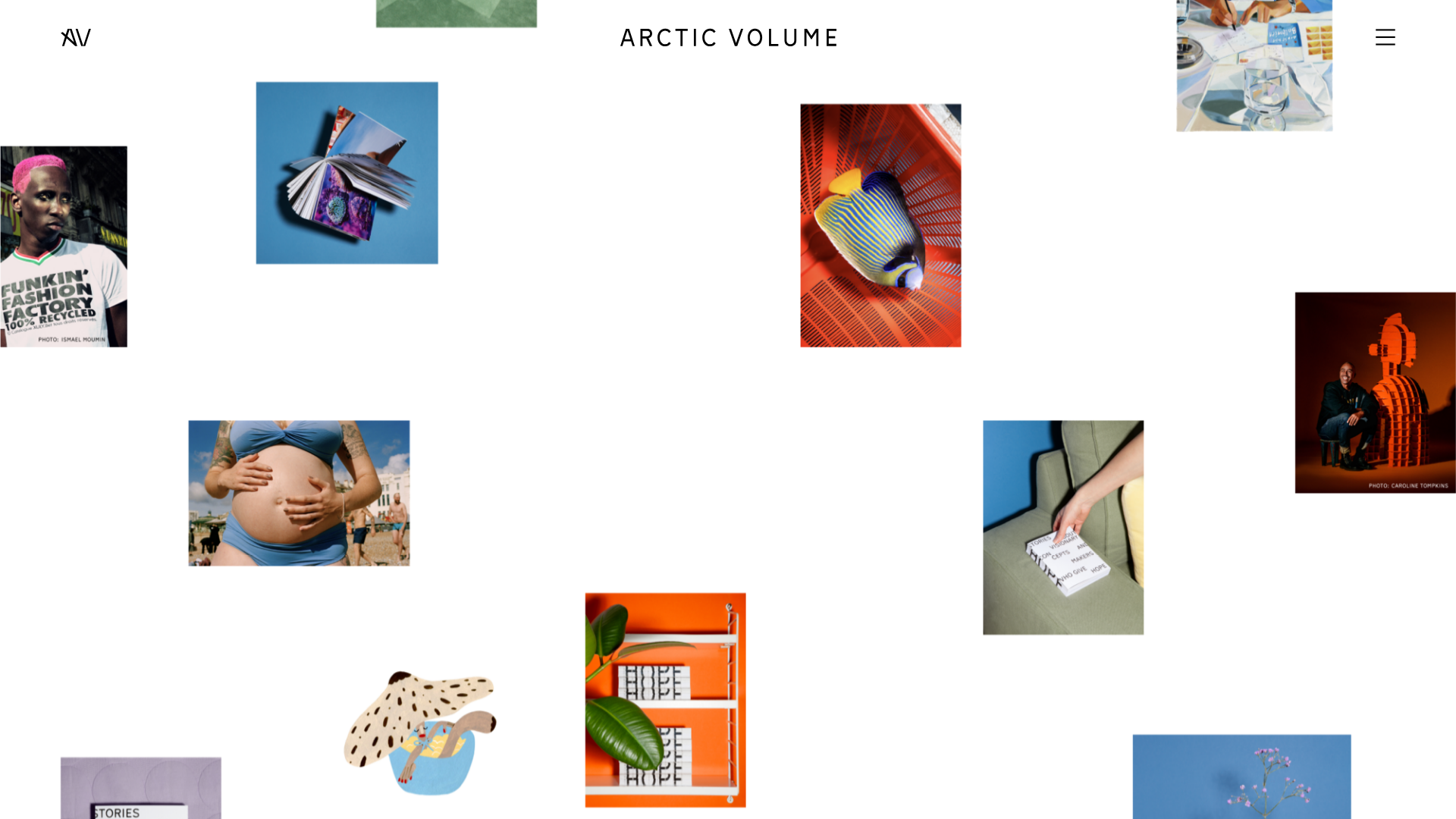
Arctic Volume Creative Portfolio Showcase
A minimalist gallery layout featuring a dynamic floating image canvas hero, smooth transitions, and a clean typography-focused editorial blog footer.
