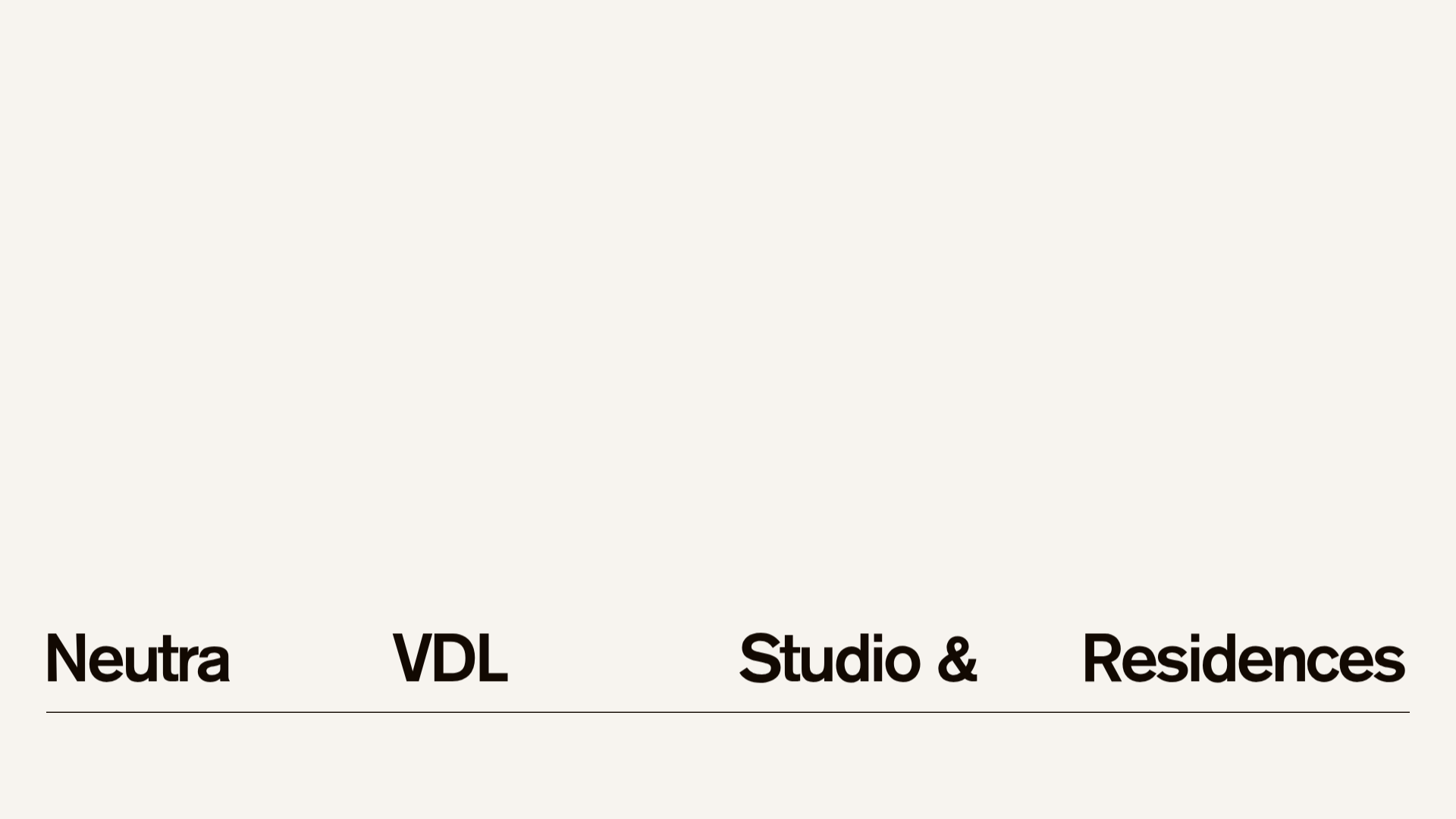
Neutra VDL Minimal Archive Layout
A refined museum site featuring a typography-focused overlay menu, sticky multi-column content sections, and an interactive image gallery with asset metadata details.
Overview
This website for the Neutra VDL Studio and Residences serves as a high-end digital archive and house museum platform. It is an exceptional reference for builders because of its sophisticated use of white space, "editorial" multi-column layouts, and a unique typography-first navigation overlay that prioritizes information architecture over traditional UI patterns.
Design System
- Color Palette & Visual Hierarchy: The design uses a minimal, warm monochromatic palette (off-white/cream backgrounds with deep black text). Contrast is achieved through varying font weights and oversized serif-less typography rather than color pops.
- Typography System: The site uses a bold, geometric sans-serif (reminiscent of Inter or Helvetica) for headings and metadata. Significant Emphasis is placed on large-scale titles in the navigation overlay and section headers to create a rhythmic visual flow.
- Page Structure & Section Flow: The layout follows a modular grid. It begins with a hero "triple-column" section (details, description, and primary links), followed by a
detailed-assetsection (high-res image paired with metadata), and aninteractive-gallerywhere a vertical list of menu items acts as triggers for an image display area. - Reusable Components:
- Typography Overlay Menu: A full-screen
nav-overlaythat uses bold<h1>spans and nested<ul>lists for a structured Table of Contents feel. - Sticky Metadata Blocks: The
.detailsblocks within.home-triple-columnand.detailed-assetsections allow key information (year, location, photographer) to remain legible while content scrolls. - Interactive Gallery: A list-to-image switcher (
.interactive-gallery) where clicking list items updates the visibleactiveasset.
- Typography Overlay Menu: A full-screen
- Interaction & Motion Patterns: The HTML reveals CSS-based state changes (e.g.,
data-fadeandopacitytransitions). The navigation features a "sliding" overlay effect indicated bytransform: translateproperties in the DOM, creating a smooth transition between content levels. - Implementation Clues: Built using Nuxt.js (as evidenced by
#ext-nuxtandnuxt-link-*classes), the site utilizes a component-driven structure with scoped CSS (seen in thedata-v-attributes) to manage layout modules.
Use Cases
- Who should clone this pattern: Architects, digital archivists, luxury boutique brands, and museum curators looking for a sophisticated, non-commercial aesthetic.
- What products can remix it effectively: Portfolio sites for high-end furniture designers, creative agencies, or long-form investigative journalism pieces that require a "reading room" digital experience.
- Practical remix directions: Swap the off-white for a dark-mode obsidian palette for a tech-focused portfolio; adapt the archive metadata sections into project specs or pricing tiers; reuse the unique "Contents" overlay as a site-wide navigation map for complex blogs.
- Suggested clone scope: For a quick win, clone the triple-column section layout for an "About" page. For a comprehensive project, clone the full navigation overlay system to replace a traditional menu.
Related Inspirations
Vita Architecture Portfolio Landing Page
A minimalist, high-end architecture portfolio featuring a custom canvas-based image gallery, split-text animations, and a project slider with dynamic image masks.

Infringe Hair Culture Portfolio Gallery
A minimalist, high-impact portfolio featuring a vertical sticky marquee sidebar and full-screen image scrolls that toggle between desktop and mobile assets.
Patrick Miller Photography Portfolio Template
A minimalist, full-bleed photography portfolio featuring a split-screen grid, scroll-triggered section transitions, and integrated Swiper.js image carousels for project galleries.
Cup of Couple Editorial Portfolio
A high-fashion editorial layout featuring a sticky compartmentalized header, a horizontal marquee carousel, and a mixed-width masonry grid with marquee typography effects.
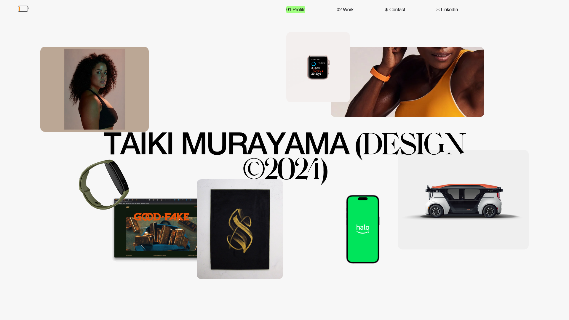
Taiki Murayama Portfolio Bento Grid
A minimalist designer portfolio featuring a dynamic bento-style layout for project imagery, integrated accordion project lists, and high-contrast typography.
Gustavo Faria Minimalist Portfolio Index
A clean, list-based portfolio layout featuring hover-triggered image previews, a sticky sidebar with biography, and a typography-driven project archive.
