Arctic Volume Creative Portfolio Showcase
A minimalist gallery layout featuring a dynamic floating image canvas hero, smooth transitions, and a clean typography-focused editorial blog footer.
Overview
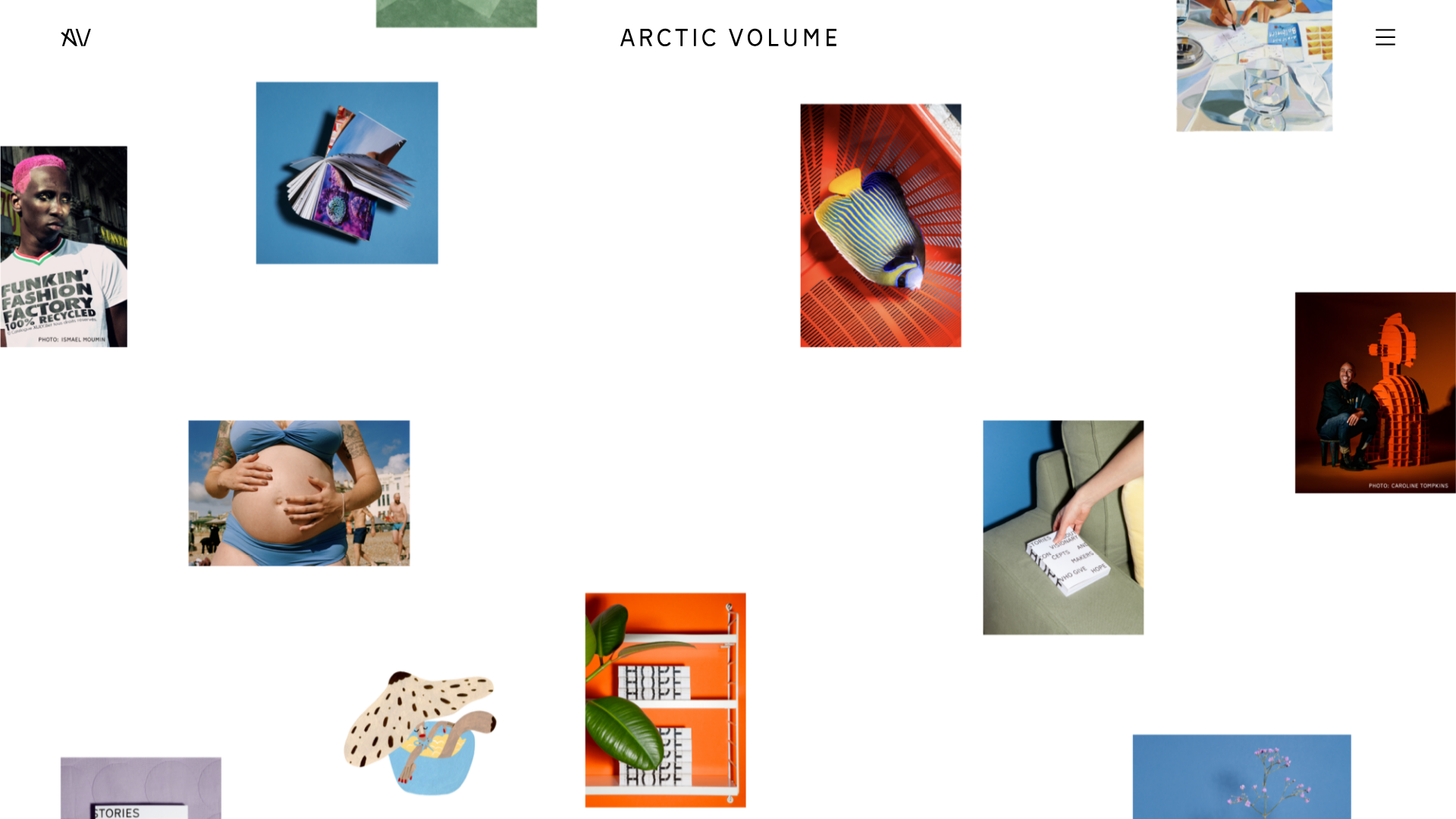
This website is a sophisticated creative portfolio and editorial project showcase for Arctic Paper's "Surface" series. It is a prime clone reference for its high-impact, "hyper-real" canvas hero section that uses a non-linear grid of floating images to create a sense of depth and curated chaos. The design expertly balances experimental layout with professional editorial typography, making it an excellent template for agencies, photographers, and high-end physical product brands.
Design System
- Color Palette & Visual Hierarchy: The site uses a clean, minimalist foundation dominated by white and light gray (
bg-gray-light). This neutral backdrop allows vibrant, high-saturation photography (oranges, blues, and rich flesh tones) to drive the visual interest. Hierarchy is established through extreme spacing and scale rather than many distinct colors. - Typography System: A refined sans-serif typeface is used throughout. Captions and body text utilize varied scales (e.g.,
c-text--lfor lead paragraphs), while the main headers (c-hl--1) are bold and authoritative. The navigation and logo use wide letter-spacing for a luxury editorial feel. - Page Structure & Section Flow:
- Hero Canvas: A dynamic
l-canvascontaining scattered, non-overlapping images and a large decorative "HOPE" title. - Editorial Intro: A centered text column (
mw-medium) with a large lead paragraph set against a light background. - Interactive Slideshow: A horizontal-scroll gallery (
l-slideshow) for deeper visual storytelling. - Side-by-Side Content: Asymmetric text and image blocks (
l-text-image-layout) for informational sections.
- Hero Canvas: A dynamic
- Reusable Components:
- Image Wrapper: The
c-image__wrapperhandles responsive scaling and lazy loading efficiently. - Action Buttons: Simple, high-contrast buttons (
c-button) with minimal padding and sharp corners. - Scatter Grid: The logic for the floating image layout is the most valuable structural component to clone for artistic impact.
- Image Wrapper: The
- Interaction & Motion: The layout uses "hyperreal" transitions where images appear to float and stack. Horizontal scrolling is implemented via a touch-friendly slider (
js-slideshow) that supports grab-to-drag interactions. - Implementation Clues: The HTML reveals a custom-built utility-first structure (using classes like
mt-base,px-base,pt-8) and a strong reliance onlazyloadfor performance-heavy imagery. It uses a structured BEM-like naming convention (e.g.,l-article,c-link--underline).
Use Cases
- Who should clone this: Independent creative directors, boutique design studios, and luxury publishers looking for a "gallery-first" web presence.
- Effective Remixes: This pattern works perfectly for digital magazines, lookbooks for sustainable fashion brands, or architectural portfolios where the imagery needs to feel curated and unconfined by standard grids.
- Practical Directions:
- Minimal Remix: Swap the floating images in the canvas for architectural renderings and change the background to a dark slate for a moodier feel.
- Structural Remix: Reuse the
mw-mediumtext layout for a blog index but keep the floating hero to introduce the brand.
- Suggested Clone Scope: A full-page clone is recommended to capture the sophisticated flow between the chaotic hero section and the structured editorial body, as the transition between "art" and "information" is the site's strongest feature.
Related Inspirations

Vita Architecture Portfolio Landing Page
A minimalist, high-end architecture portfolio featuring a custom canvas-based image gallery, split-text animations, and a project slider with dynamic image masks.
MMM.page Design Portfolio Editor
A minimalist, drag-and-drop landing page layout featuring a floating navigation bar, hidden sidebar menu, and a prominent bottom-right edit toggle.
Neutra VDL Minimal Archive Layout
A refined museum site featuring a typography-focused overlay menu, sticky multi-column content sections, and an interactive image gallery with asset metadata details.
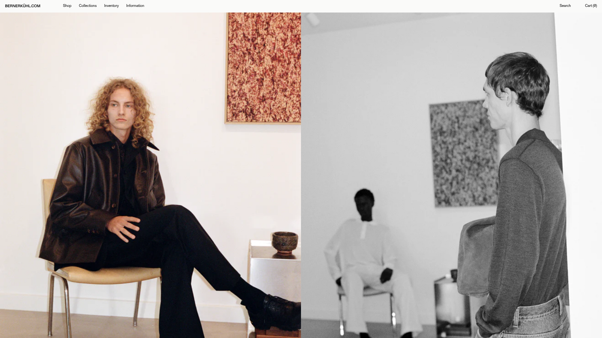
Berner Kühl Minimalist Fashion E-commerce
A high-end retail layout featuring an infinite marquee product slider, split-screen content blocks with hand-applied numbering, and a dense product grid with image hover swaps.
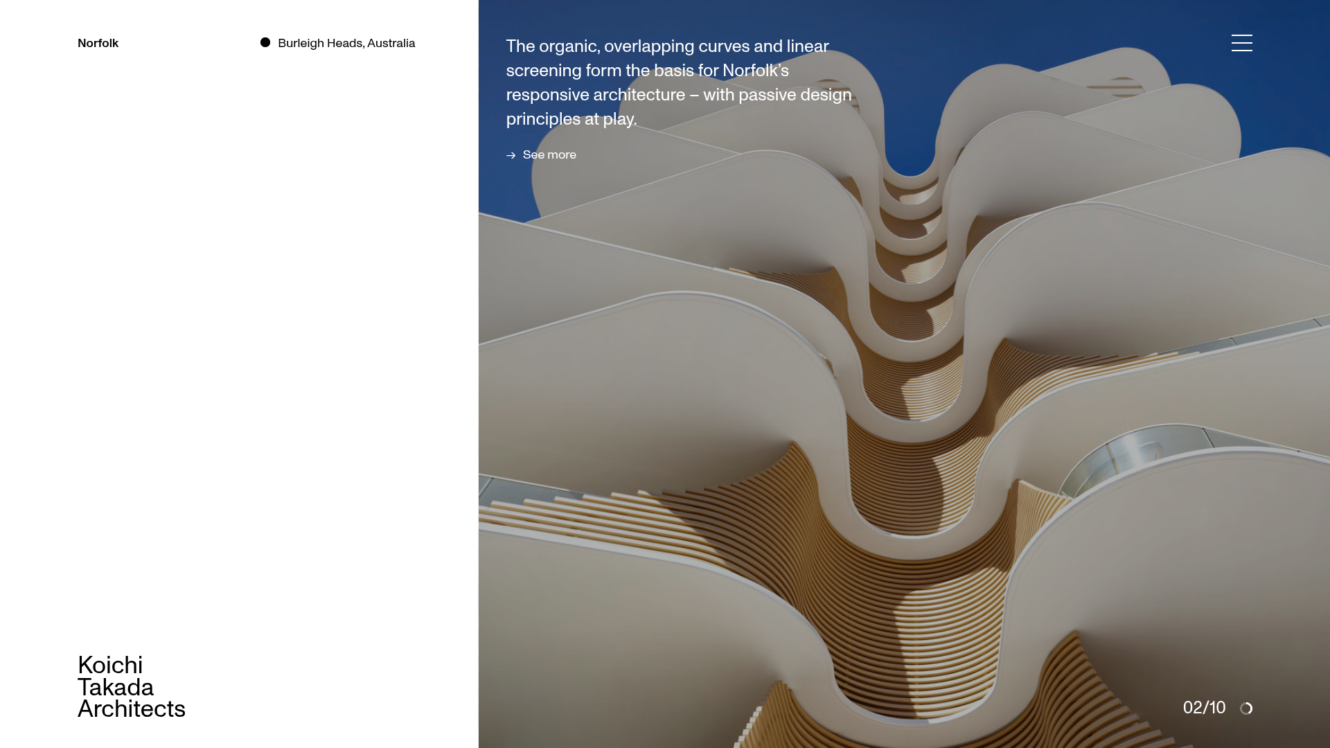
Koichi Takada Architects Portfolio Home
A high-end architectural portfolio featuring a split-screen layout with an interactive project slider, sticky typography, and smooth transition animations.
Bruno Arizio Designer Portfolio Website
A minimalist creative director portfolio featuring a clean typographic layout, side-aligned image previews, and high-contrast spacing patterns suitable for luxury or design showcases.
