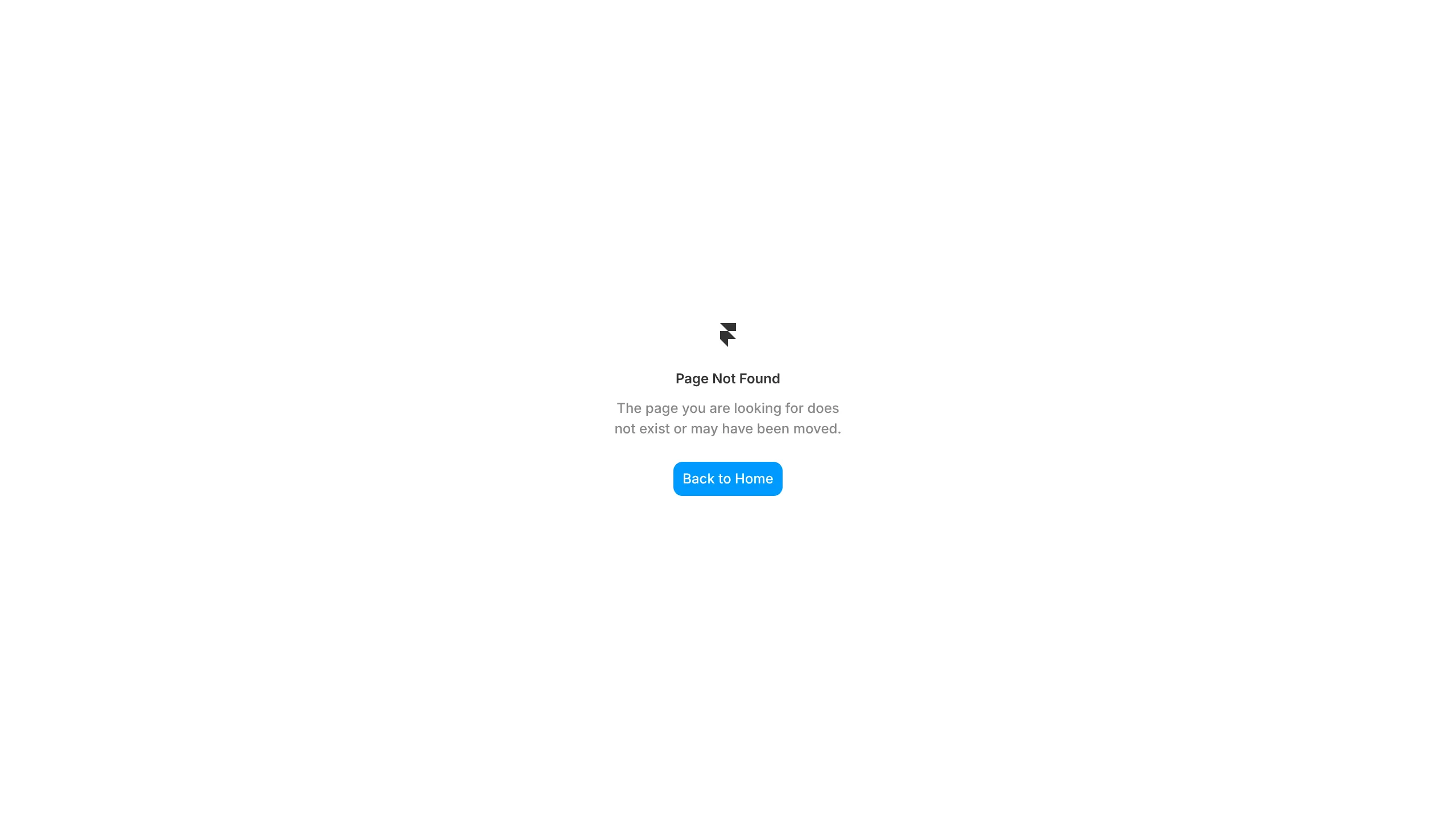
Minimalist Framer 404 Error Page
A clean, center-aligned 404 error layout with a company logo, descriptive text, and a primary call-to-action button for site navigation.
Overview
This is a clean, minimalist 404 error page template designed for Framer, featuring a centered vertical layout that prioritizes user recovery. It is an excellent clone reference for developers who need a plug-and-play error state that maintains brand consistency while keeping the user experience frictionless.
Design System
- Color Palette & Visual Hierarchy: The design utilizes a high-contrast white background (#FFFFFF) with dark charcoal text for readability. A single pop of bright blue (#0091FF) on the "Back to Home" button establishes a clear focal point and primary call-to-action.
- Typography: The layout uses a modern sans-serif typeface. The headline "Page Not Found" uses a medium font weight for hierarchy, while the supporting description employs a smaller size with reduced opacity (likely 60-70% grey) to soften the messaging.
- Page Structure: The sections flow vertically in a single column: Logo (top) → Header (middle-upper) → Descriptive paragraph (middle) → Navigation Button (bottom).
- Reusable Components: The
btn--backclass represents a highly reusable primary button component with a rounded-corner radius (approx. 8px) and centered label text. The logo container (div.logo) is a standardized placeholder for easy brand swaps. - Responsive Behavior: The center-alignment and generous whitespace indicate a fluid layout that will naturally stack and center itself across mobile and desktop viewports without requiring complex media queries.
- Implementation Clues: The HTML structure is semantically lean, using a
<main>wrapper to encapsulate the content, suggesting a "dead-end" page type that avoids distractions like headers or footers.
Use Cases
- Who should clone this: UI/UX designers building out comprehensive design systems in Framer who need a standardized error state that doesn't distract from the core brand.
- Effective Remixes: SaaS dashboards, personal portfolios, or corporate landing pages can adapt this by simply swapping the logo and updating the button hex code to match their brand primary color.
- Remix Directions: Replace the static logo with a playful SVG animation, or add "Quick Links" below the main button to direct users to popular pages like "Pricing" or "Features."
- Clone Scope: This is best as a quick full-page clone. Its simplicity allows it to be imported into any existing project as a dedicated
/404route with minimal configuration.
Related Inspirations
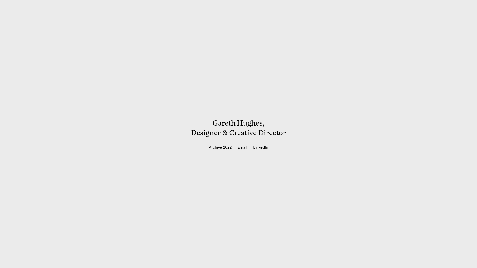
Gareth Hughes Minimalist Landing Page
A clean, centered portfolio placeholder featuring a custom cursor interaction, high-contrast typography, and a simplified navigation layout for professional networking.
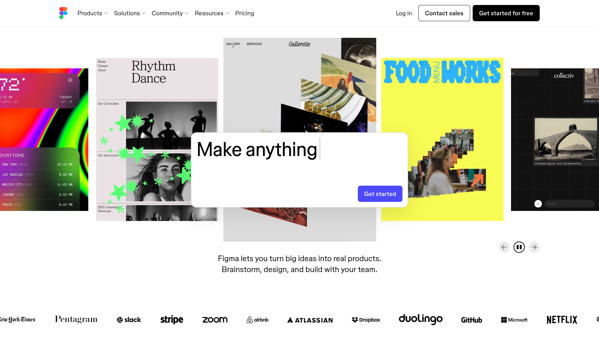
Figma Landing Page Gallery Hero
A dynamic landing page featuring a center-focused search bar hero, a horizontally-scrolling interactive video carousel, and a clean brand logo grid.

Good Glyphs Font Showcase Landing Page
A single-page layout featuring an interactive type tester, donation form with custom amount logic, and a contributor gallery using swiper-based glyph previews.
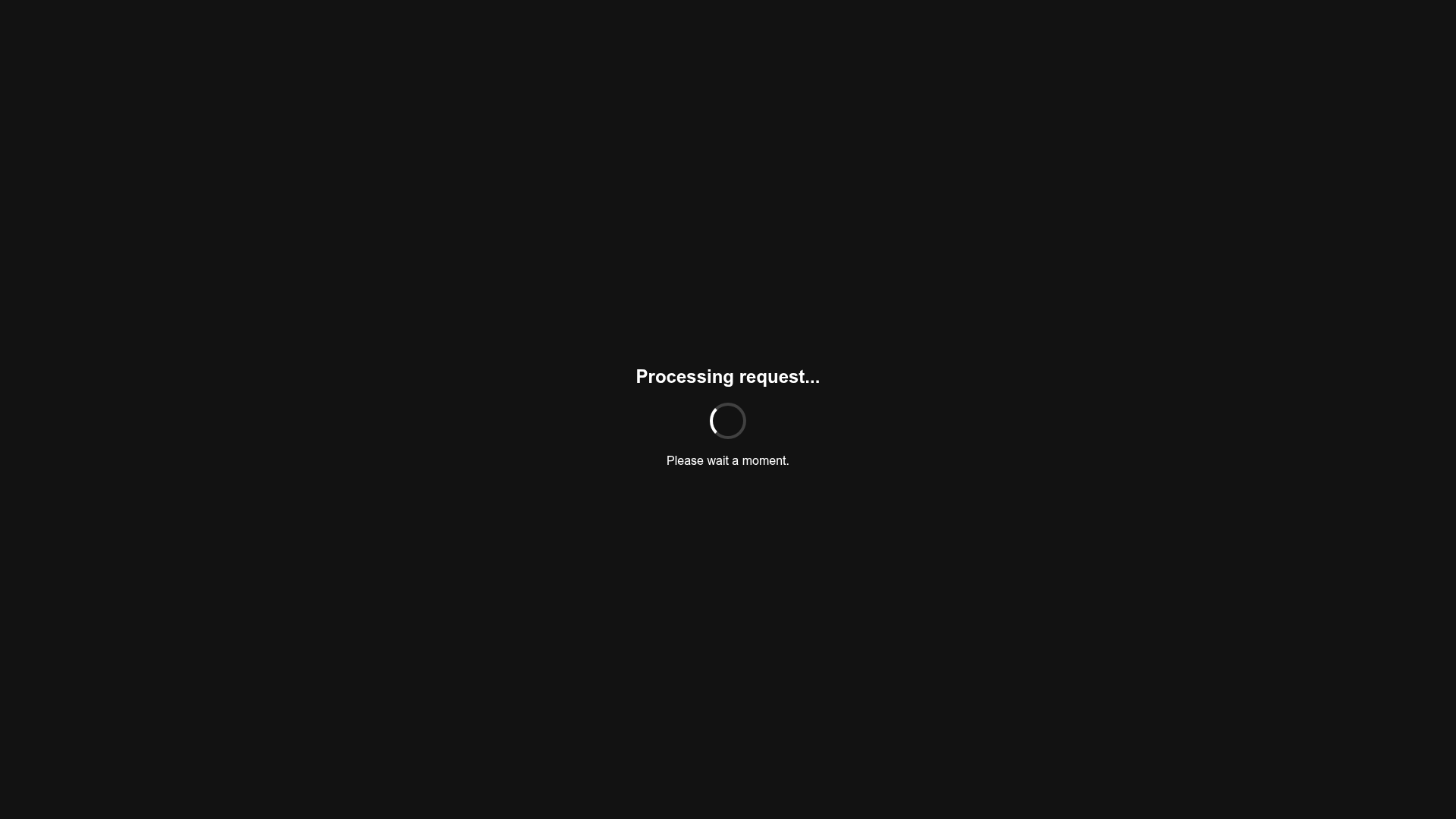
Minimalist Dark Mode Loading Screen
A clean, dark-themed redirection page featuring a centered typography layout and a CSS circular loading spinner for asynchronous processing states.
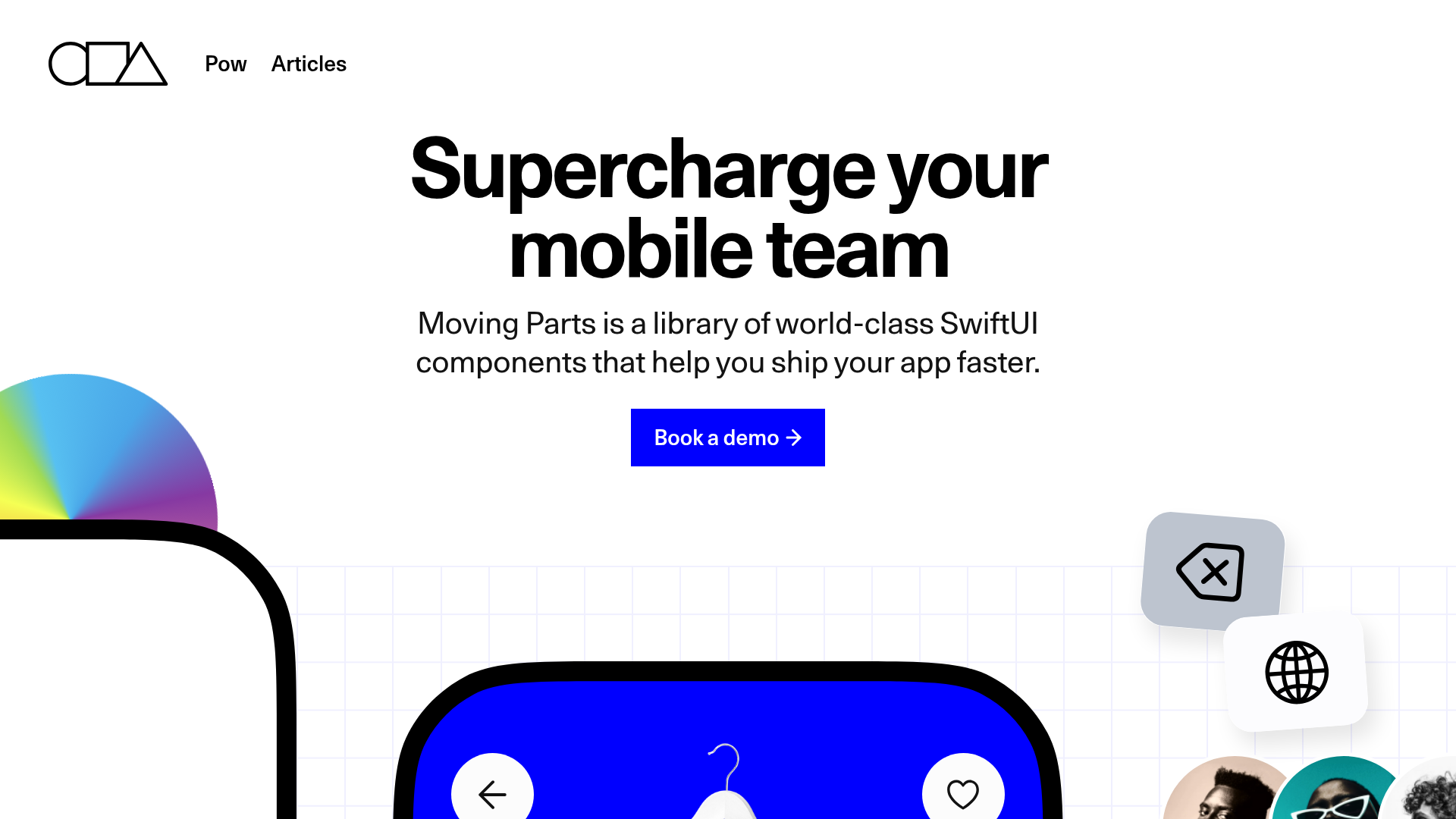
Moving Parts SwiftUI Component Library
A high-performance landing page featuring a interactive code comparison toggle, animated mobile UI previews, and a clean minimalist aesthetic for developer tools.
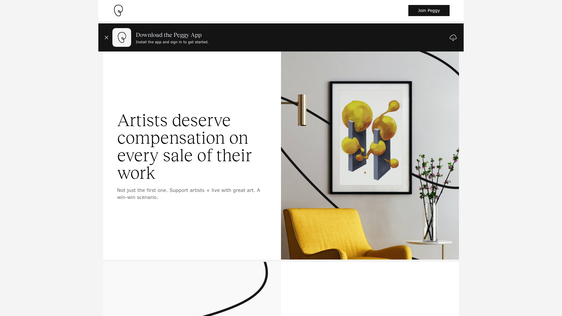
Peggy Art Royalties Pitch Page
A clean storytelling layout featuring alternating image-text sections, a three-column testimonial grid with circular avatars, and a icon-based feature grid for brand values.
