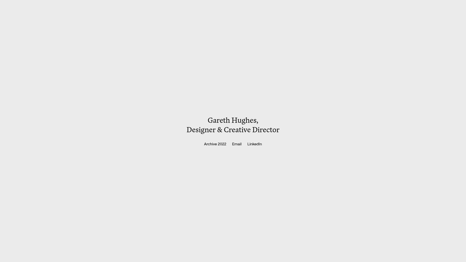
Gareth Hughes Minimalist Landing Page
A clean, centered portfolio placeholder featuring a custom cursor interaction, high-contrast typography, and a simplified navigation layout for professional networking.
Overview
This minimalist landing page serves as a refined digital business card for creative professionals. It is an excellent clone reference for builders looking to implement a "coming soon" page or a high-end personal placeholder that prioritizes white space and sophisticated interaction design over dense content.
Design System
- Color Palette & Visual Hierarchy: The design uses a monochromatic, light-gray background (#EBEBEB) with dark charcoal text. Hierarchy is achieved through vertical centering and font weight rather than color contrast.
- Typography System: A serif typeface is used for the primary headline (likely a variation of Georgia or a similar custom serif) to convey authority and tradition. The navigation links use a smaller sans-serif font for utility and modern contrast.
- Page Structure: The layout is a single-screen, non-scrolling container (
temp-home-wrapper) where all elements are vertically and horizontally centered to draw immediate focus to the identity and CTA links. - Reusable Components:
- Cursor Wrapper: A custom global cursor component (
cursor-wrapper) that adds a layer of interactivity and brand personality. - Navigation Link Row: A simple horizontal flexbox container (
temp-links) that handles external links with consistent spacing.
- Cursor Wrapper: A custom global cursor component (
- Interaction Patterns: The HTML reveals a
cursorfixembed and acursordiv, indicating an interactive pointer replacement that follows the mouse movement. Fade-in animations (opacity: 1) are applied to the name and links via Webflow interactions to create a professional entrance. - Responsive Behavior: The use of
w-layout-blockcontainerand relative units suggests a fluid layout that stacks or scales down centered text for mobile viewports while maintaining the central alignment.
Use Cases
- Who should clone this pattern: UX/UI designers, creative directors, or consultants who need a temporary but polished web presence while their full portfolio is under construction.
- Effective Remix Directions:
- Brand Swap: Replace the background with a texture or a subtle gradient while keeping the centered typography structure.
- Information Architecture: Change the "Archive" link to a "Book a Call" link to convert the page into a high-conversion lead generation landing page.
- Media Integration: Add a very low-opacity fullscreen video background or a subtle parallax image behind the text for more visual depth.
- Suggested Clone Scope: A full-page clone is recommended as the value of this design lies in its specific proportions and white space balance, which are easier to modify from a complete template than by piece-meal construction.
Related Inspirations
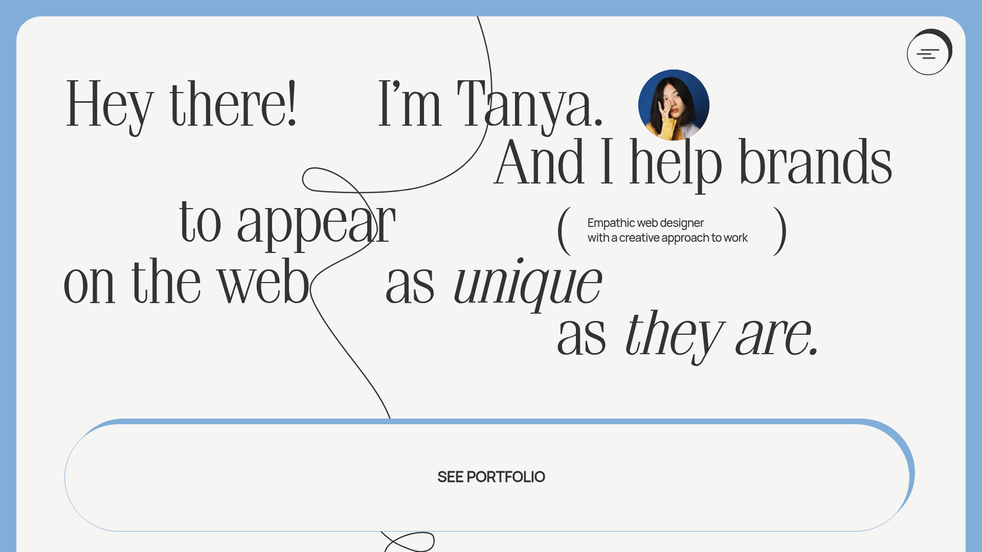
Tanya Creative Portfolio Landing Page
A minimalist hero section featuring asymmetric typography, a hand-drawn vector line animation, a custom circular cursor, and an oversized rounded call-to-action button.
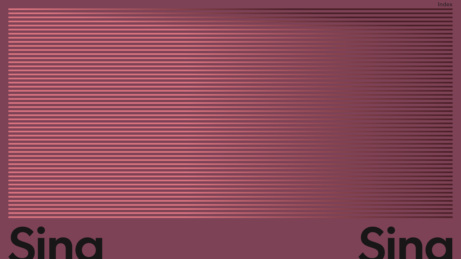
Sing-Sing Creative Portfolio Landing Page
A minimalist studio portfolio featuring high-contrast typography, a horizontal line-grid hero section, and responsive image components with custom cursor interactions.
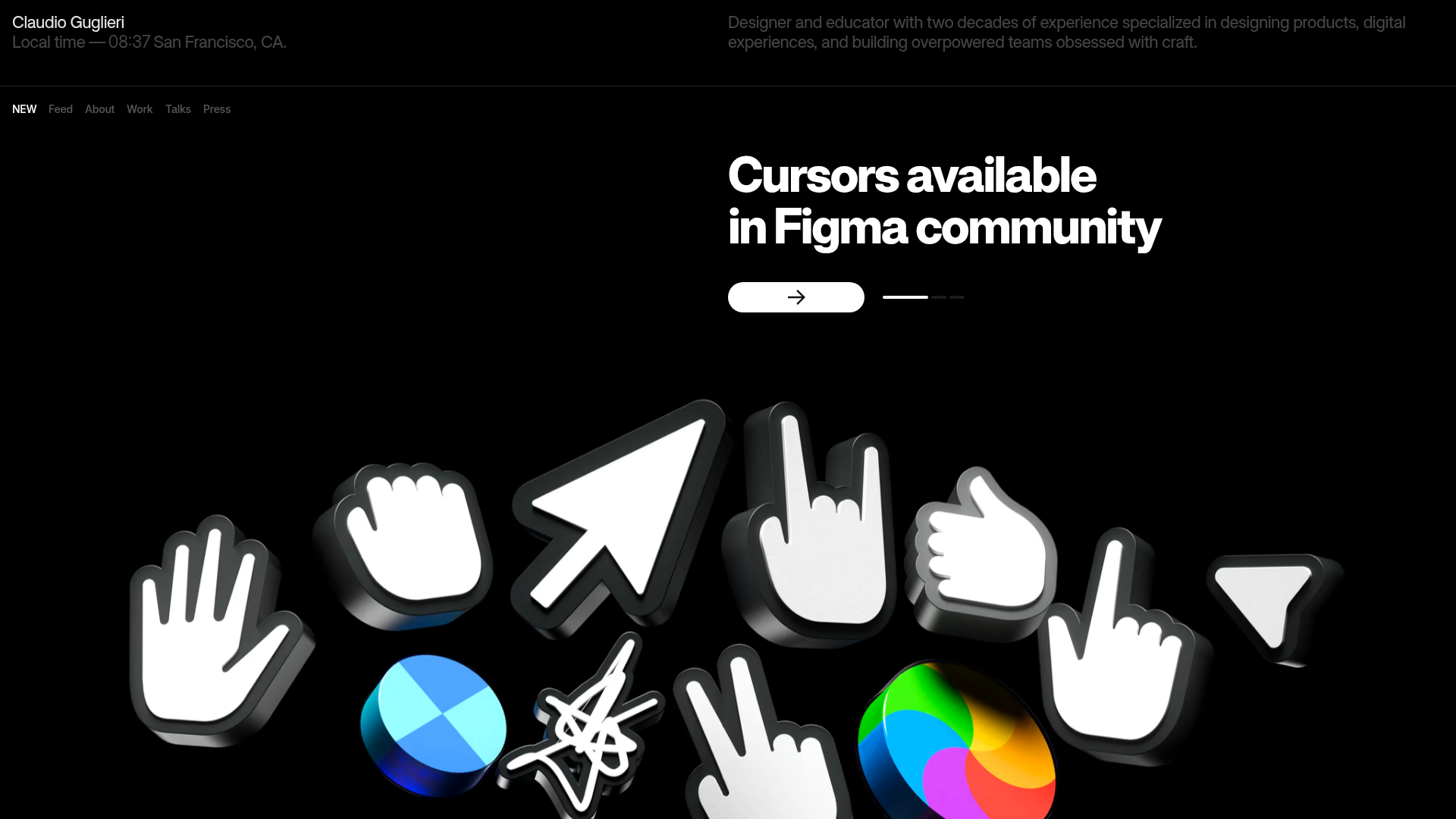
Claudio Guglieri Portfolio Portfolio Hero
A dark-themed designer portfolio featuring a 3D asset hero section, minimal top navigation bar, and integrated visitor message submission form.
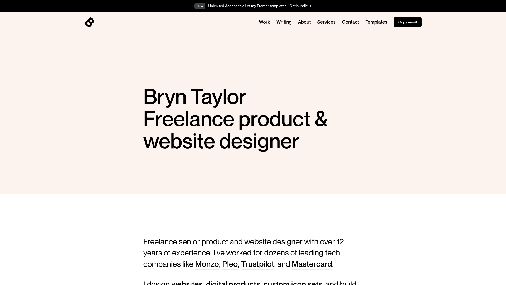
Bryn Taylor Portfolio Landing Page
A minimalist, typography-focused designer portfolio featuring a clean hero section, sticky navigation bar, and dark-mode 'Copy email' button.

Jacob Leech Portfolio Portfolio Site
A minimalist developer portfolio with custom cursor interactions, scroll-triggered text animations, a clean resume layout, and unique full-width graphic components.
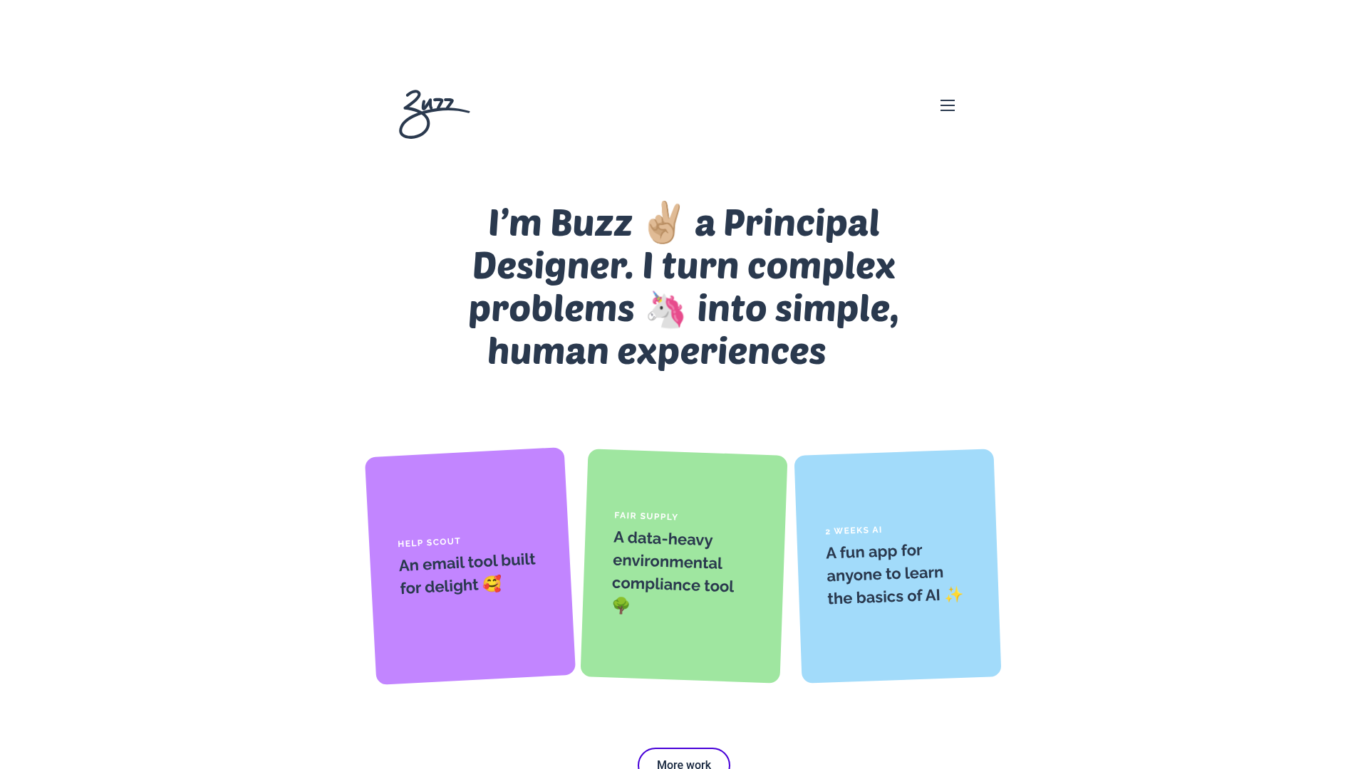
Buzz Usborne Designer Portfolio Landing
A minimalist portfolio layout featuring a large typography-driven hero section with animated emojis and a responsive grid of colorful, card-based project previews.
