Pietra AI Platform Landing Page
A commerce-focused landing page featuring a centralized AI input hero, colorful floating value-prop cards, a bento-style integration showcase, and tabbed feature sections with side-by-side comparisons.
Overview
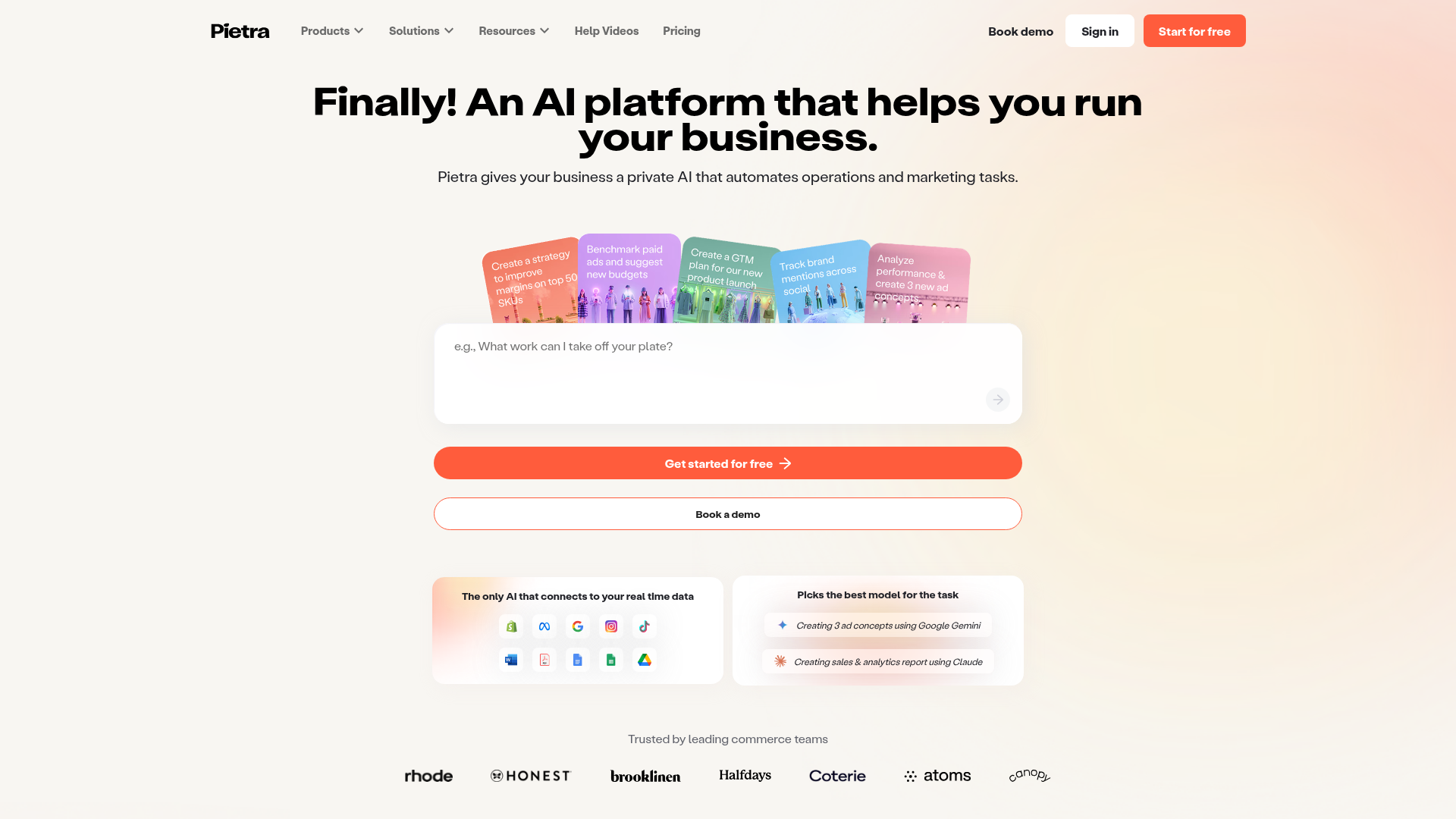
Pietra's landing page is a masterclass in modern AI platform design, utilizing a commerce-first aesthetic that balances high-tech capabilities with approachable consumer branding. It is an excellent reference for builders because it successfully integrates a complex multi-product ecosystem (Sourcing, Fulfillment, Marketing) into a cohesive, single-column narrative featuring a prominent AI-input hero.
Design System
- Color Palette & Visual Hierarchy: The site uses a clean white base with a vibrant orange (#FF5C3C) as the primary action color. It employs a "pastel-to-vibrant" spectrum for its value-prop cards (pinks, blues, greens, and purples) to differentiate AI tasks without clashing. Visual hierarchy is established through massive bold headings and high-contrast CTA buttons.
- Typography: The layout relies on a clean, geometric sans-serif (Labil Grotesk) with substantial weight for the H1 and H2 headers. Subtitles and body text use a lighter weight with increased line-height for readability, often in a dark gray instead of pure black to soften the UI.
- Page Structure & Flow: The flow begins with a high-intent AI input hero, followed by a "bento-box" integration proof section. It then transitions into a sticky tabbed navigation system that allows users to toggle between "AI Software" and "Commerce Services," which dynamically updates the comparison sections below it.
- Reusable Components:
- AI Input Hero: A centered, large-radius textarea combined with floating, overlapping value-prop cards.
- Comparator Cards: Side-by-side "With vs. Without" lists that use icons to visually prove value.
- Logo Marquee: A horizontally scrolling grid of high-profile partner logos.
- Tabbed Comparisons: A horizontal anchor menu used to filter the main feature stack.
- Interaction & Motion: The page features horizontal marquees for brand cards and testimonials. Buttons exhibit subtle hover states (scale and opacity shifts), and the tabbed navigation uses smooth anchor scrolling and active-state background color changes (e.g., the orange background for the active "AI Software" tab).
- Implementation Clues: The HTML confirms a Next.js framework using styled-components (seen via
css-w43aohclasses). It uses the Ant Design icon set (e.g.,anticon-stars-paywall) and responsive-content wrappers for fluid typography scaling.
Use Cases
- Who should clone this: SaaS companies launching AI-native tools, B2B marketplaces, or complex logistics platforms that need to simplify a wide range of services into a single "agentic" entry point.
- Effective Remixes: A developer tool could replace the commerce icons with tech stack logos (GitHub, AWS, Vercel) while keeping the input-focused hero. An HR tech platform could use the comparison blocks to contrast manual recruiting versus automated sourcing.
- Practical Directions: Builders should prioritize cloning the "With vs. Without" comparison component for immediate conversion uplift. The sticky tabbed navigation is also highly reusable for any site with more than three distinct product pillars.
- Clone Scope: The hero and integration section (bento stack) are perfect for a quick section clone to modernize an existing landing page. A full-page clone is recommended for startups needing a robust, long-form sales page that handles features, social proof, and FAQs in one go.
Related Inspirations
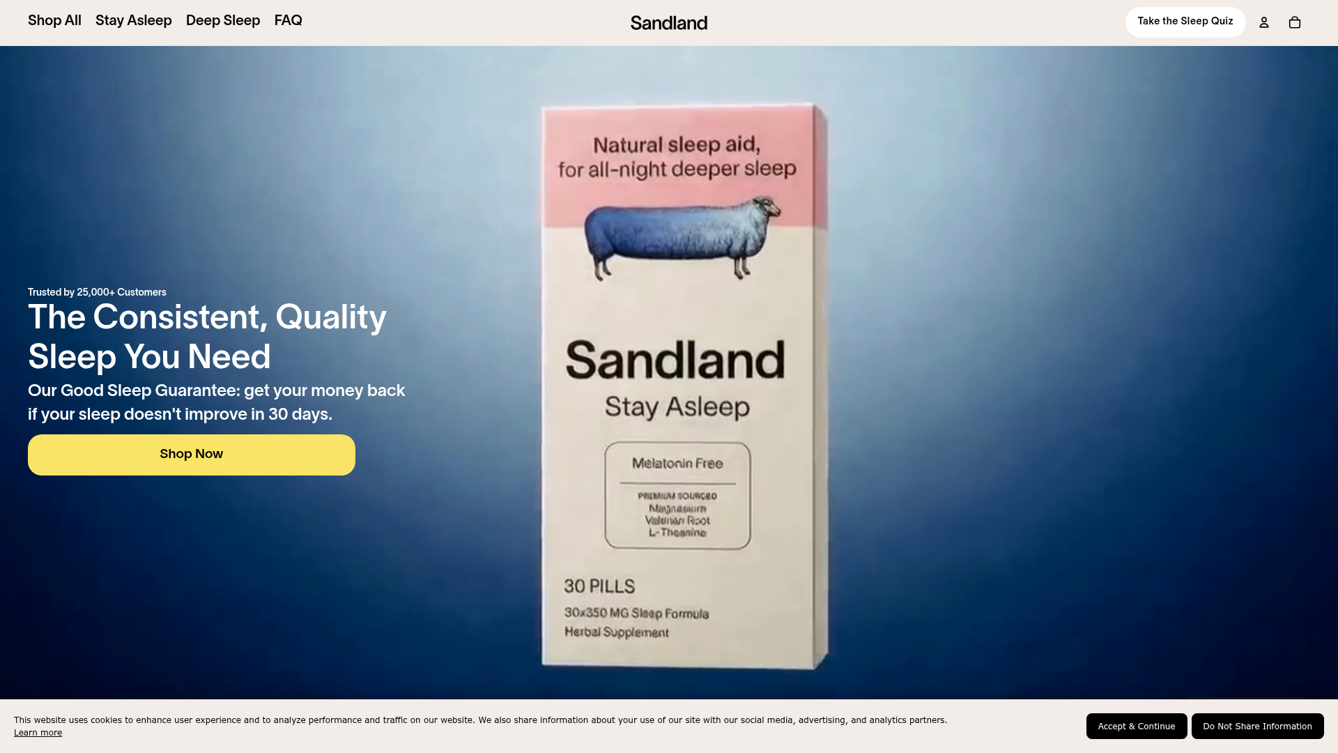
Sandland Sleep Product Landing Page
A high-conversion Shopify layout featuring split-video hero sections, logo-based social proof ribbons, and a testimonial slider integrated with biometric sleep tracker results.
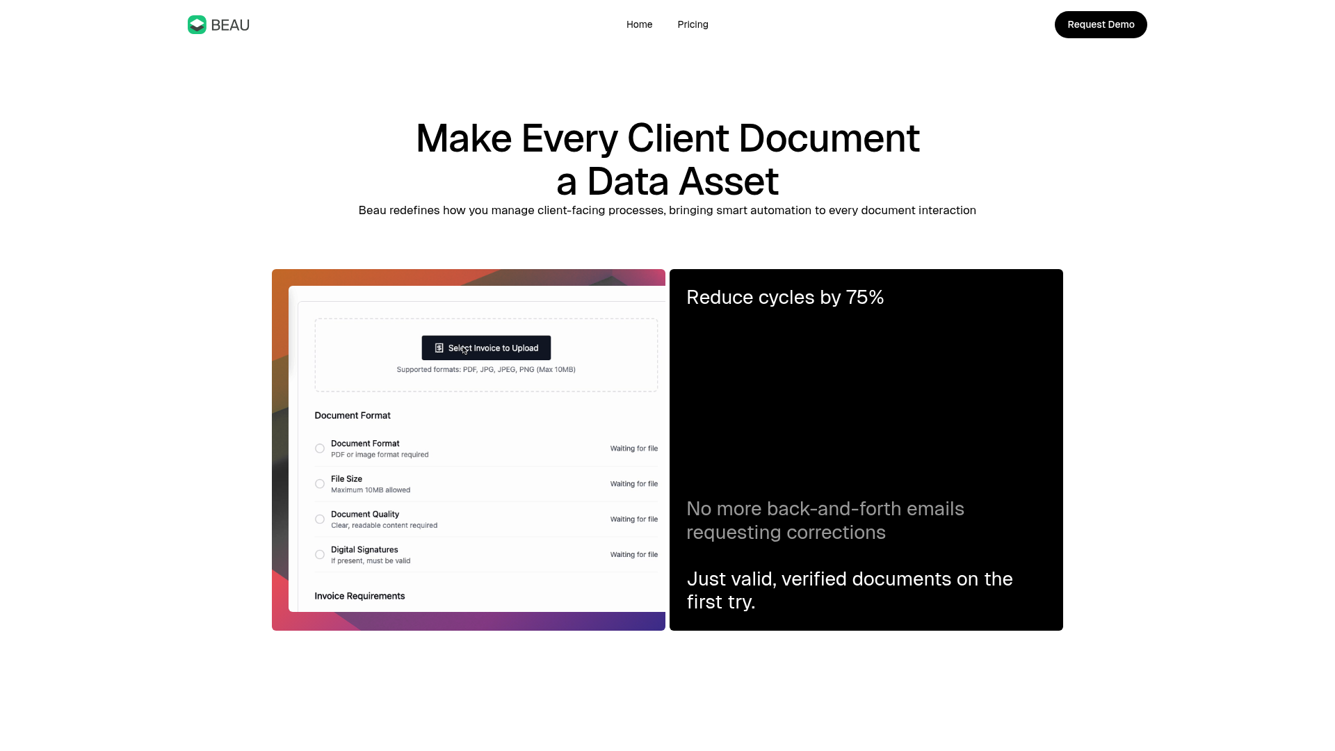
Beau Document Automation Landing Page
A modern software landing page featuring a bento-grid layout, split-screen hero assets with animated checkmarks, a step-by-step process guide, and a clean two-tier pricing table.
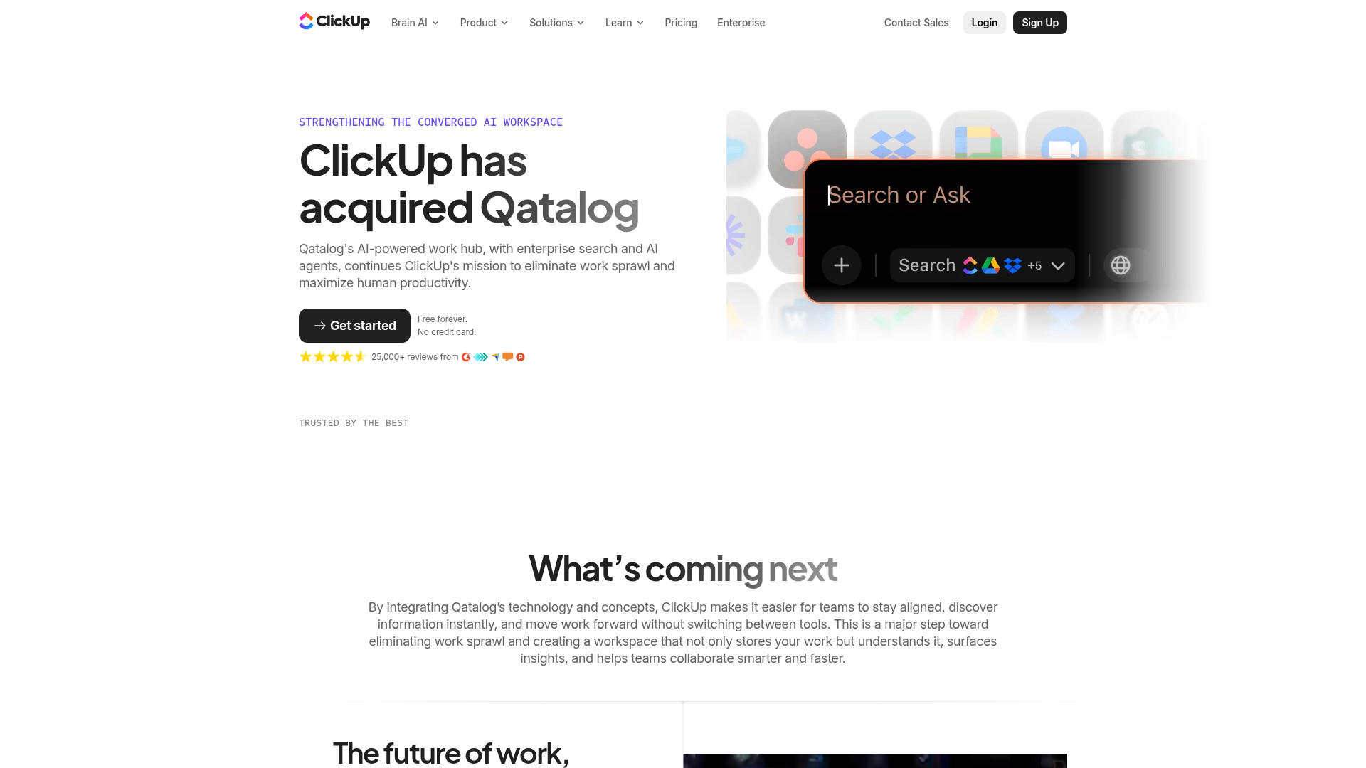
ClickUp Acquisition Hero Landing Page
Features a modern dark-themed hero section with a search UI graphic, bento-style feature grid, and a high-contrast CTA section with decorative gradients.
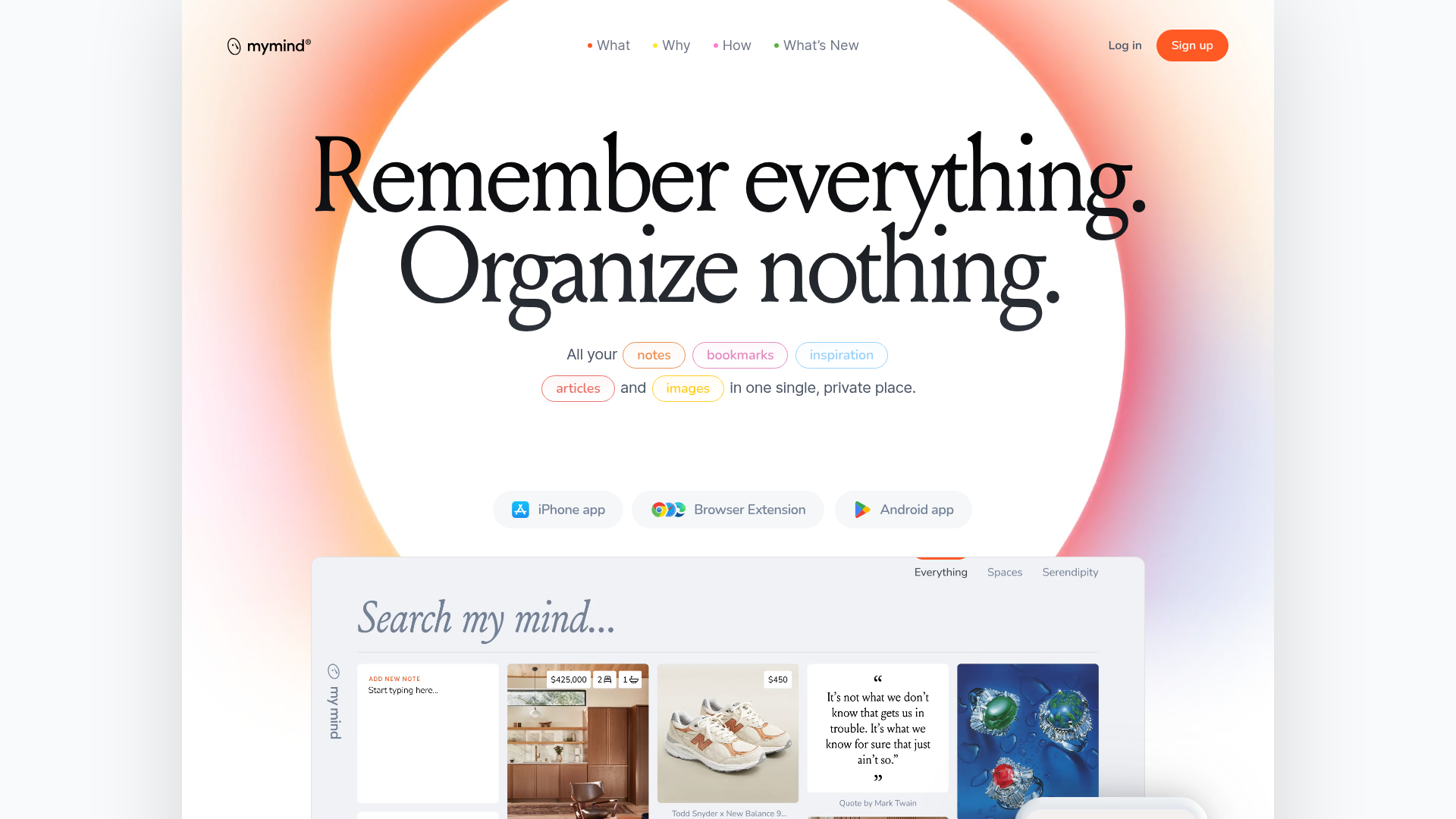
Mymind AI Tool Landing Page
A minimalist SaaS landing page featuring a soft-gradient hero section, custom pill-shaped text badges, and a dynamic bento-style search result preview grid.
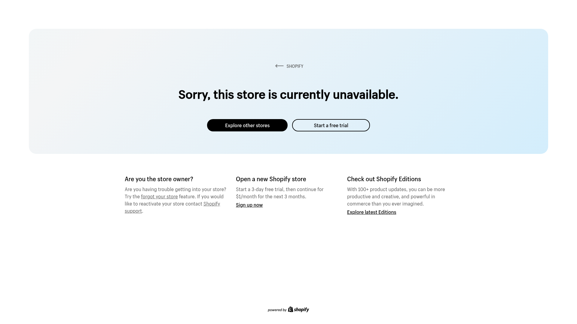
Shopify Unavailable Store Landing Page
A clean, centered error page layout featuring a hero card with rounded corners, primary/secondary action buttons, and a three-column information grid for support and CTAs.
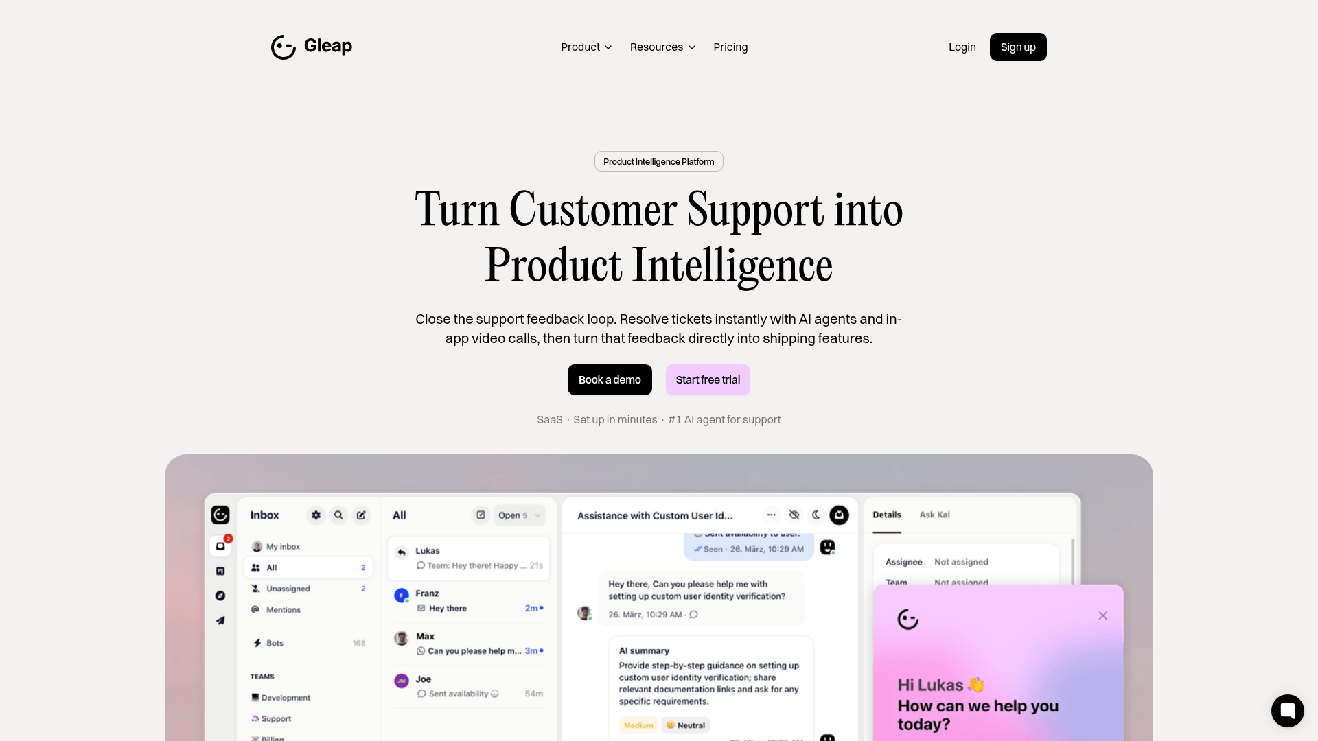
Gleap Product Intelligence Platform Landing
A SaaS template featuring a central video hero, comparison pricing tables, tabbed feature navigation, and a testimonial grid with major brand logos.
