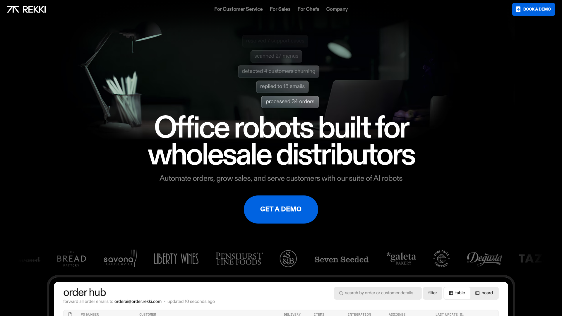
REKKI AI Automation SaaS Landing Page
A high-impact dark-mode landing page featuring a floating label hero section, marquee brand logos, an interactive dashboard UI preview, and card-based testimonial grids.
Overview
REKKI’s landing page is a masterclass in high-contrast dark mode design, utilizing a sophisticated "AI agent" aesthetic for a B2B audience. It effectively balances large-scale display typography with an interactive dashboard preview, making it an excellent reference for SaaS builders looking to demonstrate complex automation features through a clean, premium interface.
Design System
- Color Palette & Visual Hierarchy: The primary palette is high-contrast monochromatic (#000000 black background with #FFFFFF text), accented by a vibrant Royal Blue (#0063E1) for primary Call-to-Actions (CTAs). Visual hierarchy is established via severe scale differences between headers and body text, using transparency (0.52 opacity) for secondary data.
- Typography: The system utilizes a custom sans-serif family (Diatype REKKI) in Medium and Bold weights. The hero header is extremely large (96px) with tight letter-spacing (-0.064em), creating a punchy, modern editorial feel.
- Page Structure:
- Floating Hero: Overlaid notifications (“processed 34 orders”) above a centered h1.
- Logo Marquee: Low-opacity grayscale brand logos for social proof.
- Interactive Dashboard: A multi-tabbed UI preview ("Order Hub") with a progress bar transitioning between OrderAI, InboxAI, and MenuAI features.
- Benefit Grid: Four-column layout with custom SVG iconography and centered text.
- Testimonial Cards: Vertical cards with image masks, blurred glass-effect overlays (
backdrop-filter: blur(30px)), and rounded corners (16px).
- Reusable Components:
- The "Order Hub" Container: A dark, rounded-corner dashboard mock with a tab-based navigation system.
- Notification Bubbles: Semi-transparent floating labels used in the hero to visualize real-time AI activity.
- Pill Buttons: Large, fully rounded buttons for CTAs.
- Interaction Patterns: The dashboard mock-up uses a linear progress bar and opacity-based transitions to cycle through product screenshots. Buttons feature scale and color transitions on hover. The HTML indicates significant use of Framer’s animation libraries for state changes.
- Implementation Clues: The page is built using Framer, utilizing a responsive breakpoint system (860px, 1200px, 1600px). It relies heavily on CSS variables (
--token-xxx) for theme management and SVG components for iconography.
Use Cases
- Target Audience: AI startups, logistics platforms, and B2B SaaS companies needs to explain complex invisible workflows.
- Product Remixes:
- Developer Tools: Swap the "Office Robots" theme for "Deployment Automatons," keeping the dashboard preview to show code metrics.
- FinTech: Use the testimonial grid and marquee to build trust while utilizing the floating hero labels to show transaction logs.
- Remix Directions:
- Typography Swap: Replace the technical Diatype font with a high-contrast Serif (like Editorial New) to shift from "Technical SaaS" to "Luxury Lifestyle."
- Information Architecture: The hero floating labels are perfect for showing "latest events" in any real-time application.
- Scope: Builders should prioritize cloning the Hero-to-Dashboard transition first, as it is the strongest visual hook for conversion.
Related Inspirations

GoCardless Payments Platform Landing Page
A dark-themed fintech landing page featuring a split-screen video hero, bento-style feature cards, a horizontal logo slider, and step-by-step accordion guides.
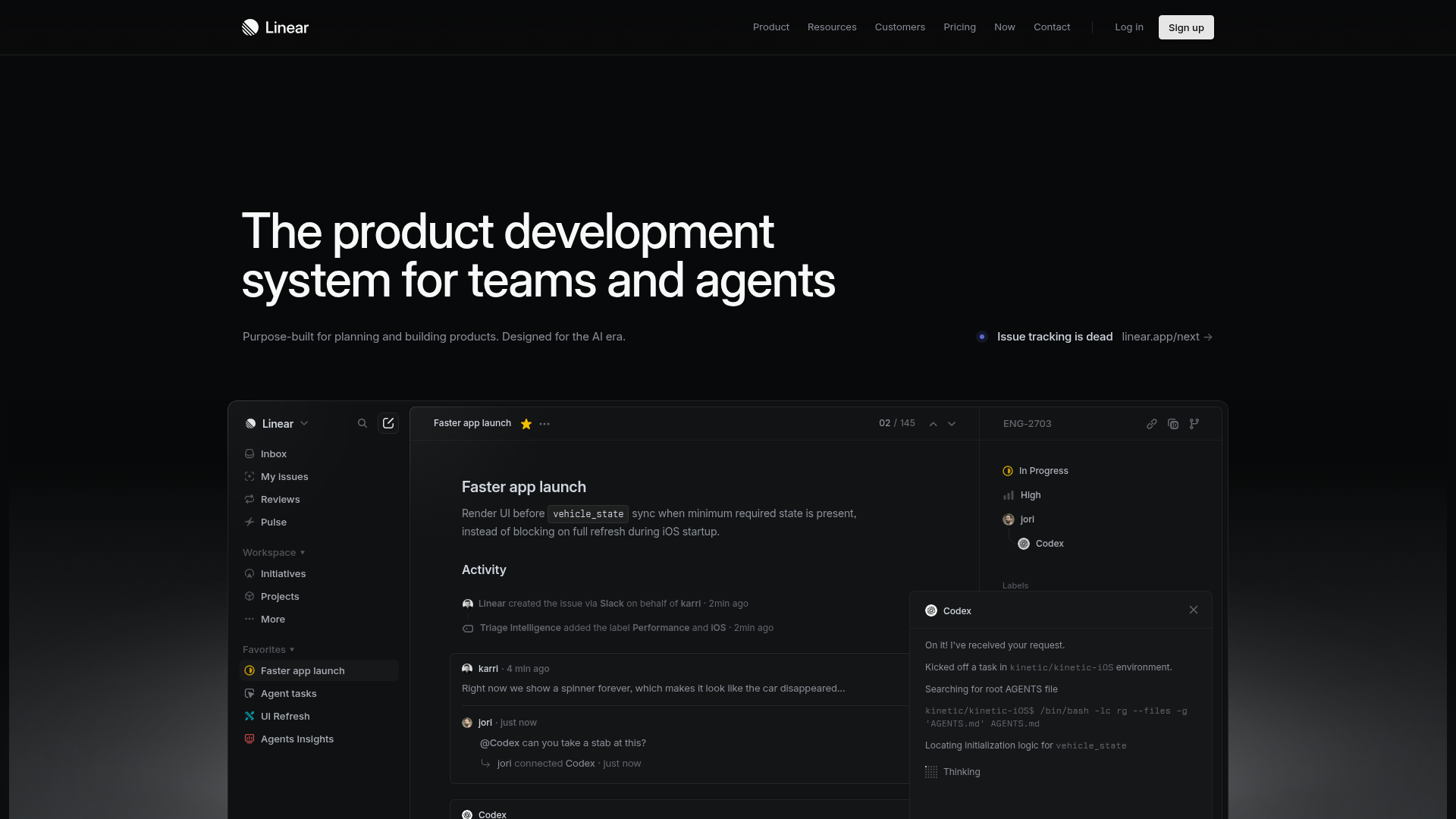
Linear Product Development System Landing Page
A high-fidelity dark-themed landing page featuring a complex dashboard UI mockup, glassmorphism effects, and a sophisticated sidebar navigation layout.
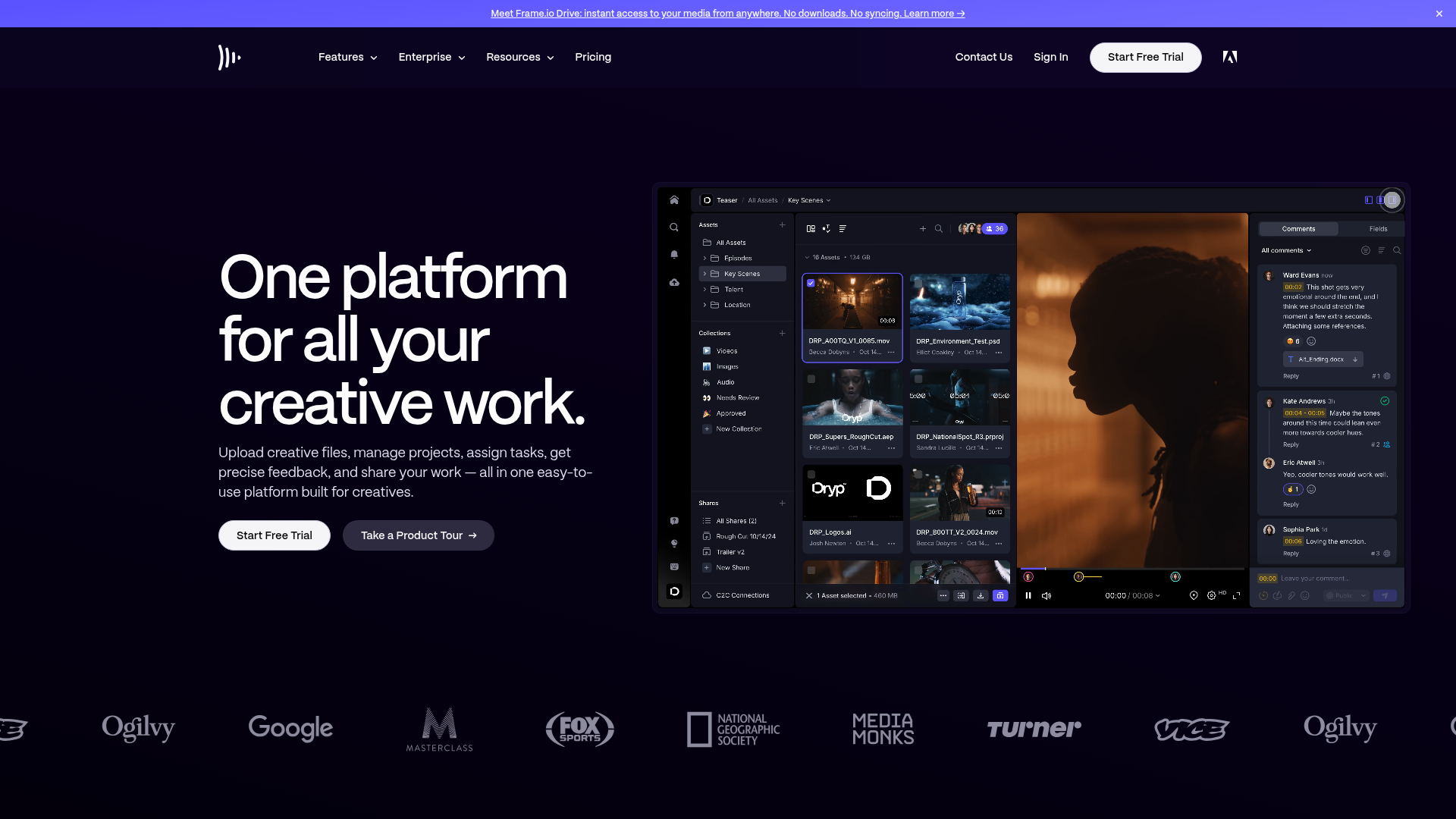
Frame.io Creative Collaboration Landing Page
A dark-themed professional SaaS landing page featuring a high-contrast hero section, interactive software interface mockup, and a scrolling logo marquee for social proof.
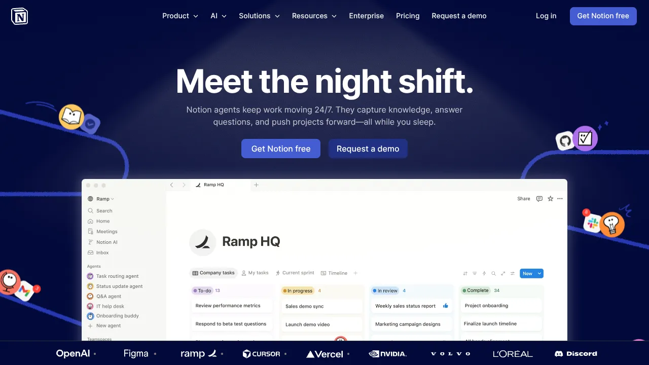
Notion AI Landing Page Design
A high-impact SaaS hero section featuring a dark-themed layout with a centralized product glassmorphism window, animated illustrated accents, and a scrolling logo marquee for social proof.

Vercel AI Cloud Landing Page
A modern landing page featuring a minimalist dark-themed navbar, a grid-overlay hero section with radial color gradients, and high-contrast typography for customer success stories.
Mapbox SaaS Hero and Showcase Landing
A dark-themed landing page featuring a 3D-effect carousel, layered product highlight cards, tabbed customer stories, and a logo proof grid.
