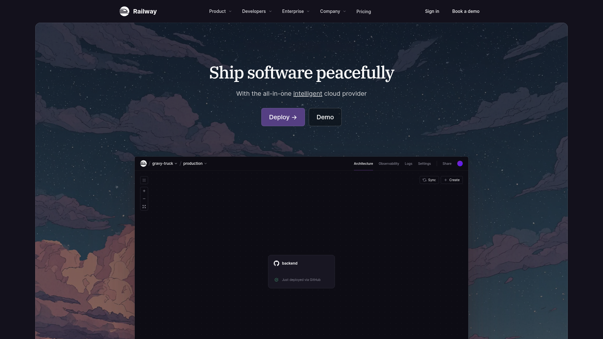
Railway Cloud Platform Landing Page
A dark-themed developer tool landing page featuring a twilight sky background, a custom dashboard interface mockup, and clean navigation with purple accents.
Overview
Railway's landing page is a premier example of modern "Developer Experience" (DX) design, balancing a technical dashboard interface with an atmospheric, illustrative background. It is a strong clone reference for builders who need to present complex infrastructure or SaaS tools through a lens of simplicity and "peaceful" deployment.
Design System
- Color Palette & Visual Hierarchy: The site uses a sophisticated dark theme. The primary background is a deep charcoal/black, overlaid with a twilight sky illustration featuring purples, subdued oranges, and blues. The high-contrast focal point is the deep purple primary CTA button (
#5E42A6range), creating a clear path for user conversion. - Typography System: It utilizes a clean sans-serif for functional UI and navigation (likely Inter or a custom variant), paired with a serif font for the main headline ("Ship software peacefully") to provide a premium, editorial feel. Hierarchy is maintained through font weight and size, with secondary text in low-opacity whites.
- Page Structure & Section Flow: The layout follows a classic hero pattern: a minimalist navigation bar at the top, a centered value proposition and CTA section, followed by a large, embedded interactive dashboard mockup that moors the abstract value prop in concrete product reality.
- Reusable Components:
- Navigation: A sticky-ready top bar with dropdown menus and distinctive primary/secondary CTAs.
- Tiered Buttons: Rounded-corner buttons with subtle hover states and distinct "Deploy" vs "Demo" visual weights.
- Dashboard Mockup: A layered container representing a cloud environment, featuring breadcrumbs, tabs (Architecture, Observability, Logs), and canvas control iconography.
- Implementation Clues: The HTML structure suggests a modern component-based framework (like Next.js or React) using utility-first styling. The dashboard interface is built as a simulation of the core product rather than a flat image, allowing for high-fidelity CSS-based shadows and borders.
Use Cases
- Who should clone this: Small teams building Cloud-native tools, PaaS/IaaS startups, and DevOps utility providers who want to signal reliable and calm user experiences.
- Effective Remixing: The twilight sky illustration can be swapped for other atmospheric imagery (e.g., cybernetic grids or abstract gradients) to immediately shift the brand's mood while keeping the functional layout intact.
- Practical Directions: Builders should focus on the "Dashboard as Hero" pattern. Remix this by replacing the Railway dashboard mockup with your own product's interface, maintaining the inner spacing and minimal tab system.
- Clone Scope: A full-page clone is ideal for startups needing an immediate home page, but the internal "mini-dashboard" container is the most valuable individual component to remix for product-led growth (PLG) pages.
Related Inspirations
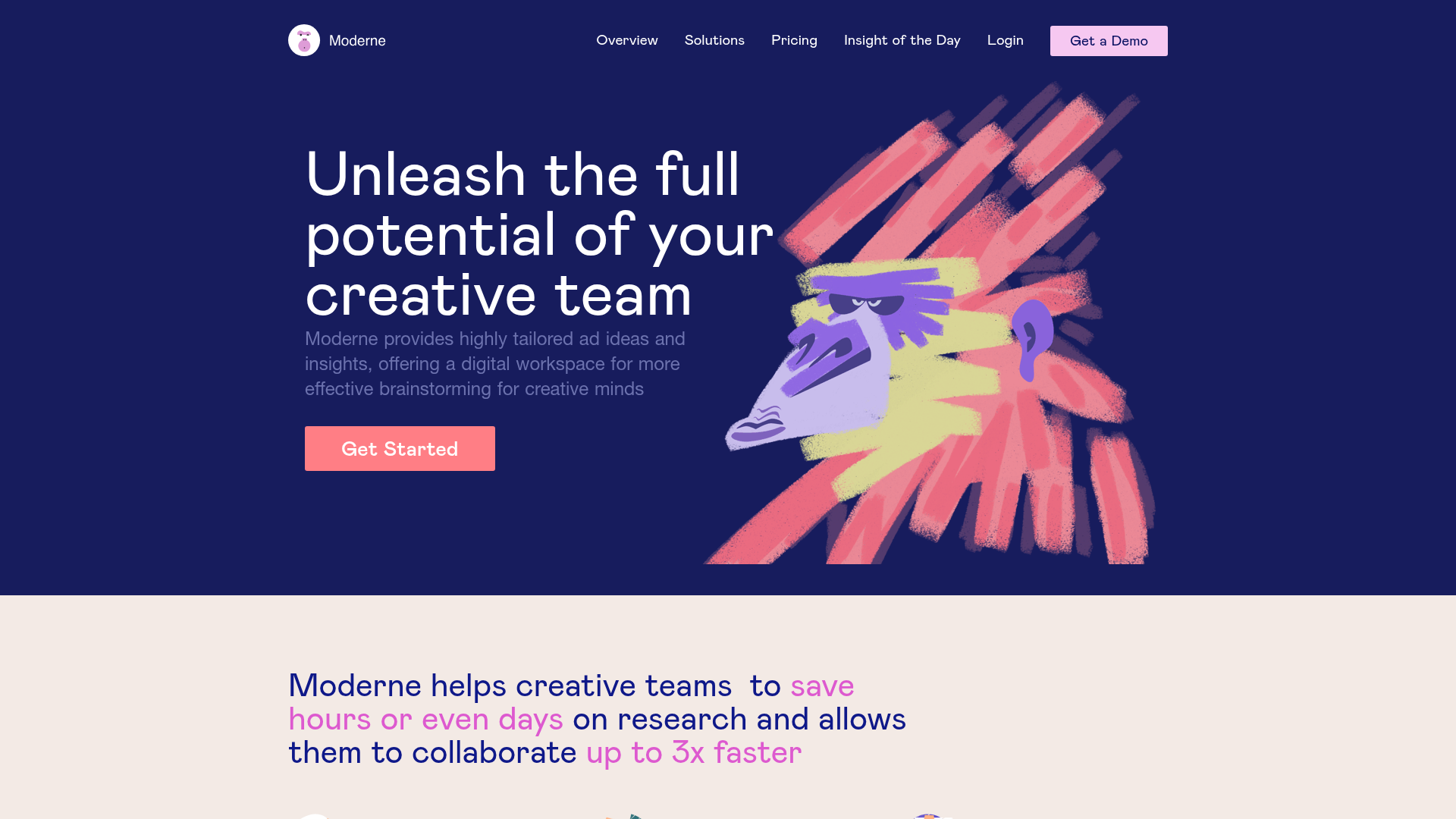
Moderne Creative Landing Page
A high-contrast landing page featuring a dark hero section with an artistic illustration overlay, distinct alternating content blocks, and a visual comparison bar chart component.
Intranetus Project Showcase Landing Page
A high-concept portfolio page featuring a large-scale video hero, Lottie animations, layered parallax transition effects, and a vertical grid of browser-mockup feature cards.
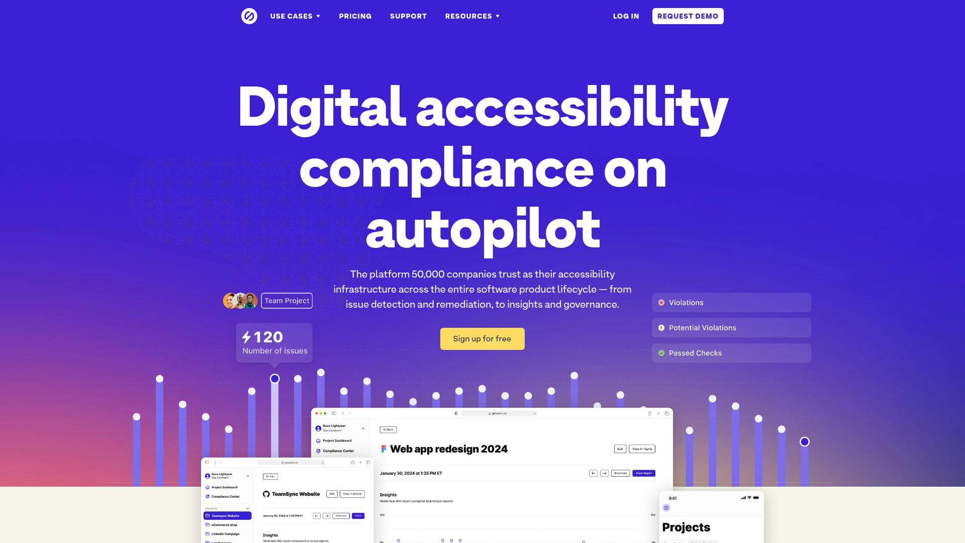
Stark Accessibility Software SaaS Landing Page
A vibrant SaaS landing page featuring a purple gradient hero, layered dashboard mockups, grid-based feature highlights, and segmented user-persona navigation.
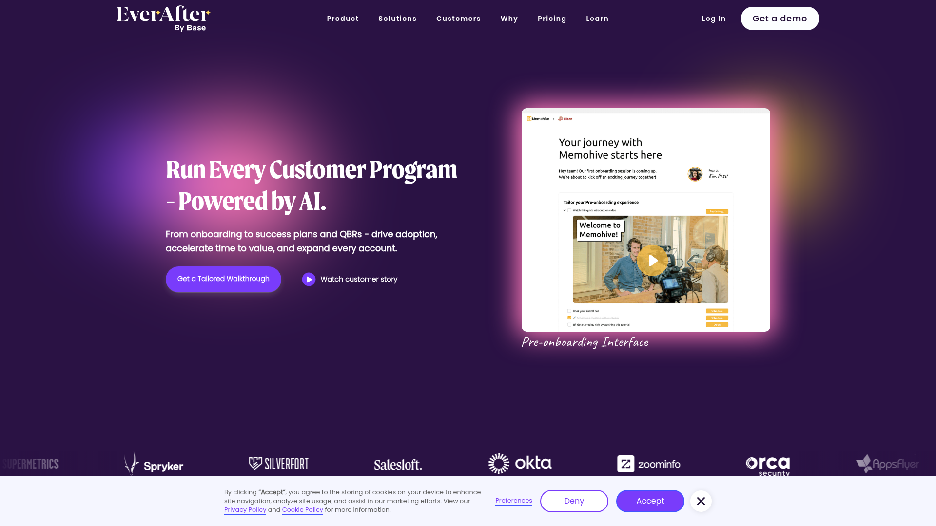
EverAfter AI Customer Portal Hero
A SaaS landing page template featuring a glowing product carousel, auto-scrolling logo marquee, accordion-based feature reveals, and an embedded scheduling widget.
Squadeasy Employee Engagement SaaS Landing Page
A vibrant wellness platform layout featuring a sticky navigation bar, modular high-contrast sections, interactive testimonials slider, and animated data counting components.
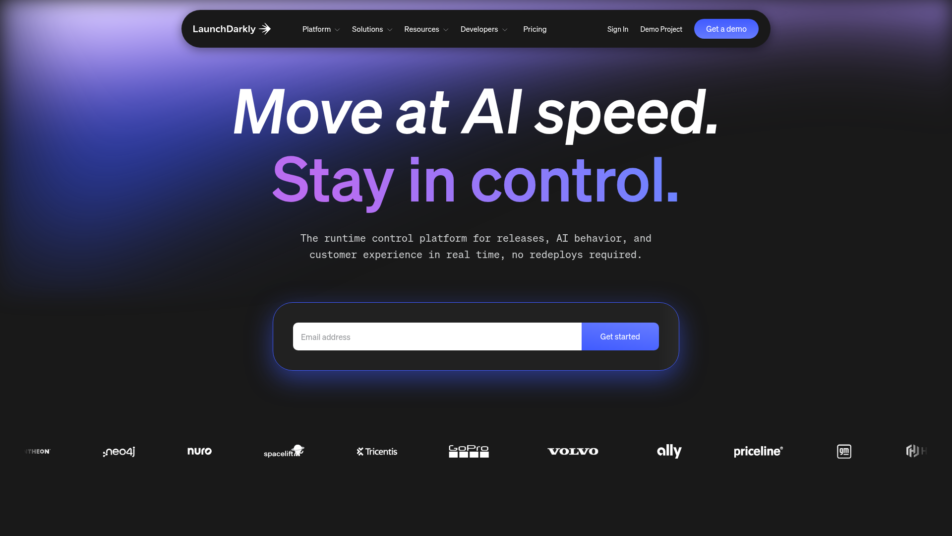
LaunchDarkly SaaS Landing Page Hero
A dark-themed developer marketing layout featuring a glowing blurred background, sticky pill-shaped navigation, tabbed feature showcases, and a horizontal logo marquee.
