Block Corporate Minimalist Interaction Landing
A minimalist landing page featuring a central kinetic logo, fullscreen video transitions, and a clean navigation system for showcasing sub-brands.
Overview
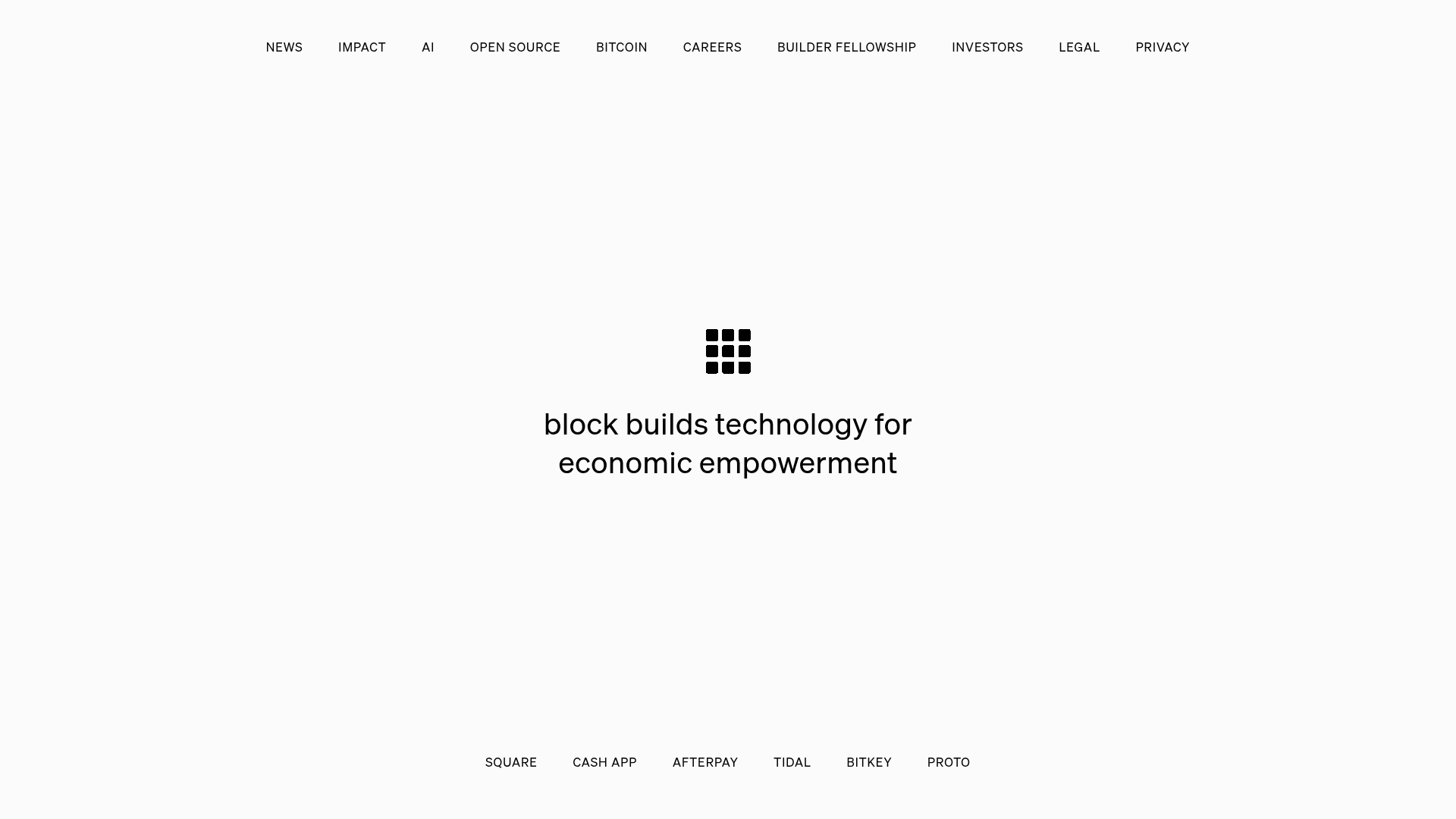
This site is the corporate landing page for Block (formerly Square), showcasing a masterclass in extreme minimalism and interactive storytelling. It stands as a prime reference for builders because it uses high-contrast typography and motion rather than traditional layout structures to communicate brand identity across multiple sub-entities.
Design System
- Color Palette & Visual Hierarchy: A stark, monochromatic white-and-black base creates a sophisticated canvas. The hierarchy is centered entirely on a kinetic grid logo and ultra-bold typography, ensuring that when the background transitions to full-screen video for sub-brands (Square, Cash App, etc.), the contrast remains striking.
- Typography System: The site utilizes a custom sans-serif (Cash Sans) with wide letter-spacing. Headings are rendered in lowercase for a modern, approachable yet architectural feel. Scale is massive for central messaging and tight/uniform for navigation links.
- Page Structure & Section Flow: The layout is a fixed-viewport single-page application. Top navigation handles corporate links (News, Impact, Investors), while a bottom-persistent secondary navigation allows users to switch between brand ecosystems (Square, Cash App, Tidal). Selecting a sub-brand triggers a full-screen video overlay transition.
- Reusable Components: The unique dual-navigation system (top-weighted generic links vs. bottom-weighted brand selects) is the most valuable architectural pattern to clone. The central kinetic logo container is also highly reusable for hero sections.
- Interaction & Motion Patterns: The site relies on seamless video transitions and state changes within a single viewing frame. Instead of scrolling, the UI focuses on 'resizing' containers and toggling visibility of brand sections via CSS classes (
svelte-dy0vg3 visible). - Implementation Clues: Built using Svelte, the HTML structure uses CSS custom properties for nearly every design token (spacing-base, twist-color, twist-ease), making it highly themeable for developers using design systems.
Use Cases
- Who should clone this pattern: Holding companies with distinct sub-brands, high-end design agencies, or venture capital firms that need to provide quick access to disparate portolio entities without clutter.
- Effective Remixes: A product studio could use the bottom navigation as a 'project selector,' where clicking each name changes the entire hero background to a video demo of that specific app.
- Practical Remix Directions: Builders can adapt the 'Info Architecture' by keeping the dual nav bars but swapping the minimalist center text with a more traditional three-column feature section or a lead-gen form that remains anchored while the background visuals shift.
- Suggested Clone Scope: Start with the
sections-containerand the fixed top/bottom navigation bars. This 'empty stage' pattern is the most powerful part of the template before adding complex video transitions.
Related Inspirations

Bruno Arizio Designer Portfolio Website
A minimalist creative director portfolio featuring a clean typographic layout, side-aligned image previews, and high-contrast spacing patterns suitable for luxury or design showcases.
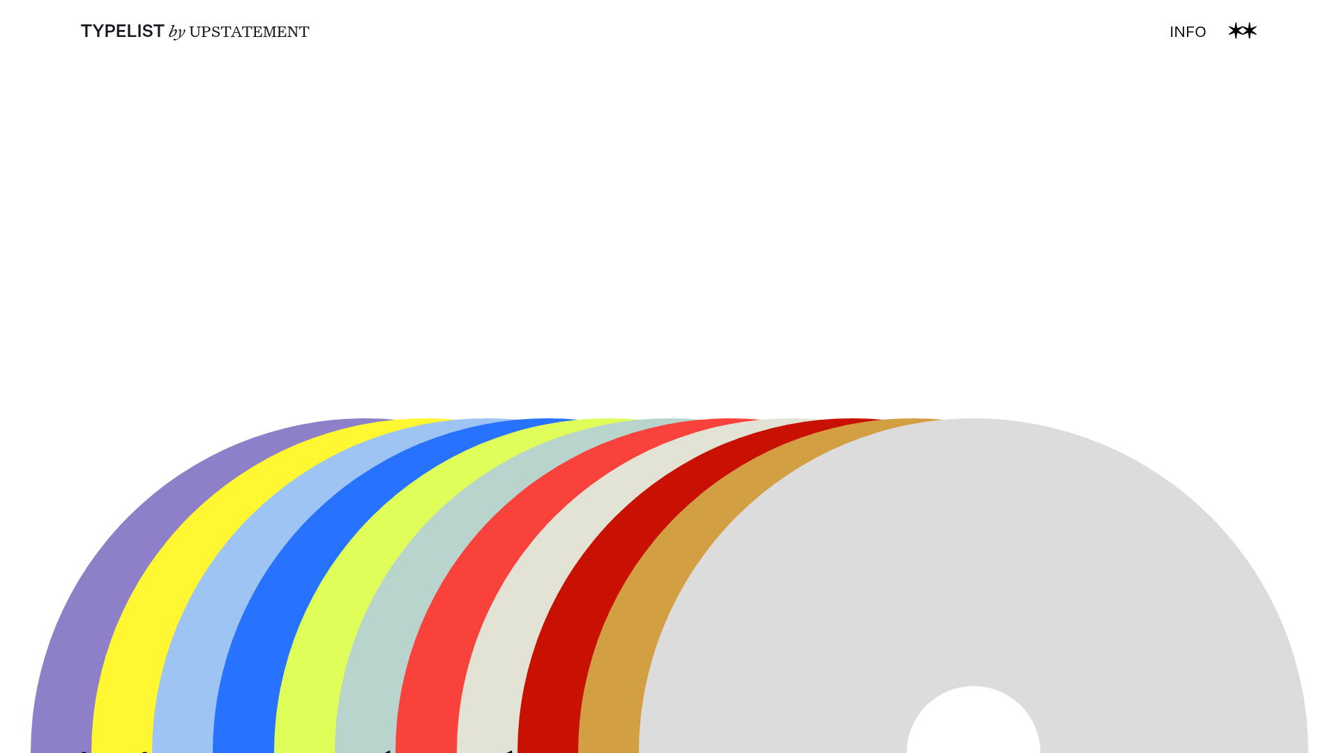
Typelist Typography Playlist Gallery
A creative curated gallery featuring a horizontal overlapping disc navigation pattern, CSS-driven theme color shifting, and smooth page transitions for showcasing design collections.

OpenWeb B2B Service Landing Page
A professional landing page layout featuring a central animated hero area, data visualization counters, a client logo grid, testimonial slider, and tabbed lead generation forms.
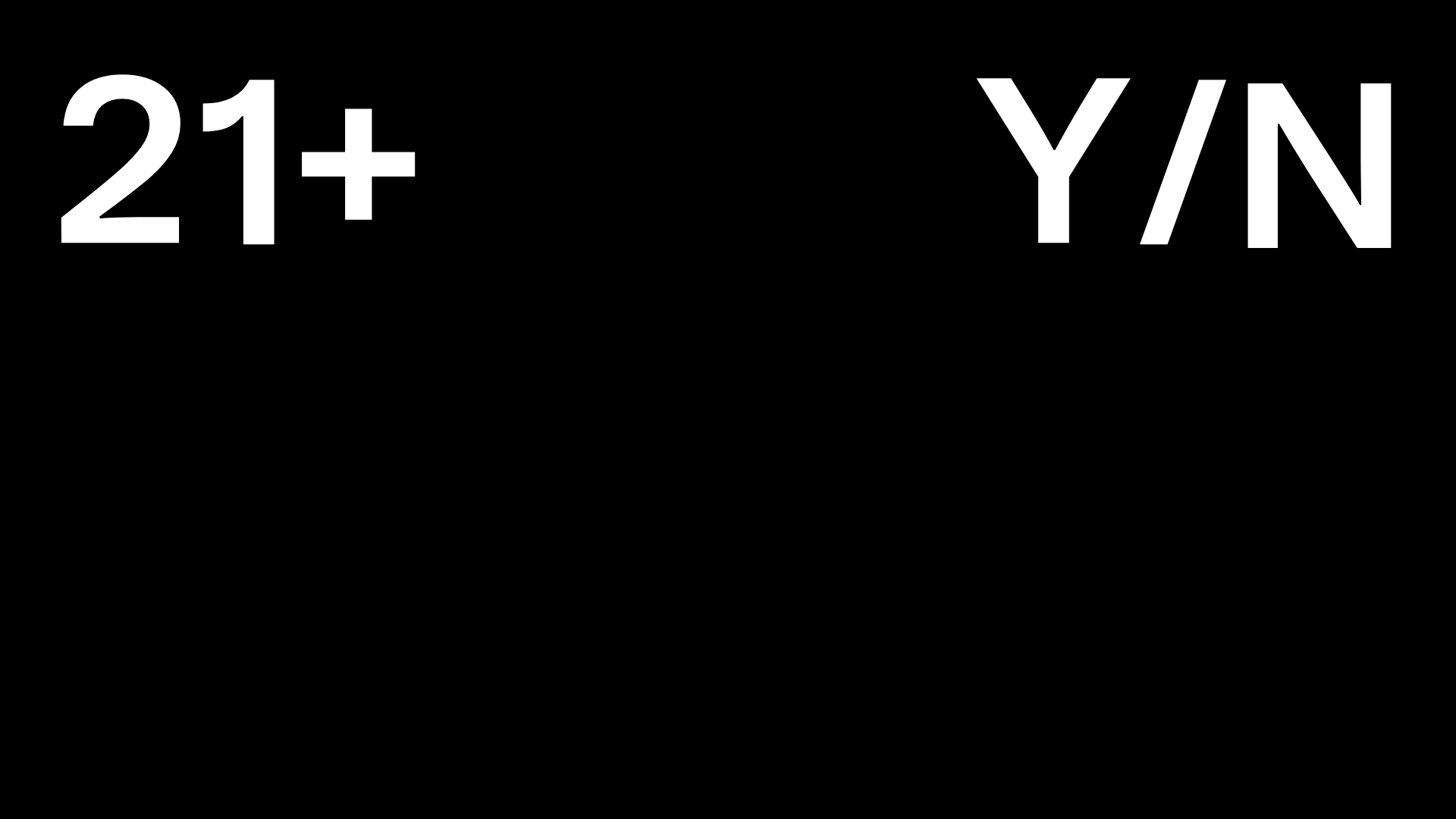
Post Familiar Minimalist Winery Storefront
An experimental e-commerce layout featuring a high-contrast age verification screen, bold typography grids, and a horizontal scrollable product showcase.
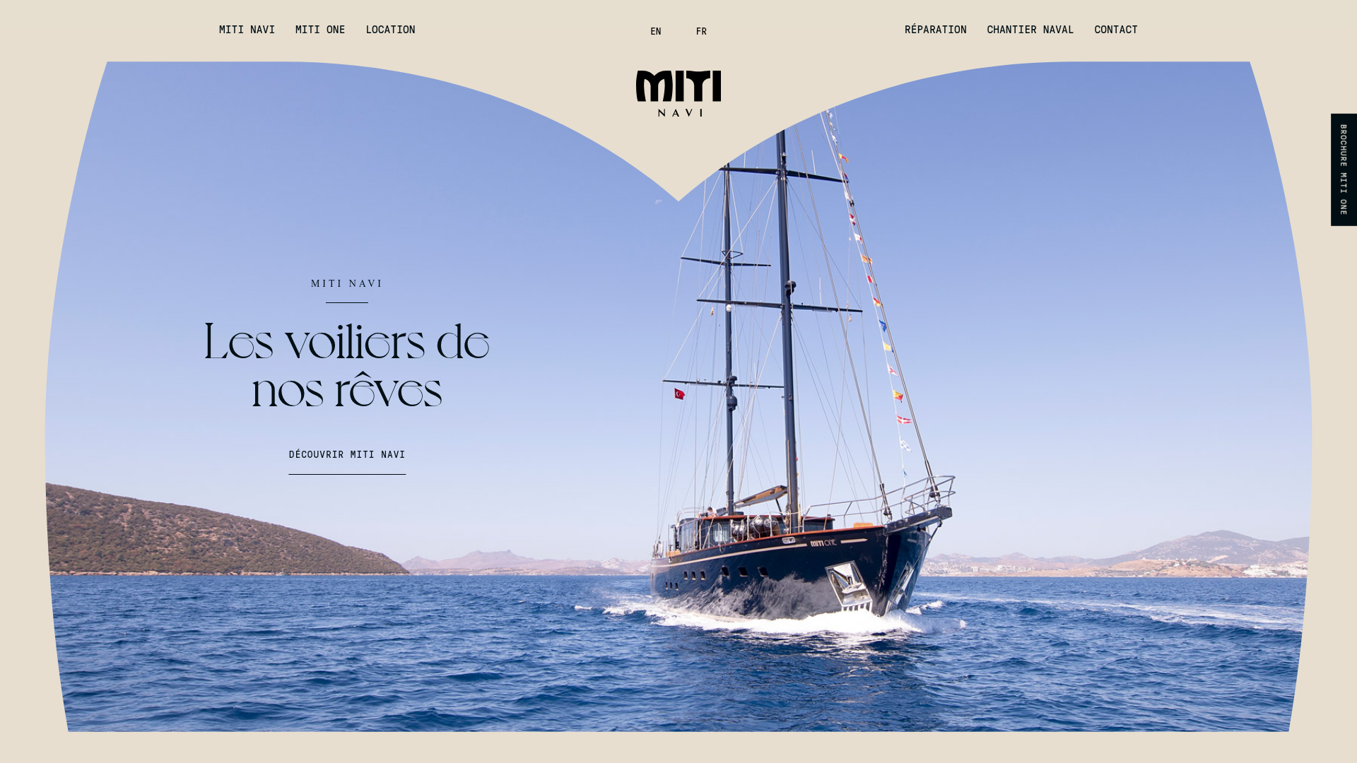
Miti Navi Luxury Nautical Portfolio
A high-end landing page featuring a curved hero mask, smooth parallax scroll effects, card-based service layouts, and sophisticated serif typography for a premium brand feel.
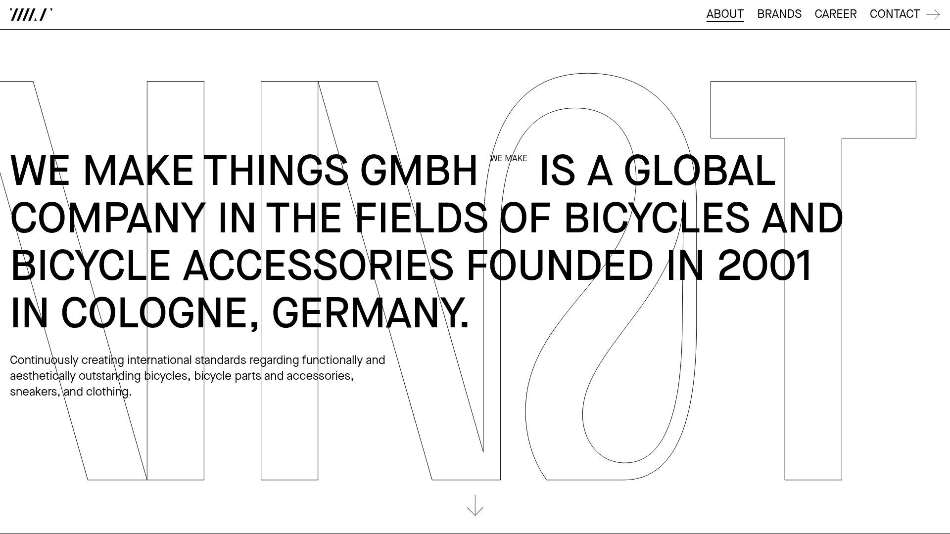
WE MAKE THINGS Corporate Portfolio
A minimalist corporate site featuring a bold typography-heavy hero section and an accordion-style brand list with integrated image galleries and external links.
