Rou Hun Fan Portfolio Site
A creative developer portfolio featuring a dynamic offset typography layout, overlapping interactive image galleries, and motion-heavy CSS transformations.
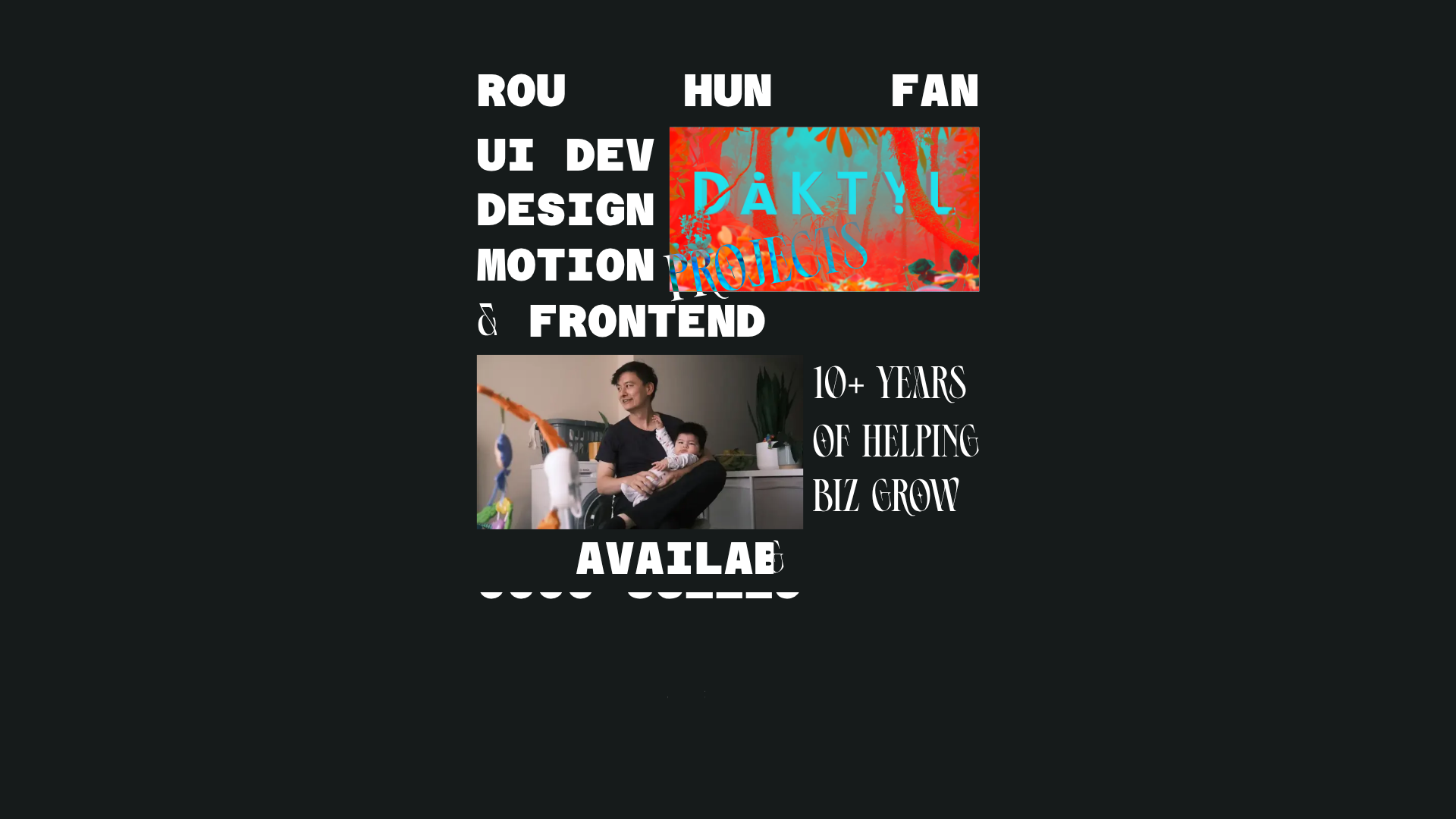
Overview
This portfolio site is a masterclass in high-impact, editorial-style typography and dynamic spatial layouts. It utilizes a "brutalist-chic" aesthetic where text and media overlap in a fluid, non-traditional grid, making it an excellent reference for creators who want to break away from standard boxy layouts. Builders should clone this to study how to manage complex z-indexing and CSS transformations for an interactive, experimental user experience.
Design System
- Color Palette & Visual Hierarchy: A stark, high-contrast palette of solid black (#000000) backgrounds with crisp white text. Visual hierarchy is established through extreme scale rather than color, using massive font sizes and overlapping image containers to create depth.
- Typography System: The design uses two distinct typefaces: a heavy, ultra-wide sans-serif (e.g., UI dev, DESIGN) for a modern feel, and a high-contrast, decorative serif (e.g., 10+ YEARS, PROJECTS) for an editorial touch. The text is often slightly offset or rotated (e.g., the "Projects" label is rotated -10deg).
- Page Structure: The layout follows a dense, centered vertical stack where content clusters are grouped. It leads with a professional summary (UI Dev, Design, Motion), transitions into a featured work gallery, and ends with a personal section and availability status.
- Reusable Components:
- Overlapping Image Gallery: A container holding multiple
imgelements with absolute positioning, where anactiveclass toggles visibility. - Animated Text Lines: The
c-fxrEBZwrapper pattern suggests a system for line-by-line text reveals or horizontal shifts (e.g.,transform: translateX). - Floating Badges: Tilted header tags that overlap image borders.
- Overlapping Image Gallery: A container holding multiple
- Interaction & Motion: The HTML indicates the use of
transformandopacityproperties for state changes. Images in the project section appear to be part of a hover-triggered cycle, and the entire wrapper uses a globalscaletransform, likely to ensure the layout fits various viewport sizes while maintaining its proportions. - Implementation Clues: Built using Next.js (indicated by
_next/image), the site uses a CSS-in-JS or utility-based styling system with hashed class names (e.g.,c-blzpcY). It heavily relies onposition: absoluteandflex: 0 0 autoto maintain a rigid, overlapping layout regardless of text length.
Use Cases
- Who should clone this: Creative developers, motion designers, and high-end digital agencies looking for a "low-content, high-impact" landing page.
- Effective Remixes: This pattern works perfectly for fashion lookbooks, experimental music launches, or studio landing pages where the brand's visual identity is the primary selling point.
- Remix Directions: Replace the dark theme with a high-saturation "neon" palette for a cyberpunk look, or swap the wide sans-serif for a monospace font to create a more technical, "developer-centric" vibe. The typography-heavy header can be adapted into a navigation menu where each line is a link.
- Suggested Scope: A full-page clone is best to capture the spatial relationship between elements, but the overlapping "Project" image component is a highly reusable standalone section for any modern portfolio.
Related Inspirations
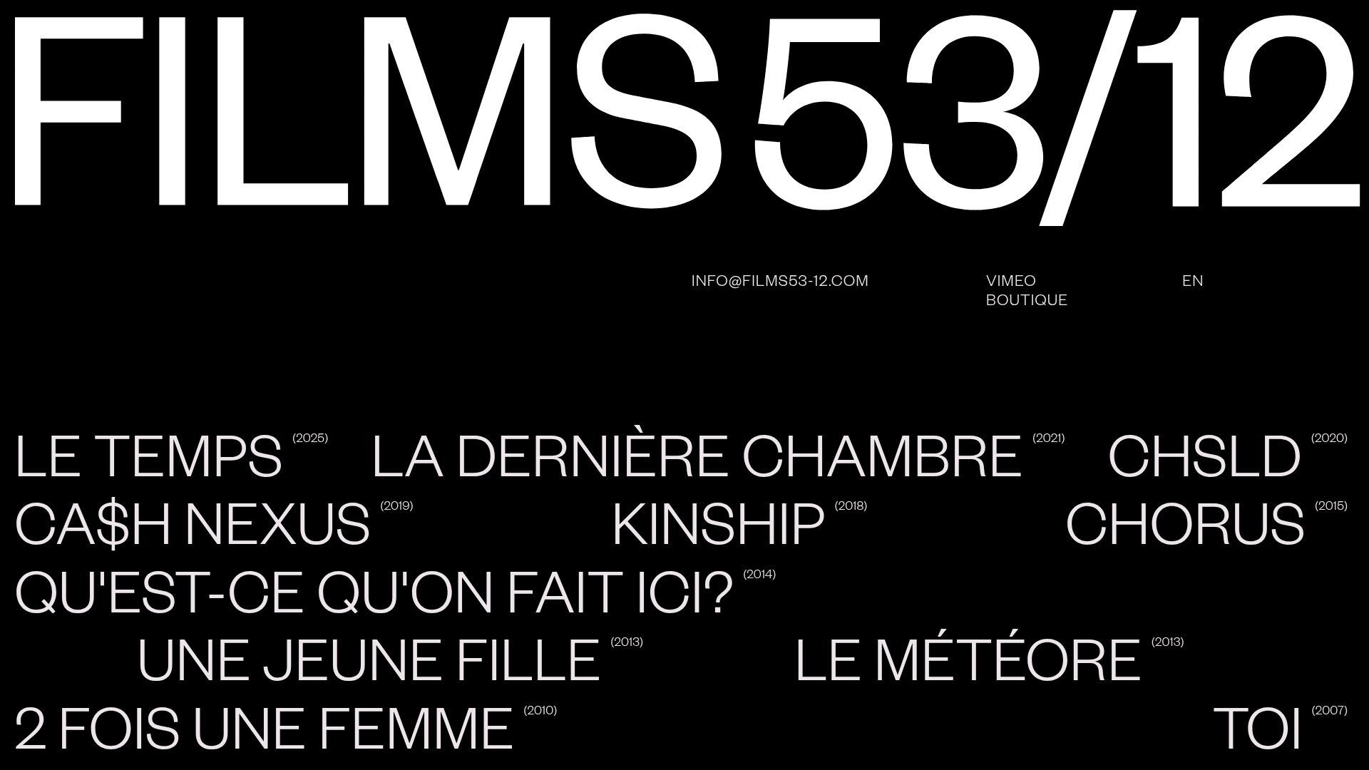
Films 53/12 Cinematographic Portfolio Layout
A minimalist dark-mode production site featuring a scattered typography grid, interactive hover-to-reveal image states, and a clean list-based film catalogue.
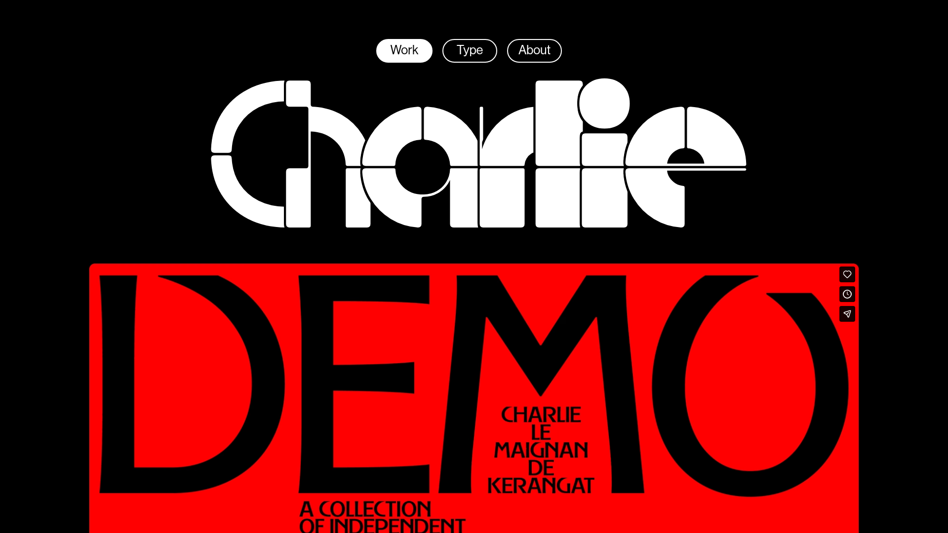
Charlie Le Maignan Portfolio Archive
A minimalist dark-mode portfolio featuring high-contrast typography, a geometric logo header, and an integrated full-width video gallery showcasing independent creative work.
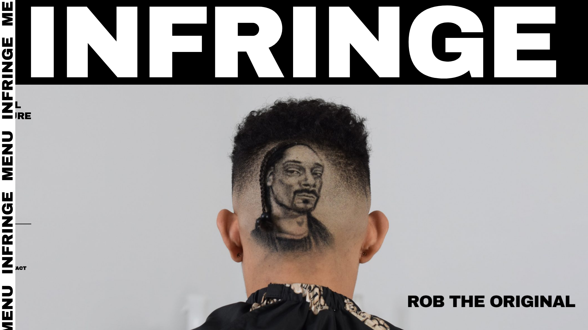
Infringe Hair Culture Portfolio Gallery
A minimalist, high-impact portfolio featuring a vertical sticky marquee sidebar and full-screen image scrolls that toggle between desktop and mobile assets.
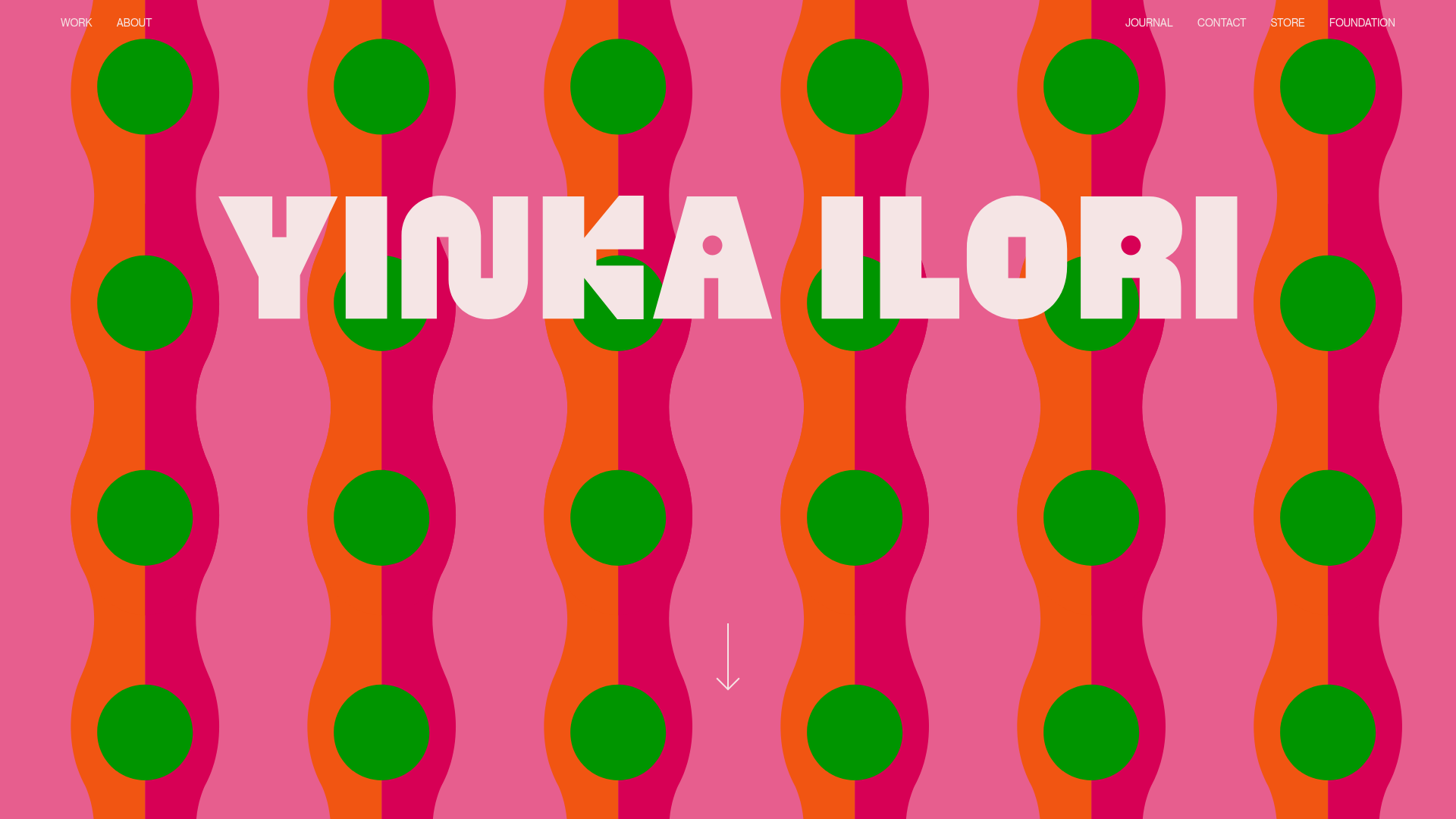
Yinka Ilori Portfolio Mosaic Grid
A vibrant portfolio featuring a scroll-activated parallax hero, bold typography, and a staggered mosaic image grid with asymmetric layouts and fade-in animations.
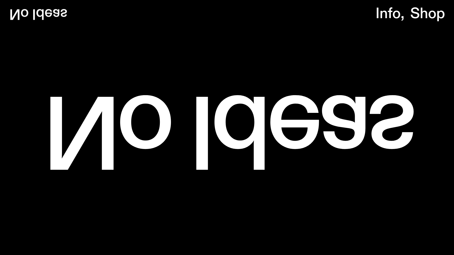
No Ideas Design Portfolio Carousel
A minimalist, full-screen portfolio featuring a high-impact typography hero and a large-scale Bootstrap carousel with video and image support.
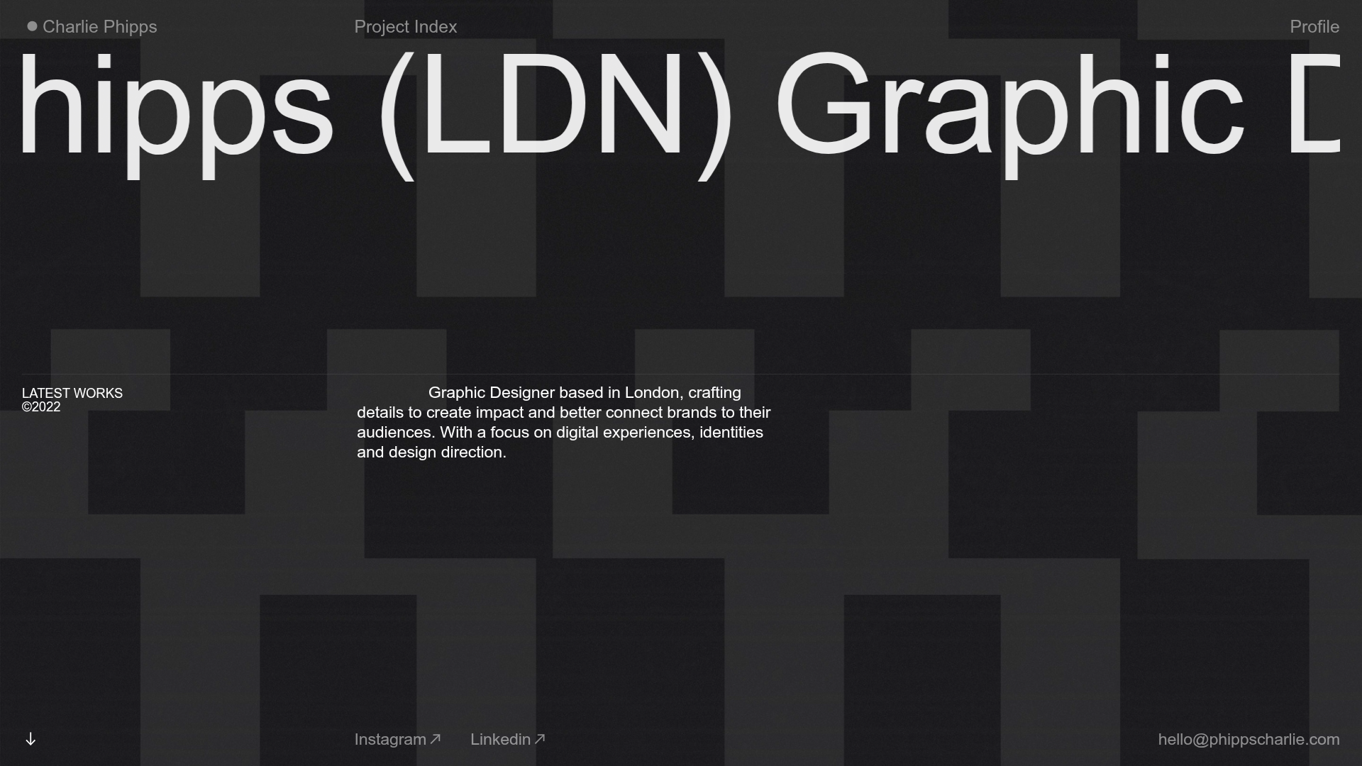
Charlie Phipps Portfolio Hero Layout
A dark-themed portfolio featuring a large horizontal scrolling marquee header, full-bleed video backgrounds, and a clean typography-focused grid for case studies.
