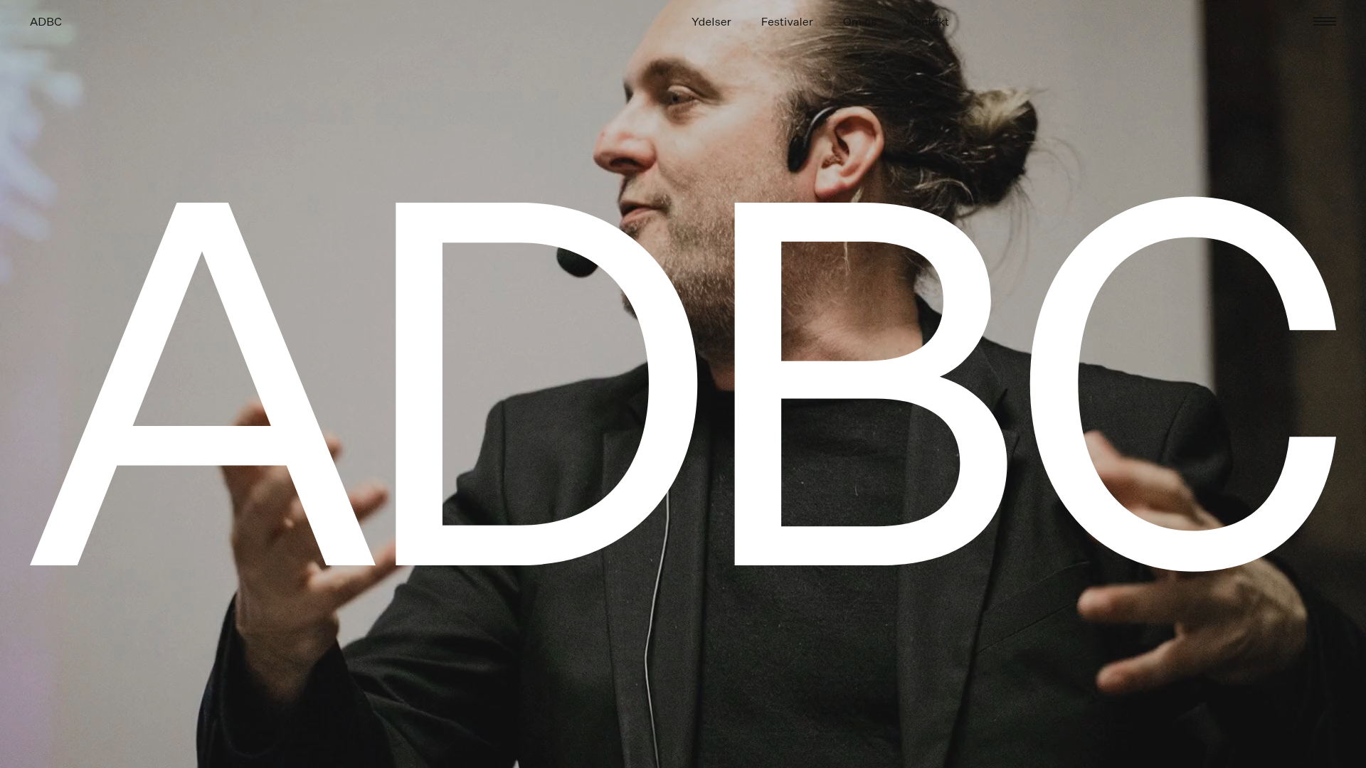
ADBC Studio Agency Landing Page
A high-impact agency site featuring a full-bleed video hero with centered typography, large image-based service cards, and an immersive dark-themed editorial layout.
Overview
ADBC Studio's landing page is a masterclass in high-impact editorial design for creative agencies. It combines a cinematic full-bleed video hero with oversized, high-contrast typography and a structured, image-heavy layout. It is an ideal reference for builders looking to create a premium-feel brand presence that balances bold atmospheric visuals with clean, scanable content.
Design System
- Color Palette & Visual Hierarchy: The site uses a predominantly dark theme (rich blacks and dark grays, likely
rgba(21, 18, 17)) to make white typography and high-saturation imagery pop. Hierarchy is established through extreme scale rather than color diversity. - Typography System: A clean, geometric Sans-Serif (reminiscent of Helvetica or Inter) is used throughout. The hero features massive, centered "ADBC" lettering in white, while section headings (
.intro__textand.front-content__entry__heading) maintain a large, bold scale to drive readability. - Page Structure & Flow:
- Hero: Full-screen video background (
.hero__media) with centered logo overlay. - Intro: A punchy text-only section (
.section.intro) with a primary CTA. - Service Grid: A vertical stack of
.front-content__entryblocks featuring alternating or full-width image media paired with descriptive text. - Contact Loop: A concluding CTA section (
.front-contact) that mirrors the intro style to bookend the page.
- Hero: Full-screen video background (
- Reusable Components:
- Responsive Video Wrapper: The
.videocomponent withdata-autoplay="true"is a perfect template for background media. - Editorial Cards: The
.front-content__entrypattern (large picture followed by heading and description) is highly reusable for portfolios. - Minimalist Navigation: A transparent top bar with thin typography and a discreet hamburger menu.
- Responsive Video Wrapper: The
- Interaction & Motion: The HTML indicates a
data-router-wrapperandlazyloadclasses, suggesting smooth page transitions and optimized image delivery. The layout implies a scroll-heavy, immersive experience. - Implementation Clues: The structure uses a BEM (Block Element Modifier) naming convention (e.g.,
front-content__entry__media), making it highly modular and easy to copy into modern CSS frameworks like Tailwind or Sass.
Use Cases
- Who should clone this: Creative studios, production houses, architecture firms, and independent directors who want to lead with visual impact over heavy text.
- Effective Remixes:
- Product Showcase: Swap the agency reels for high-quality product close-ups to create a luxury e-commerce landing page.
- Event/Festival Page: Use the oversized hero for dates and headliners, and the image cards for specific venue or line-up details.
- Practical Directions: To remix, keep the typography scale but swap the dark theme for a high-contrast "Art Gallery" white-and-black palette. The info architecture can be adapted by adding a "Team" grid at the bottom using the same
.front-content__entrylogic. - Clone Scope: For a fast win, clone the
.heroand.introsections to create a high-converting splash page. For a full brand overhaul, the entire page structure provides a cohesive editorial flow.
Related Inspirations
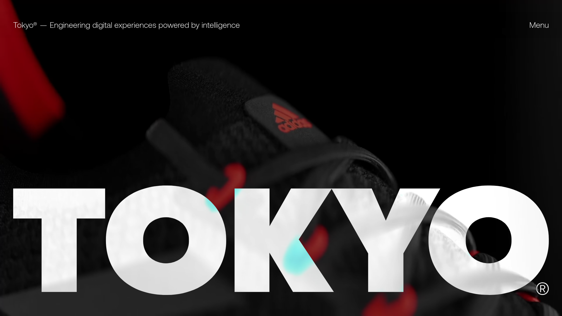
Tokyo Digital Agency Showcase Site
A high-impact agency landing page featuring an animated video hero with oversized typography, logo ticker, and a multi-column project grid with integrated media sliders.

Niklas Rosén Designer Portfolio Index
A minimalist, responsive grid-based portfolio index featuring a clean 16-column layout, typographic list components, and a custom dark mode transition.

Christopher Doyle Agency Portfolio Layout
A minimalist, typography-led portfolio featuring a wide-margin grid system, smooth fade-in animations, and simple image-focused project cards.

Clase Agency Branding Portfolio
A minimalist design agency portfolio featuring a typographic hero section, full-width image articles, sticky title bars, and integrated scrolling text marquees for a clean editorial layout.
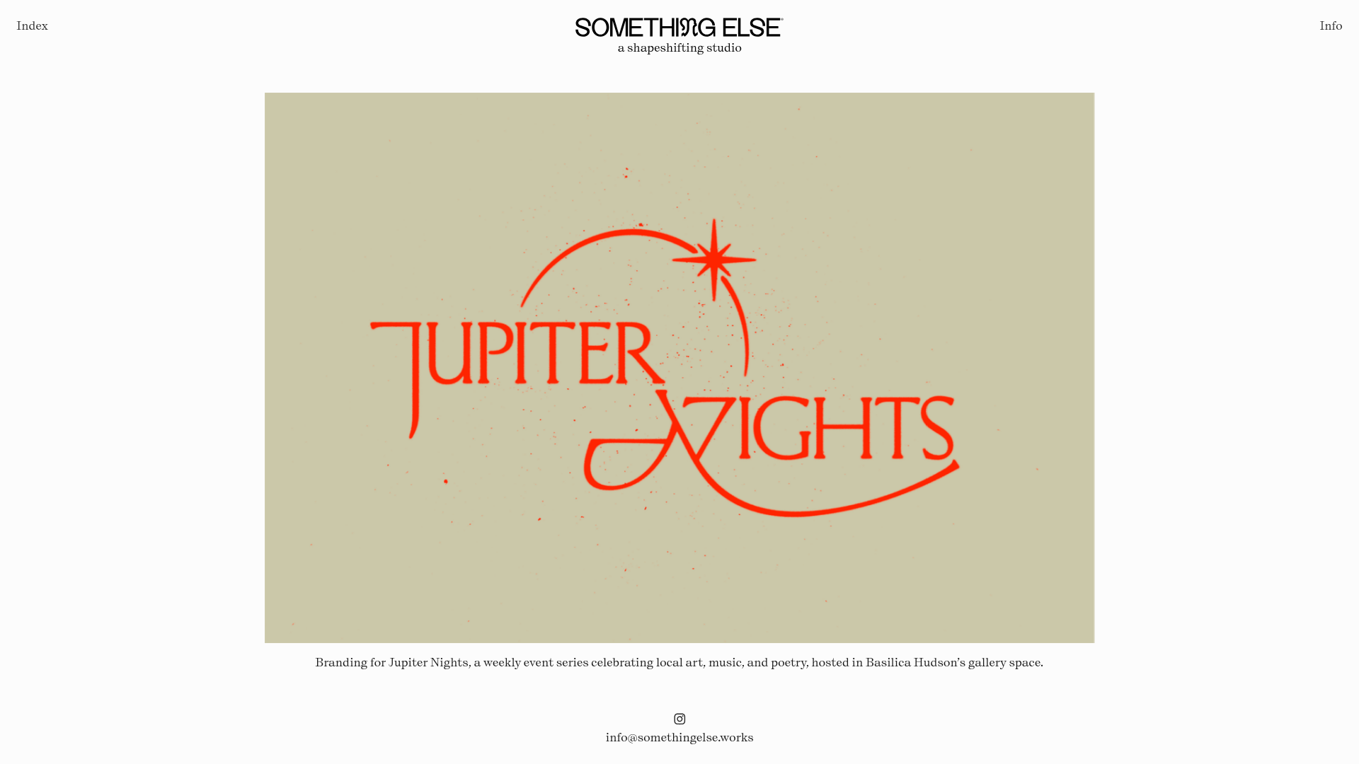
Something Else Portfolio Slideshow
A minimalist design studio portfolio featuring a full-width image and video slideshow with large-scale typography, sticky navigation, and centered captions.
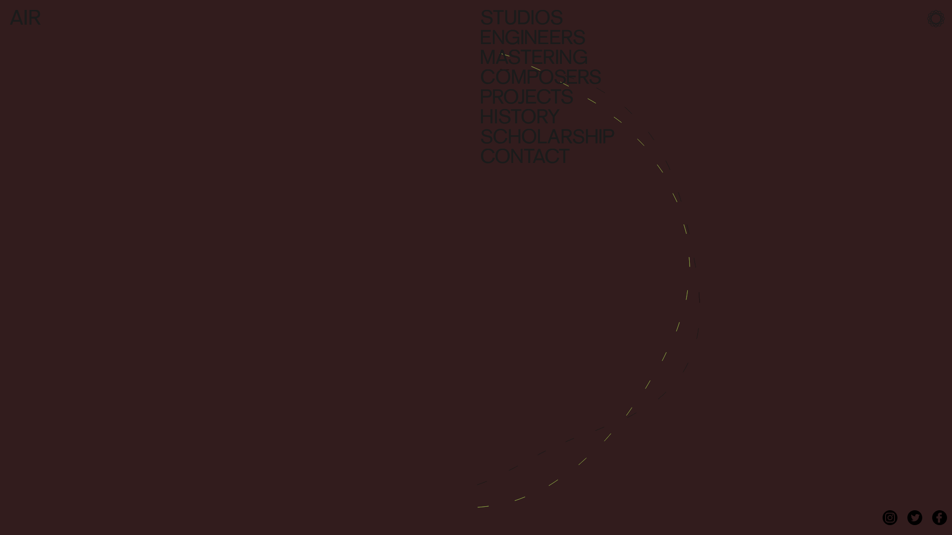
AIR Studios Minimalist Navigation Landing
A dark, minimalist layout featuring a vertical text-based navigation menu, a full-screen background video wrapper, and a dynamic canvas-based interactive drawing layer.
